Landing pages
How SaaS products sell themselves, read off the page. Filter by what they lead with — and see what share of the catalogue does the same.
What this selection has in common
493
pages analysed
of 1,233 in the catalogue — the rest are still to read
Not enough read yet to say what this selection has in common.
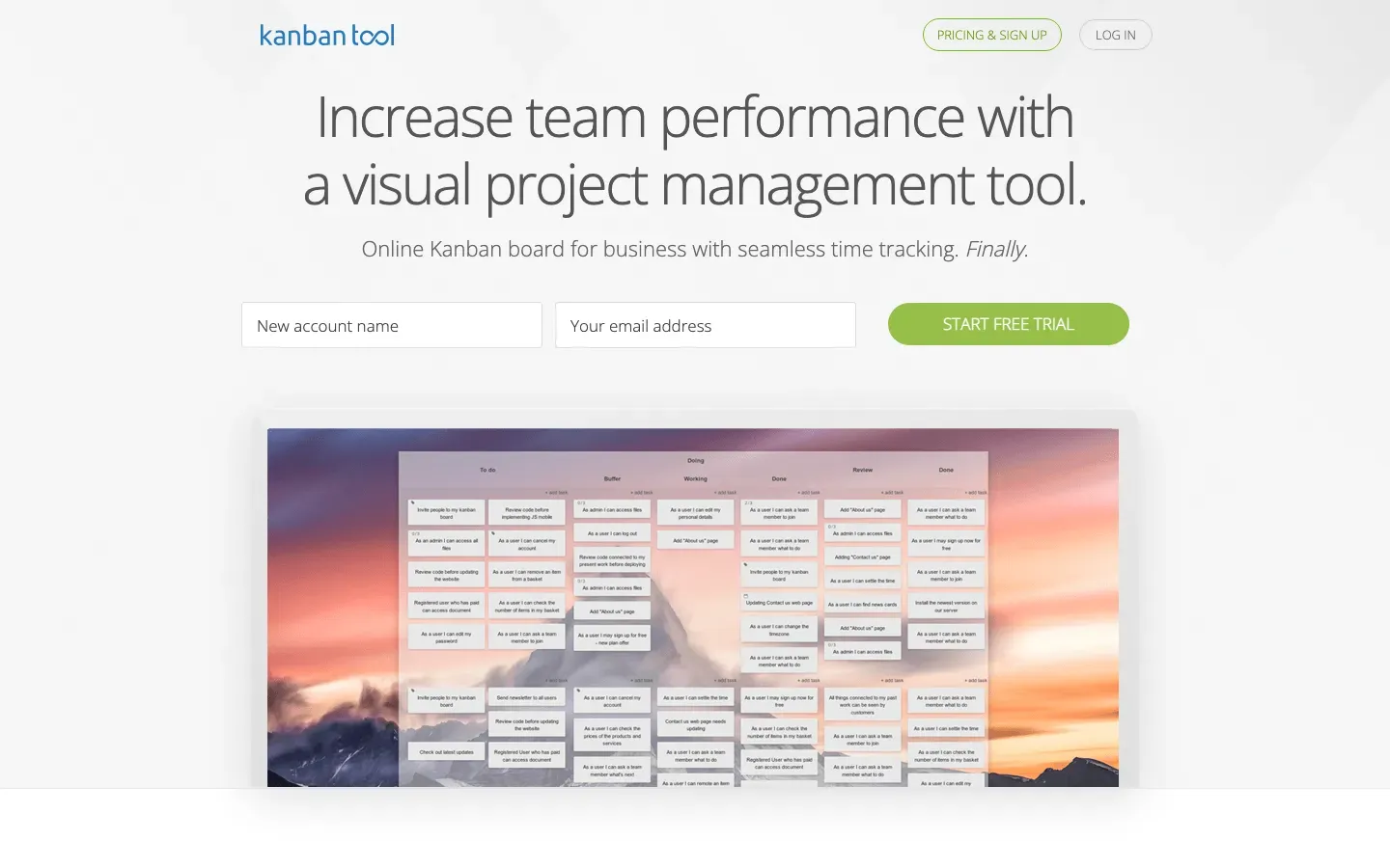
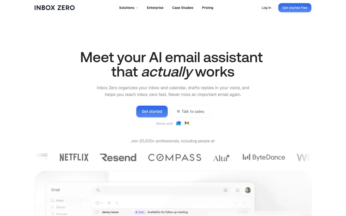
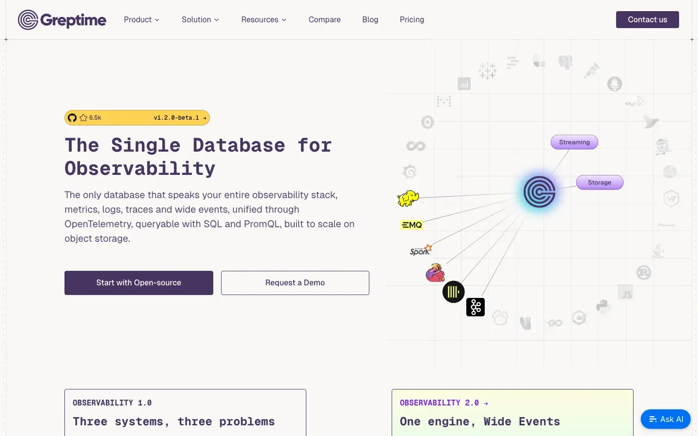
Kanban Tool
“Increase team performance with a visual project management tool.”
Angle: Outcome / benefit-led
Jitsi
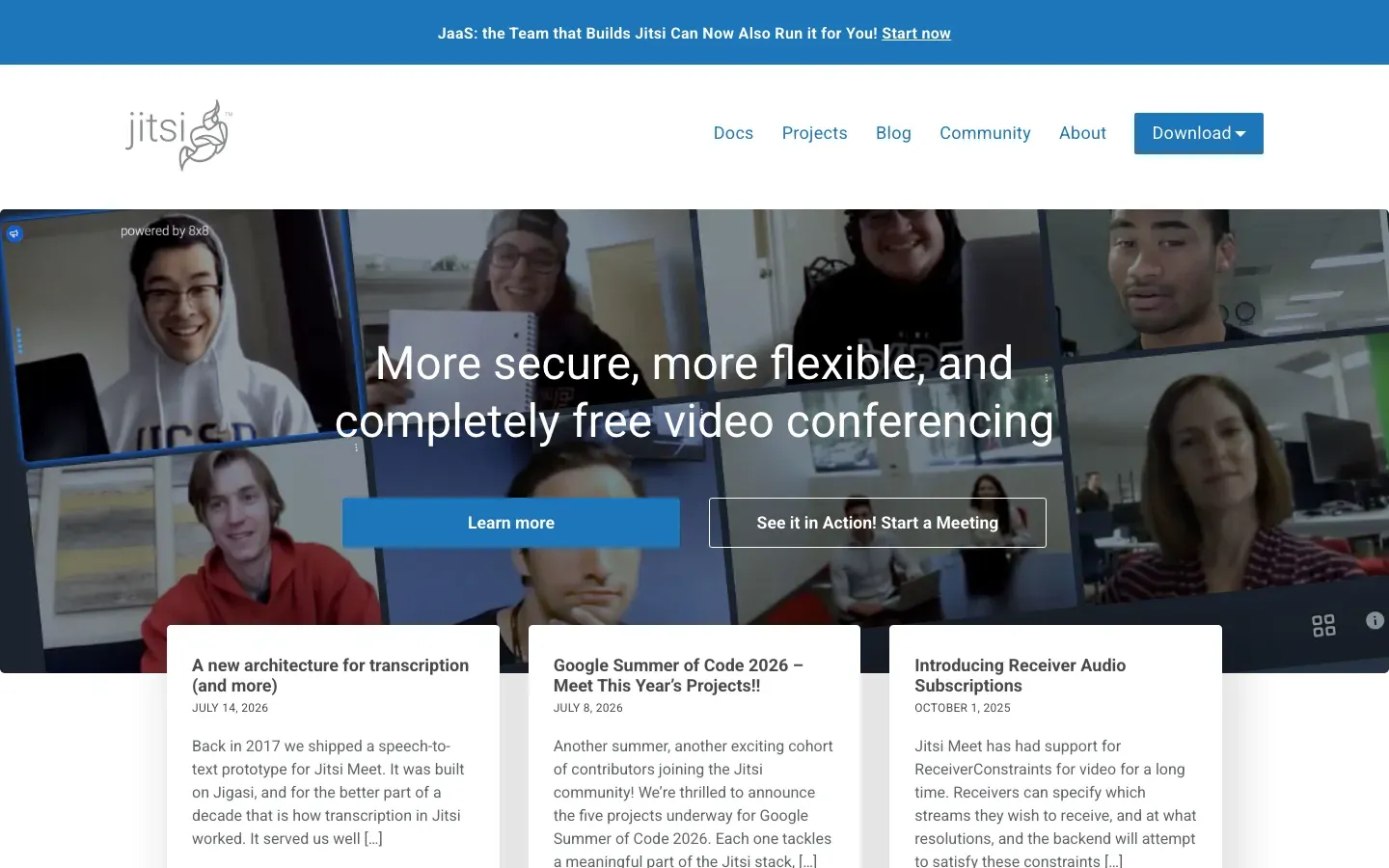
“More secure, more flexible, and completely free video conferencing”
Angle: Outcome / benefit-led



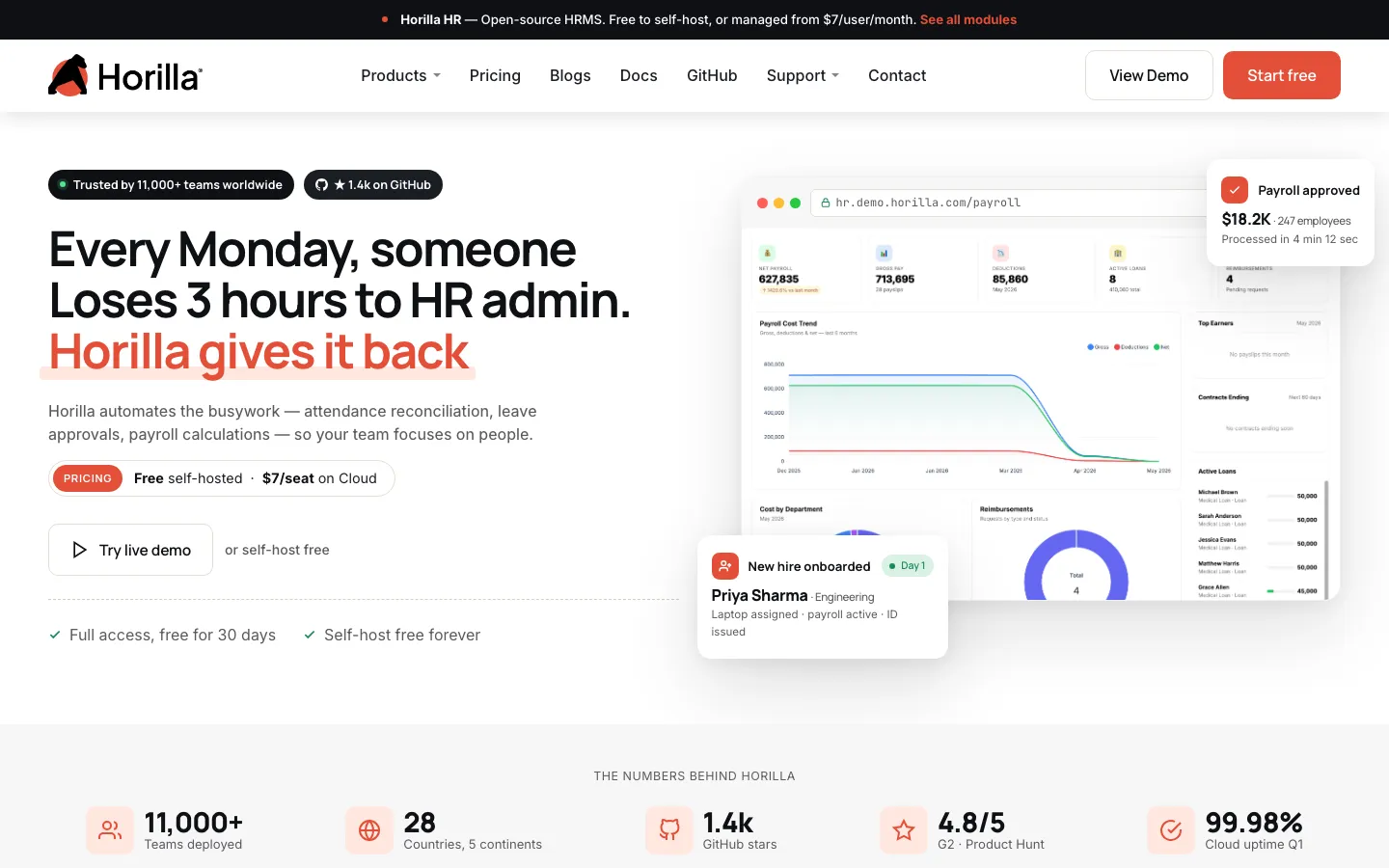
Horilla
“Every Monday, someone Loses 3 hours to HR admin. Horilla gives it back”
Angle: Pain agitation

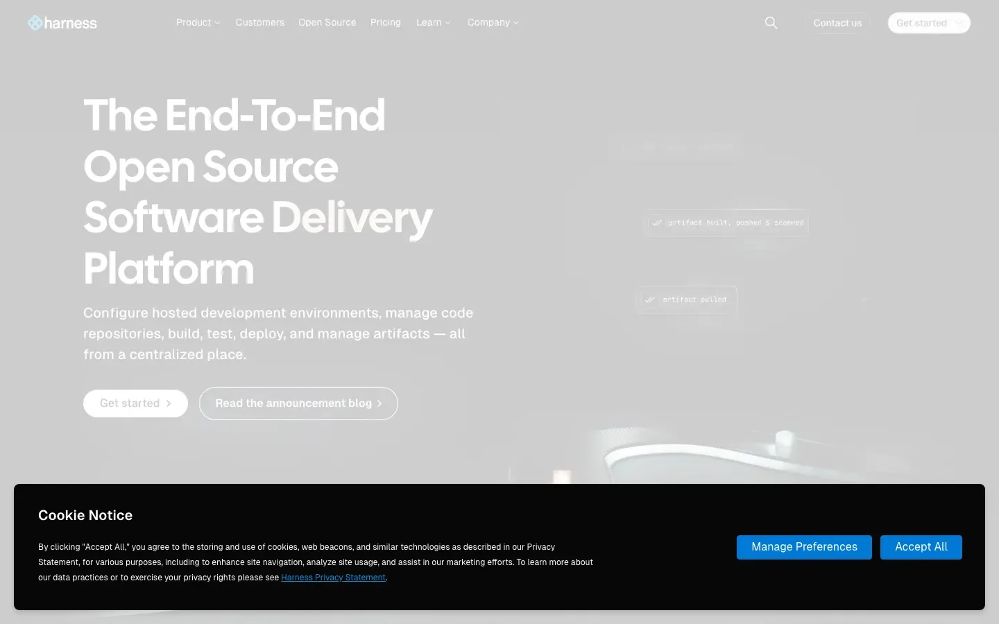
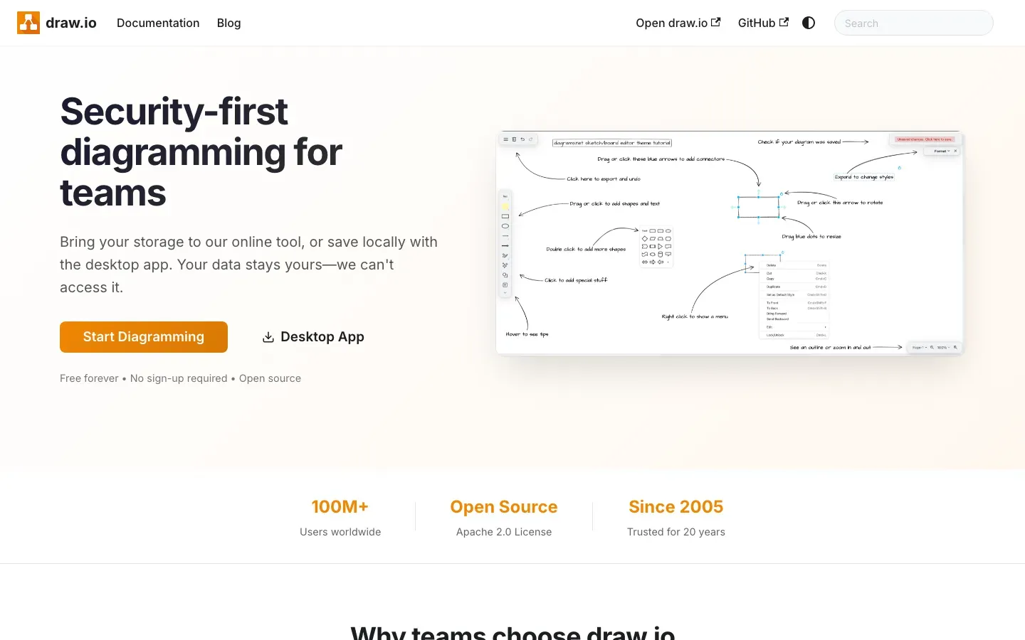
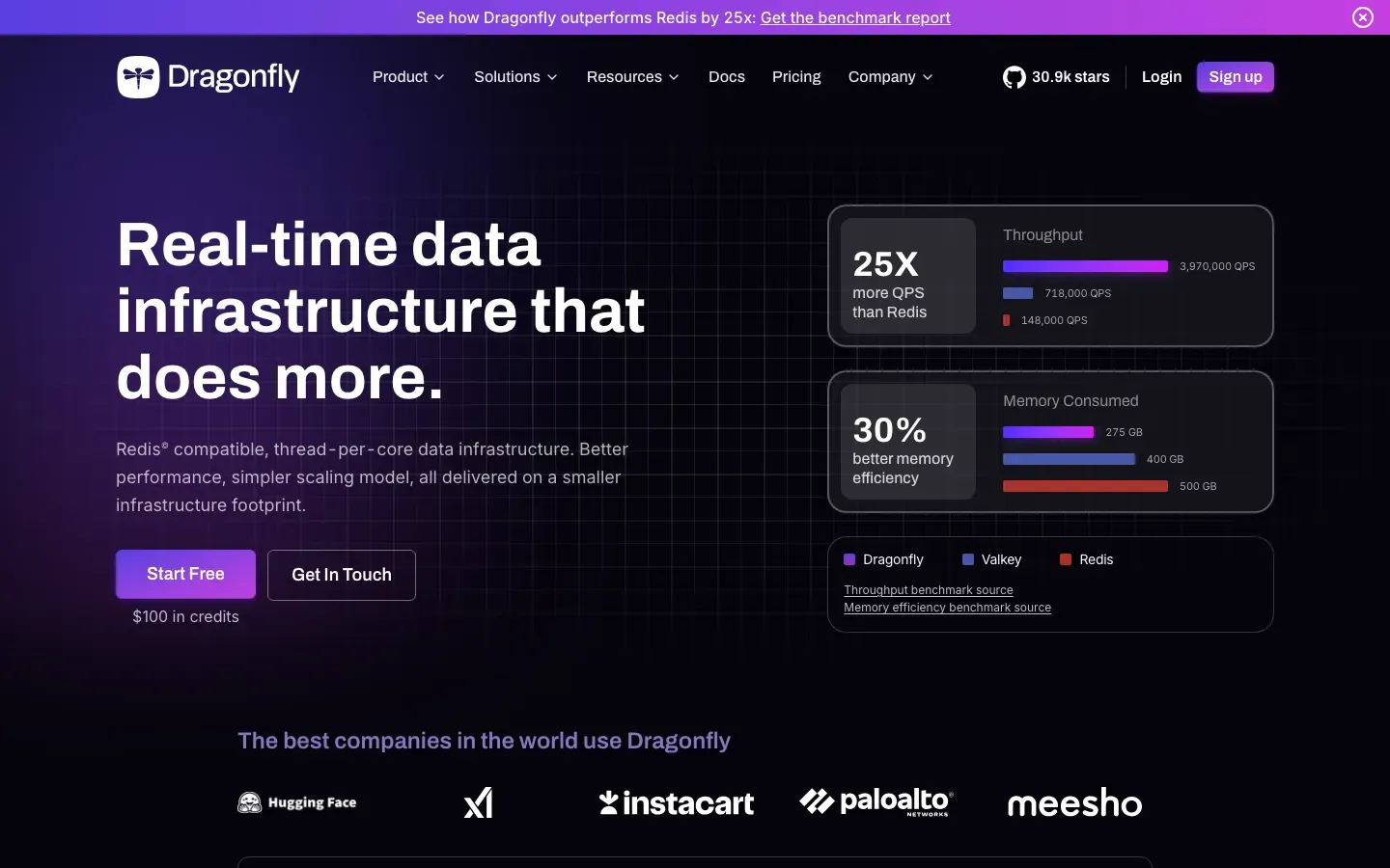
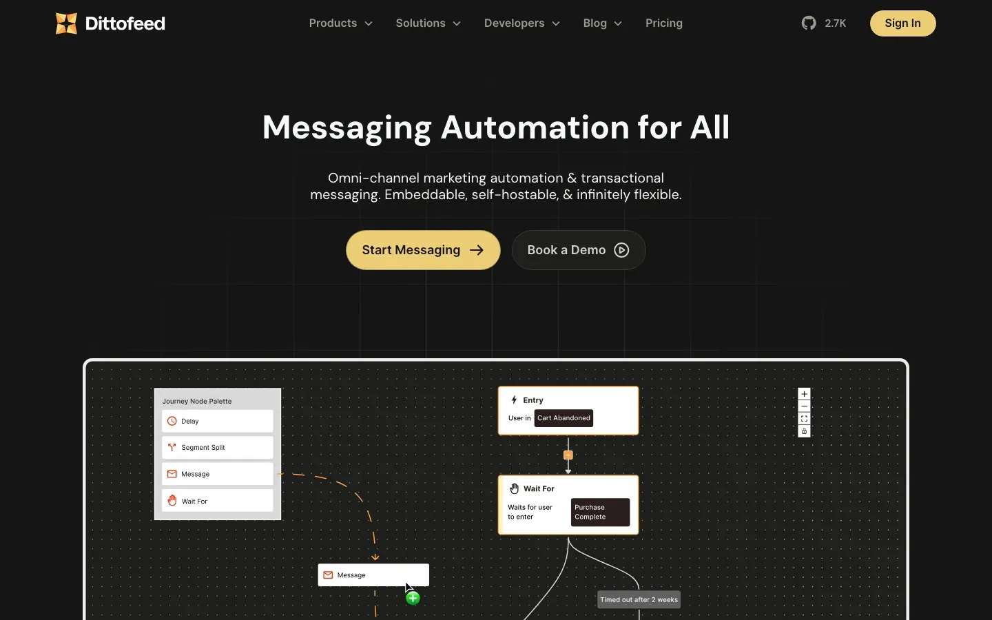
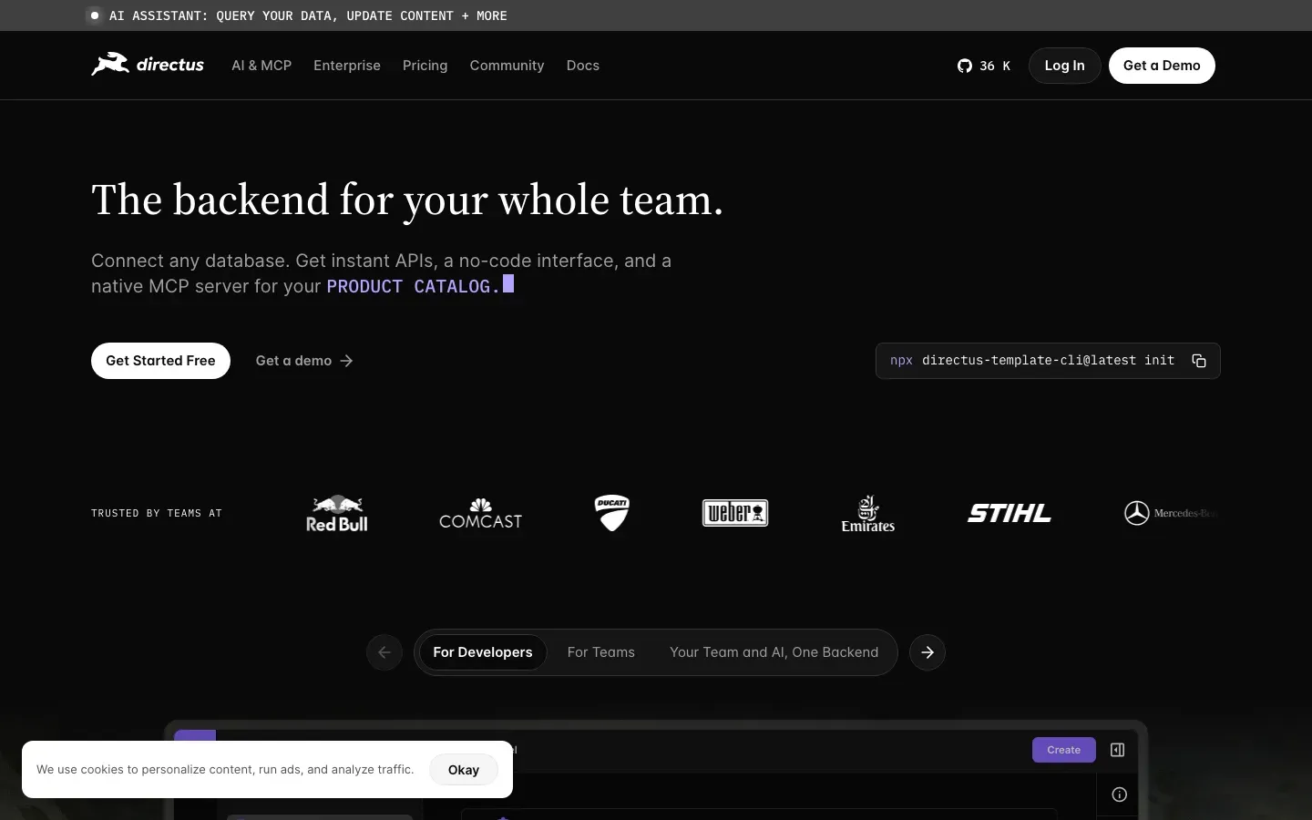
Harness Open Source
“The End-To-End Open Source Software Delivery Platform”
Angle: Open source / ownership
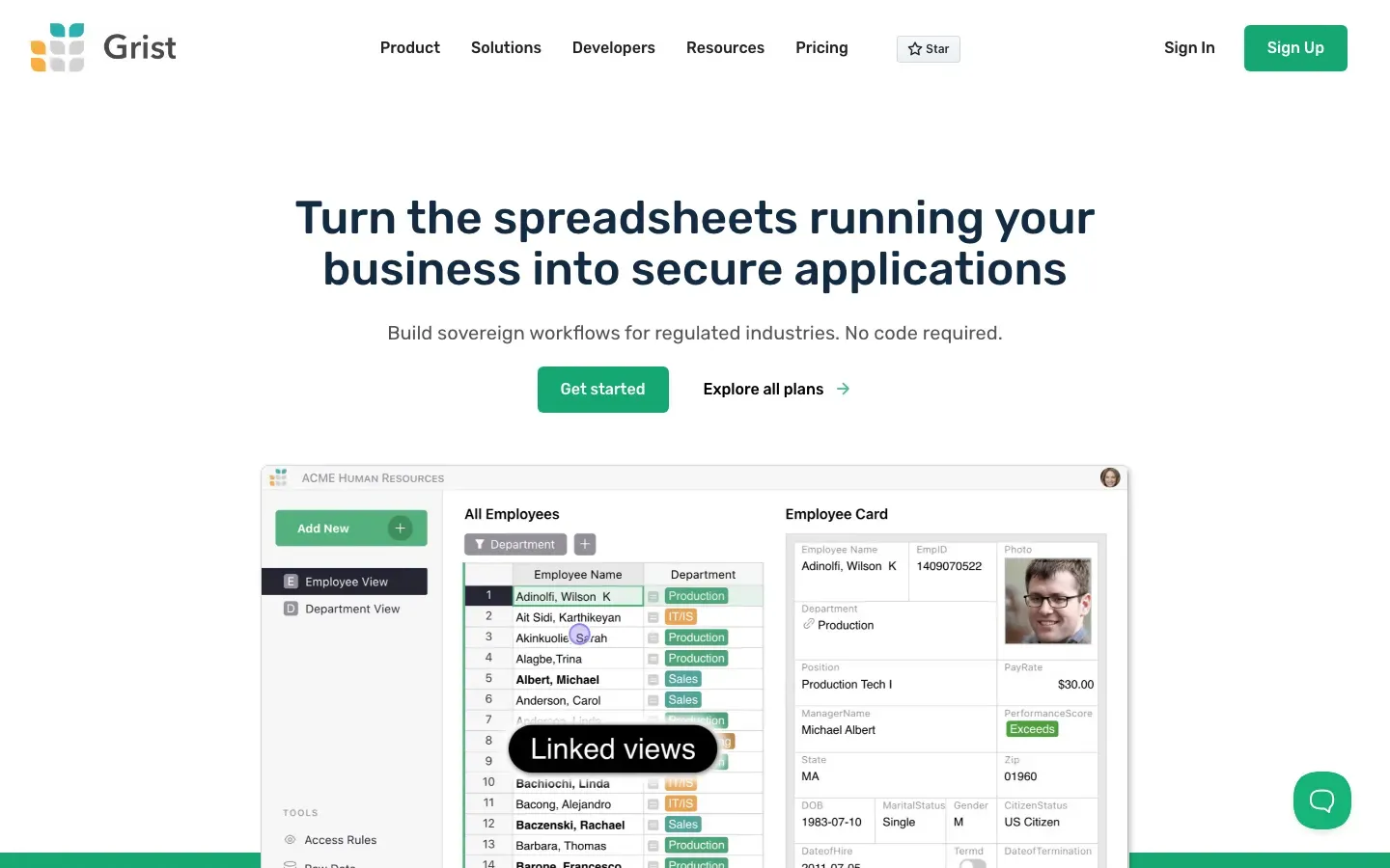
Grist
“Turn the spreadsheets running your business into secure applications”
Angle: Outcome / benefit-led


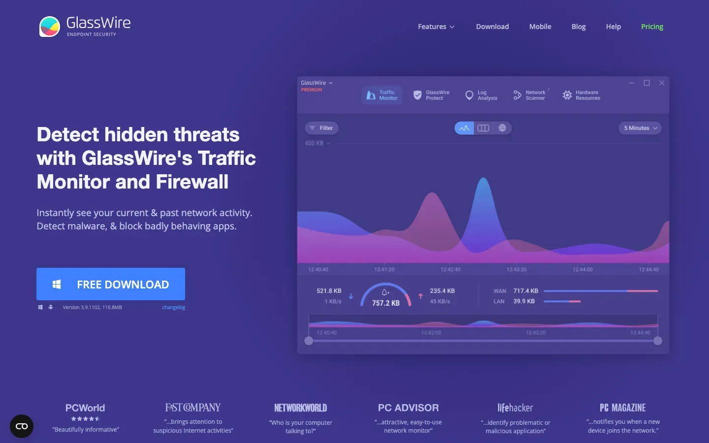
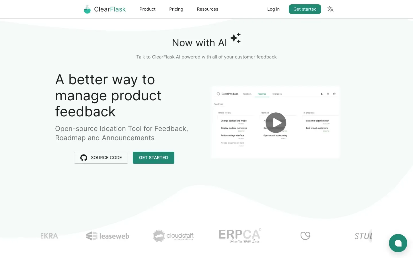
GlassWire
“Detect hidden threats with GlassWire's Traffic Monitor and Firewall”
Angle: Outcome / benefit-led





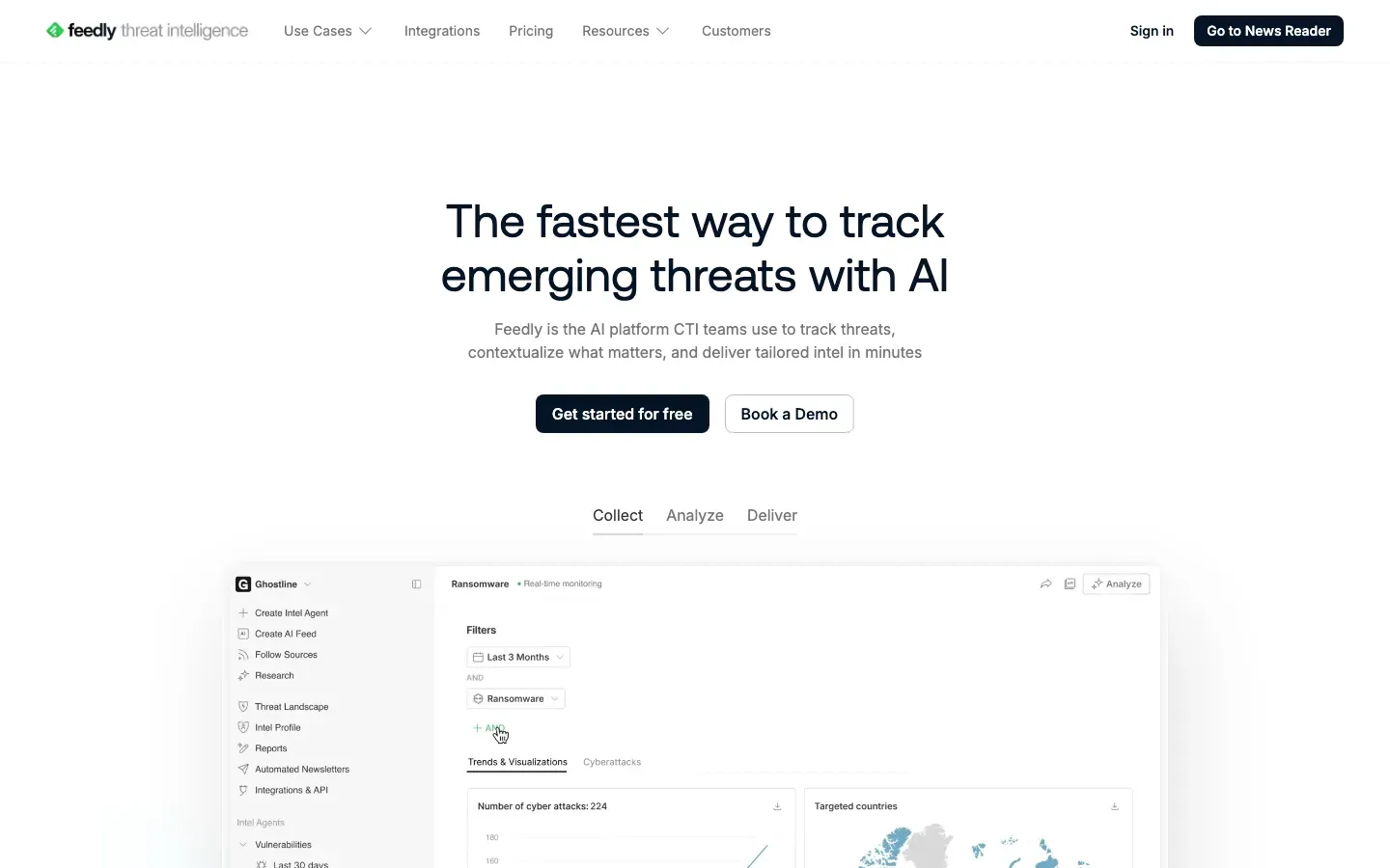
Feedly Threat Intelligence
“The fastest way to track emerging threats with AI”
Angle: Speed / time-to-value
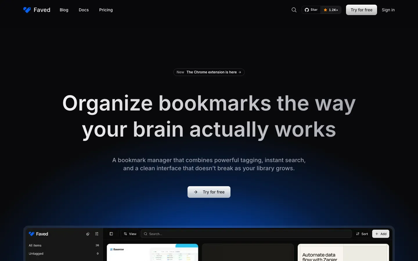
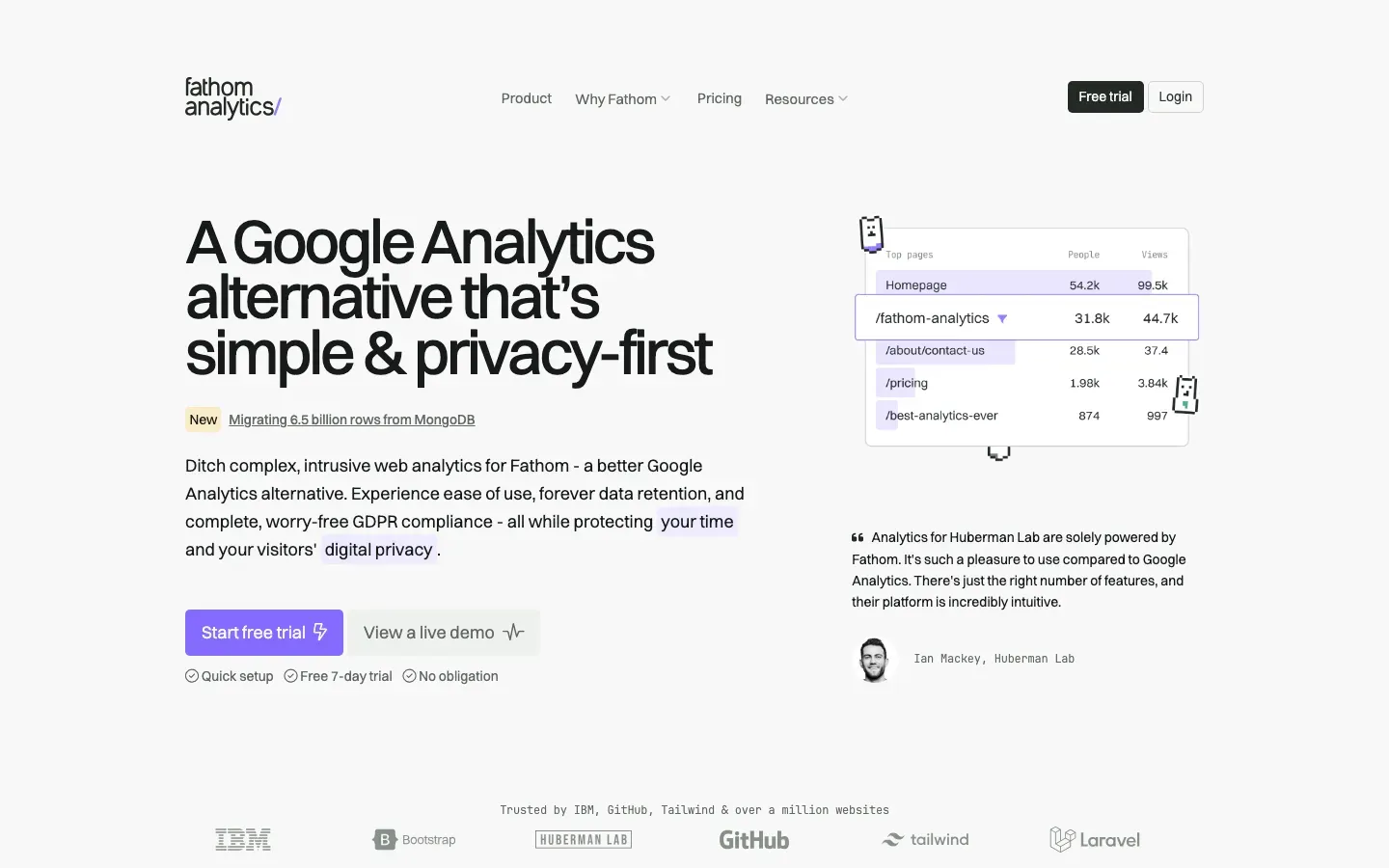
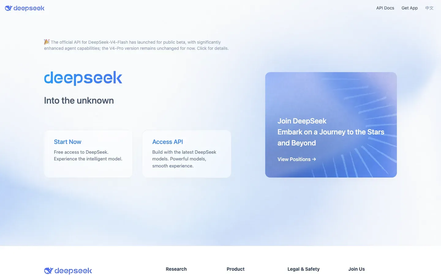
Fathom Analytics
“A Google Analytics alternative that's simple & privacy-first”
Angle: Contrarian / anti-incumbent

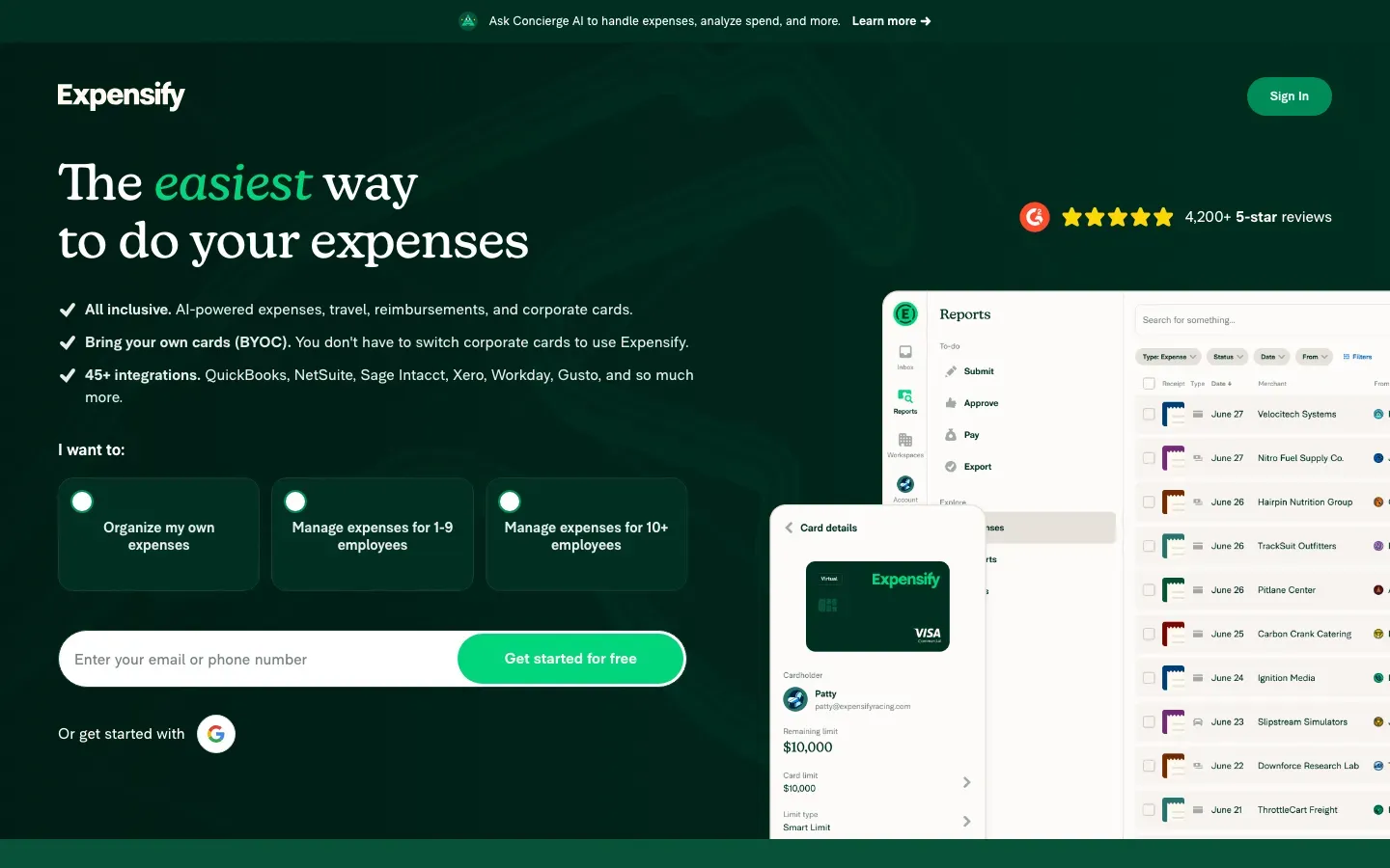
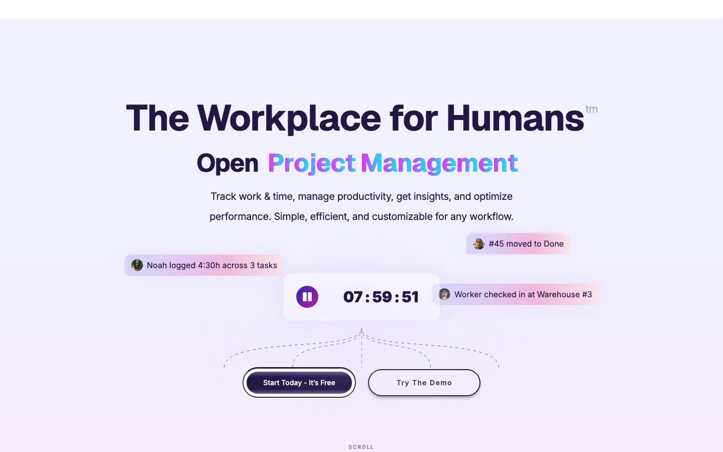

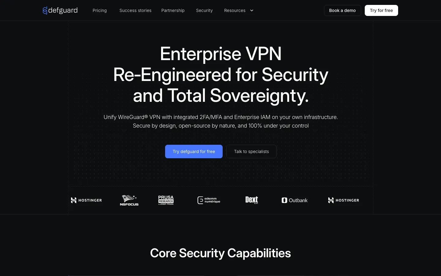
Defguard
“Enterprise VPN Re‑Engineered for Security and Total Sovereignty.”
Angle: Security / trust-led
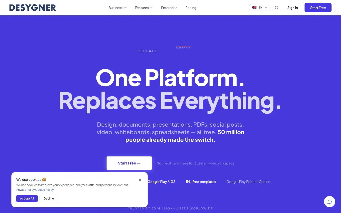
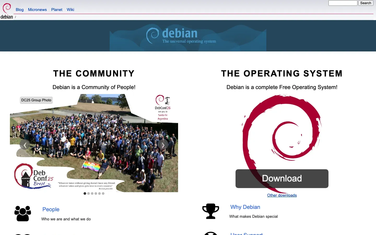

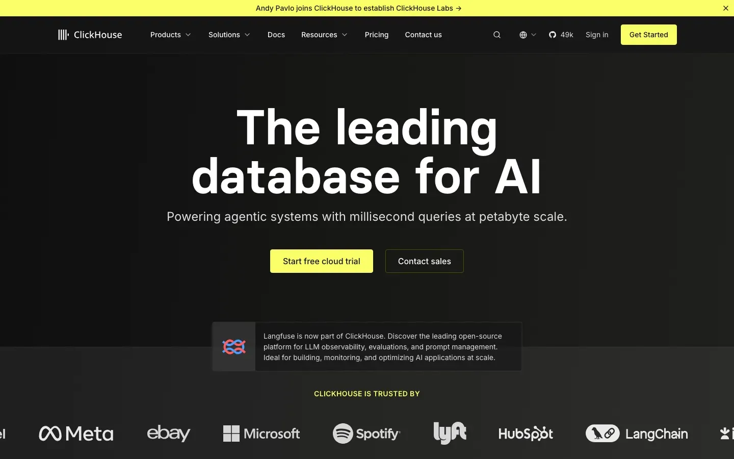
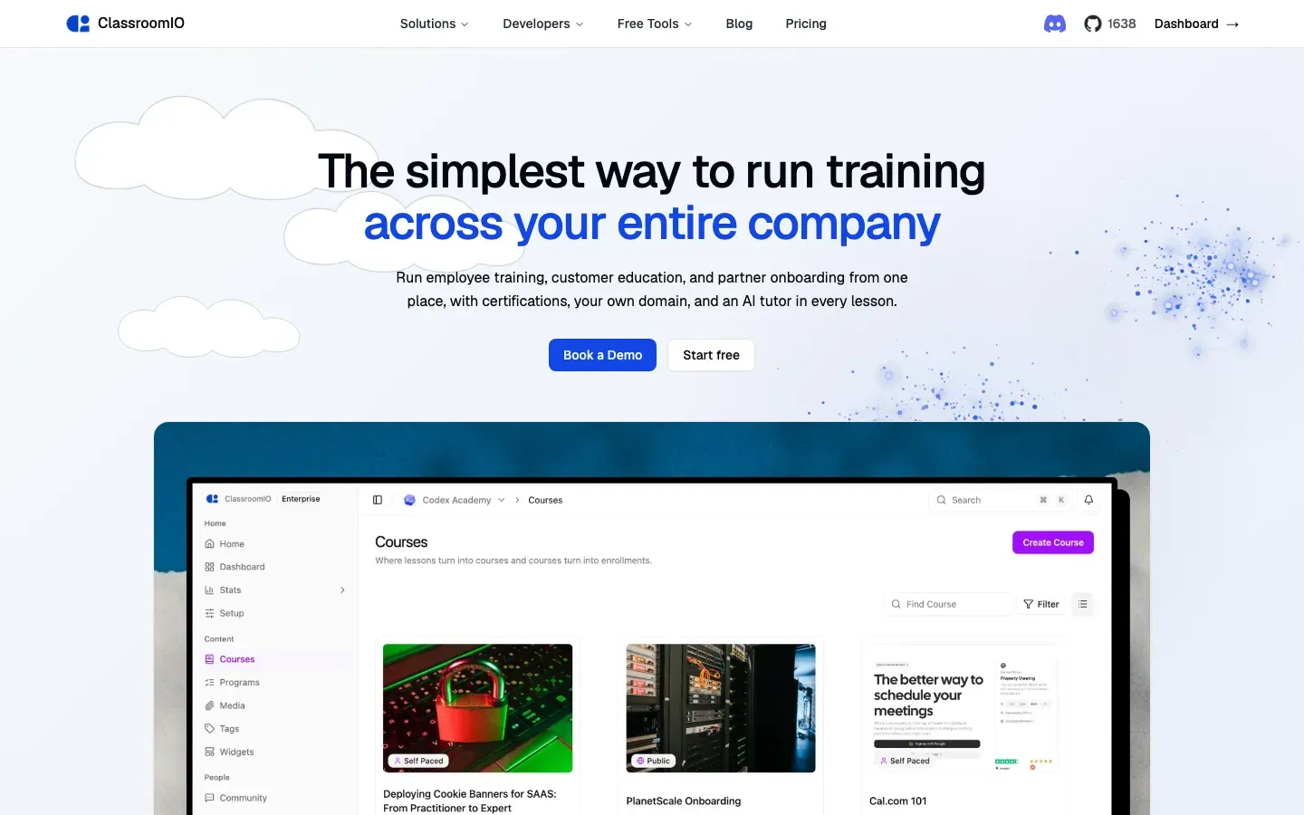
CourseLit
“Build, Sell & Market Your Courses And Digital Downloads”
Angle: Contrarian / anti-incumbent

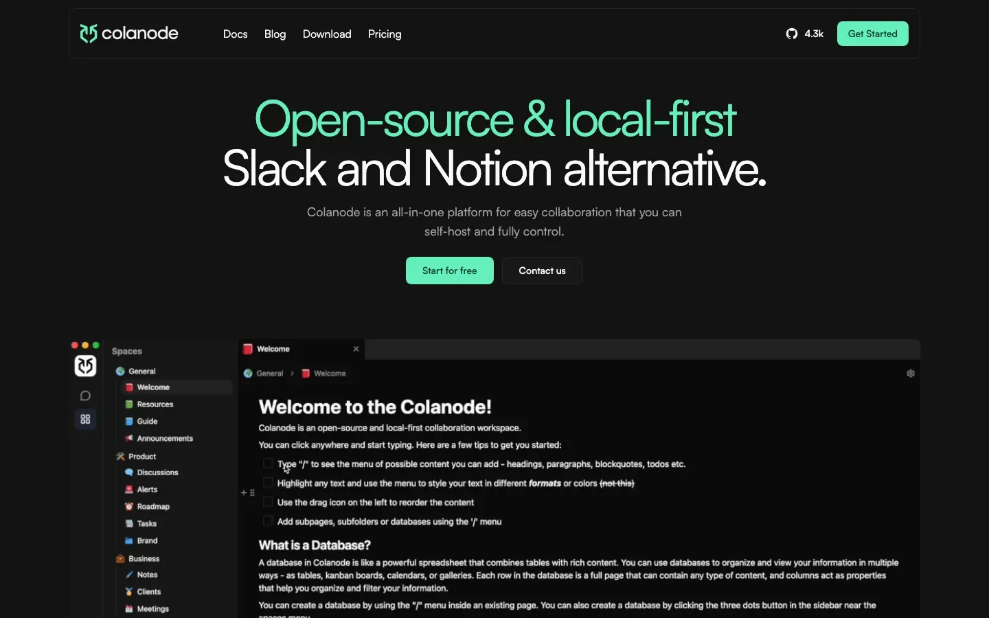
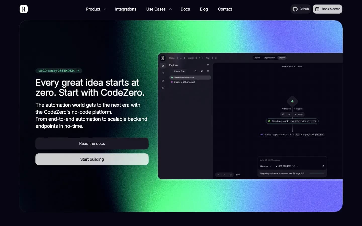
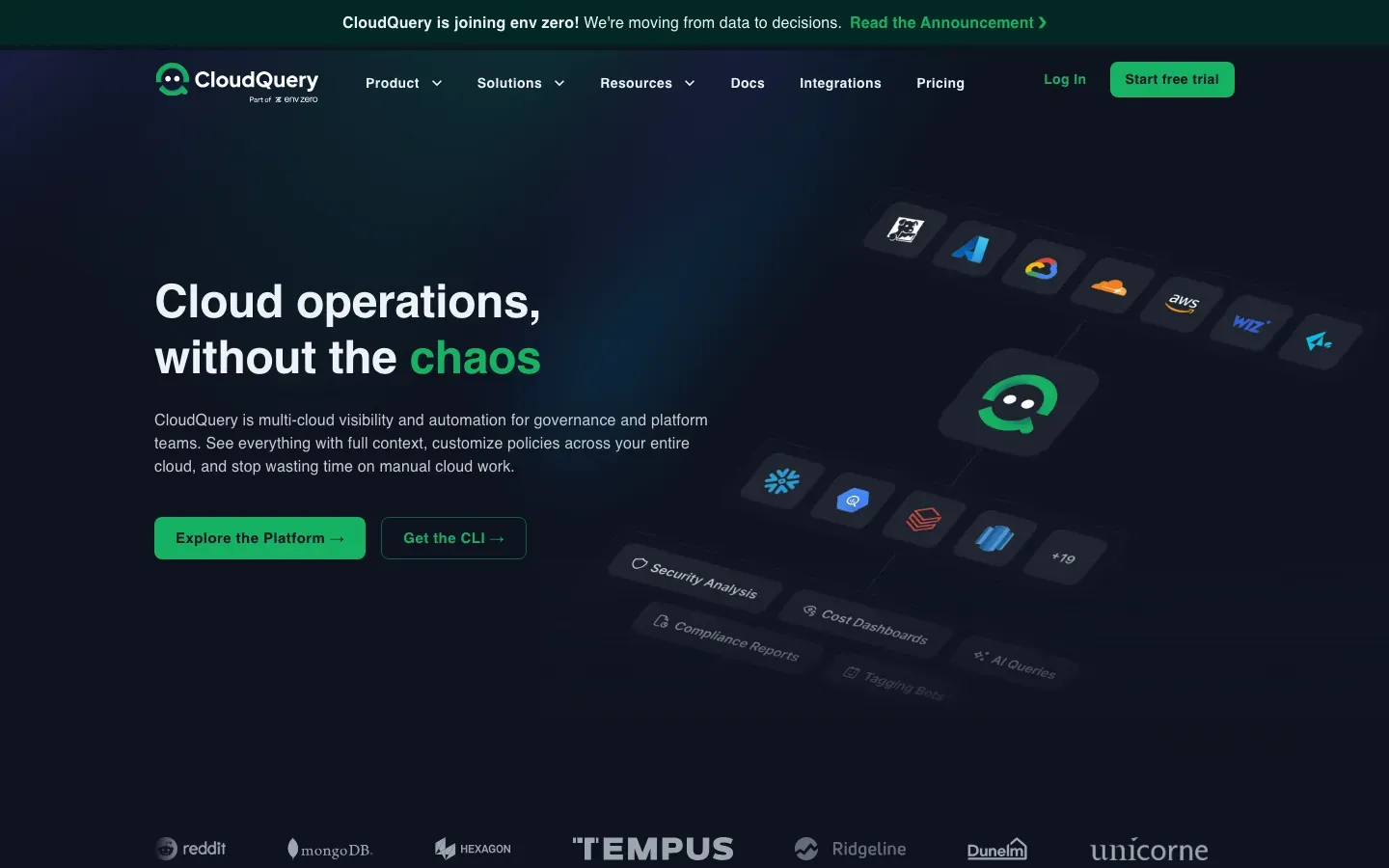
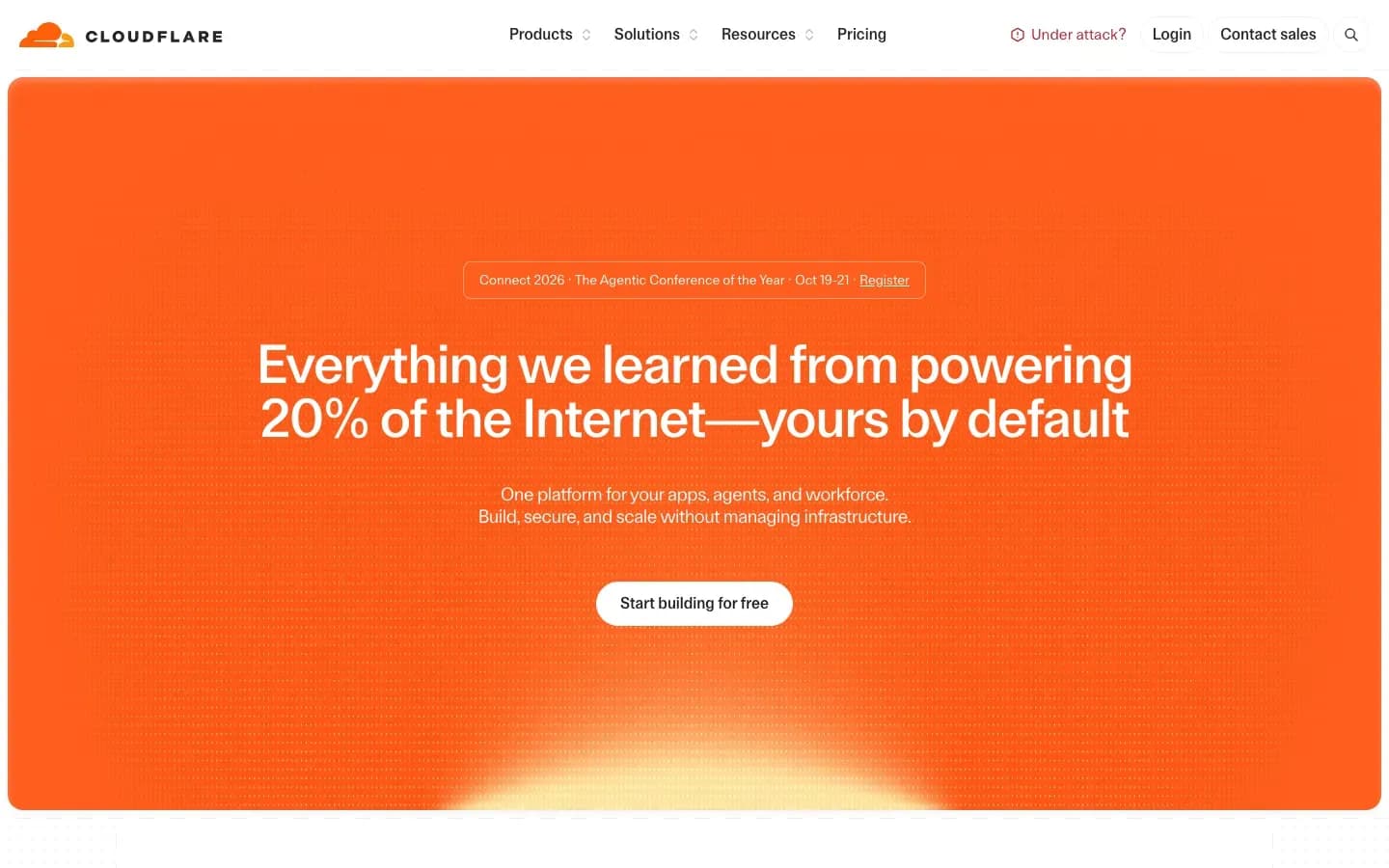
Cloudflare
“Everything we learned from powering 20% of the Internet—yours by default”
Angle: Authority / credibility
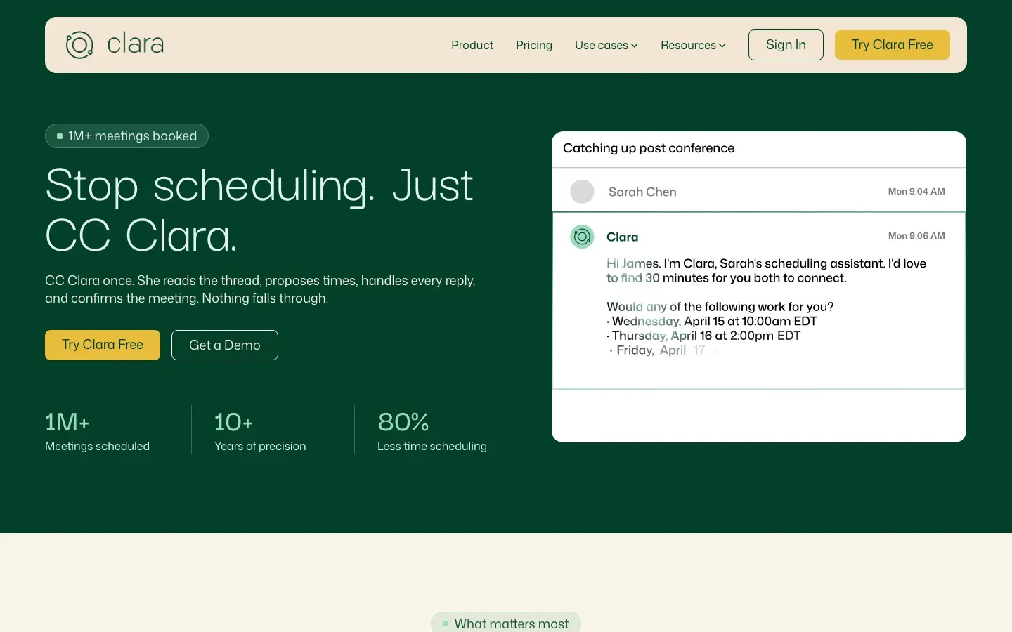

Chobble Tickets
“Event ticketing software with no per-ticket platform fees”
Angle: Contrarian / anti-incumbent
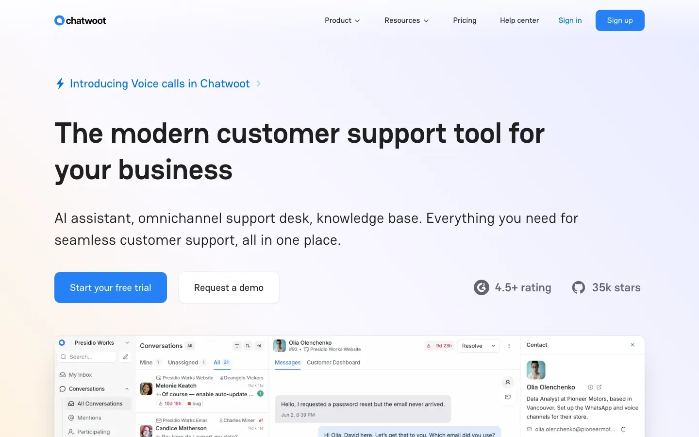
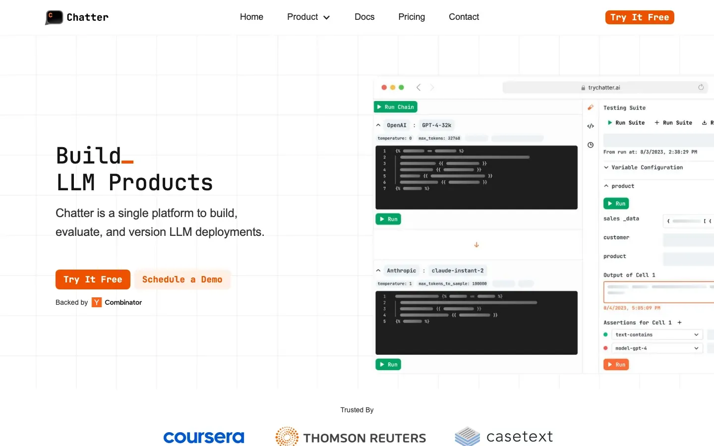
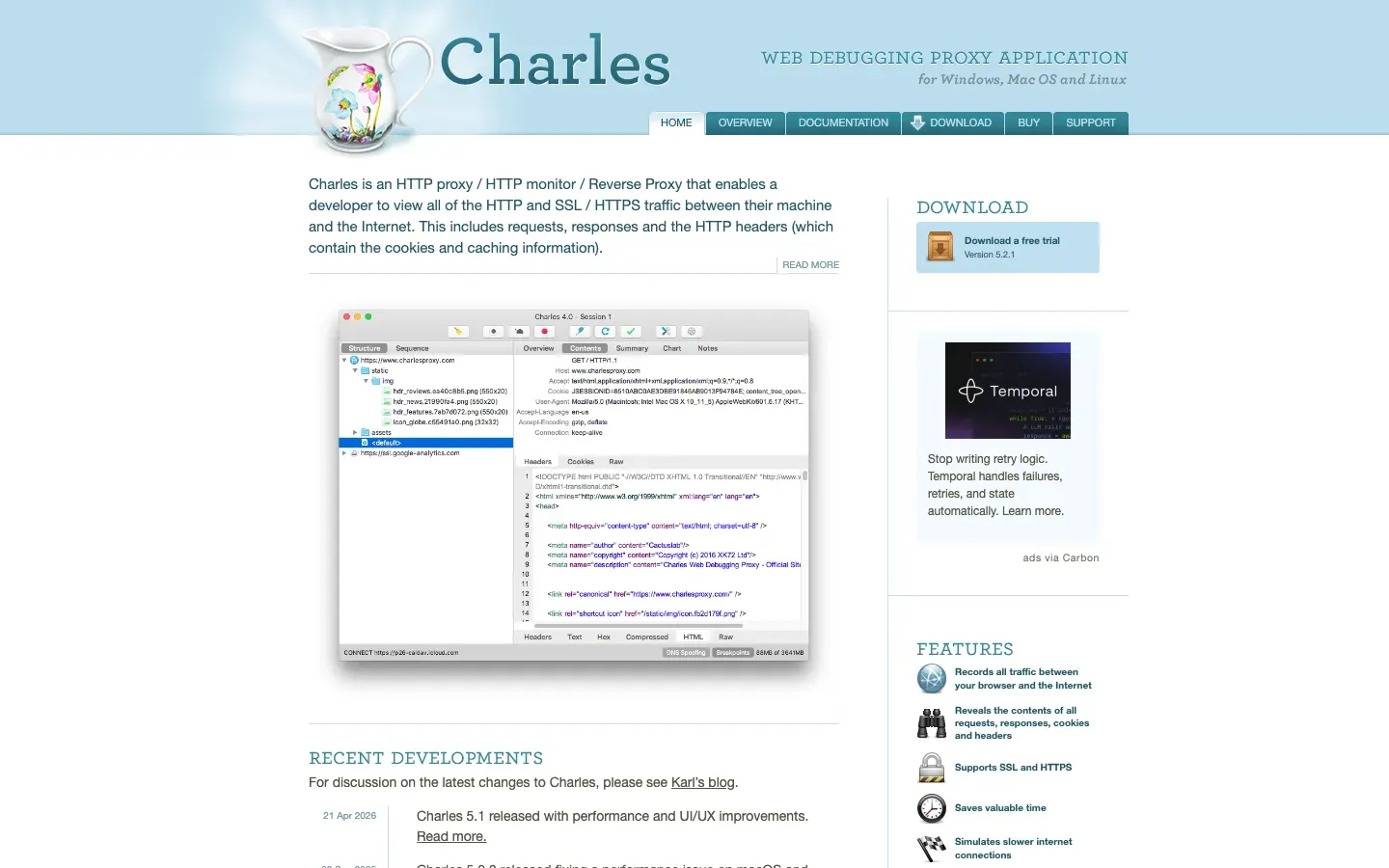
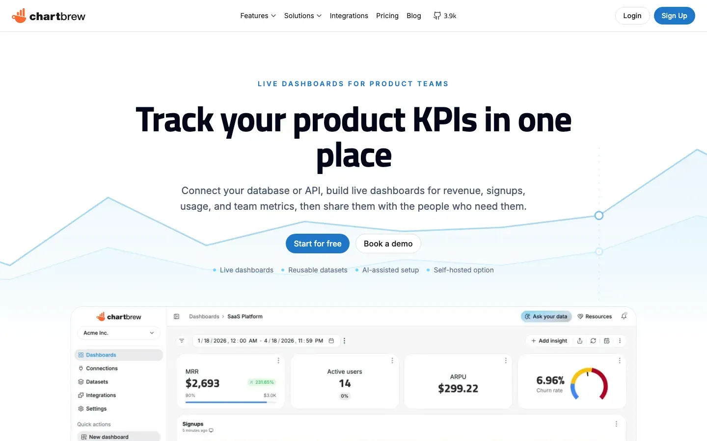


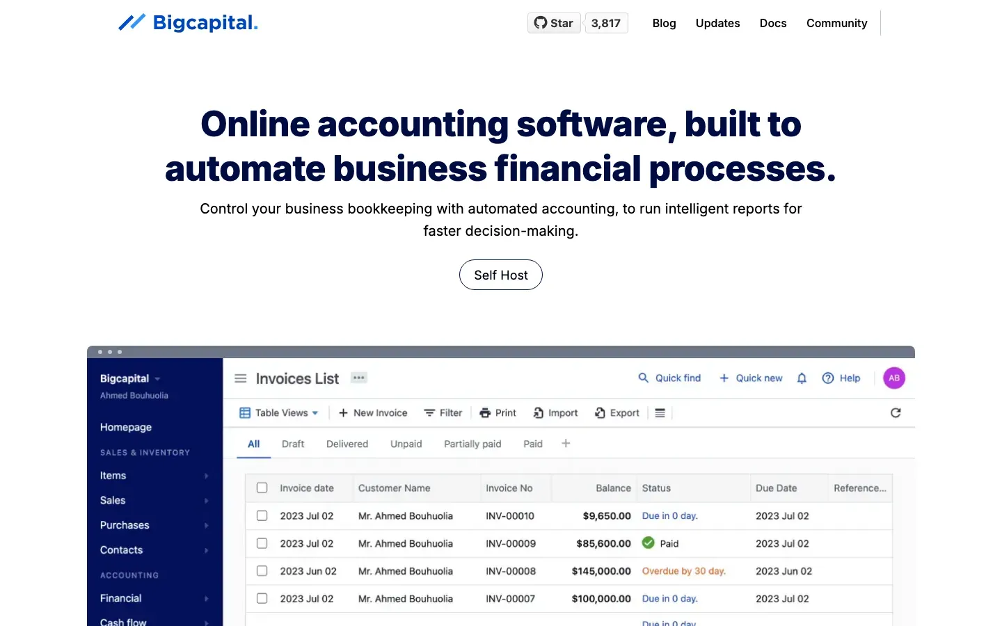
Bigcapital
“Online accounting software, built to automate business financial processes.”
Angle: Outcome / benefit-led
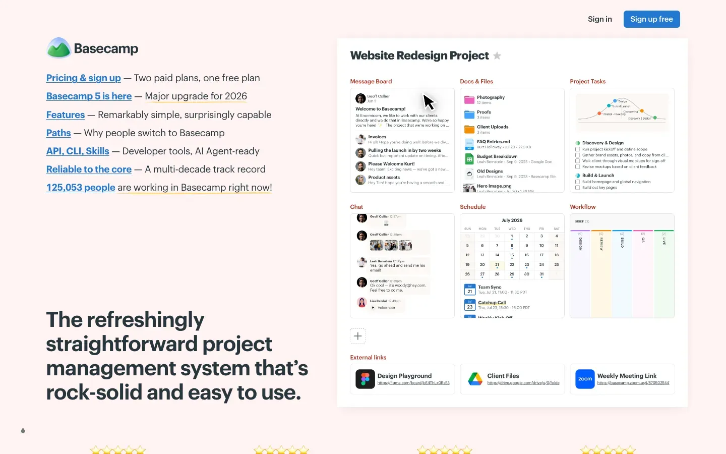
Basecamp
“The refreshingly straightforward project management system that's rock-solid and easy to use.”
Angle: Simplicity / ease

AVG AntiVirus Free
“Defend your PC against cyberthreats with our award-winning, free antivirus”
Angle: Outcome / benefit-led
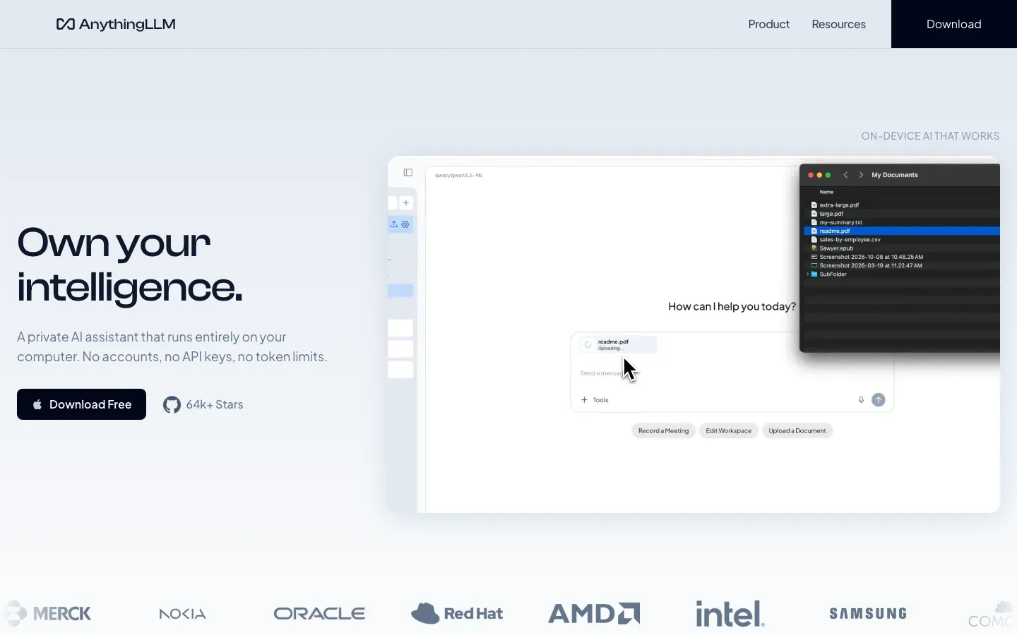
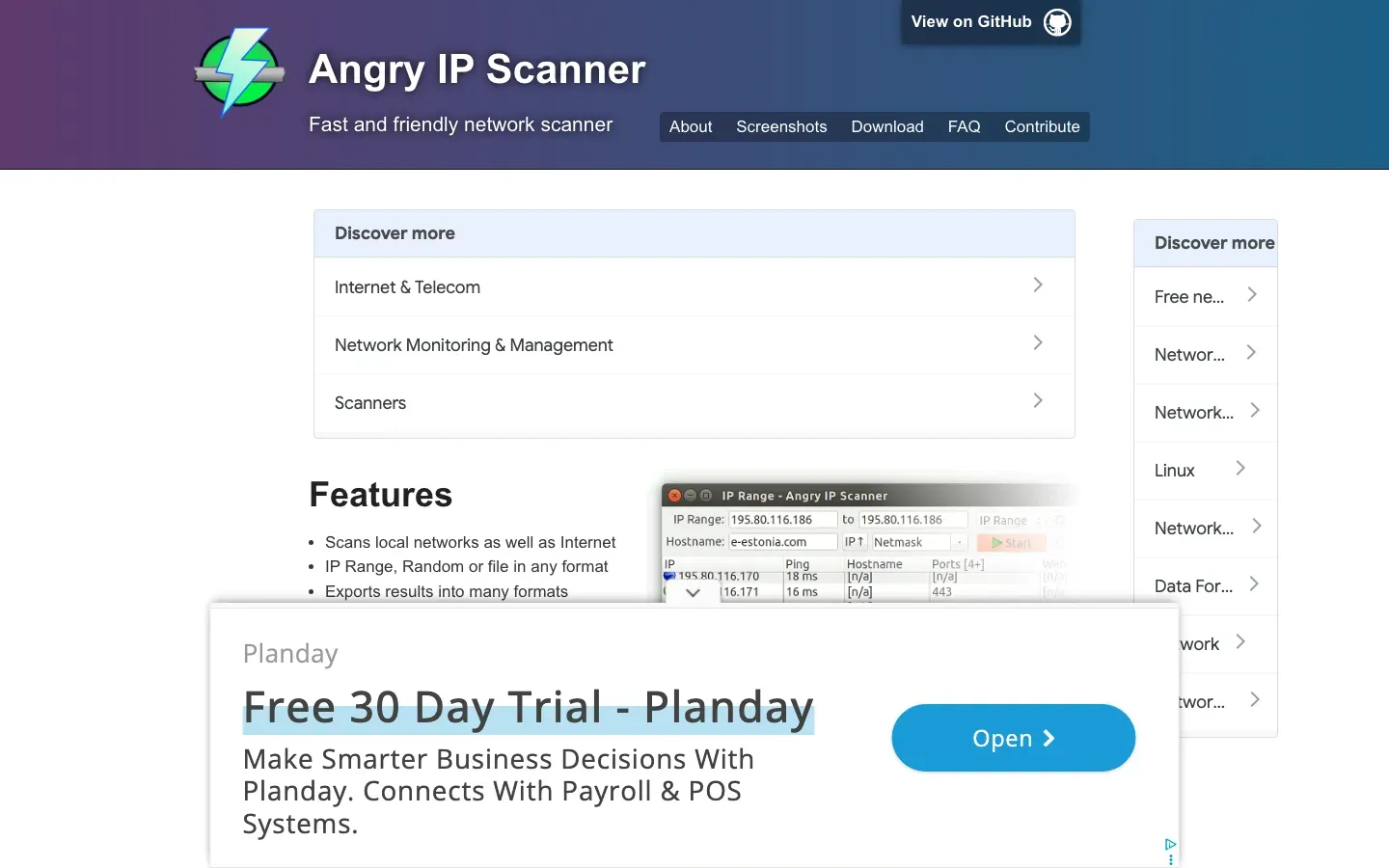
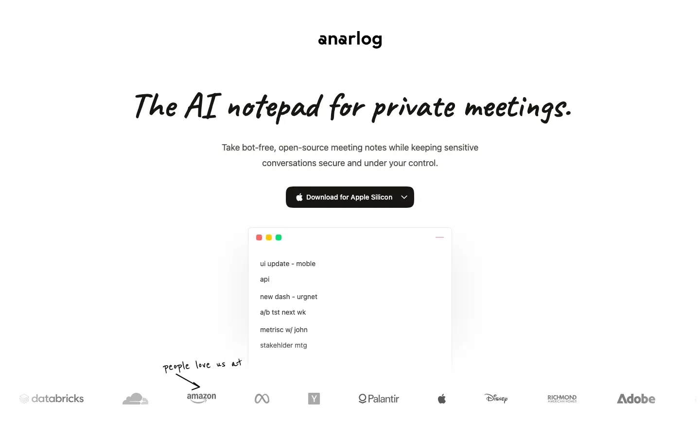
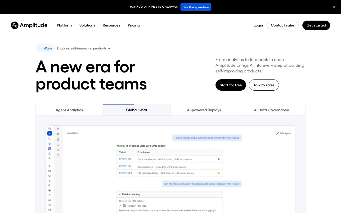
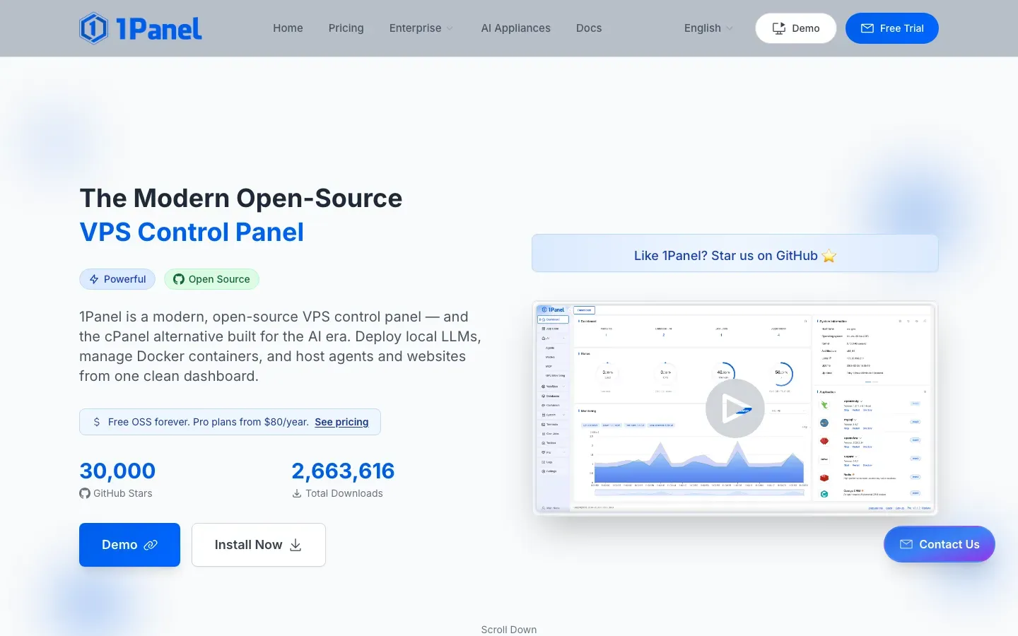
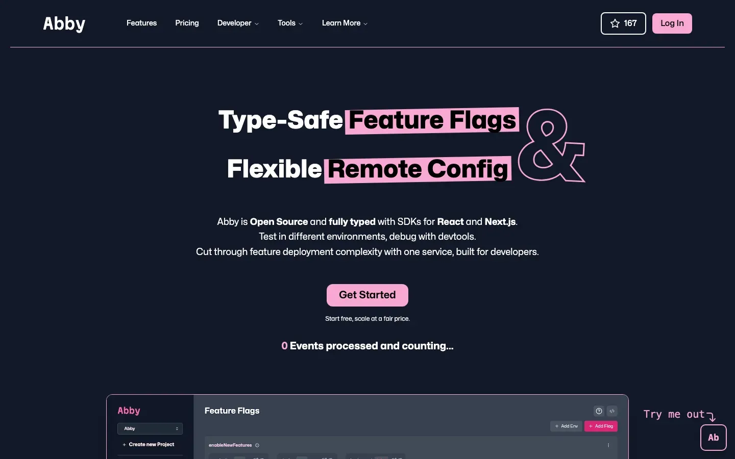
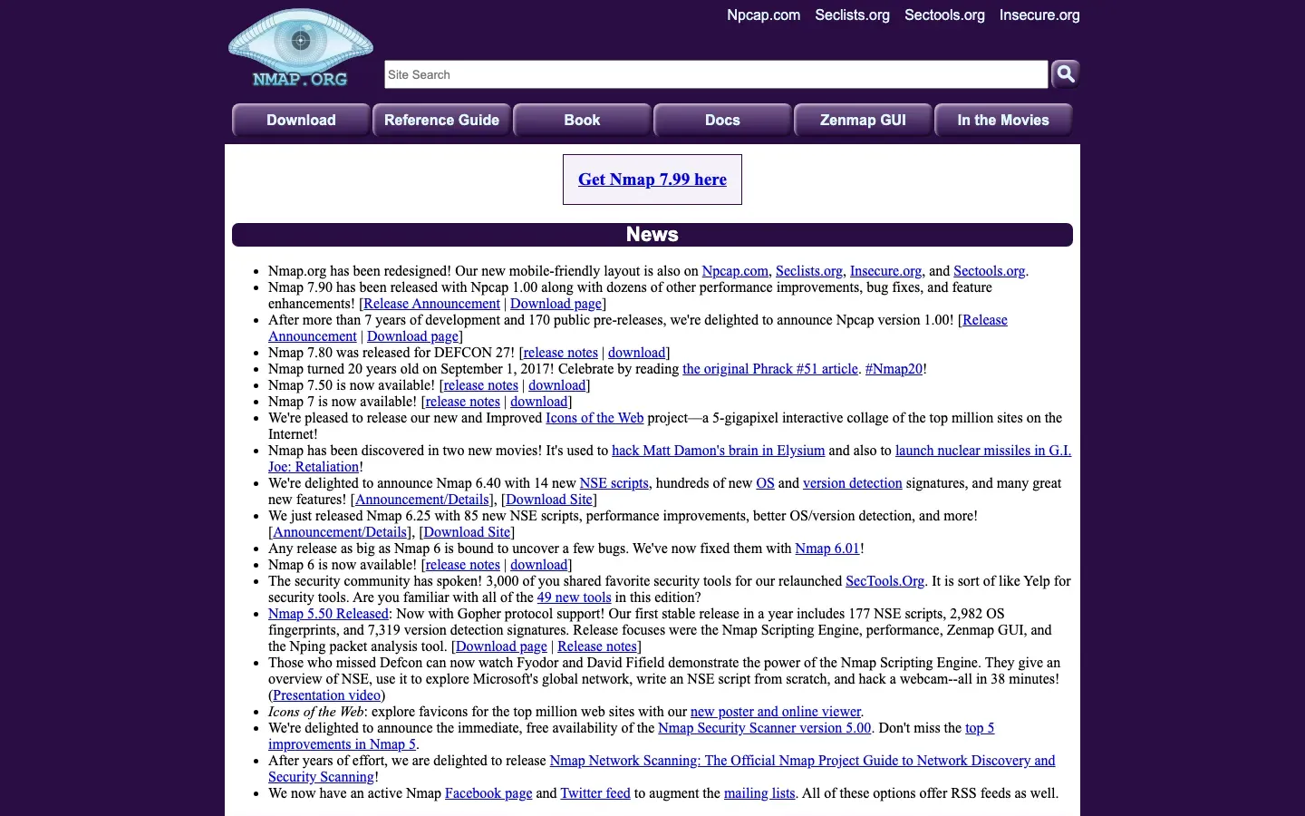
Nmap
“Nmap: Discover your network”
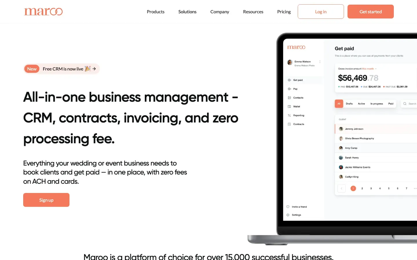
Maroo
“All-in-one business management - CRM, contracts, invoicing, and zero processing fee.”

Zynq
“Office Management for the Flexible Future”
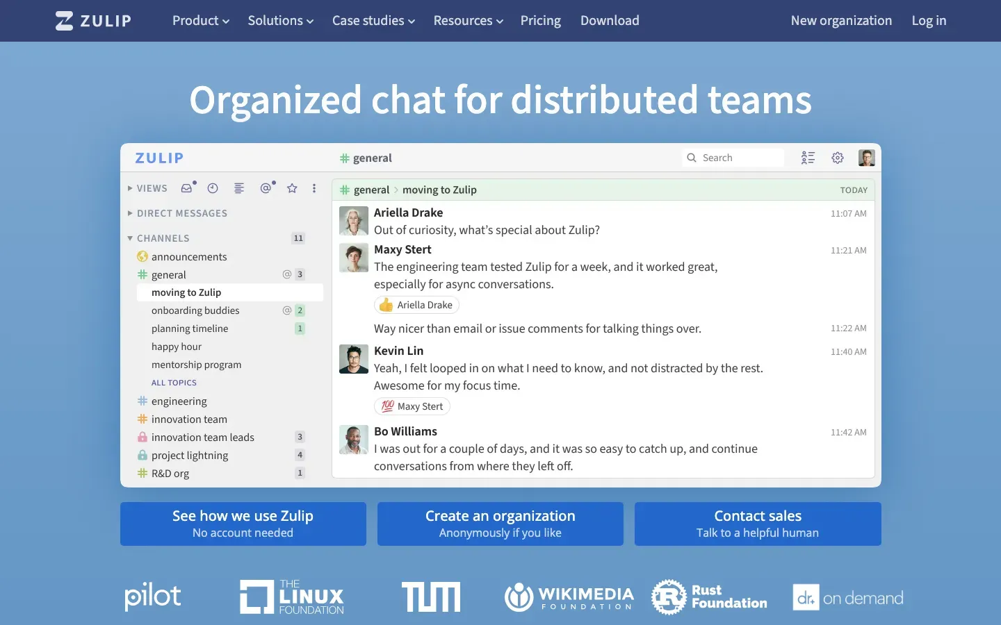
Zulip
“Organized chat for distributed teams”
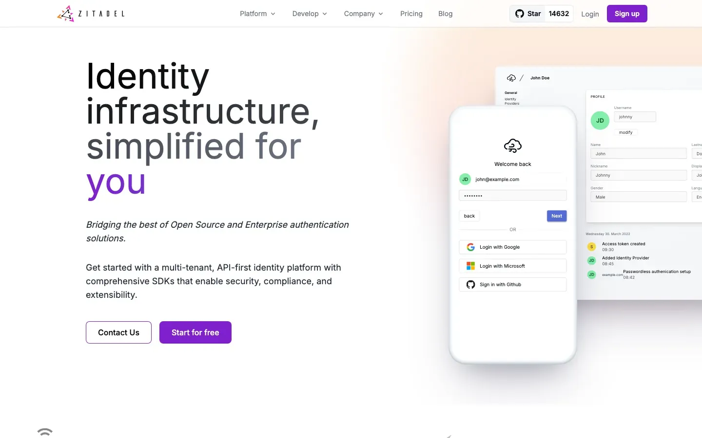
ZITADEL
“Identity infrastructure, simplified for you”
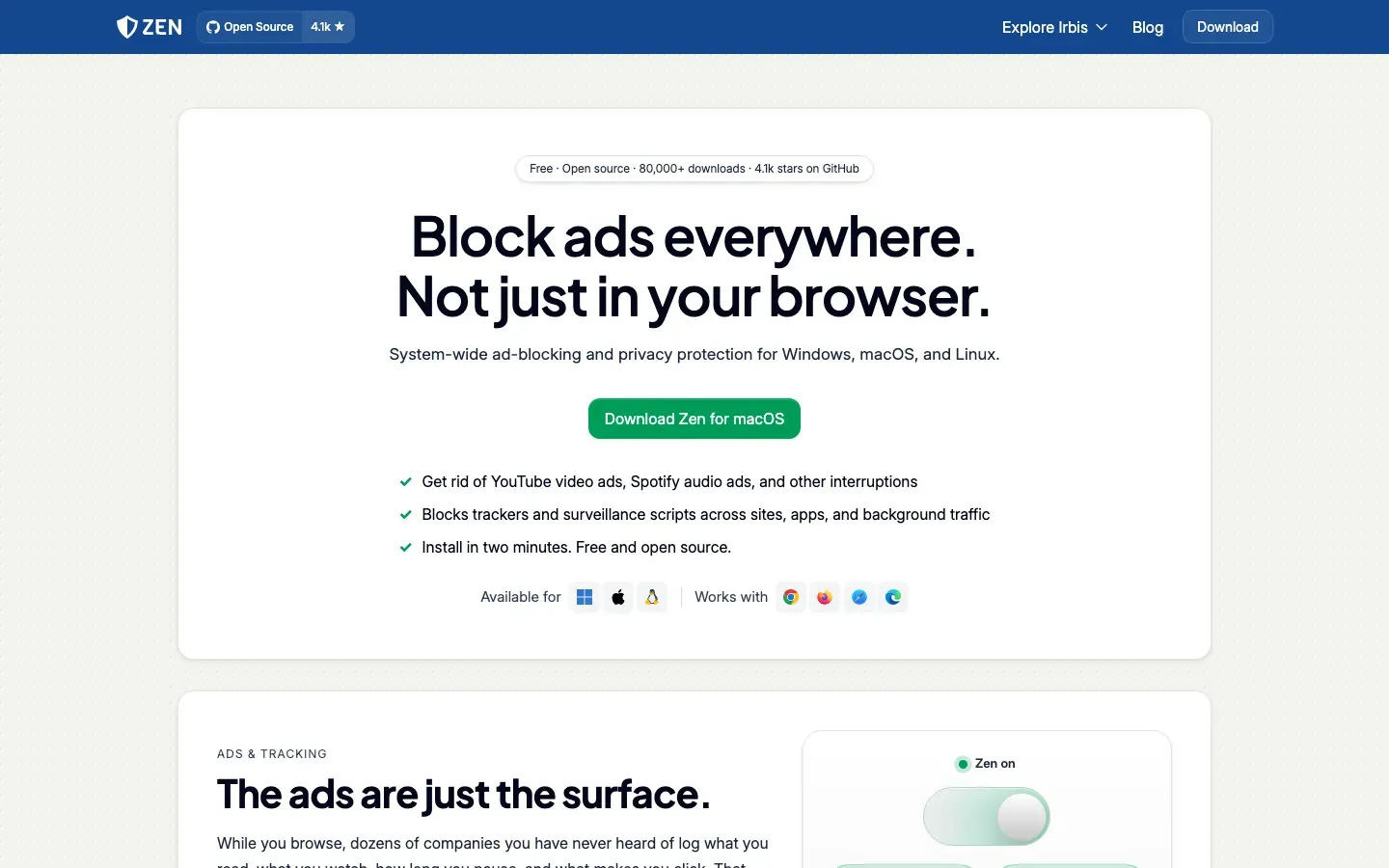
Zen
“Block ads everywhere. Not just in your browser.”
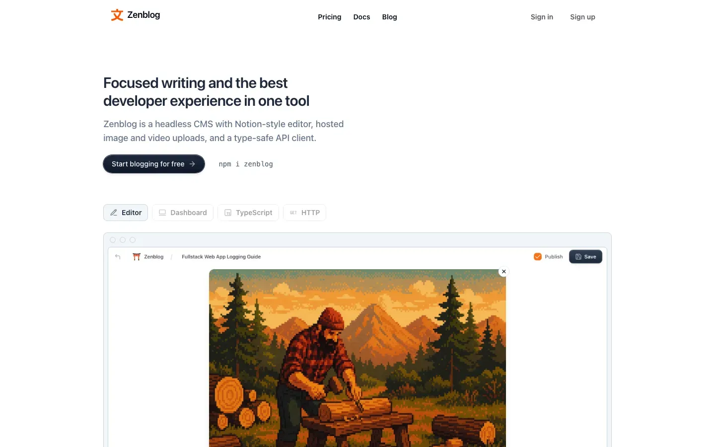
Zenblog
“Focused writing and the best developer experience in one tool”

Zabbix
“Learn. Connect. Innovate.”
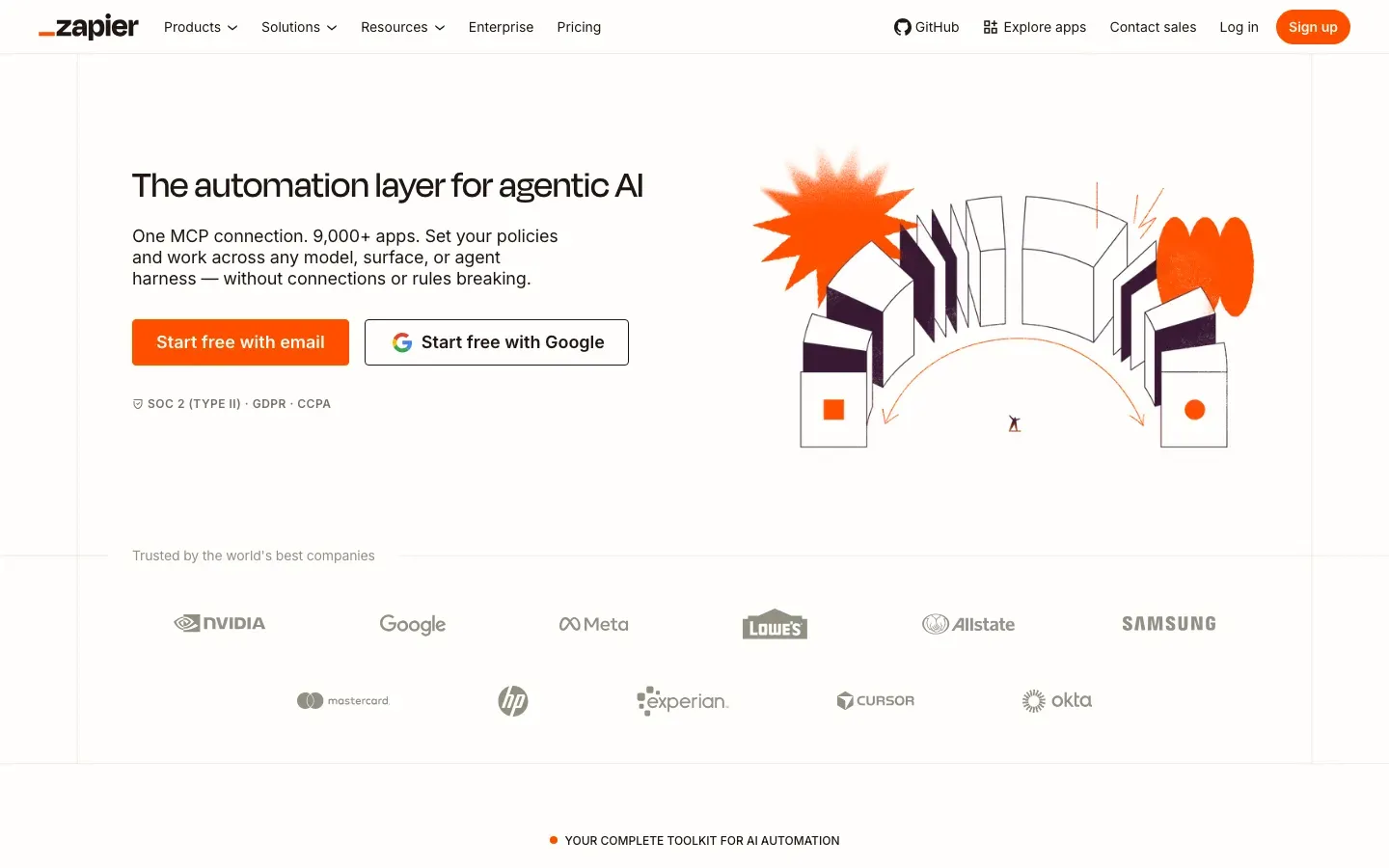
Zapier
“The automation layer for agentic AI”
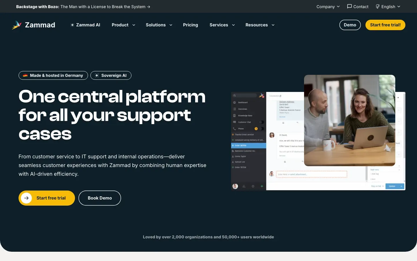
Zammad
“One central platform for all your support cases”
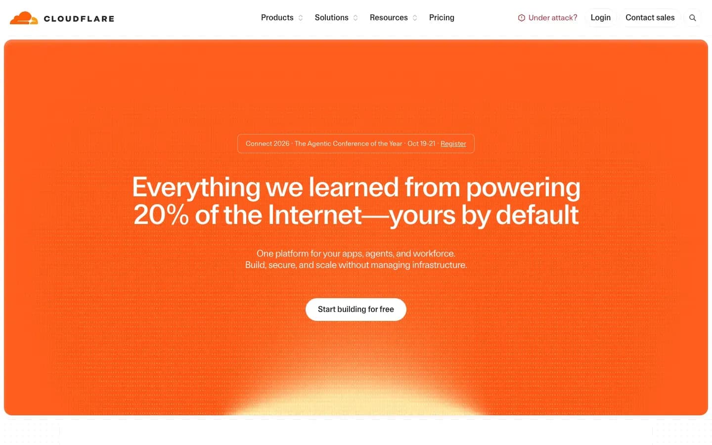
Zaraz
“Everything we learned from powering 20% of the Internet—yours by default”
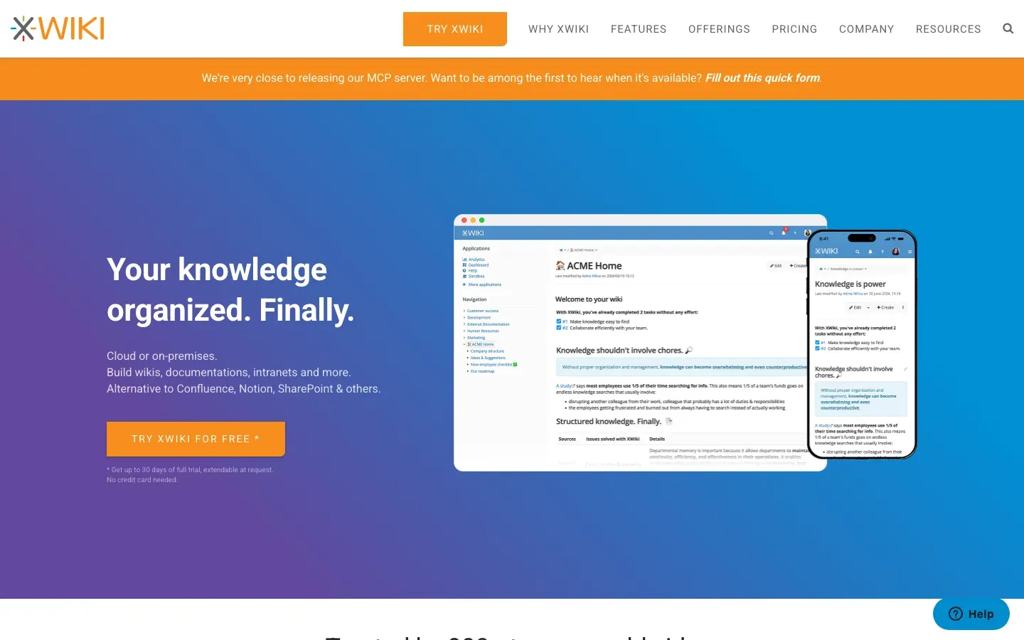
XWiki
“Your knowledge organized. Finally.”
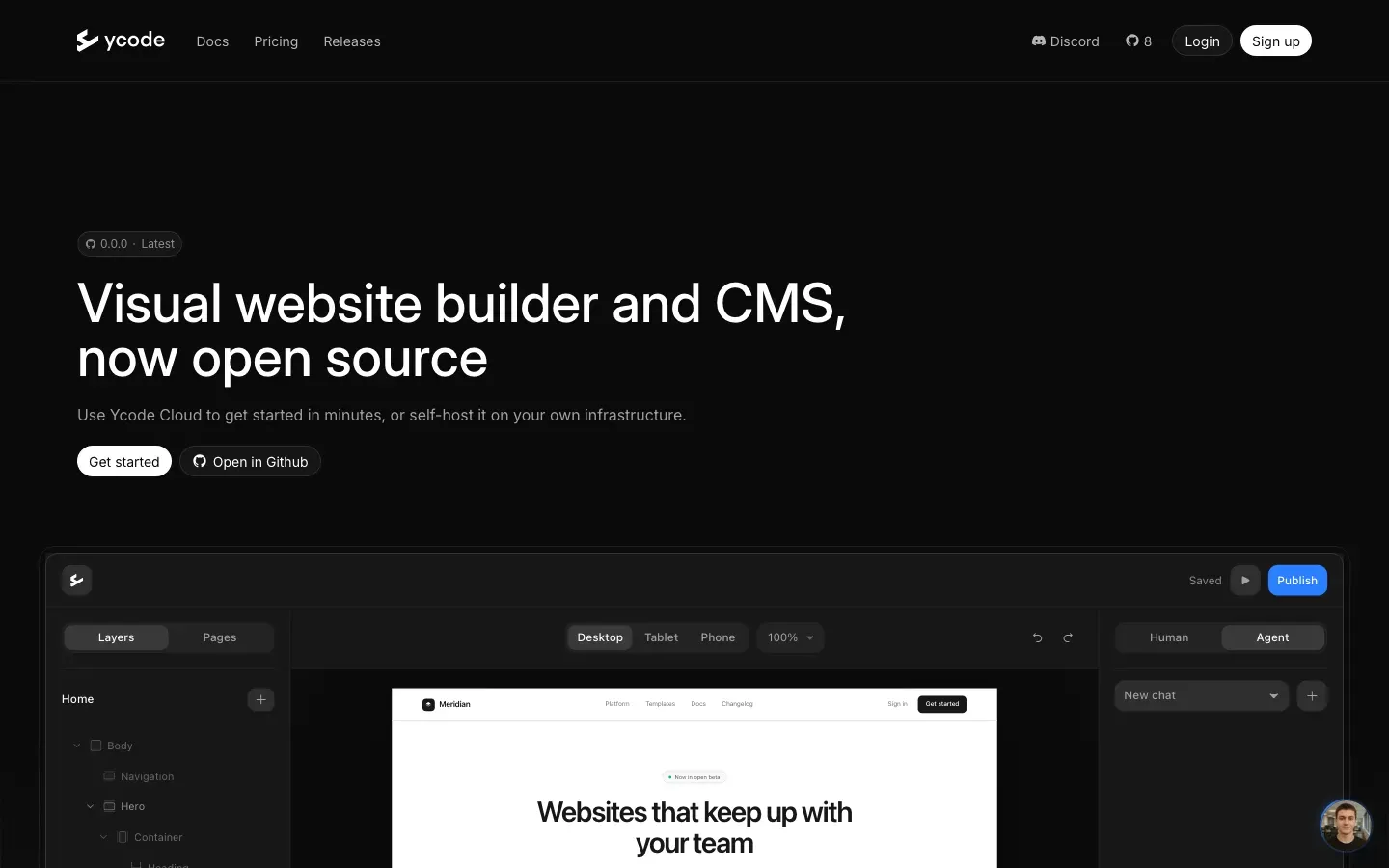
Ycode
“Visual website builder and CMS, now open source”
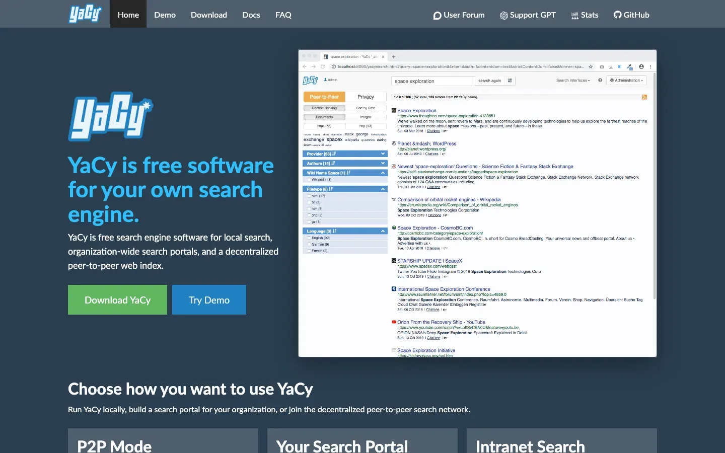
YaCy
“YaCy is free software for your own search engine.”
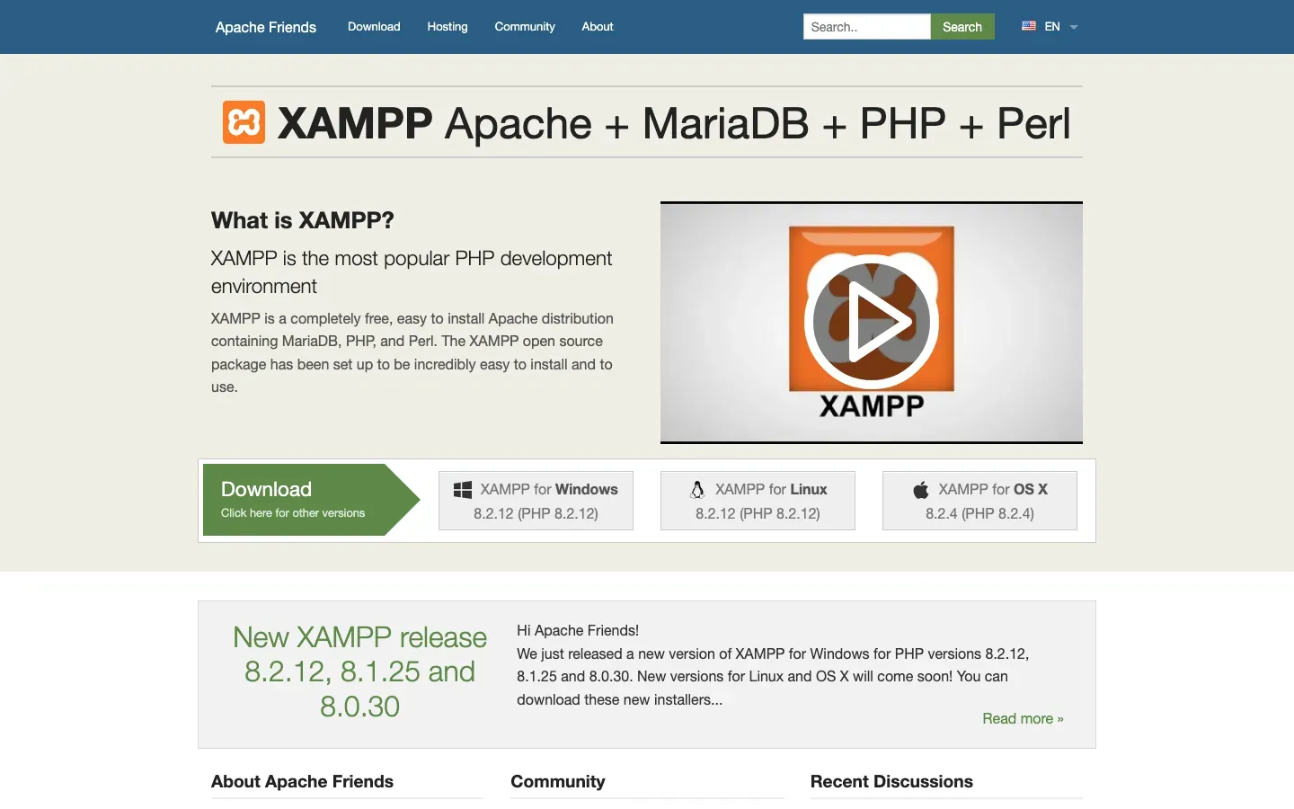
XAMPP
“XAMPP Apache + MariaDB + PHP + Perl”
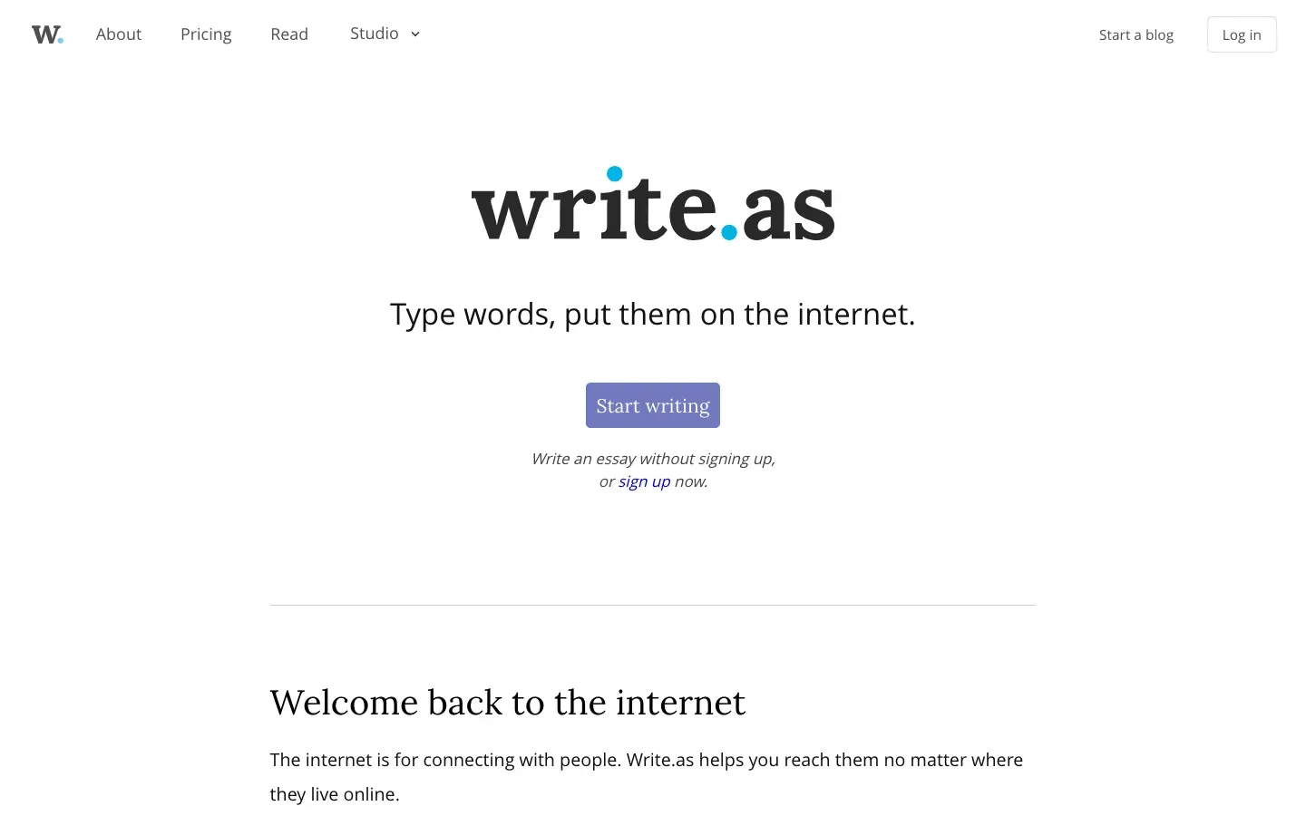
Write.as
“write.as”
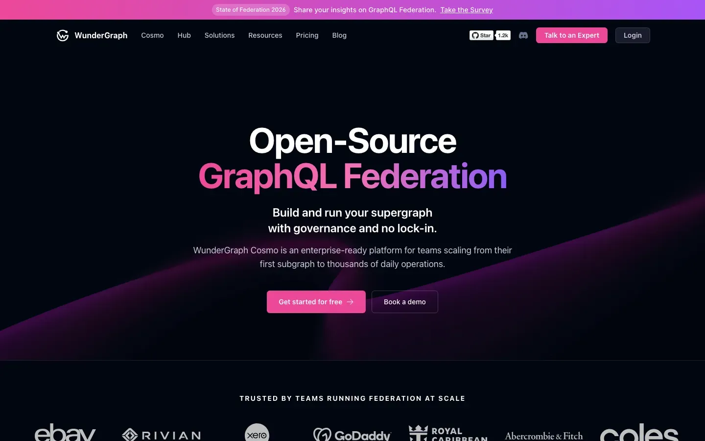
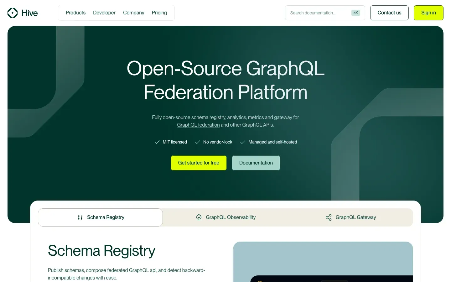
WunderGraph
“Open-Source GraphQL Federation”
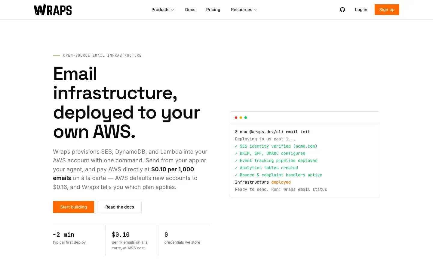
Wraps
“Email infrastructure, deployed to your own AWS.”
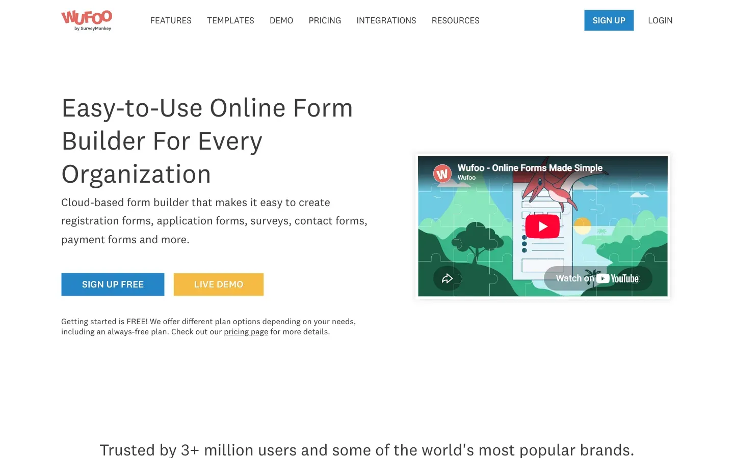
Wufoo
“Easy-to-Use Online Form Builder For Every Organization”
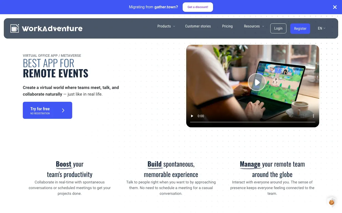
WorkAdventure
“BEST APP FOR REMOTE EVENTS”
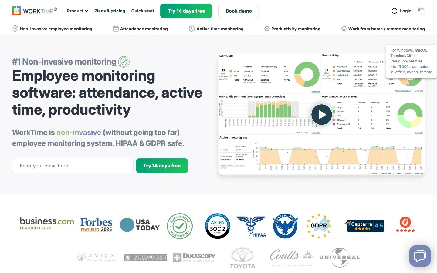
WorkTime
“Employee monitoring software: attendance, active time, productivity”
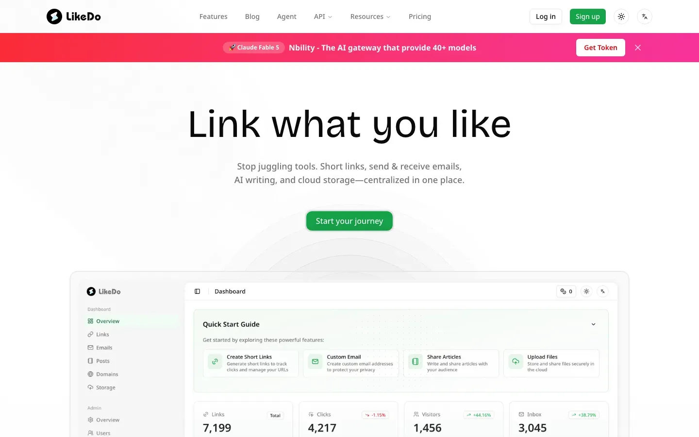
LikeDo
“Link what you like”
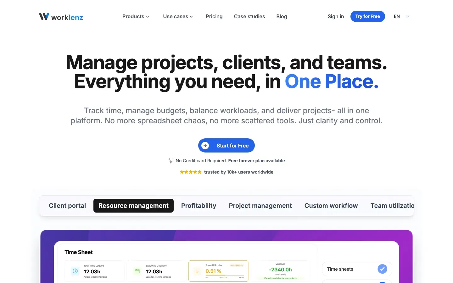
Worklenz
“Manage projects, clients, and teams. Everything you need, in One Place.”
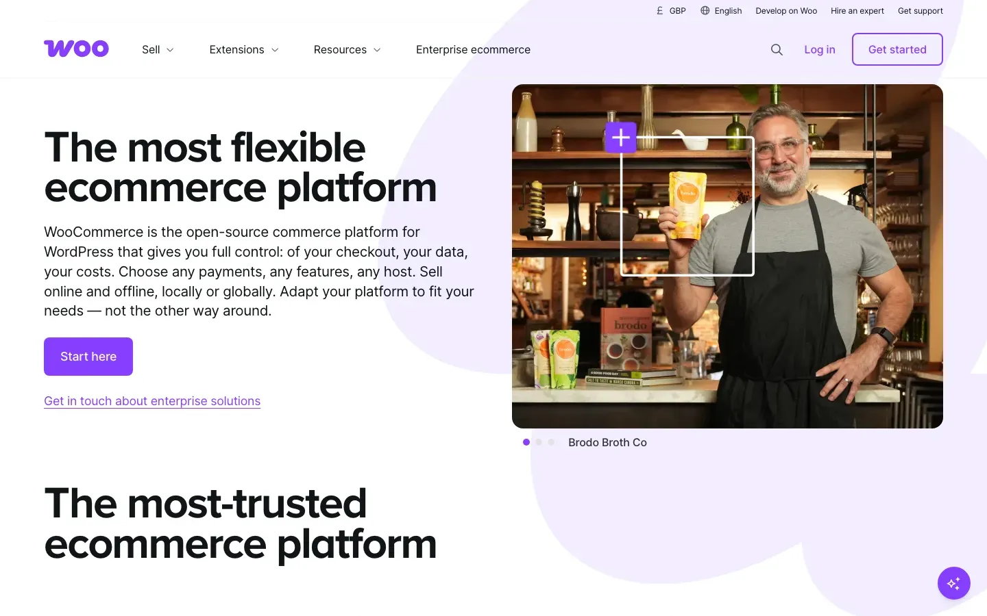
WooCommerce
“The most flexible ecommerce platform”
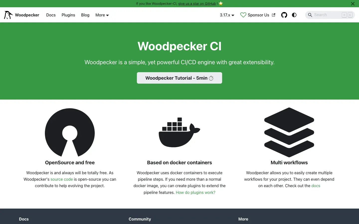
Woodpecker CI
“Woodpecker CI”
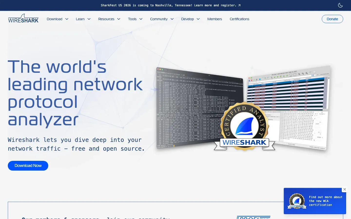
Wireshark
“The world's leading network protocol analyzer”
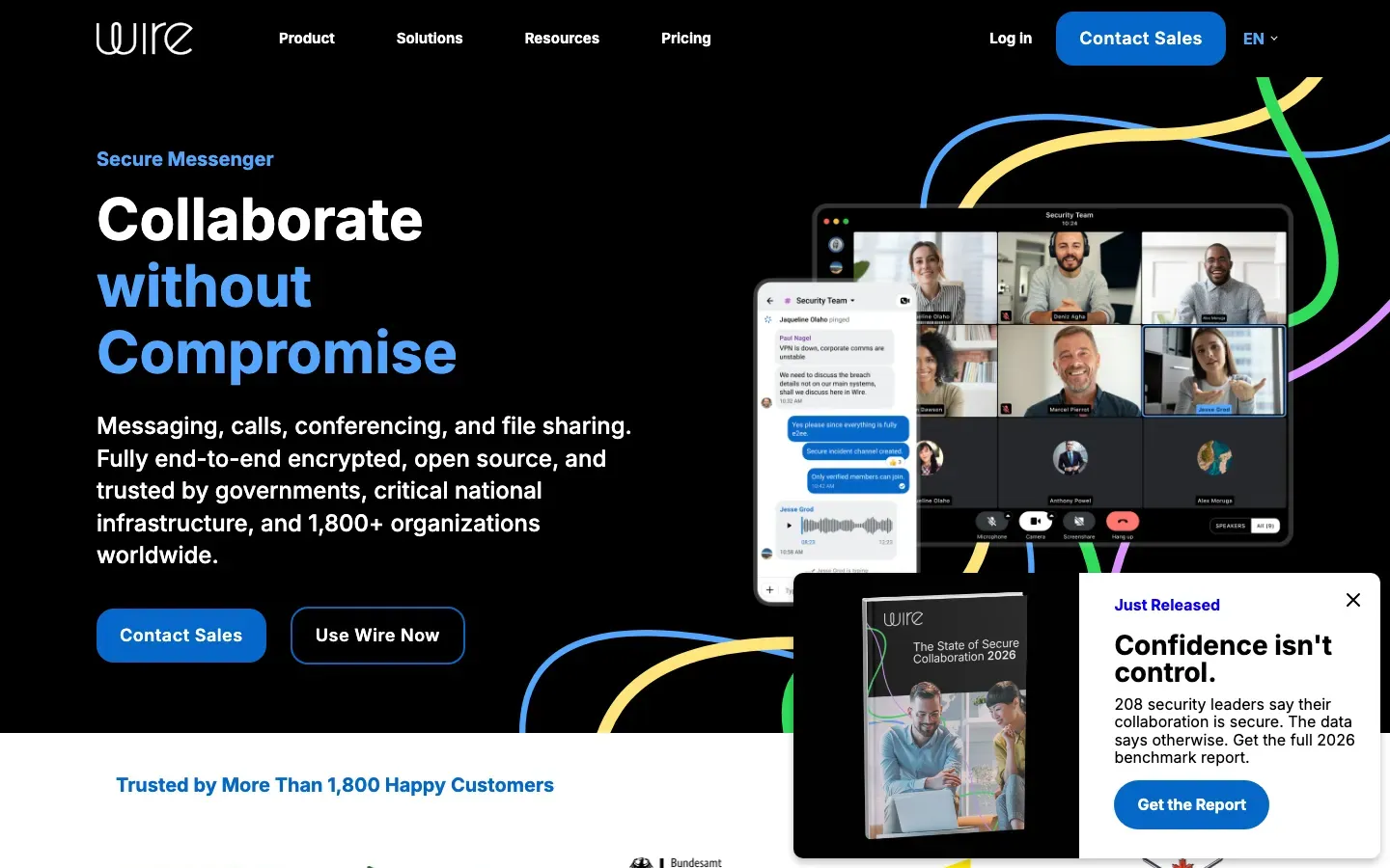
Wire
“Collaborate without Compromise”

Windscribe
“Windscribe: The Best VPN on Earth.”
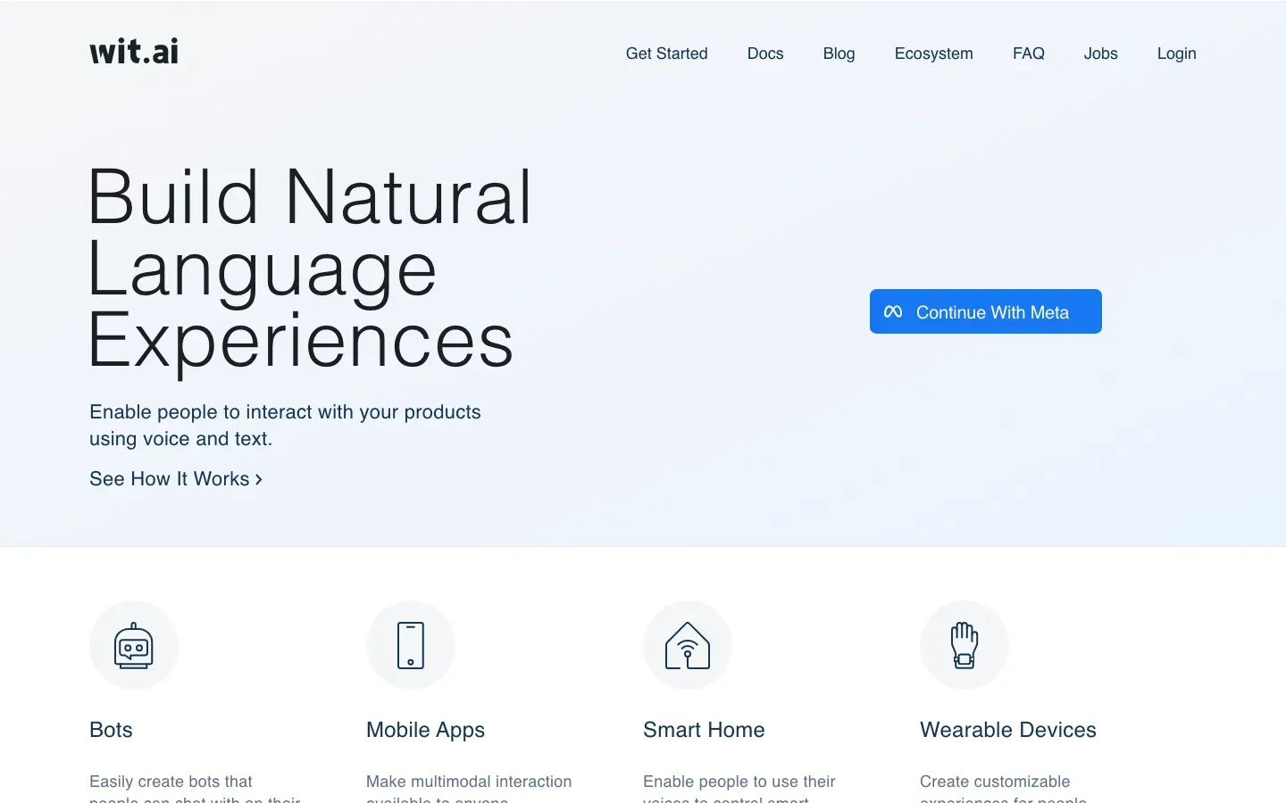
Wit.ai
“Build Natural Language Experiences”

Weebly
“Build a professional website that grows with your business.”
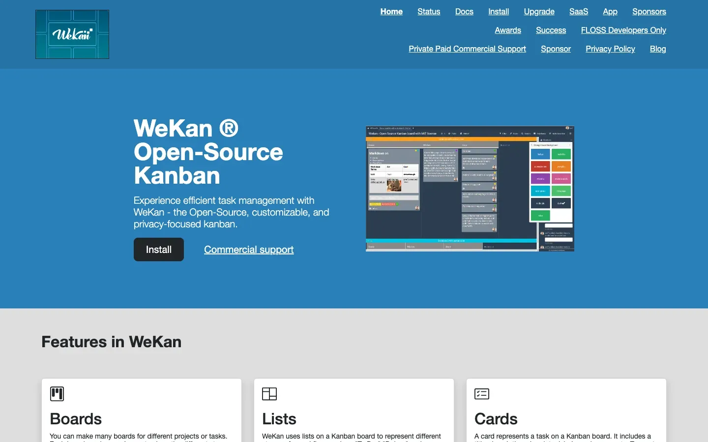
WeKan
“WeKan ® Open-Source Kanban”
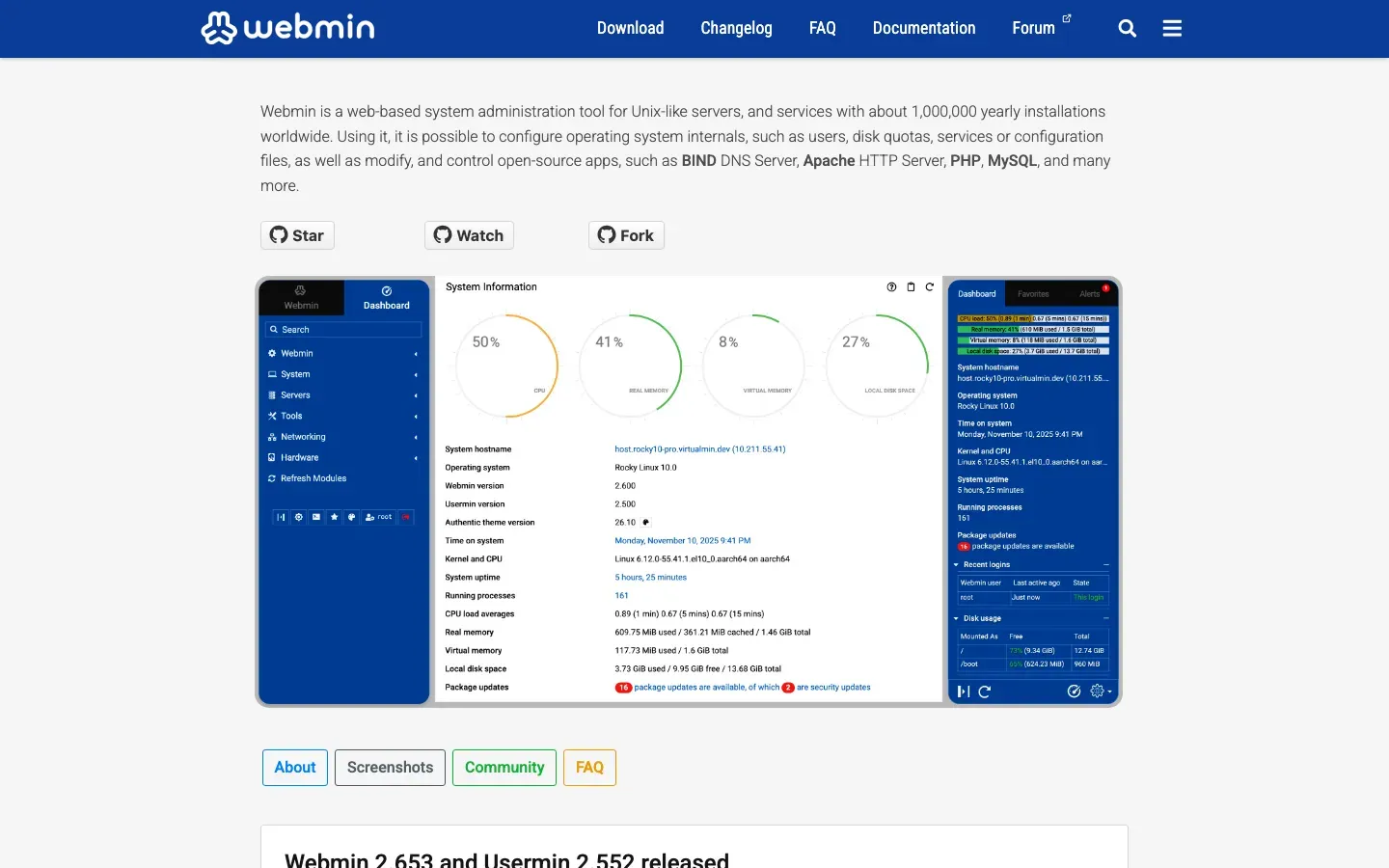
Webmin
“Webmin is a web-based system administration tool for Unix-like servers, and services with about 1,000,000 yearly installations worldwide.”
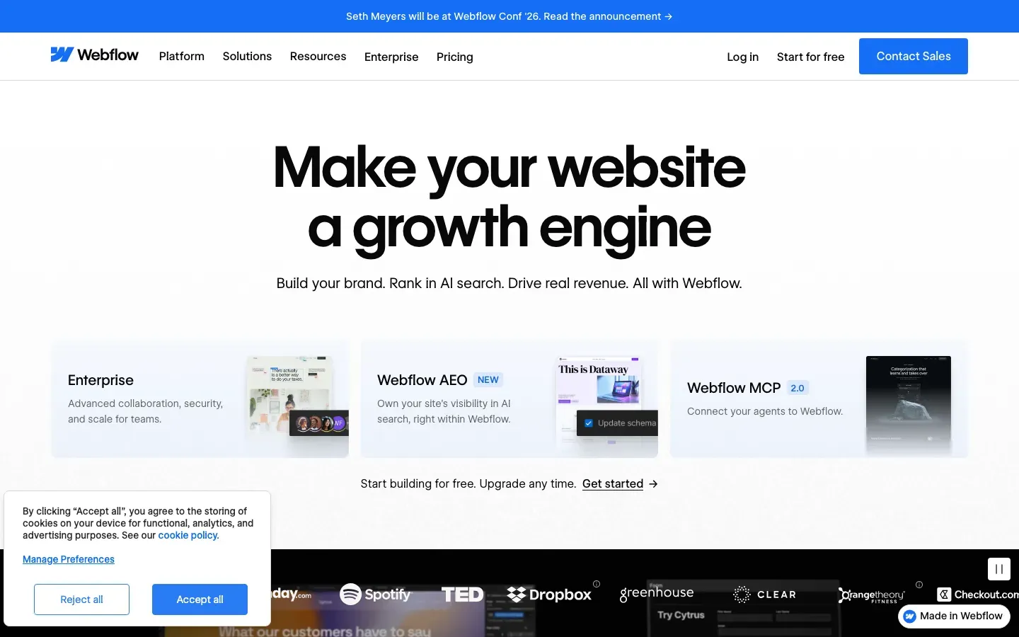
Webflow
“Make your website a growth engine”
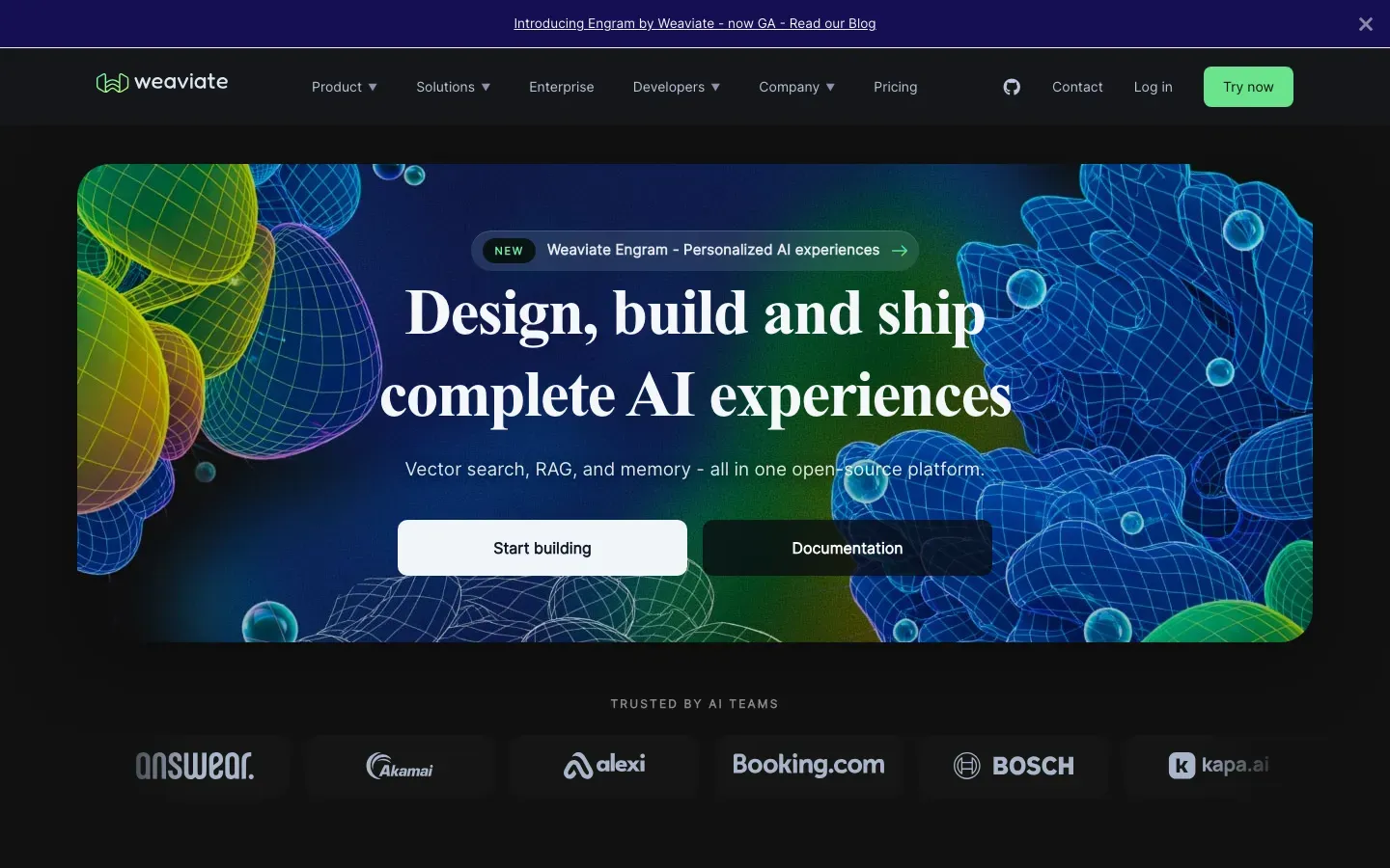
Weaviate
“Design, build and ship complete AI experiences”
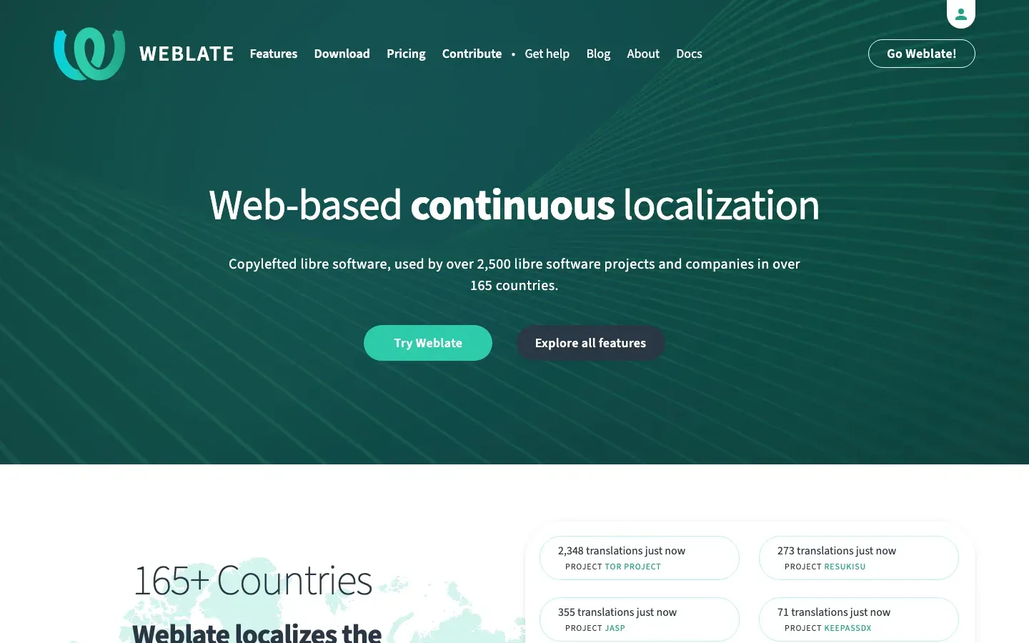
Weblate
“Web-based continuous localization”
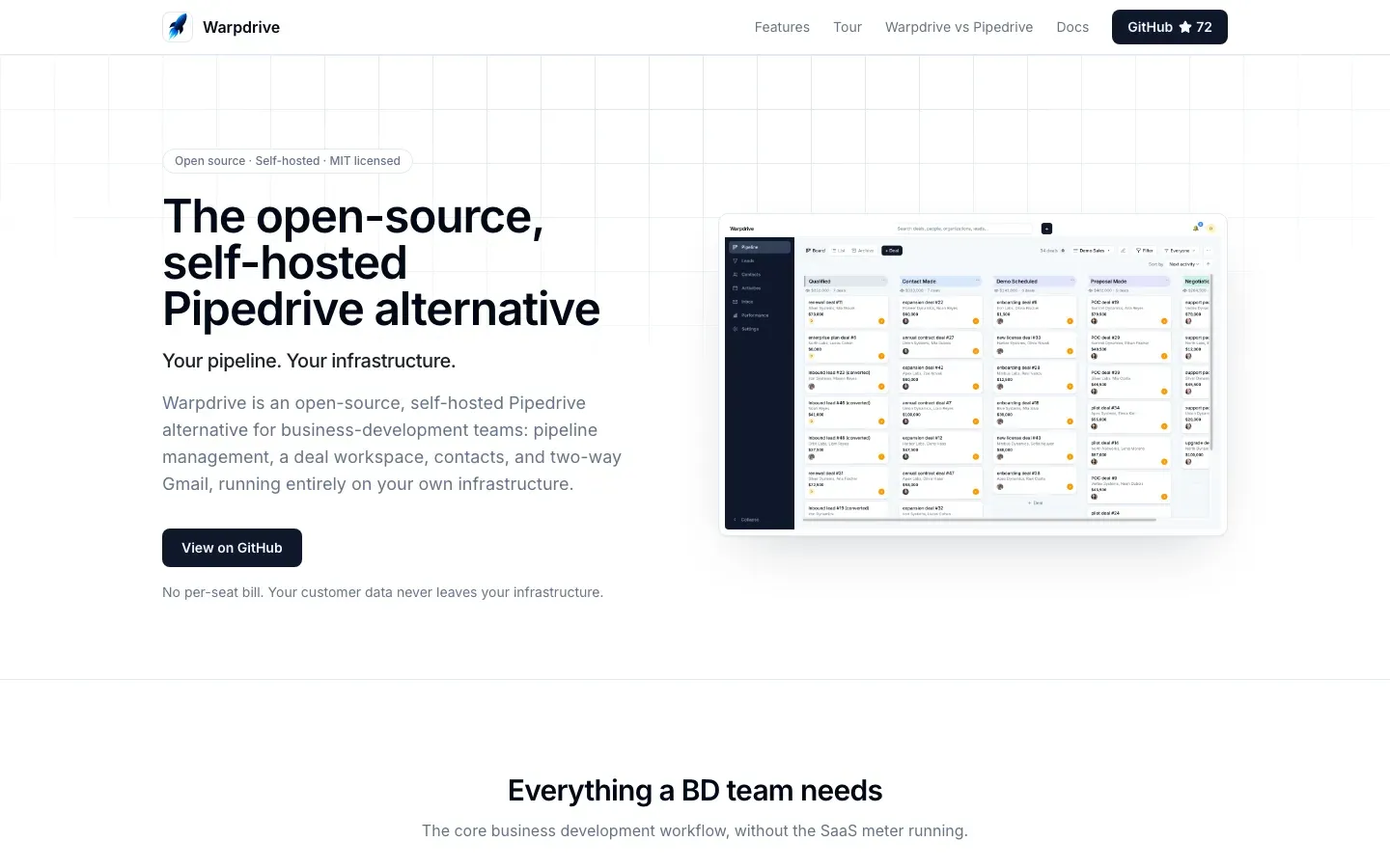
Warpdrive
“The open-source, self-hosted Pipedrive alternative”
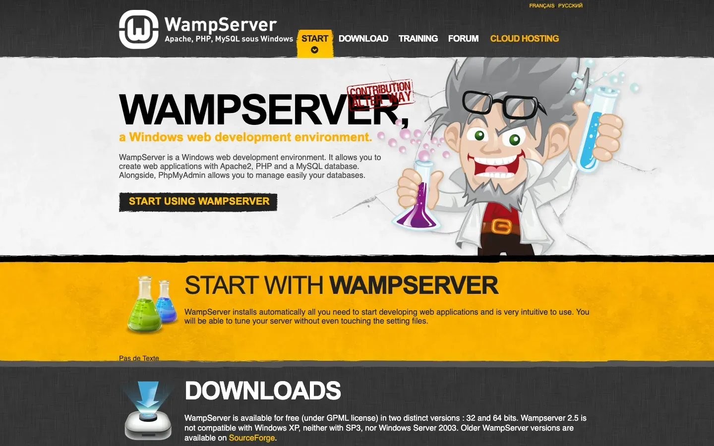
WampServer
“WAMPSERVER,”

wallabag
“Save web articles. Read them later, your way.”

Wachd
“Your on-call engineer gets answers, not just alerts”
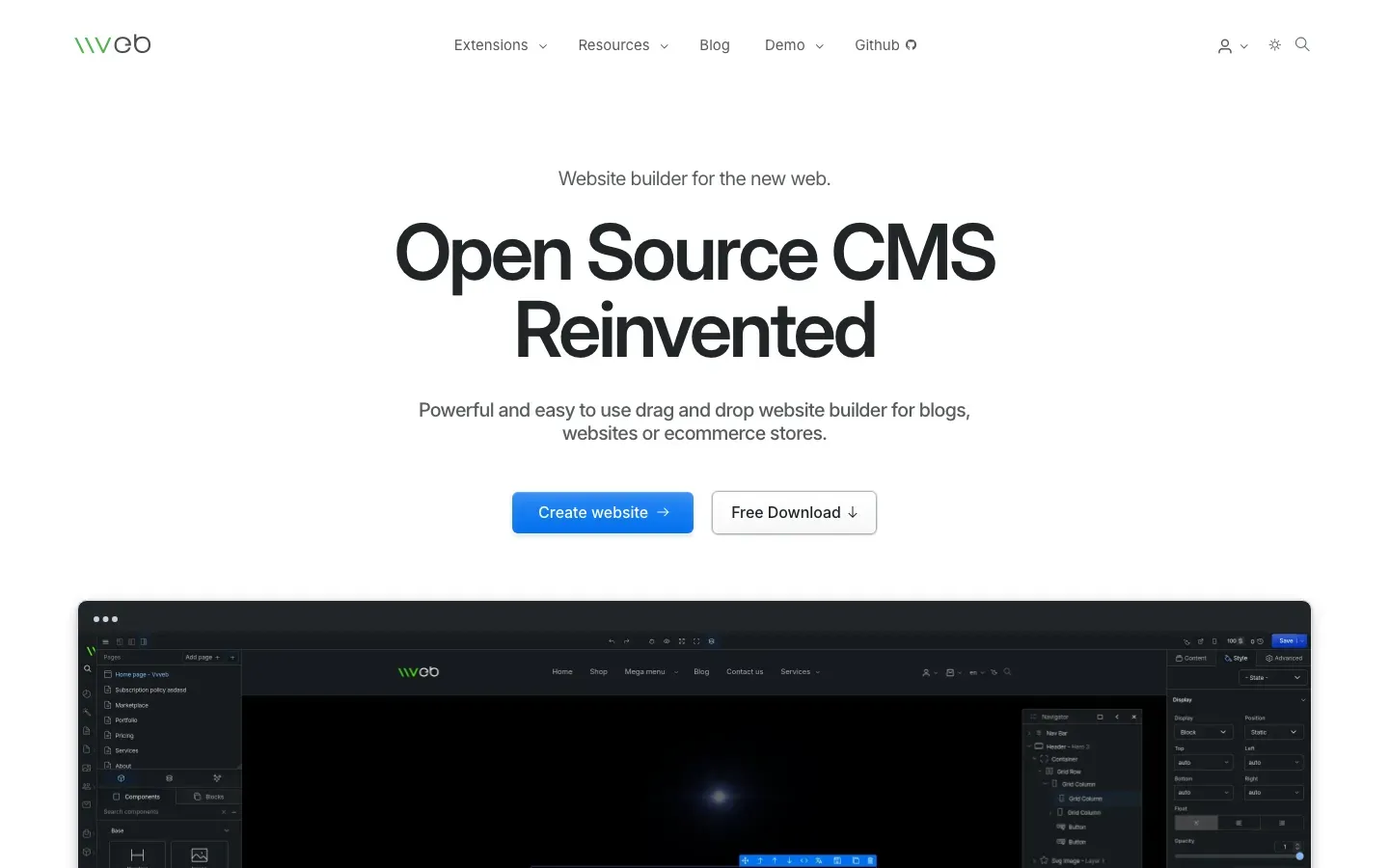
Vvveb
“Open Source CMS Reinvented”
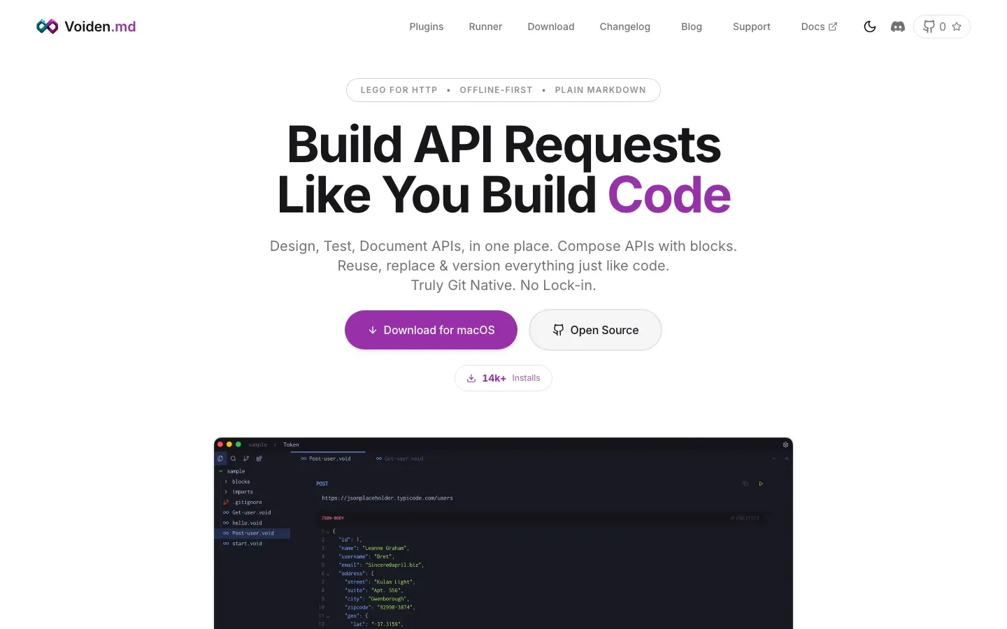
Voiden
“Build API Requests Like You Build Code”
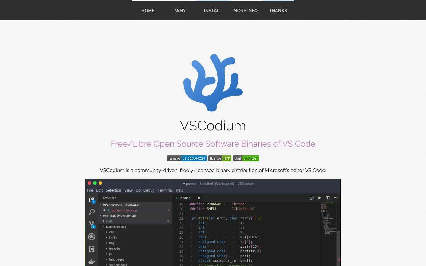
VSCodium
“VSCodium”

VMmanager
“VIRTUALIZATION MANAGEMENT PLATFORM”

Virool
“A NATIVE VIDEO ADVERTISING PLATFORM”

Vimeo
“Your videos, your way”
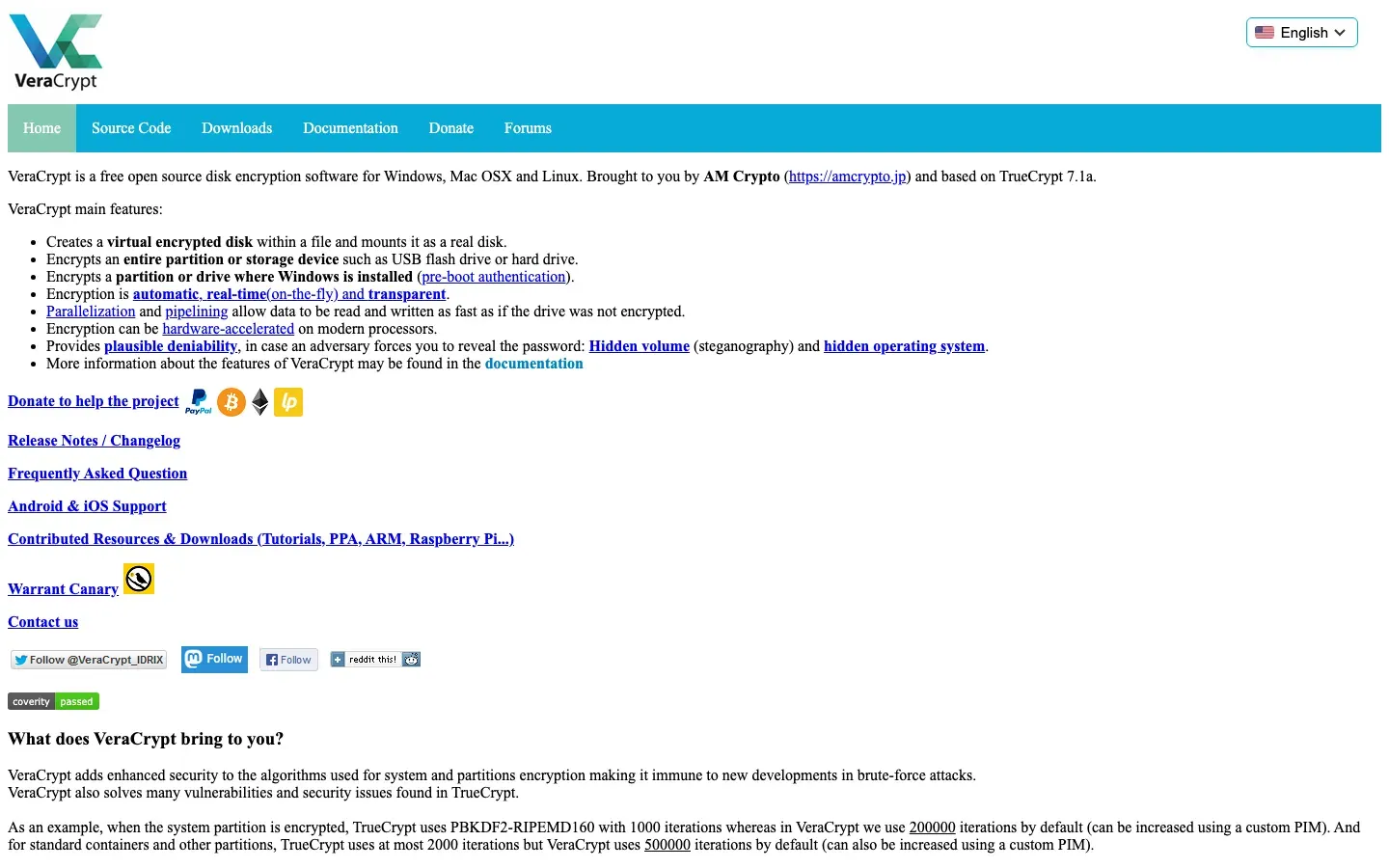
VeraCrypt
“VeraCrypt is a free open source disk encryption software for Windows, Mac OSX and Linux. Brought to you by AM Crypto (https://amcrypto.jp) and based on TrueCrypt 7.1a.”
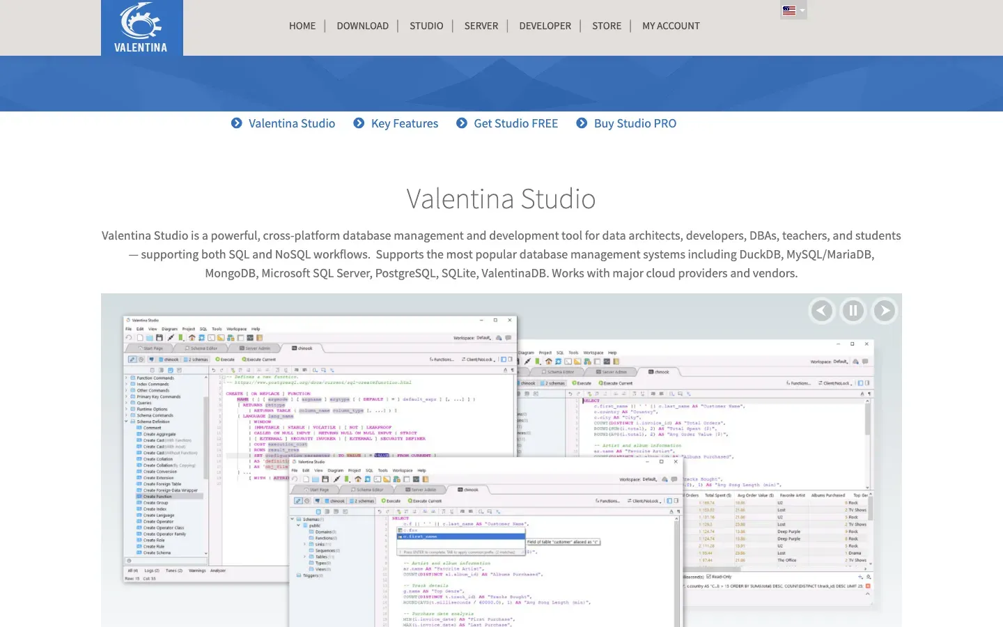
Valentina Studio
“Valentina Studio”
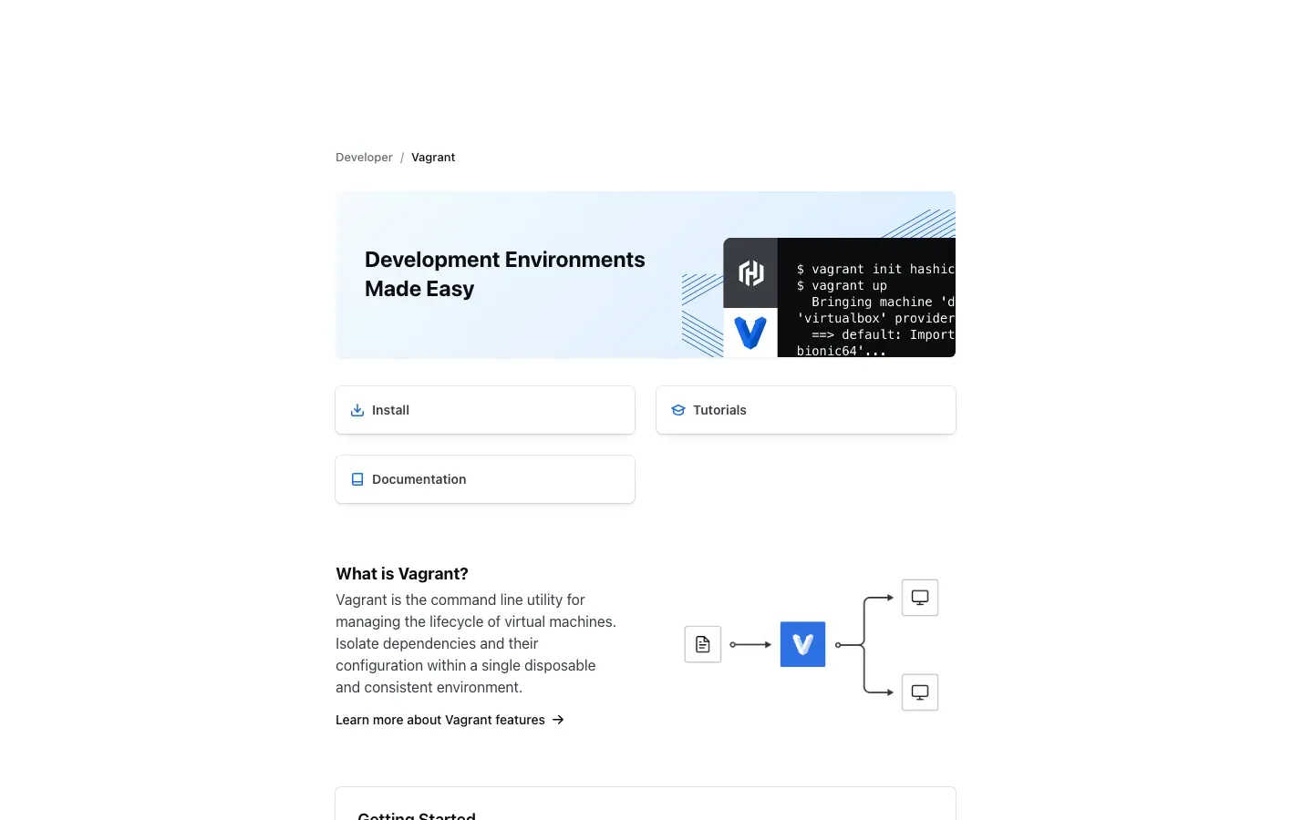
Vagrant
“Development Environments Made Easy”
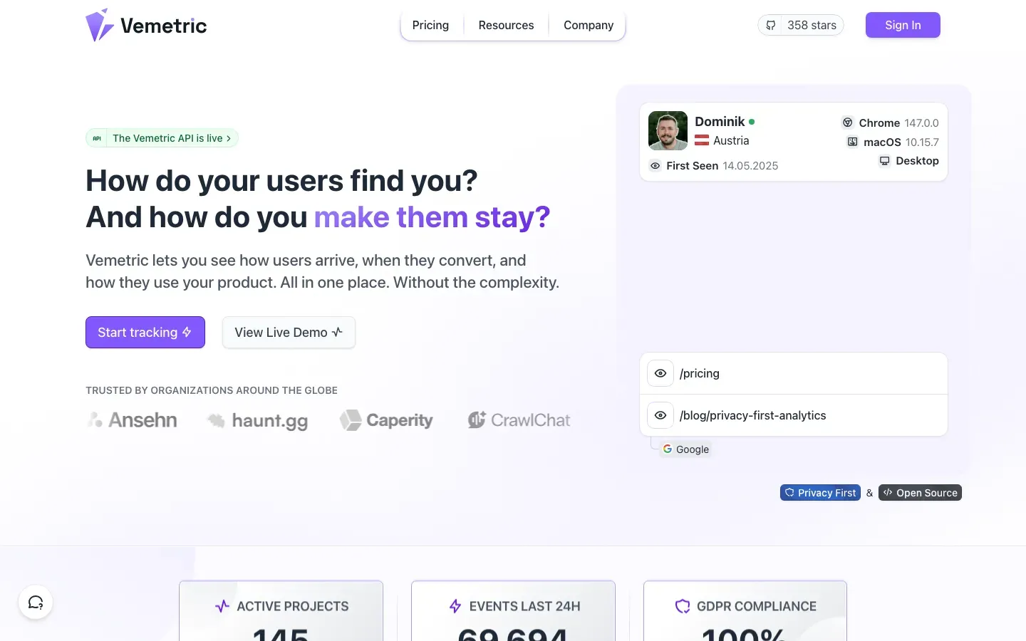
Vemetric
“How do your users find you?”
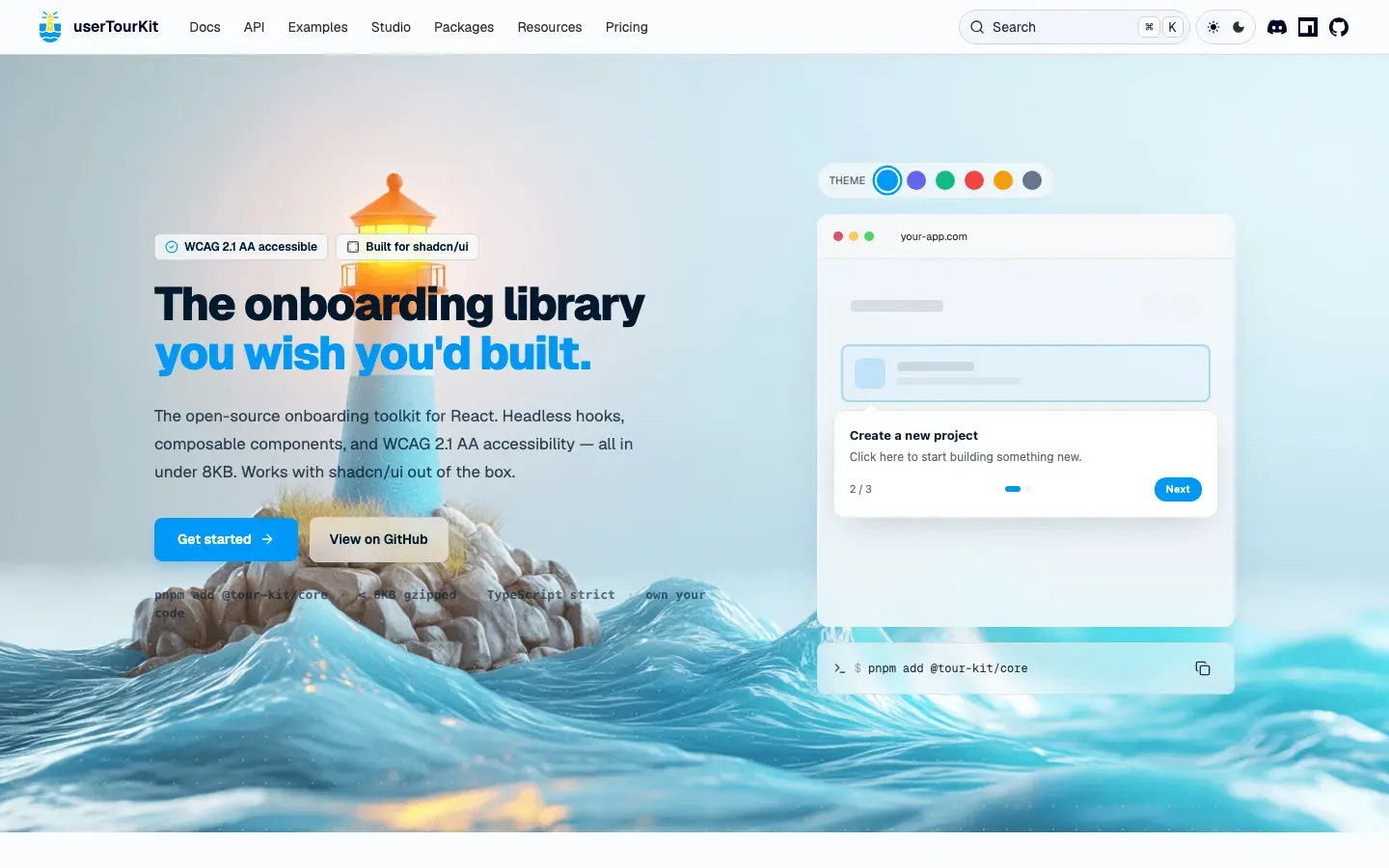
userTourKit
“The onboarding library you wish you'd built.”
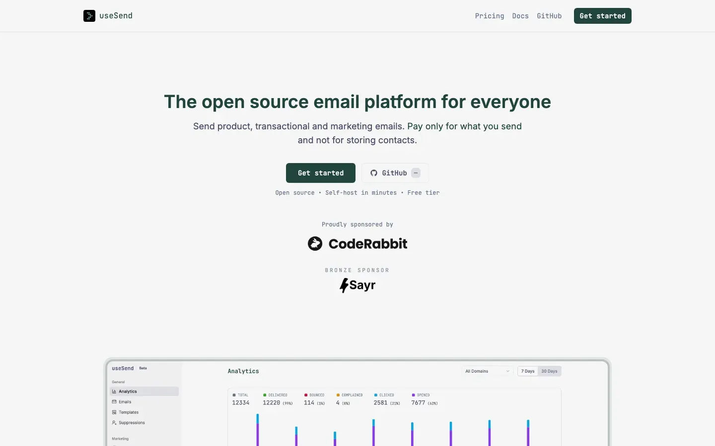
useSend
“The open source email platform for everyone”
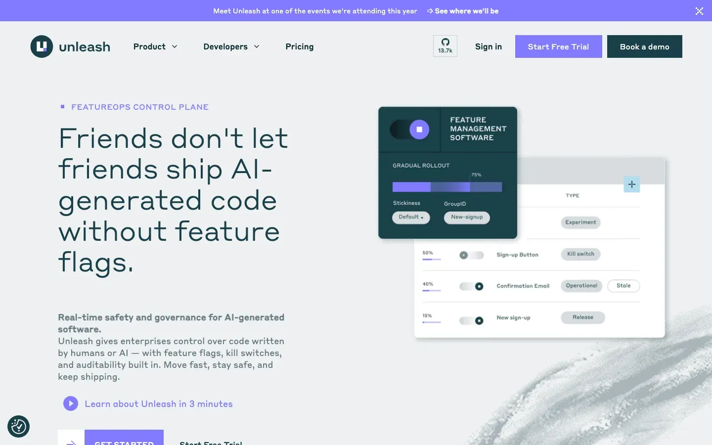
Unleash
“Friends don't let friends ship AI-generated code without feature flags.”
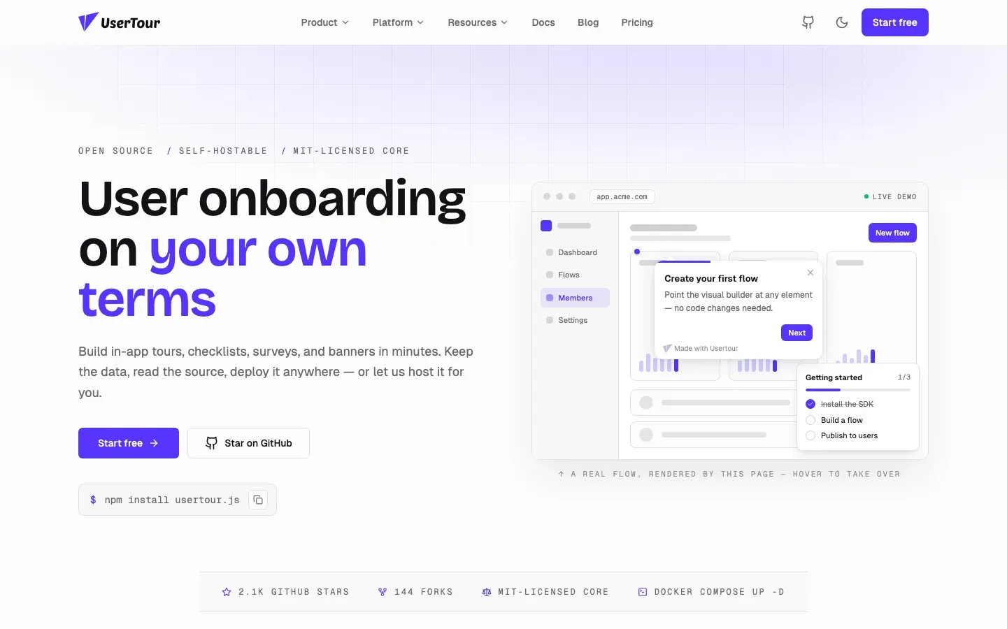
Usertour
“User onboarding on your own terms”
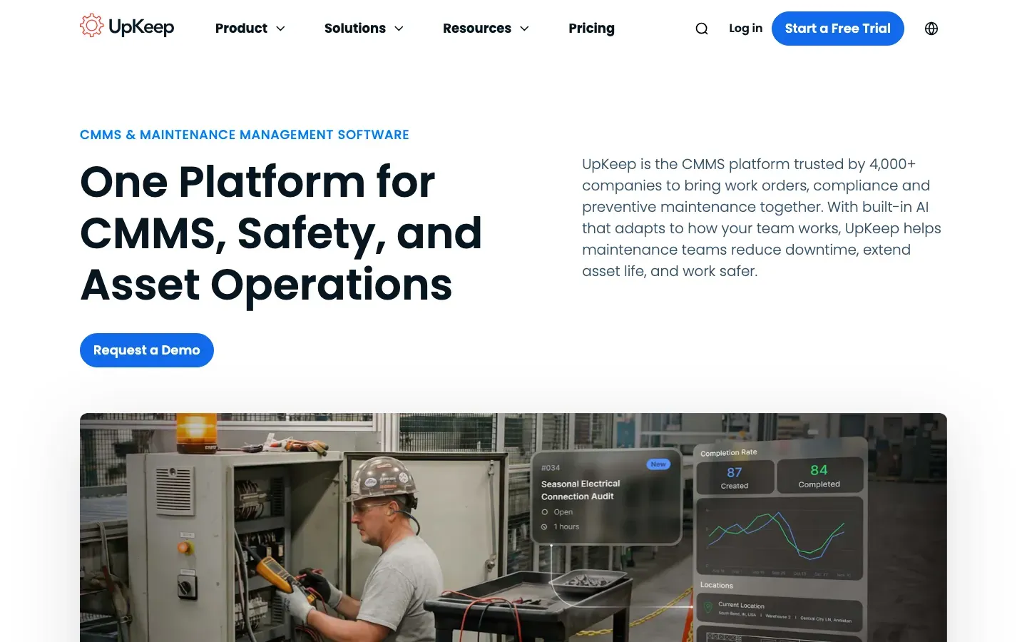
UpKeep
“One Platform for CMMS, Safety, and Asset Operations”
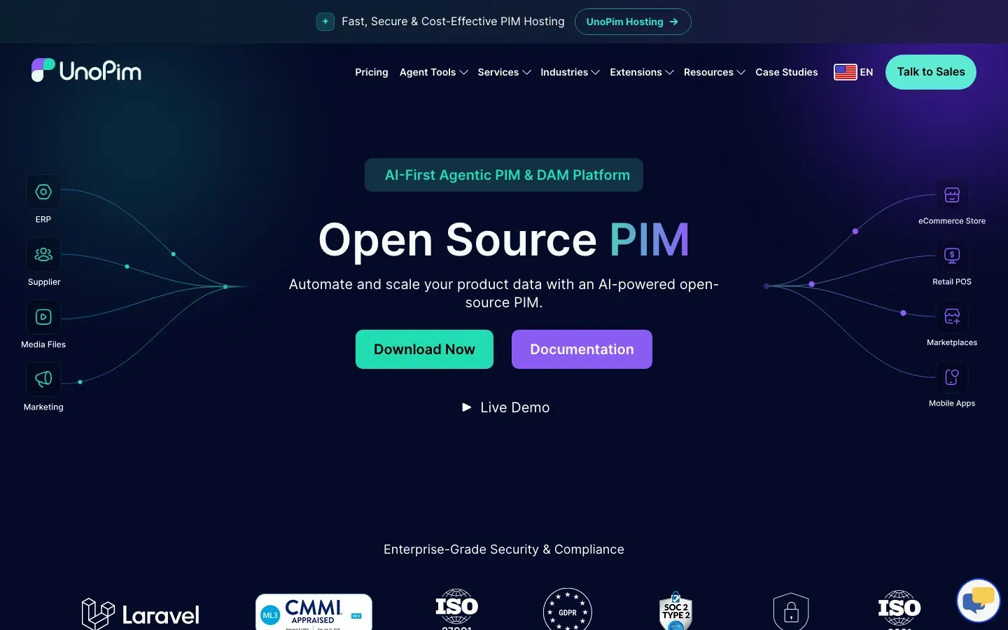
UnoPim
“Open Source PIM”
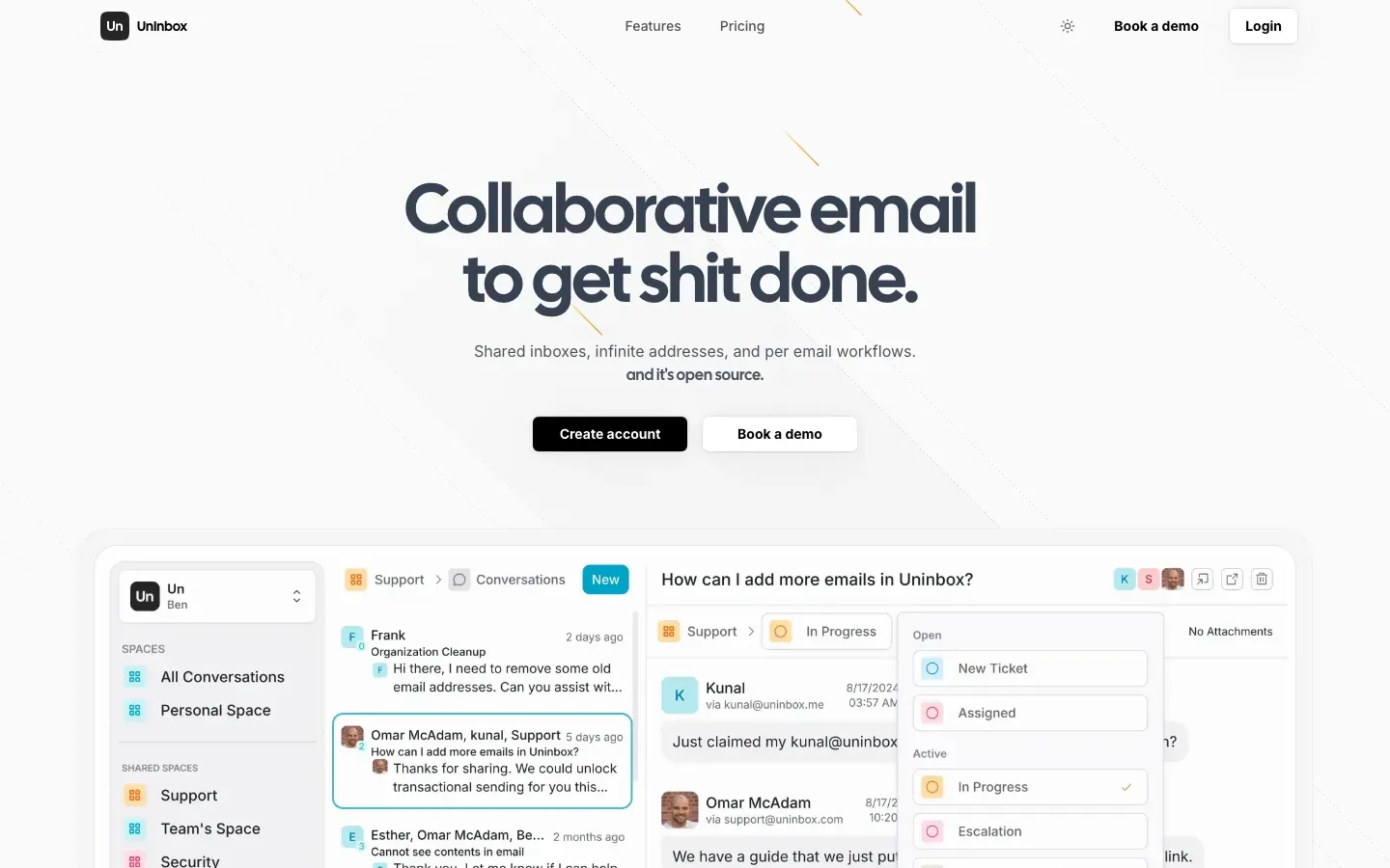
UnInbox
“Collaborative email to get shit done.”
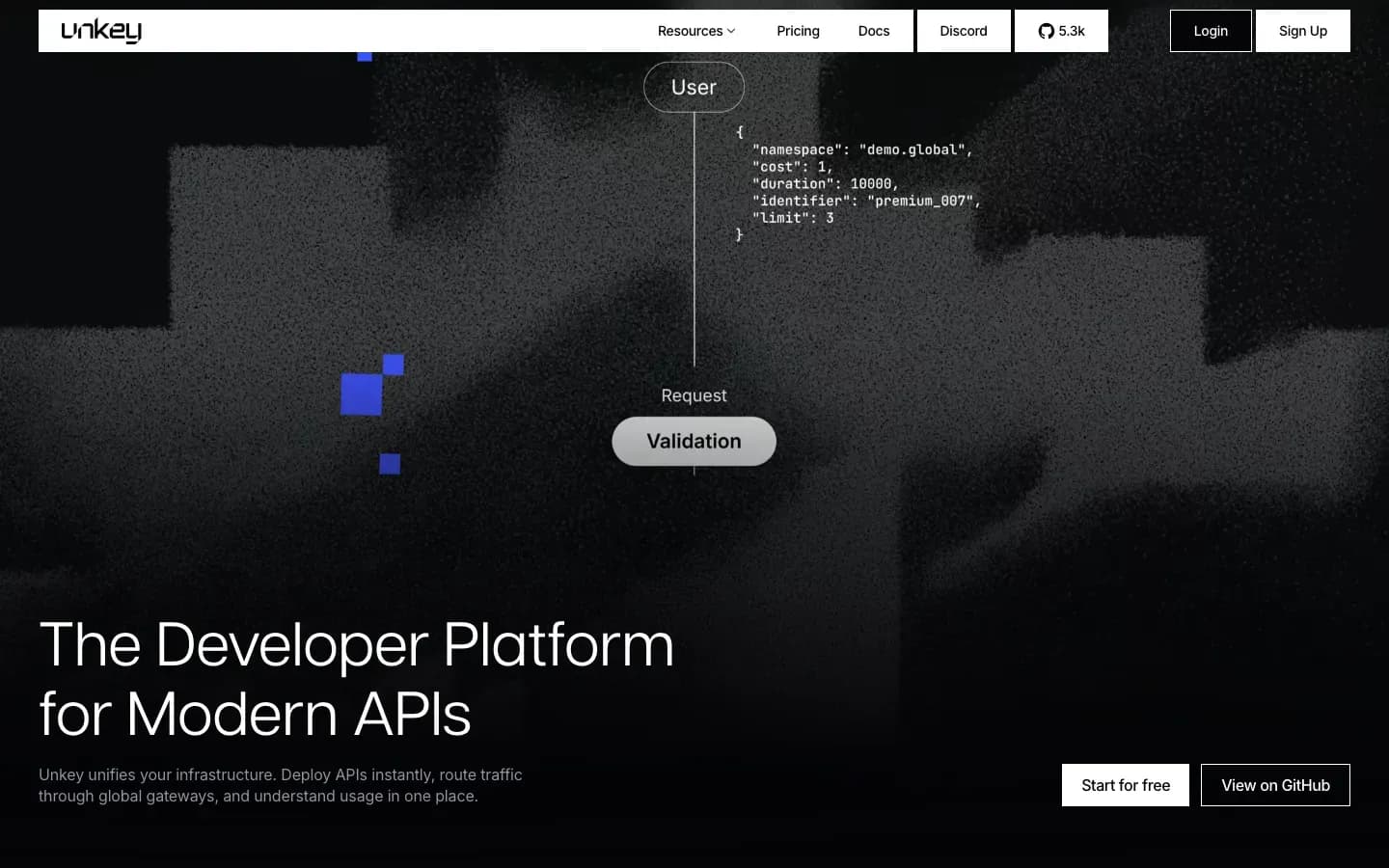
Unkey
“The Developer Platform for Modern APIs”

UniBee
“Automate Subscription Billing & Recurring Payments”
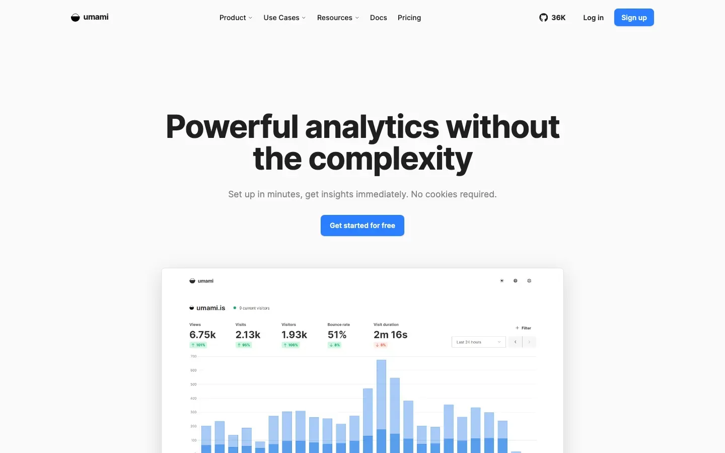
Umami
“Powerful analytics without the complexity”
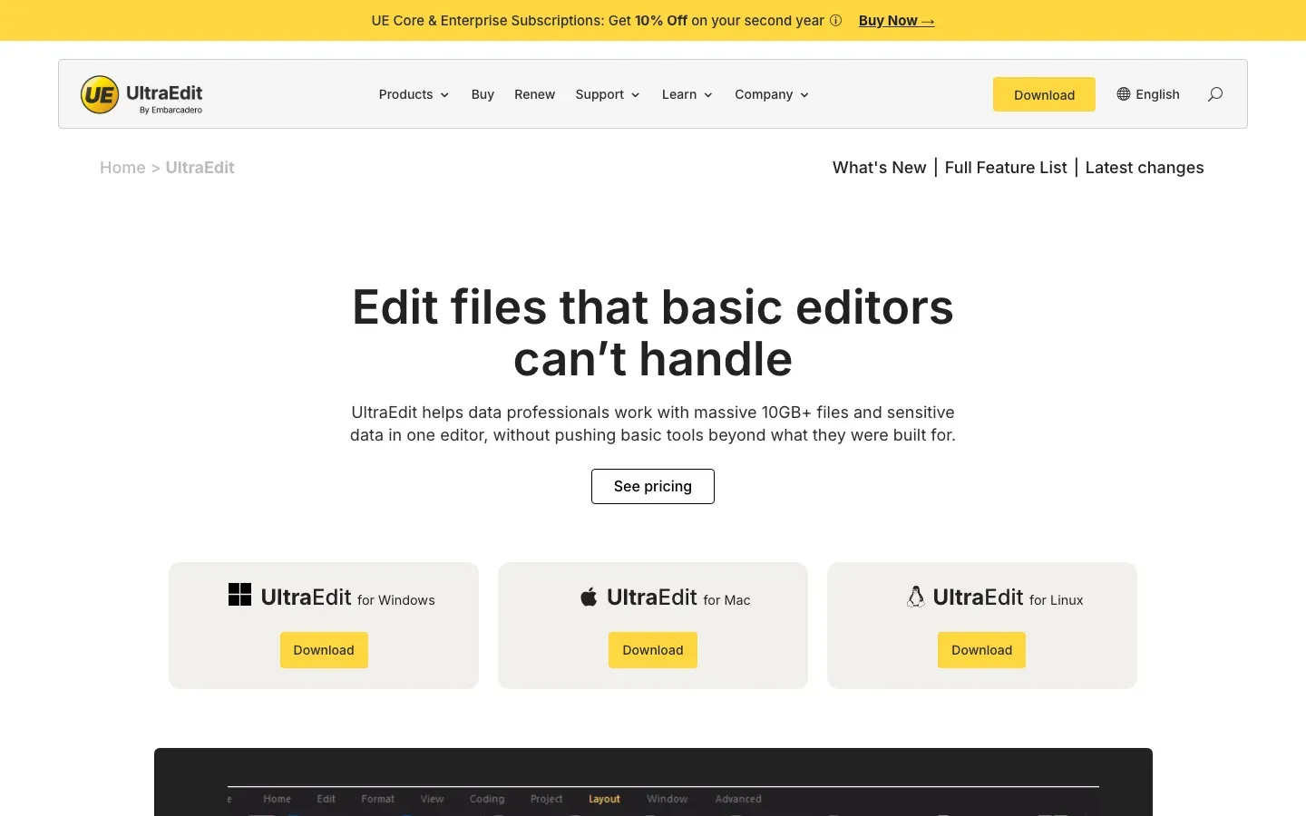
UltraEdit
“Edit files that basic editors can't handle”
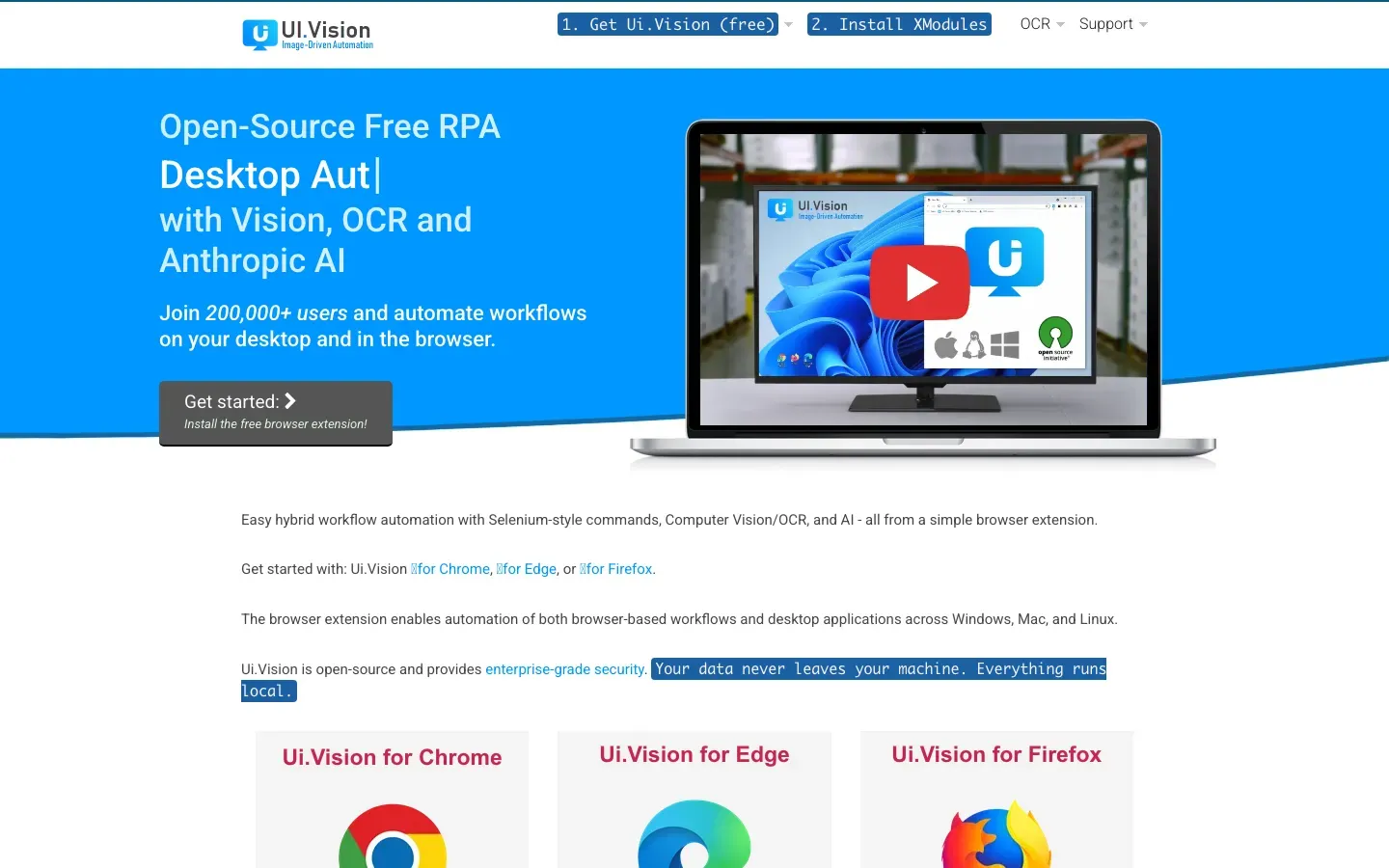
Ui.Vision RPA
“Open-Source Free RPA”
Typebot
“HACK THE BOT GAME: BUILD FASTER, CHAT SMARTER”
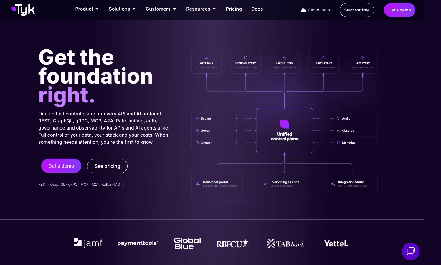
Tyk
“Get the foundation right.”
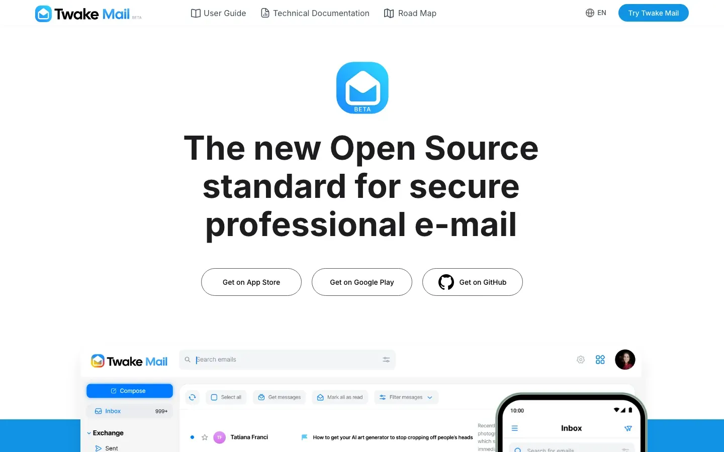
Twake Mail
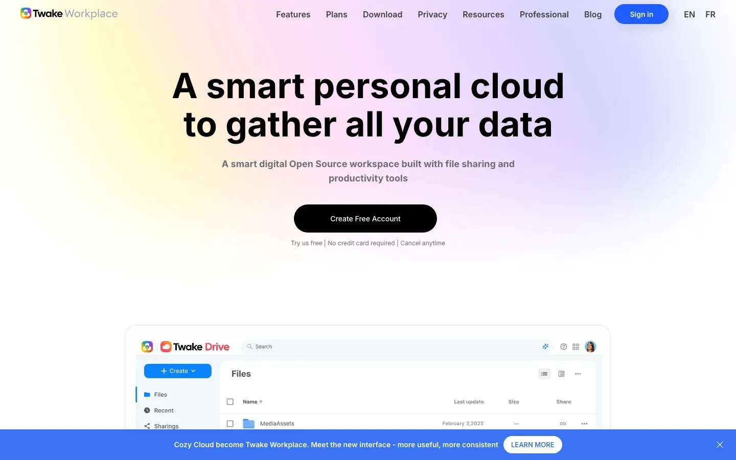
“The new Open Source standard for secure professional e-mail”
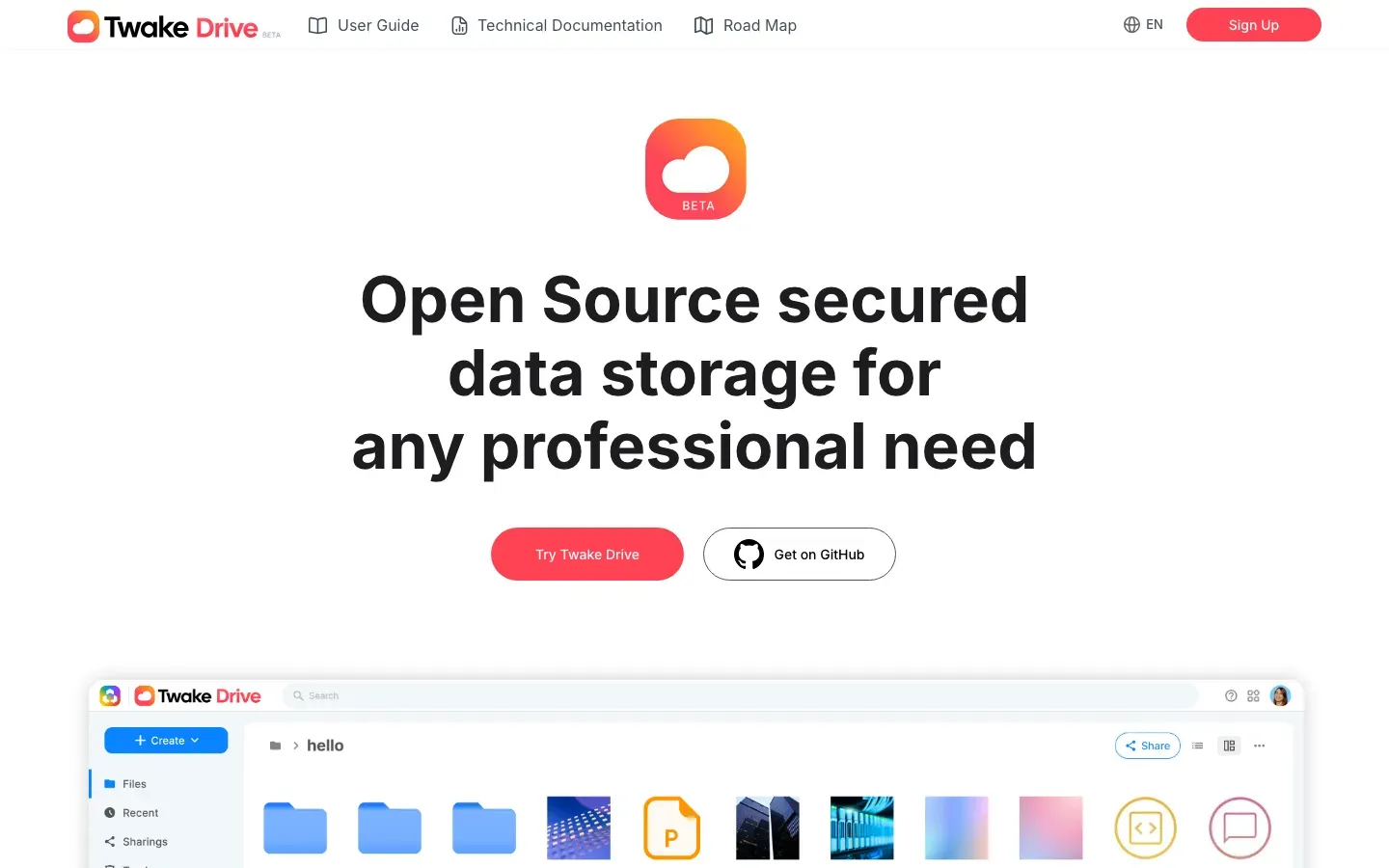
Twake Drive
“Open Source secured data storage for any professional need”
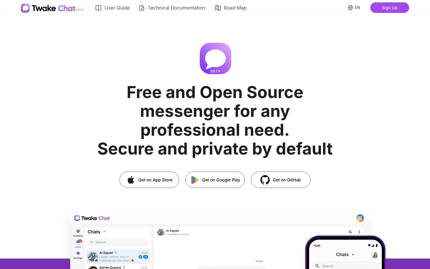
Twake Chat
“Free and Open Source messenger for any professional need.”
Tuta
“Turn ON Privacy”
Turso
“Millions of Databases. One Architecture.”
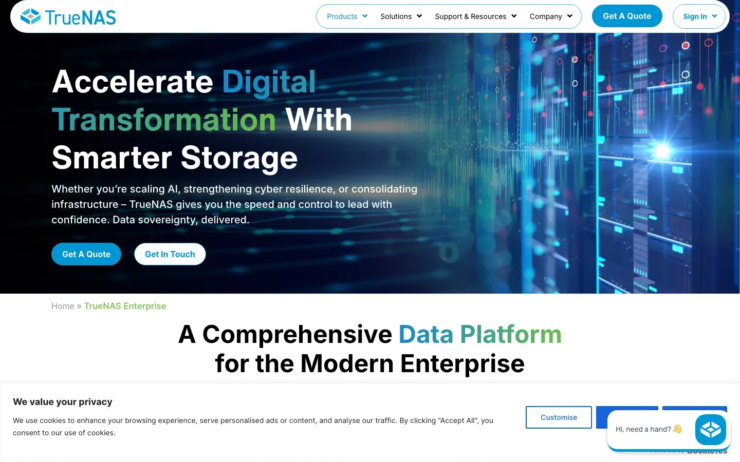
TrueNAS Enterprise
“Accelerate Digital Transformation With Smarter Storage”
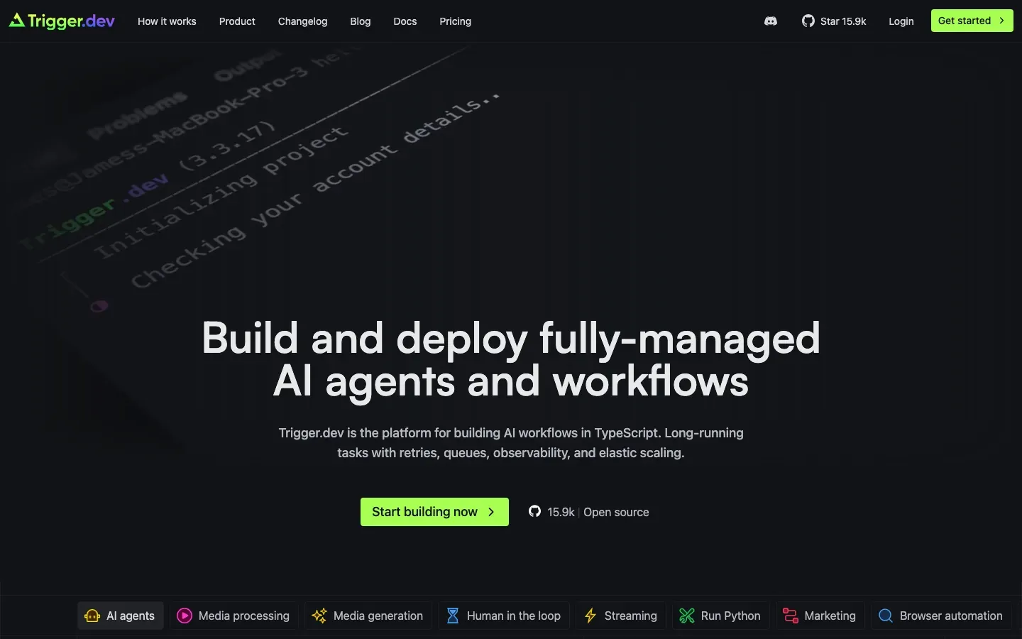
Trigger.dev
“Build and deploy fully‑managed AI agents and workflows”
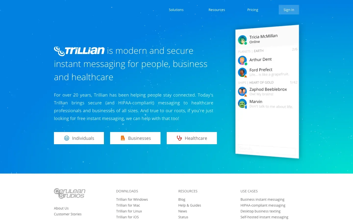
Trillian
“is modern and secure instant messaging for people, business and healthcare”
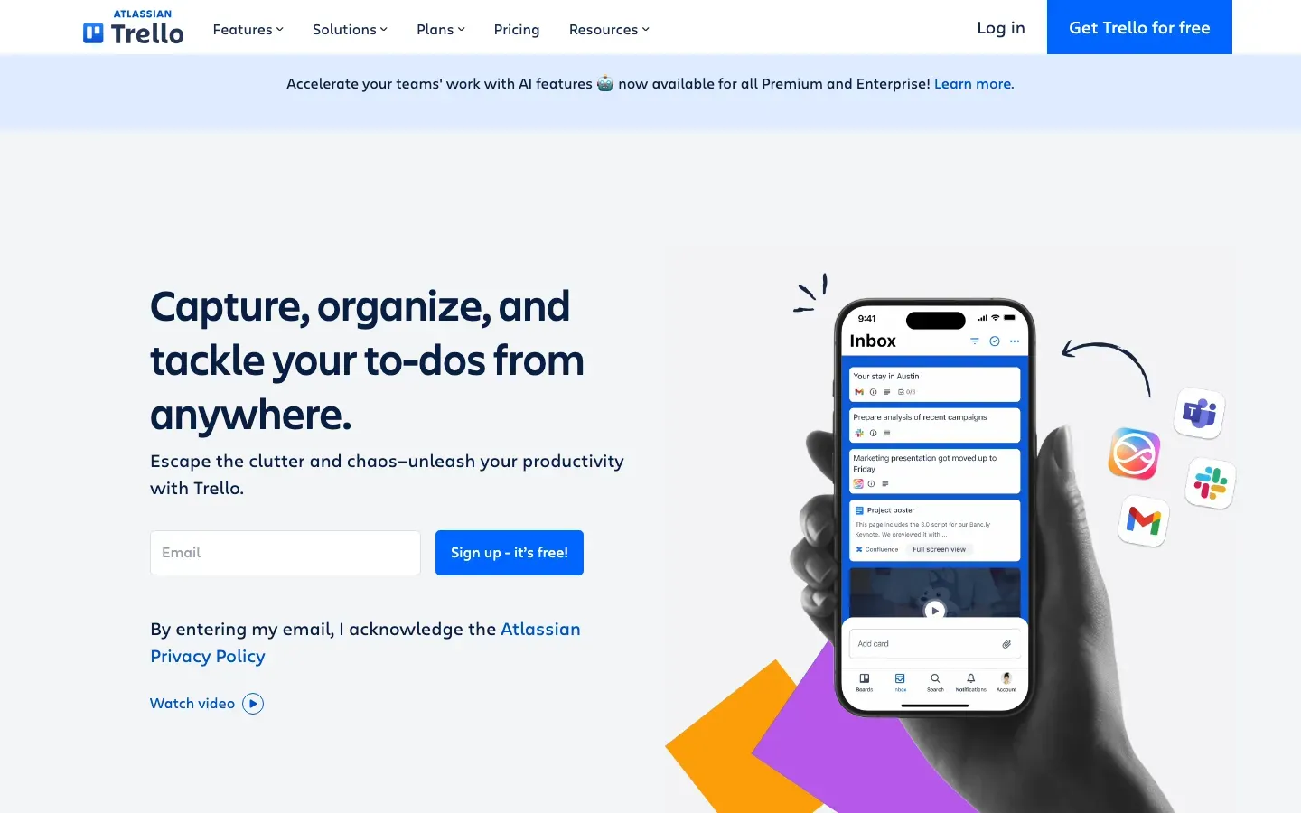
Trello
“Capture, organize, and tackle your to-dos from anywhere.”
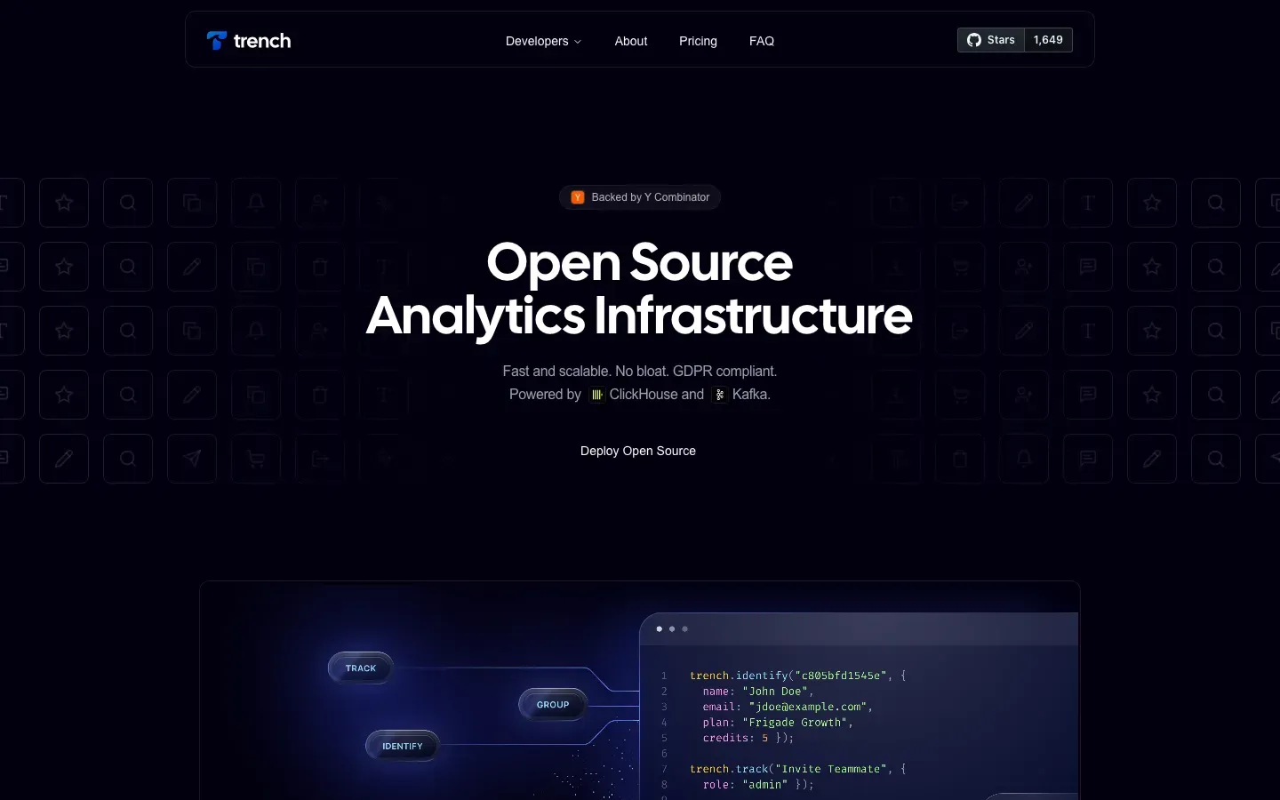
Trench
“Open Source Analytics Infrastructure”
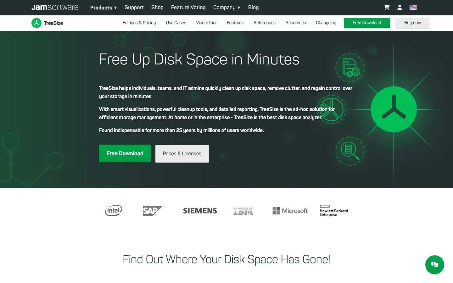
TreeSize
“Free Up Disk Space in Minutes”
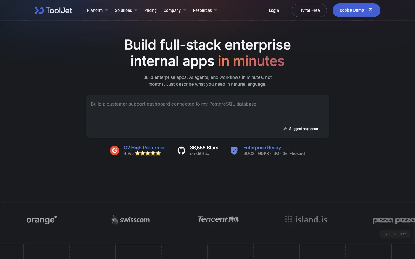
ToolJet
“Build full-stack enterprise internal apps in minutes”
TortoiseSVN
“TortoiseSVN”
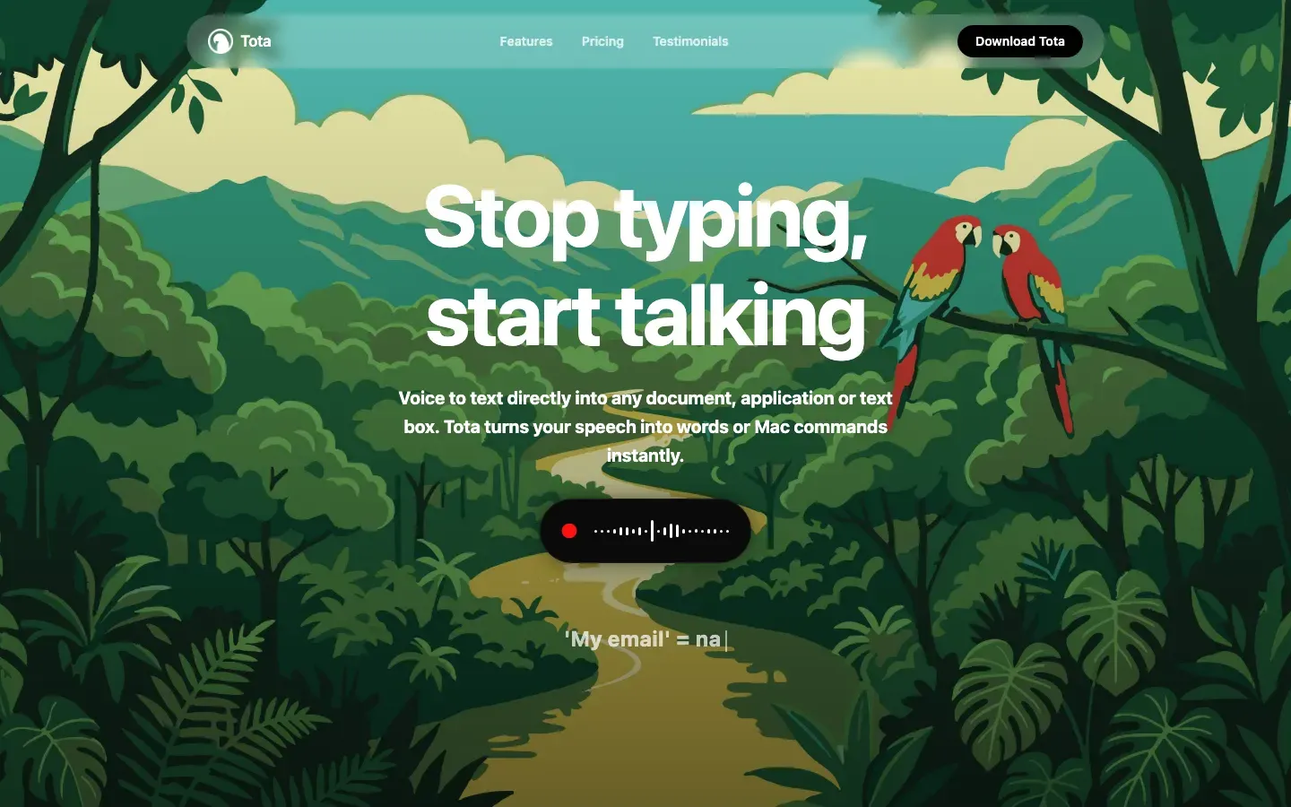
Tota
“Stop typing, start talking”
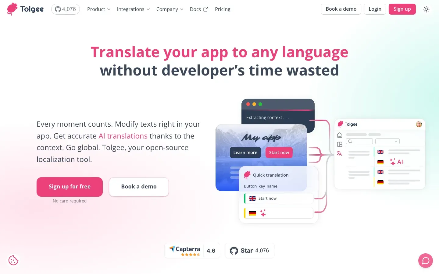
Tolgee
“Translate your app to any language”

Tonkatsu Box
“Your games, movies, shows, animation, anime, manga, novels & books — all in one box”
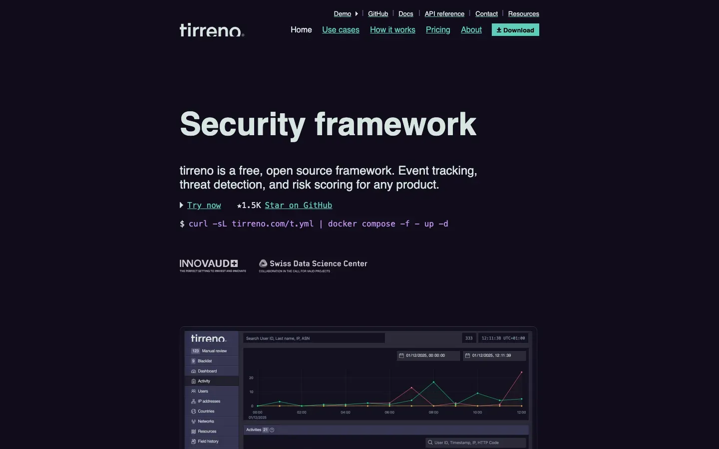
tirreno
“Security framework”
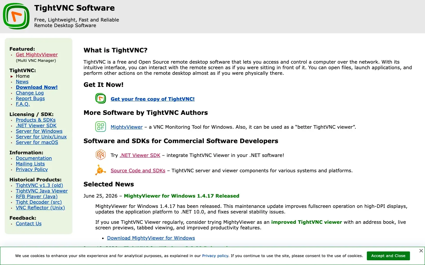
TightVNC
“TightVNC Software”
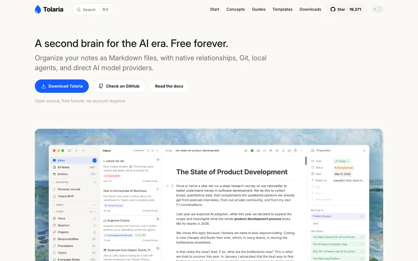
Tolaria
“A second brain for the AI era. Free forever.”
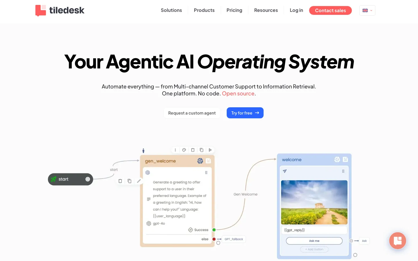
Tiledesk
“Your Agentic AI Operating System”
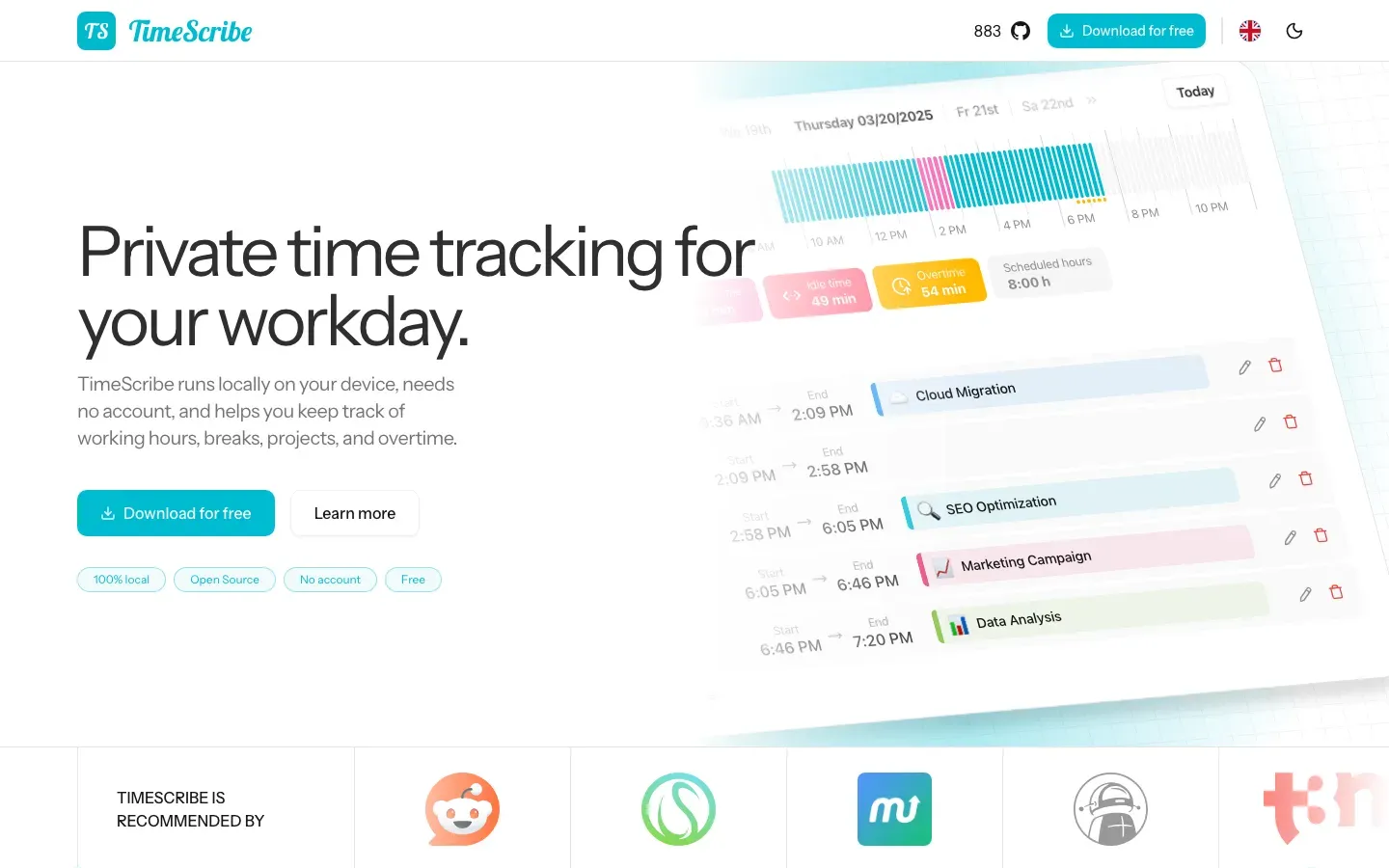
TimeScribe
“Private time tracking for your workday.”
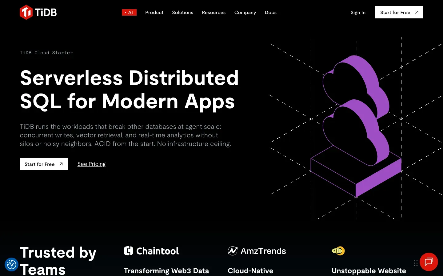
TiDB Cloud Starter
“Serverless Distributed SQL for Modern Apps”
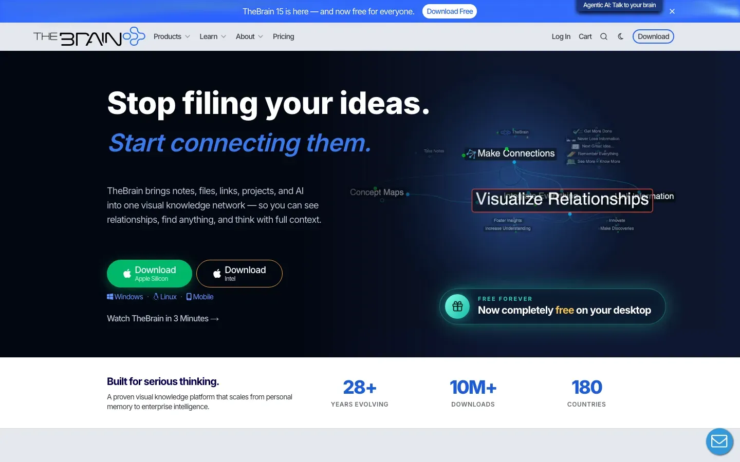
TheBrain
“Stop filing your ideas.”

Threema
“HIGHLY SECURE COMMUNICATION – DESIGNED FOR MAXIMUM CONFIDENTIALITY”
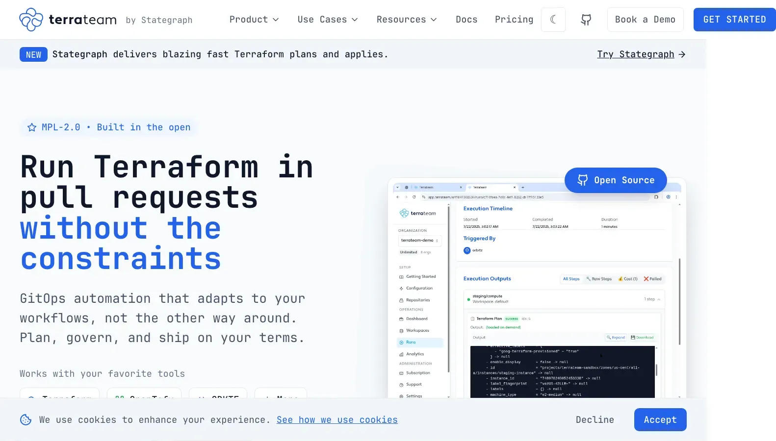
Terrateam
“Run Terraform in pull requests without the constraints”

TextMaker
“TextMaker”
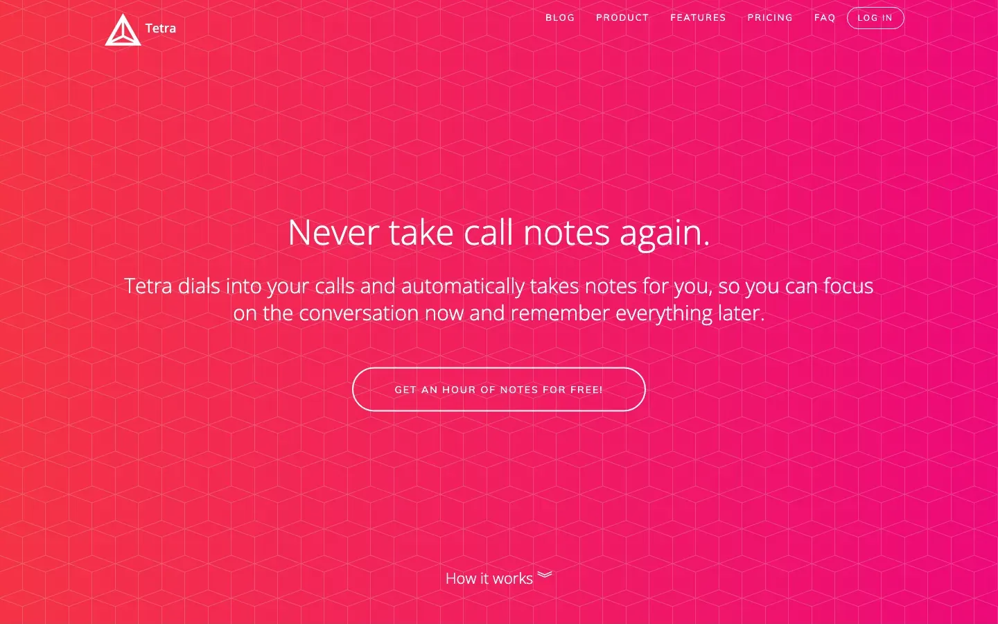
Tetra
“Never take call notes again.”
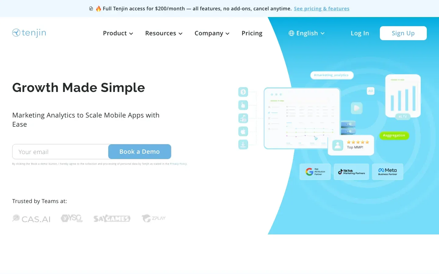
Tenjin
“Growth Made Simple”
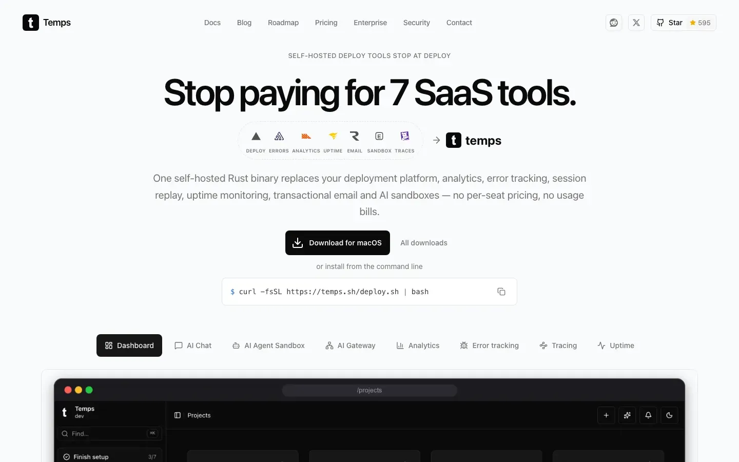
Temps
“Stop paying for 7 SaaS tools.”
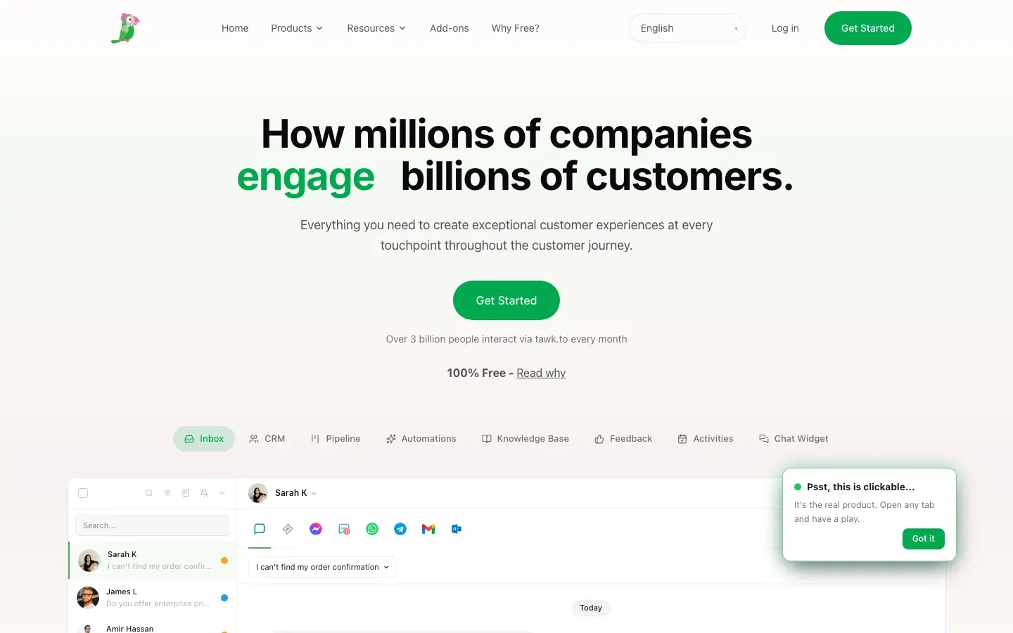
tawk.to
“How millions of companies support billions of customers.”
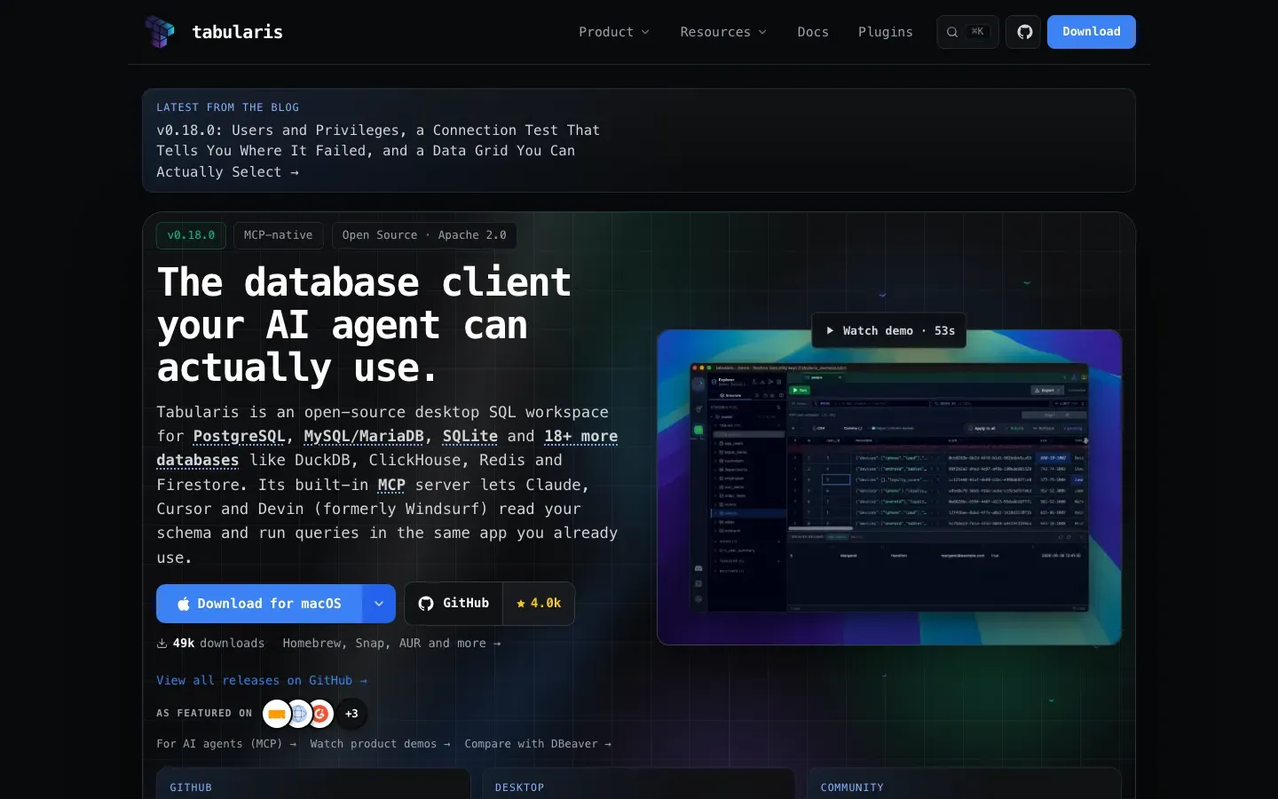
Tabularis
“The database client your AI agent can actually use.”
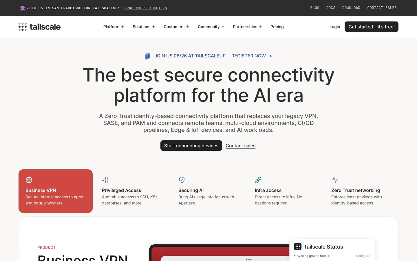
Tailscale
“The best secure connectivity platform for the AI era”
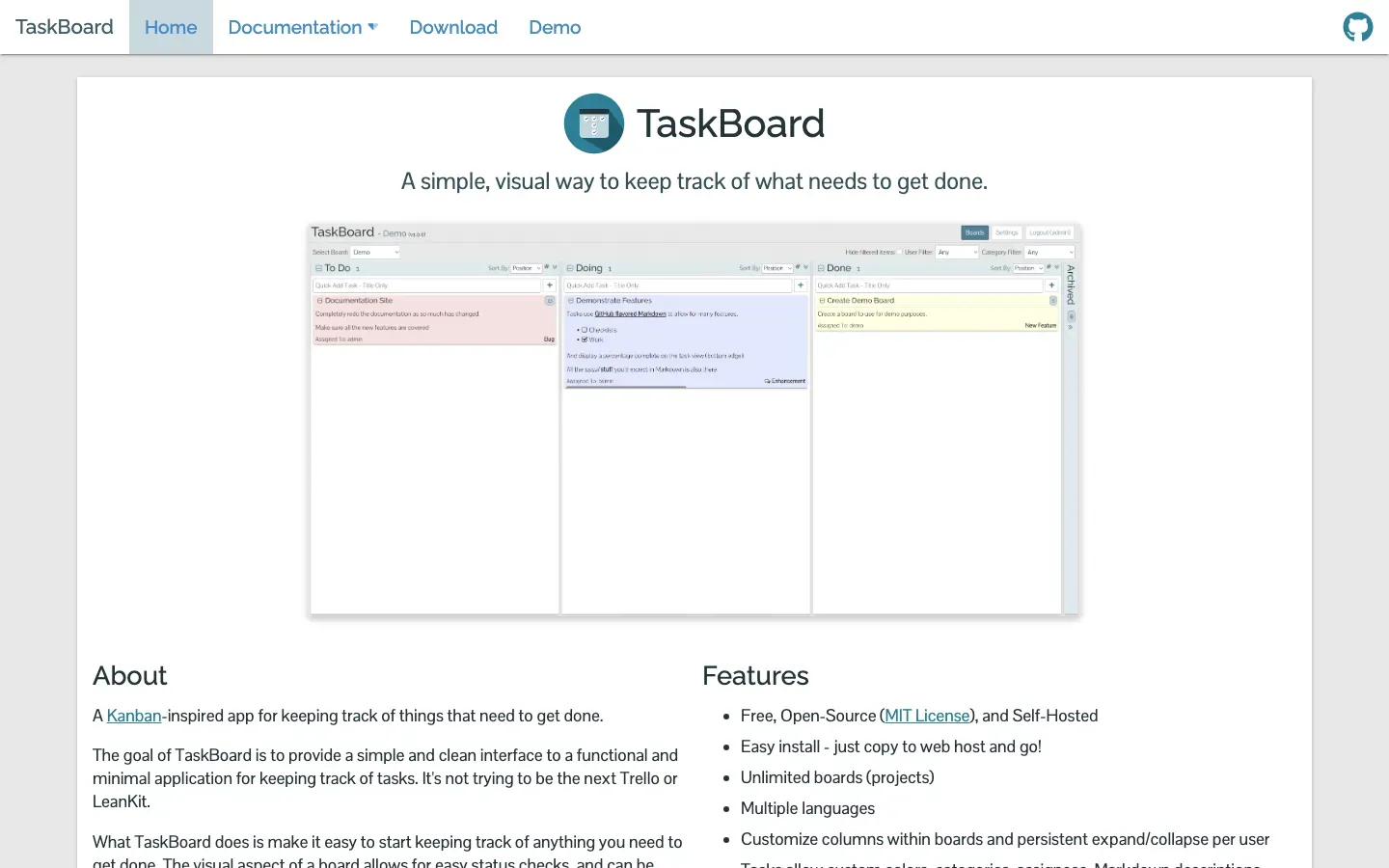
TaskBoard
“TaskBoard”
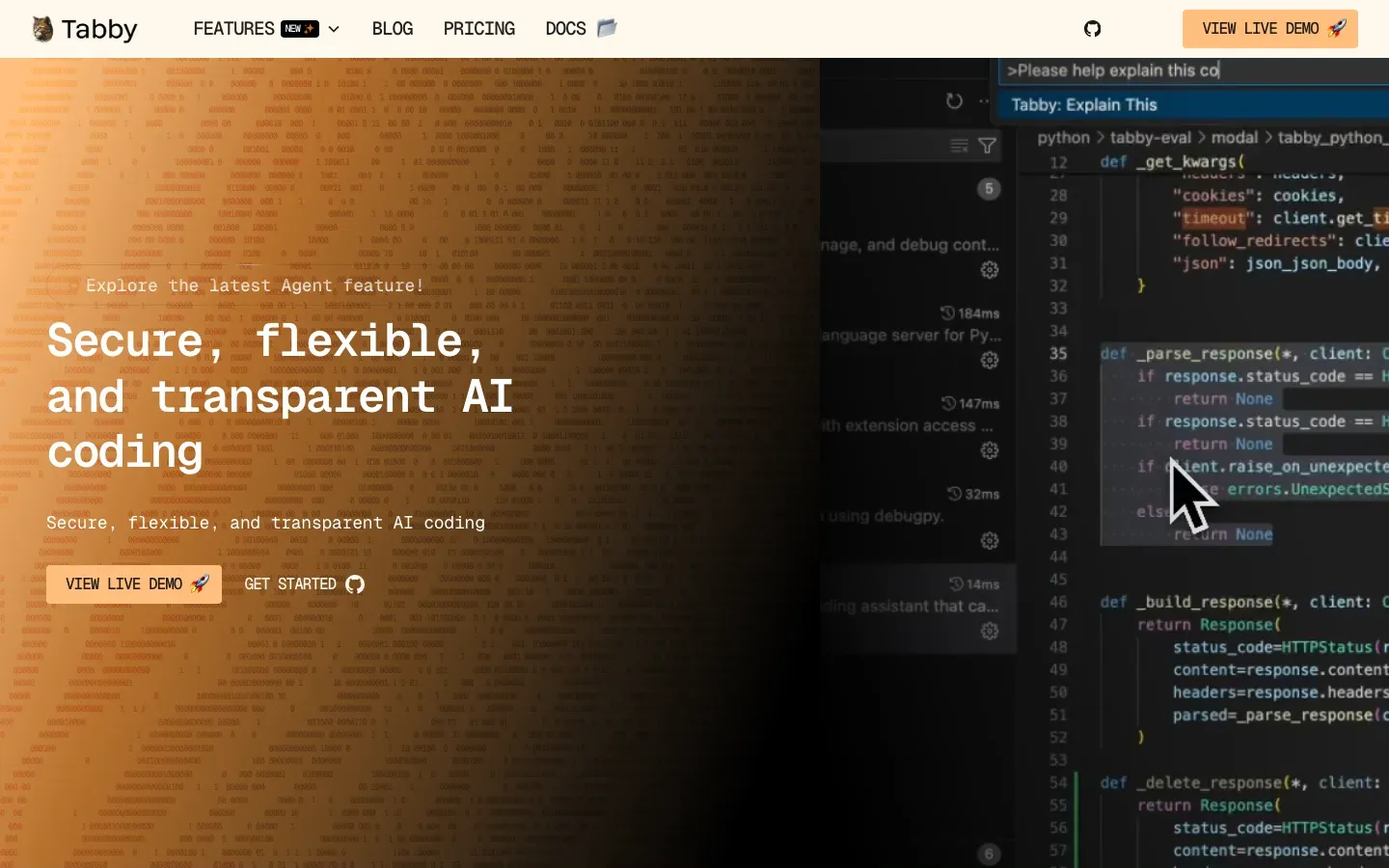
Tabby
“Secure, flexible, and transparent AI coding”
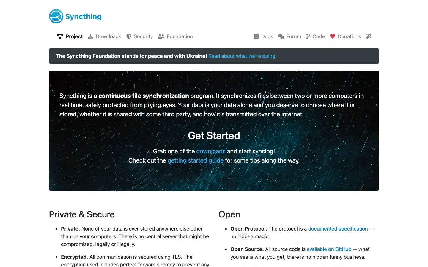
Syncthing
“Syncthing is a continuous file synchronization program.”
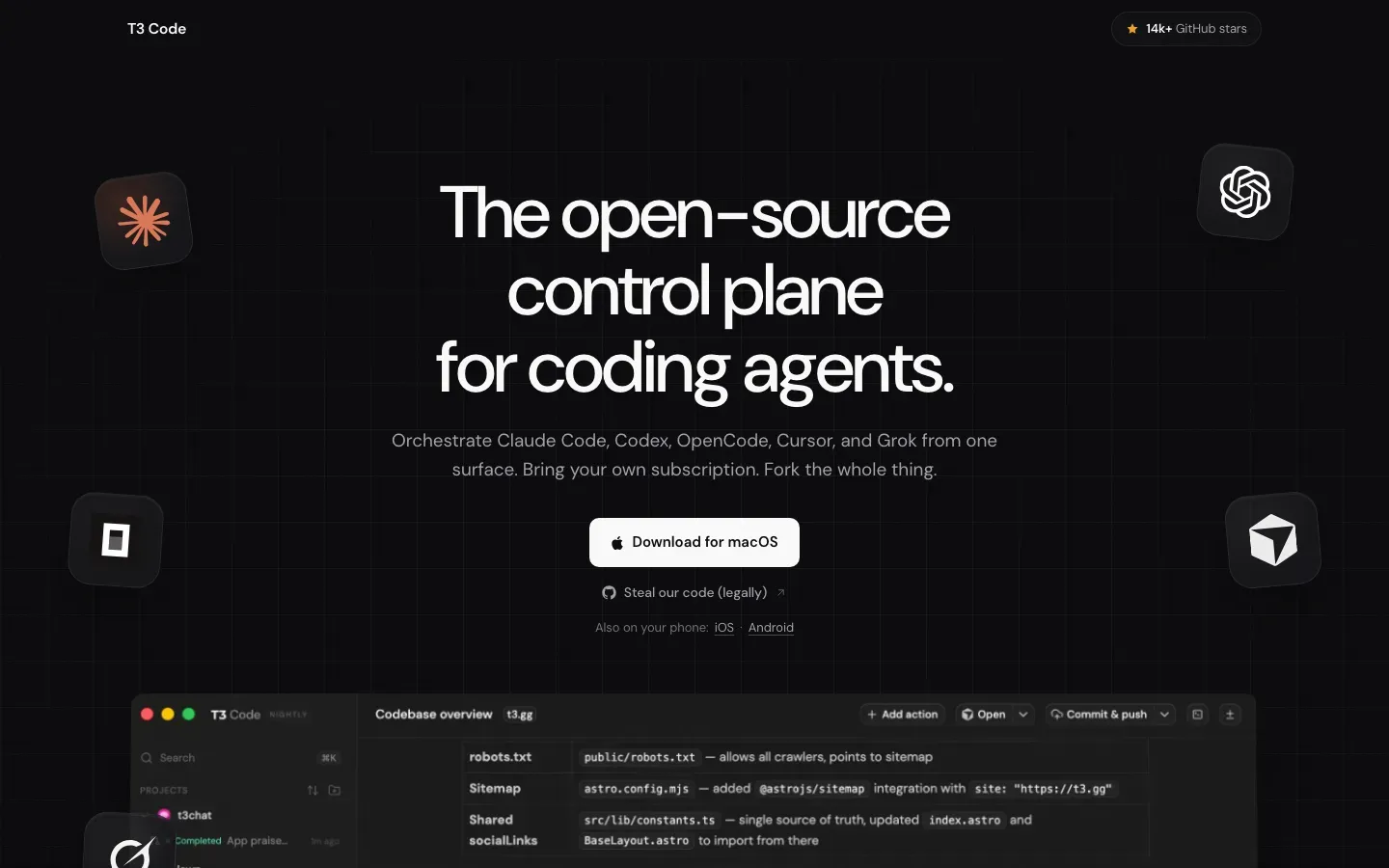
T3 Code
“The open-source control plane for coding agents.”
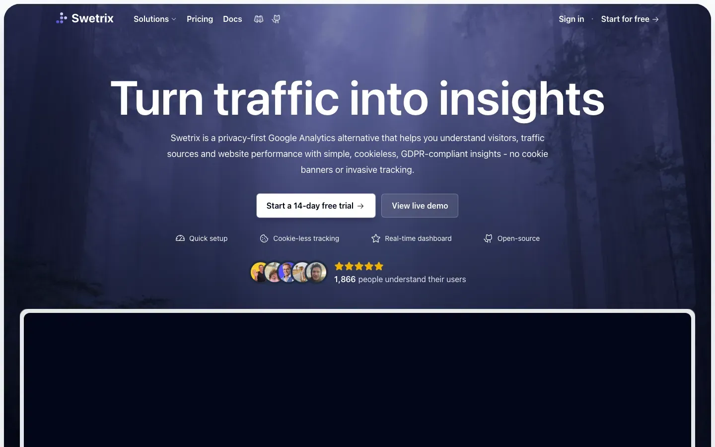
Swetrix
“Turn traffic into insights”
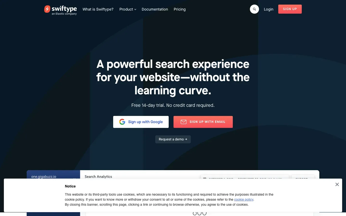
Swiftype
“A powerful search experience for your website—without the learning curve.”
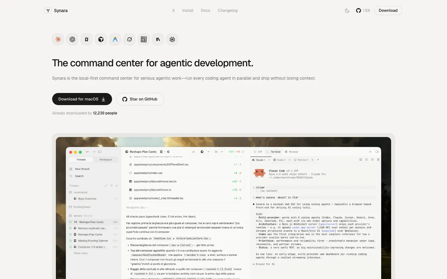
Synara
“The command center for agentic development.”
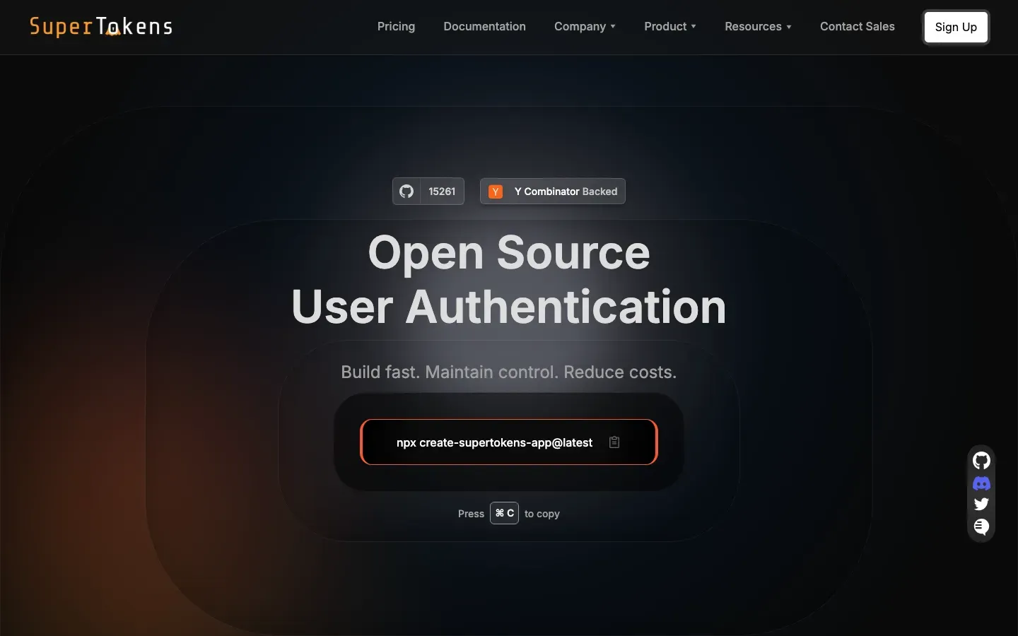
SuperTokens
“Open Source User Authentication”
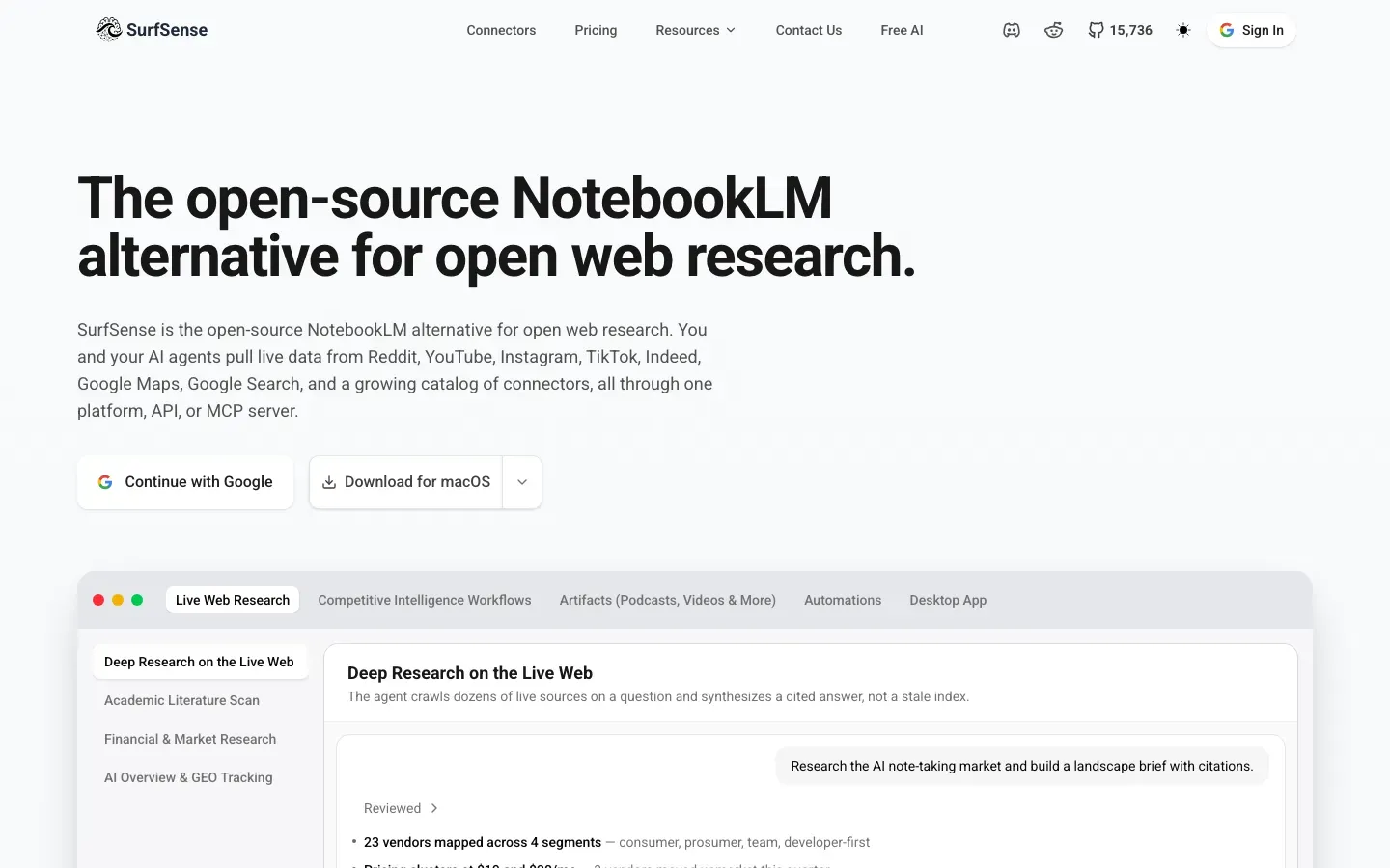
SurfSense
“The open-source NotebookLM alternative for open web research.”
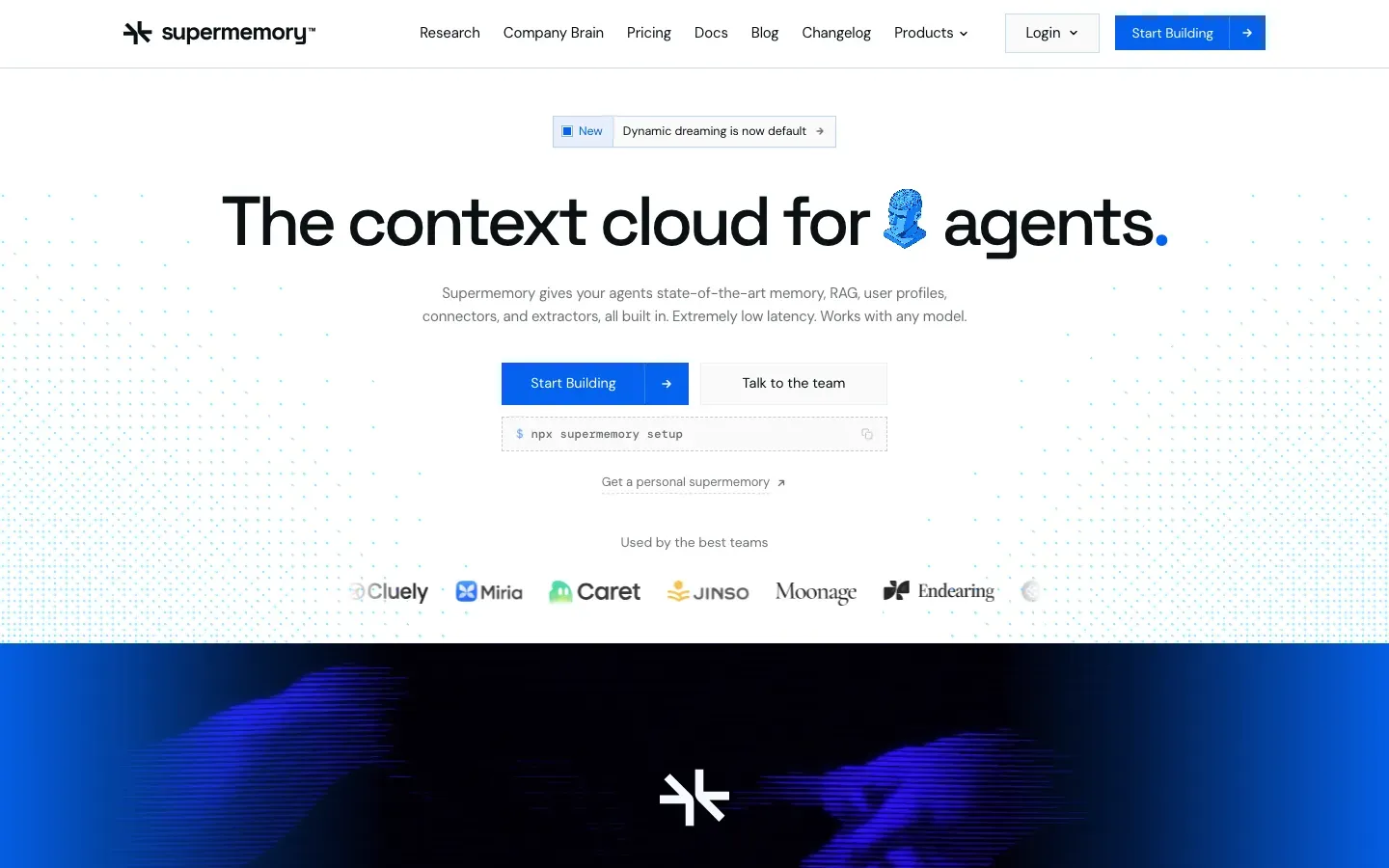
Supermemory
“The context cloud for 🧠 agents.”
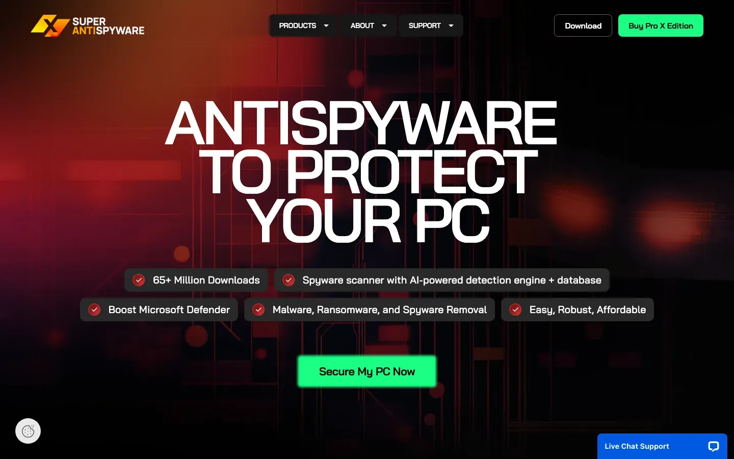
SUPERAntiSpyware Professional X Edition
“ANTISPYWARE TO PROTECT YOUR PC”
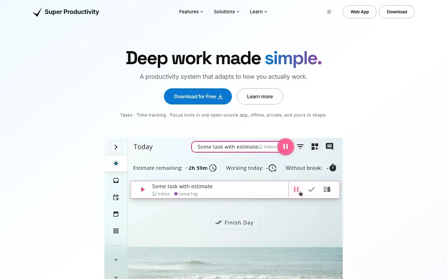
Super Productivity
“Deep work made simple.”

Study Edge
“Get the Edge to Succeed”
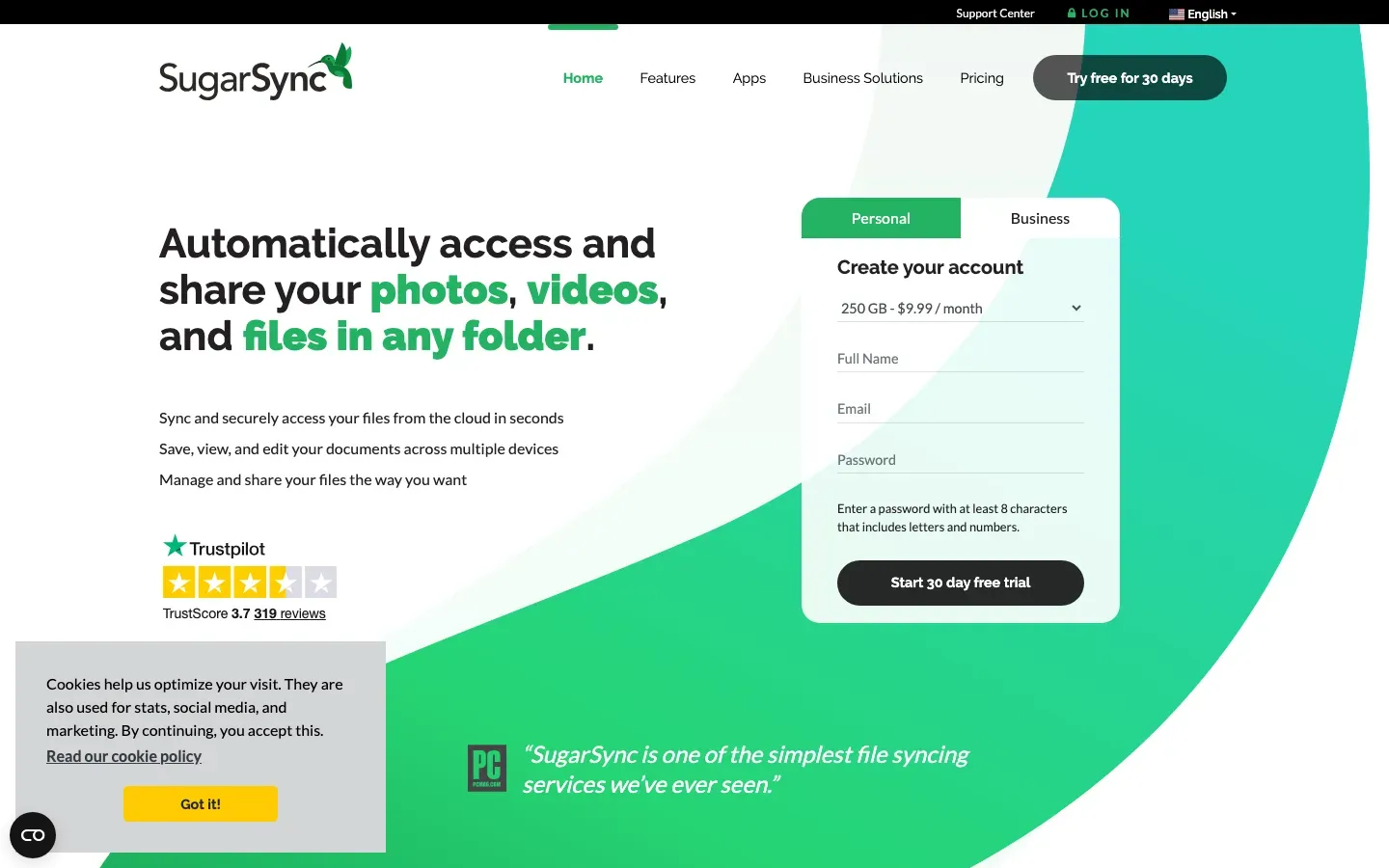
SugarSync
“Automatically access and share your photos, videos, and files in any folder.”
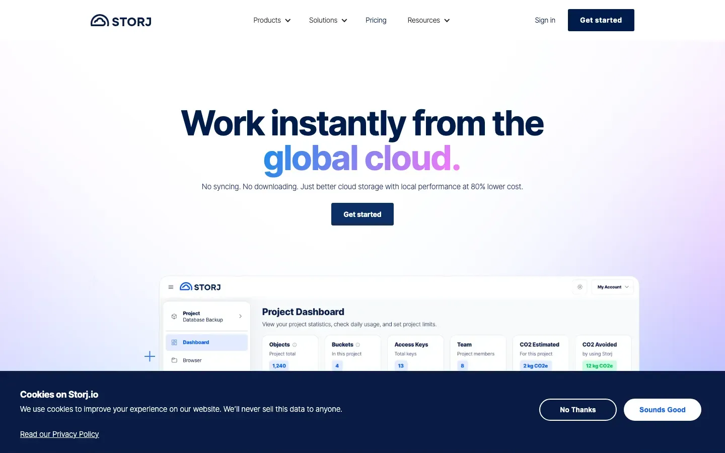
Storj
“Work instantly from the global cloud.”
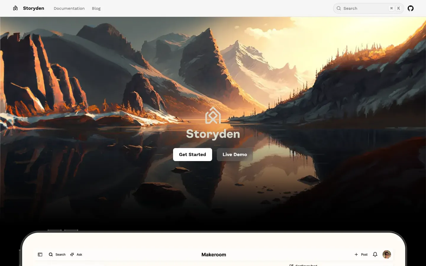
Storyden
“Communities deserve permanence.”
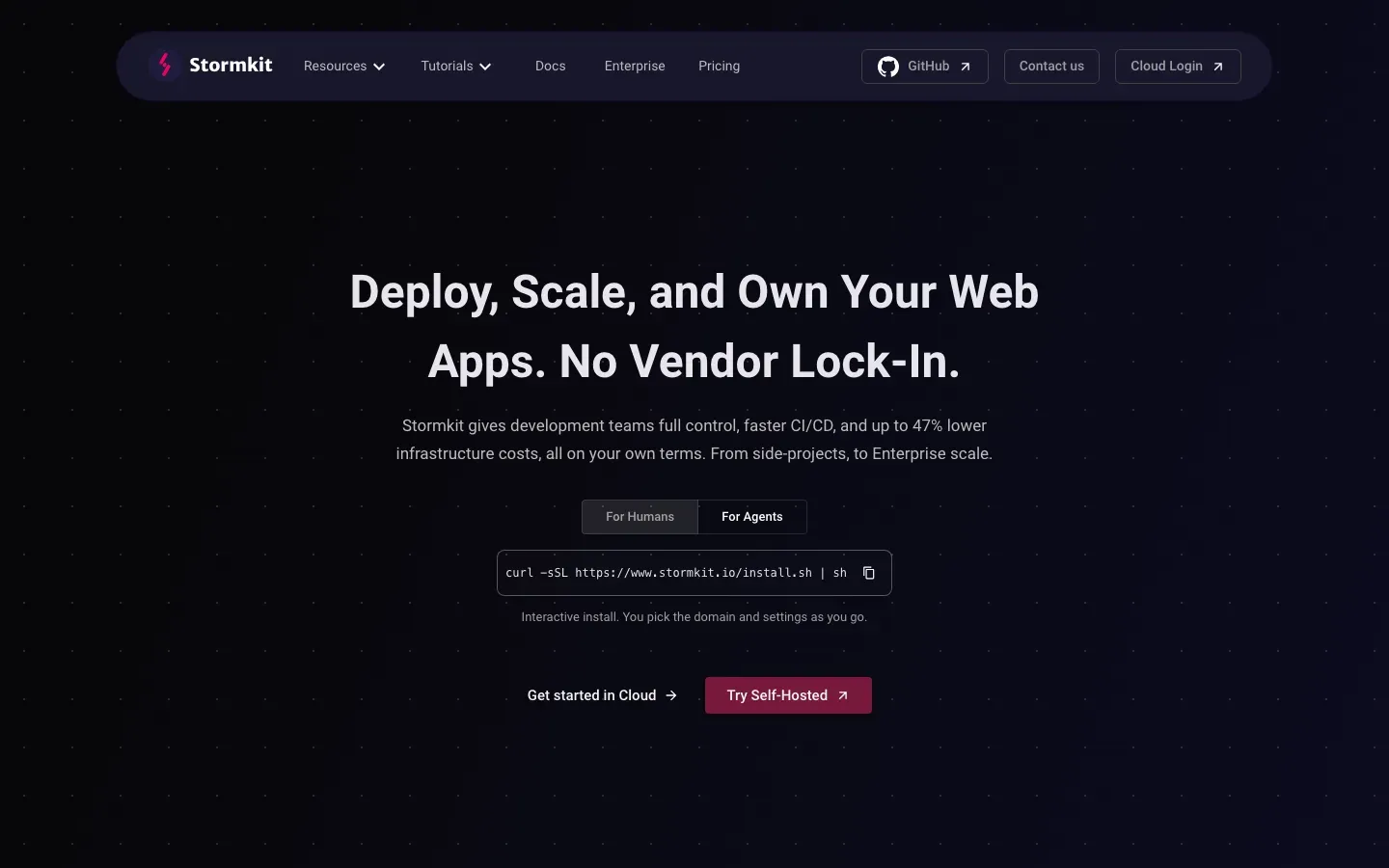
Stormkit
“Deploy, Scale, and Own Your Web Apps. No Vendor Lock-In.”
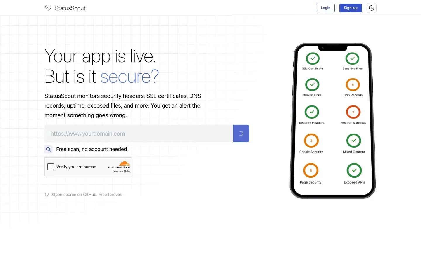
StatusScout
“Your app is live.”
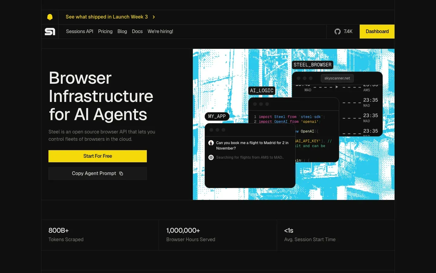
Steel
“Browser Infrastructure for AI Agents”
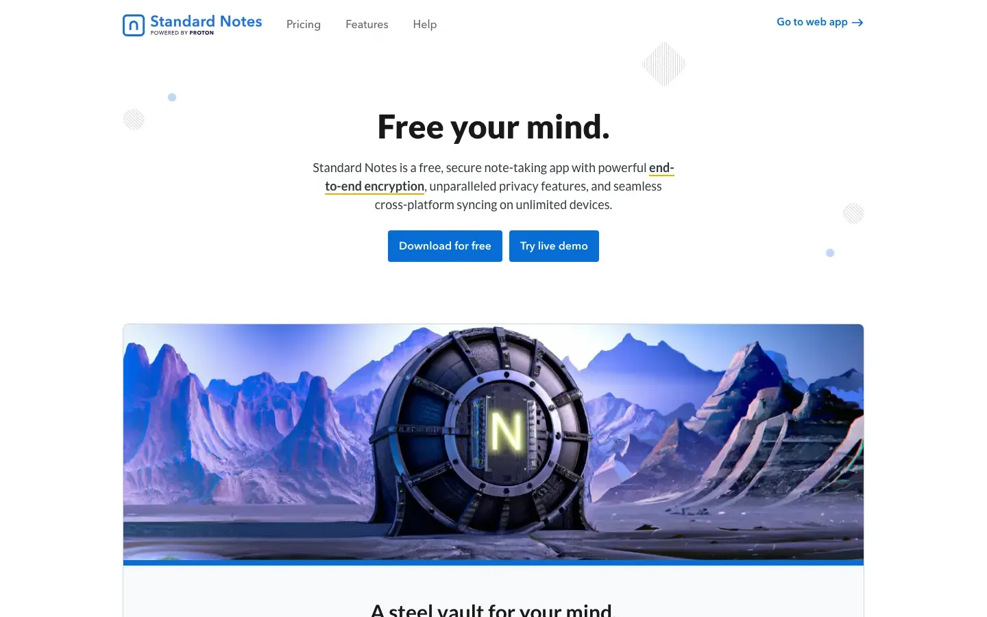
Standard Notes
“Free your mind.”
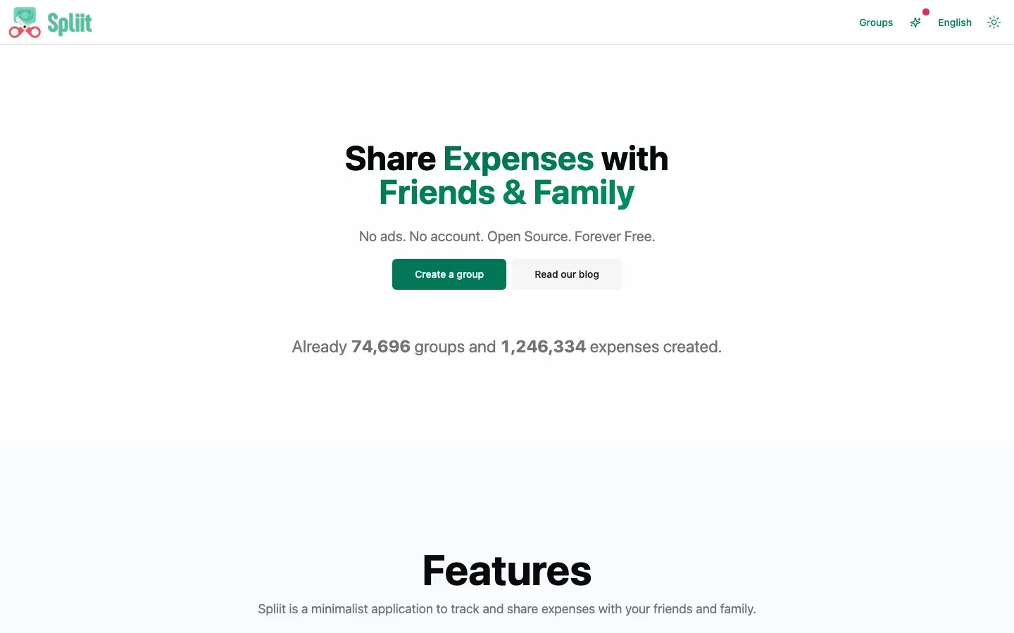
Spliit
“Share Expenses with Friends & Family”
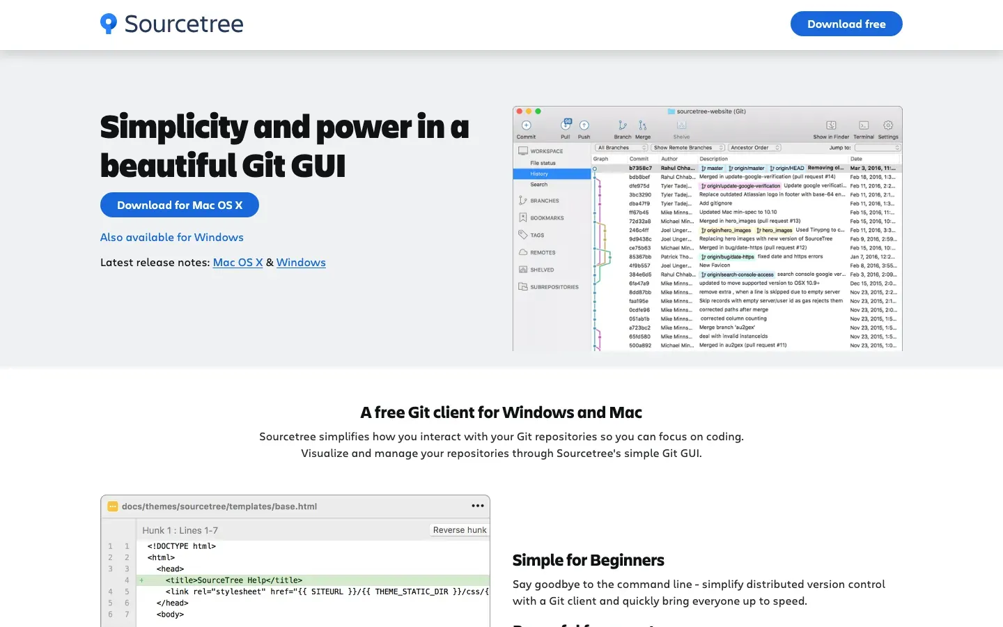
Sourcetree
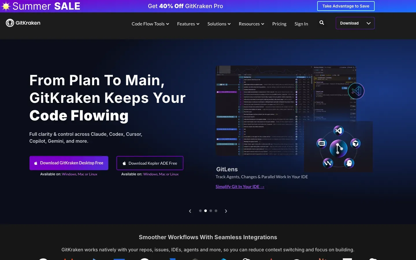
“Simplicity and power in a beautiful Git GUI”
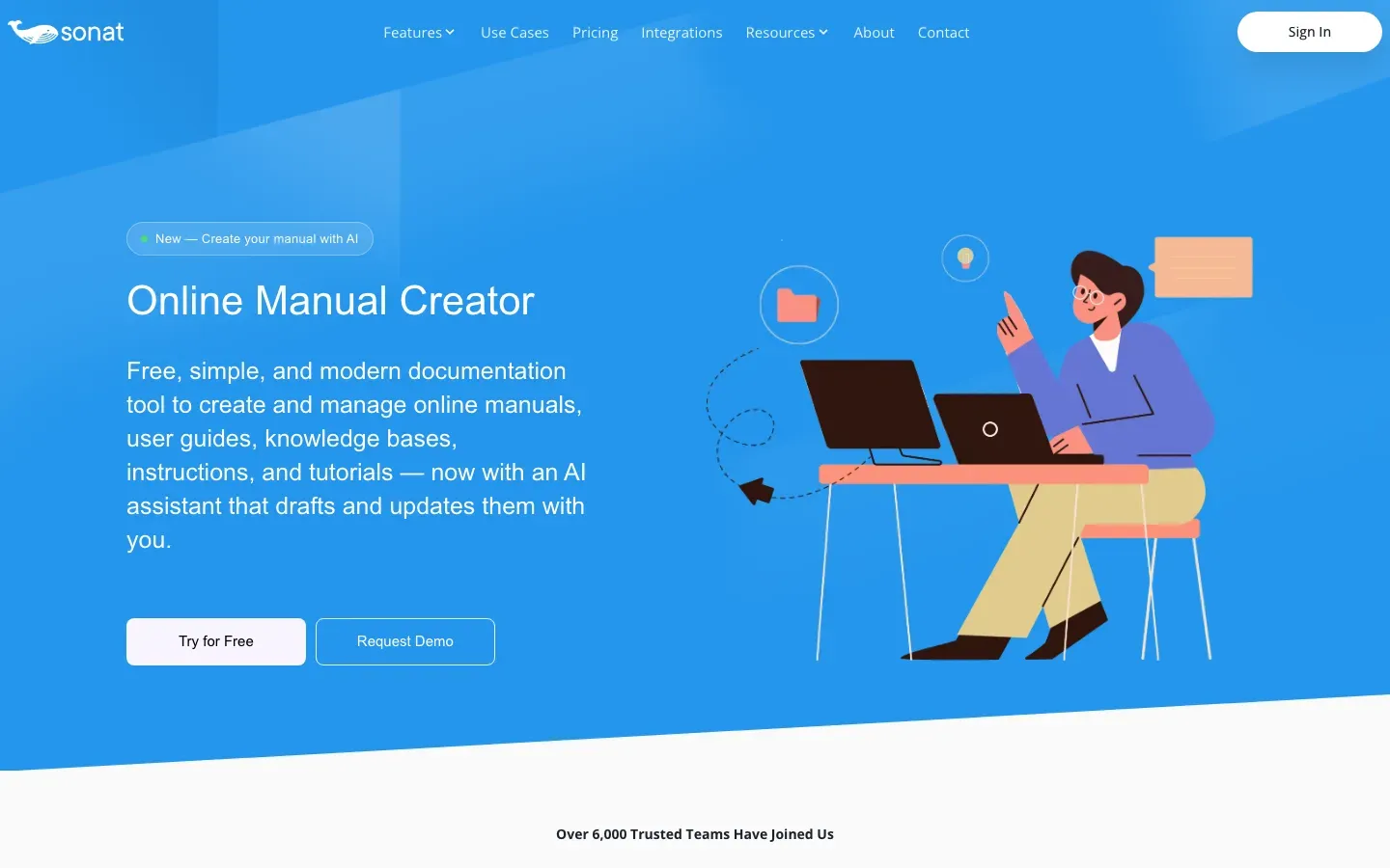
Sonat
“Online Manual Creator”
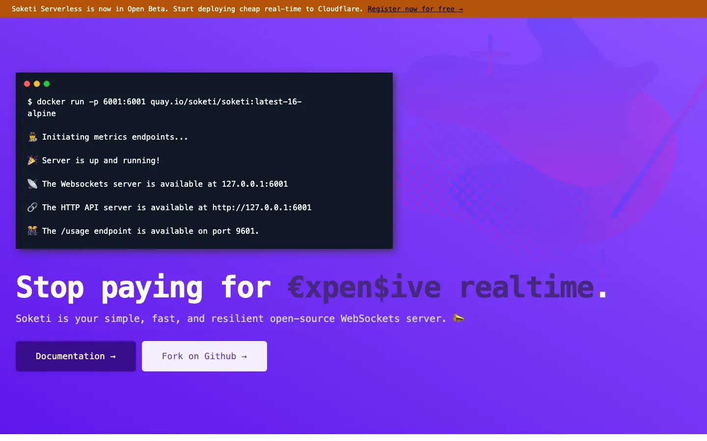
Soketi
“Stop paying for €xpen$ive realtime.”
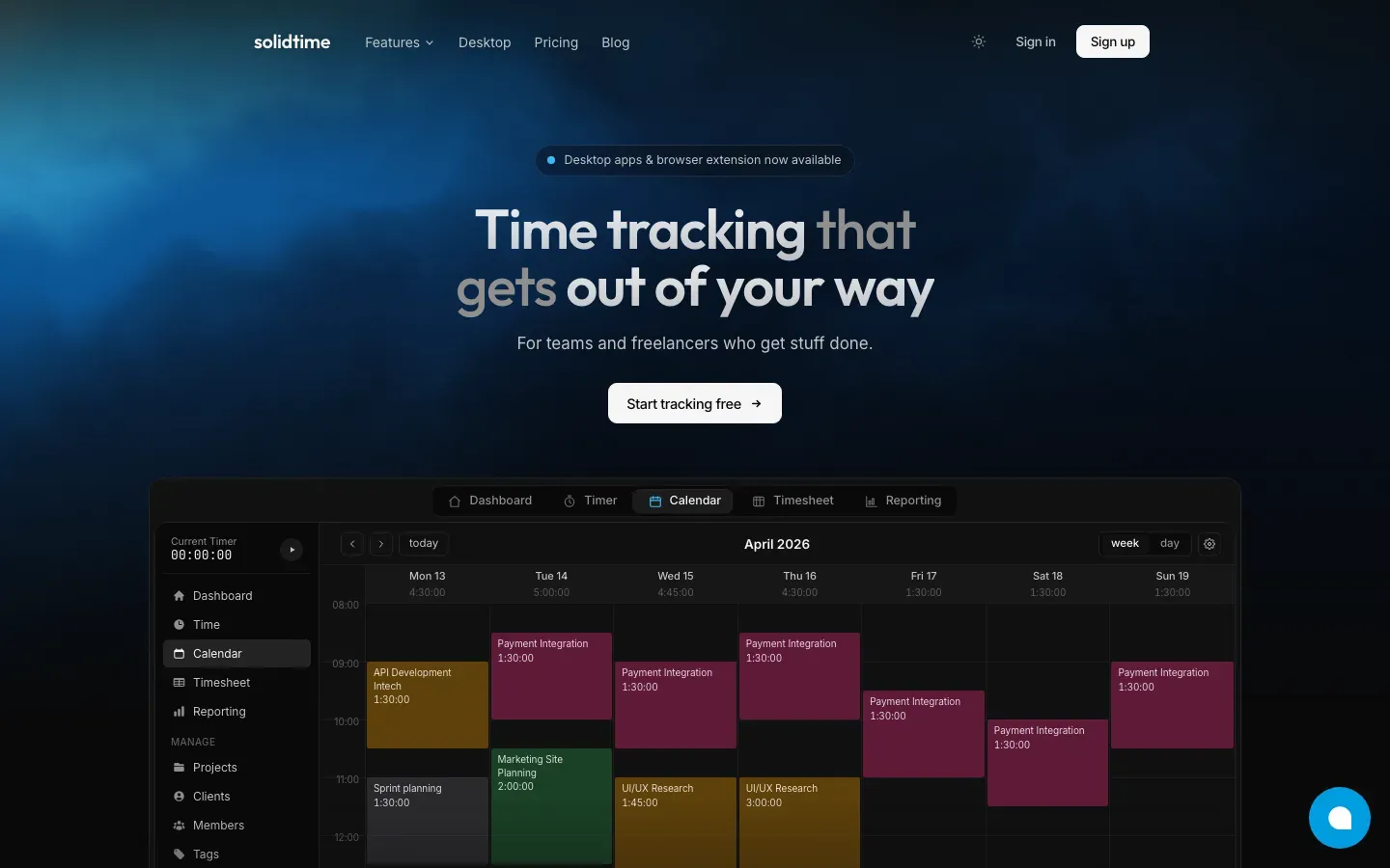
solidtime
“Time tracking that gets out of your way”
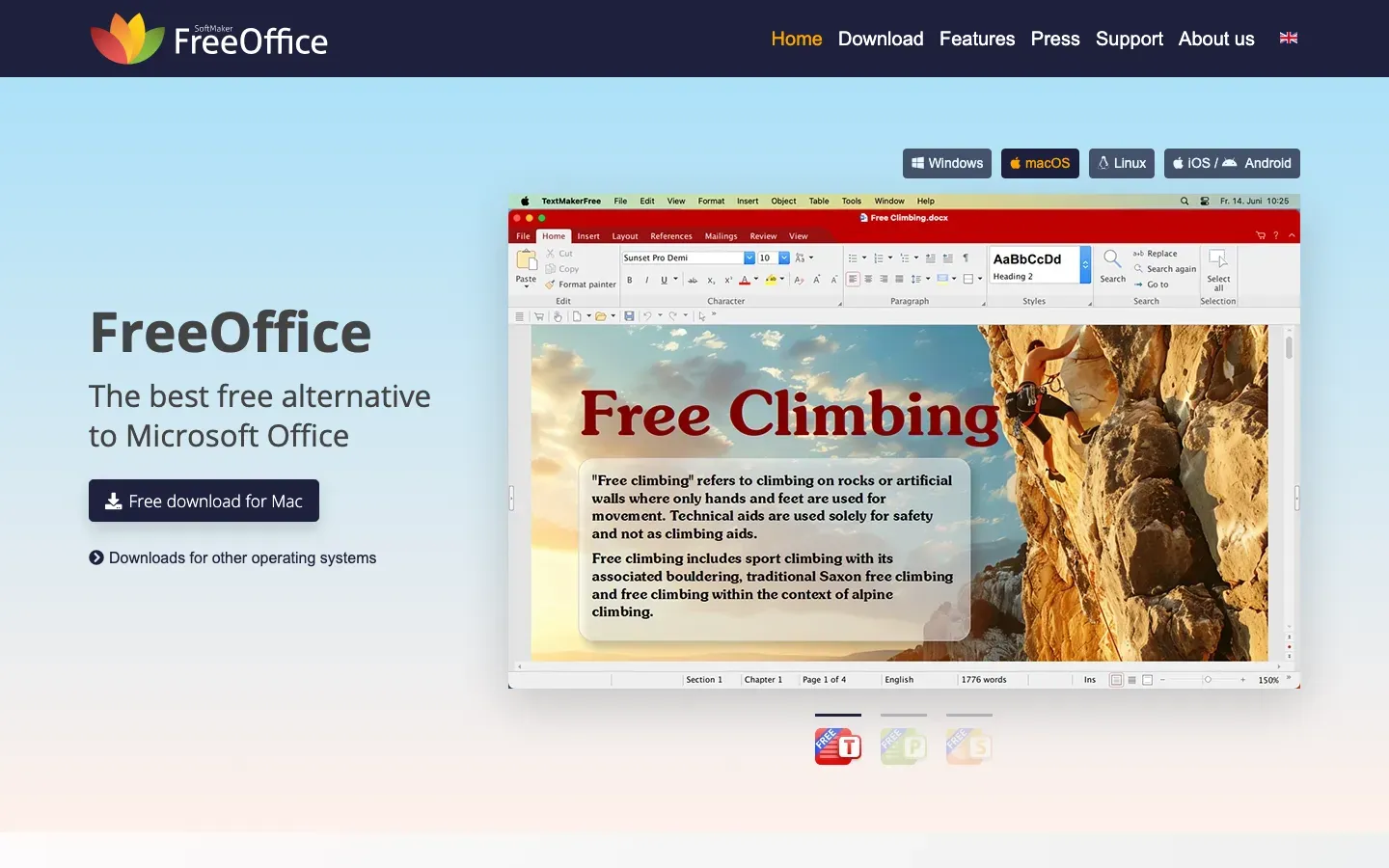
FreeOffice
“FreeOffice”
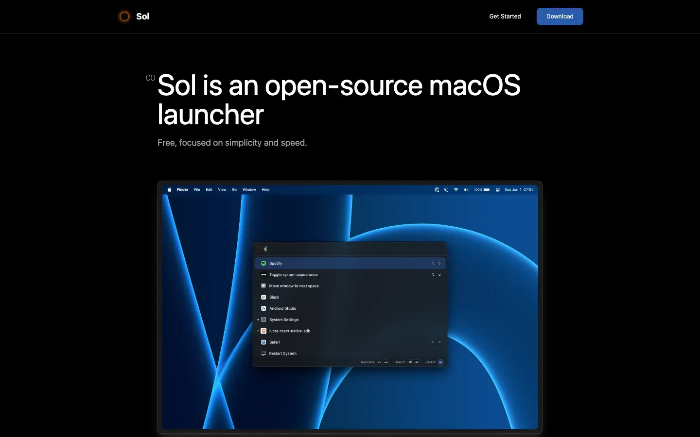
Sol
“Sol is an open-source macOS launcher”
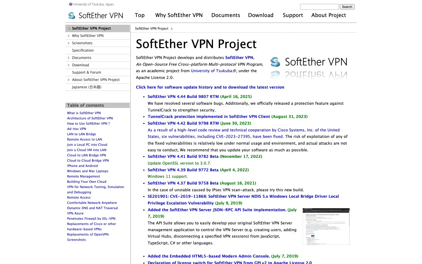
SoftEther VPN
“SoftEther VPN Project”
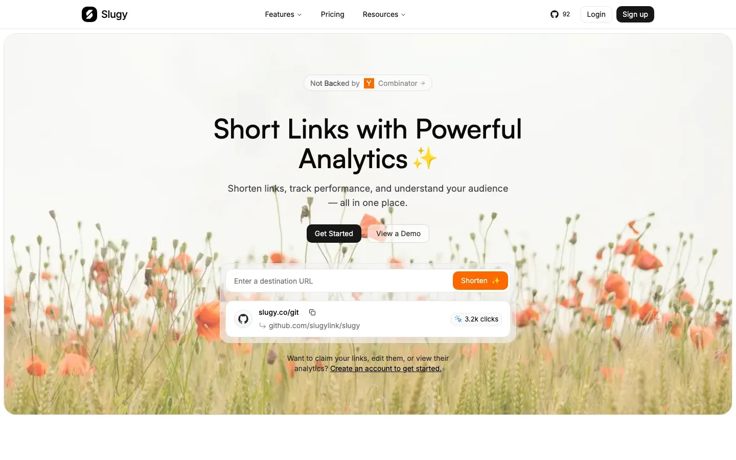
Slugy
“Short Links with Powerful Analytics ✨”

SkyLink
“The VIP Travel Agent for Executives to Entry Level”
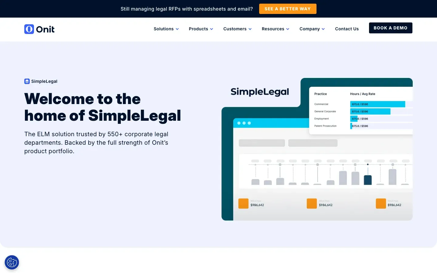
SimpleLegal
“Welcome to the home of SimpleLegal”
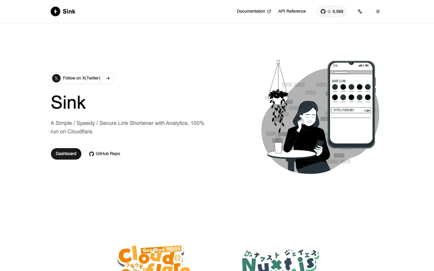
Sink
“Sink”
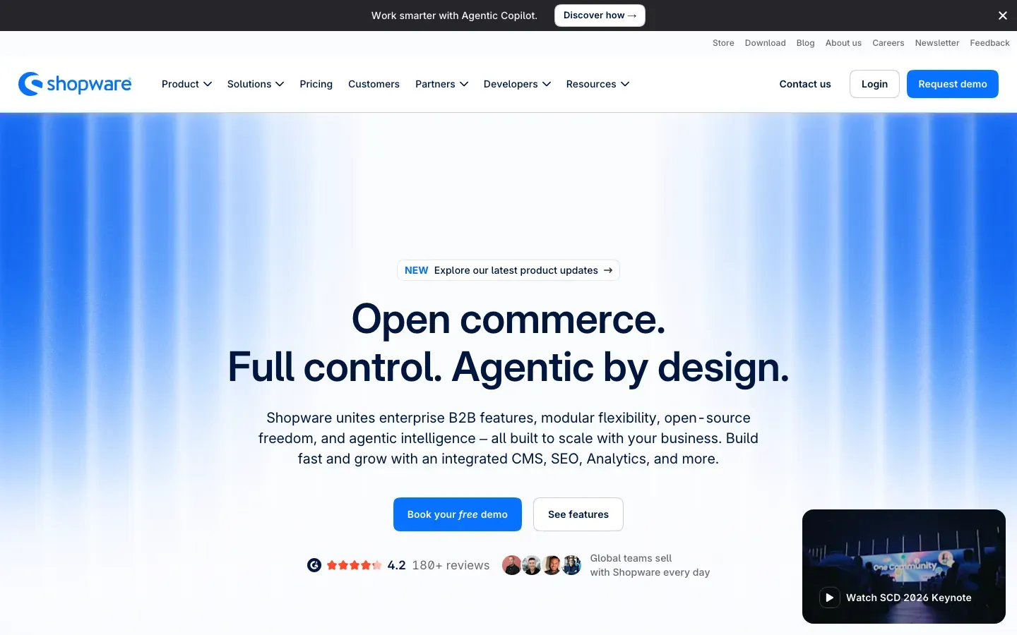
Shopware
“Open commerce. Full control. Agentic by design.”
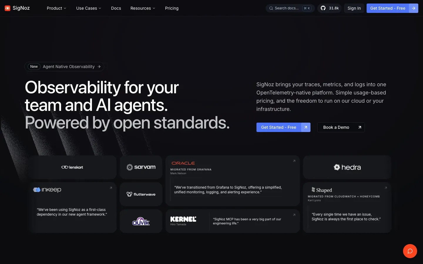
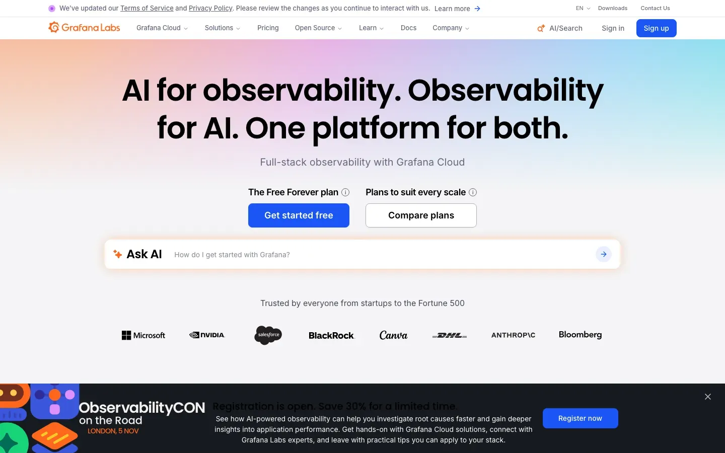
SigNoz
“Observability for your team and AI agents.”
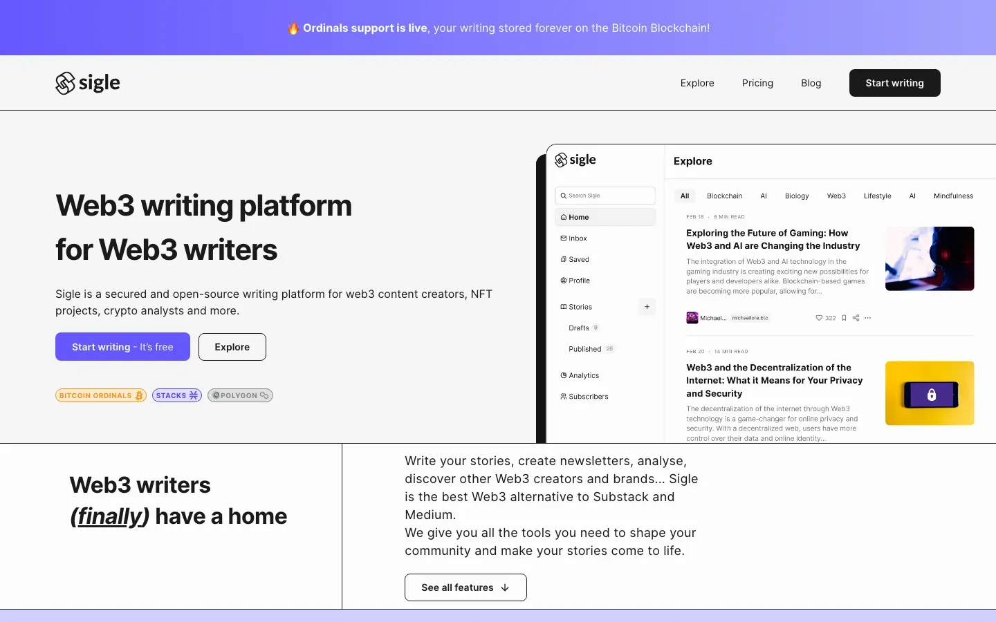
Sigle
“Web3 writing platform for Web3 writers”
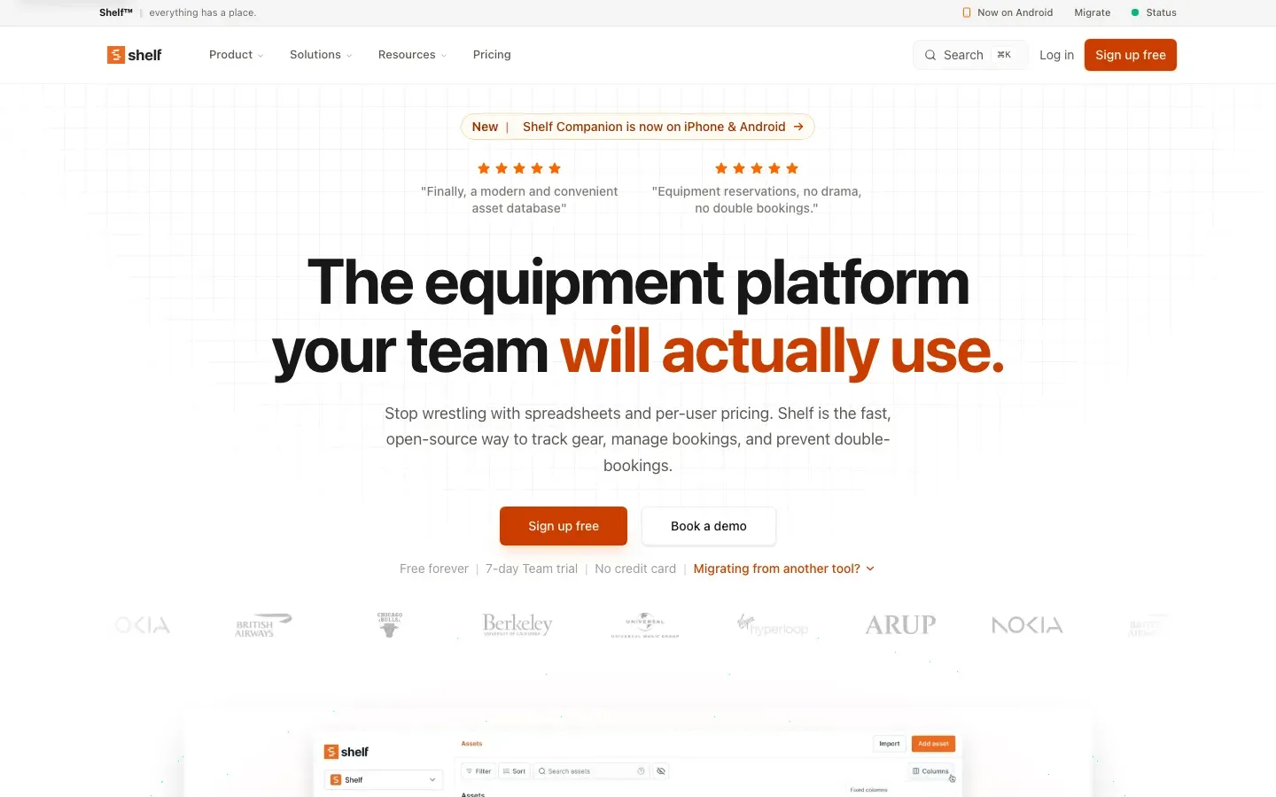
Shelf
“The equipment platform your team will actually use.”
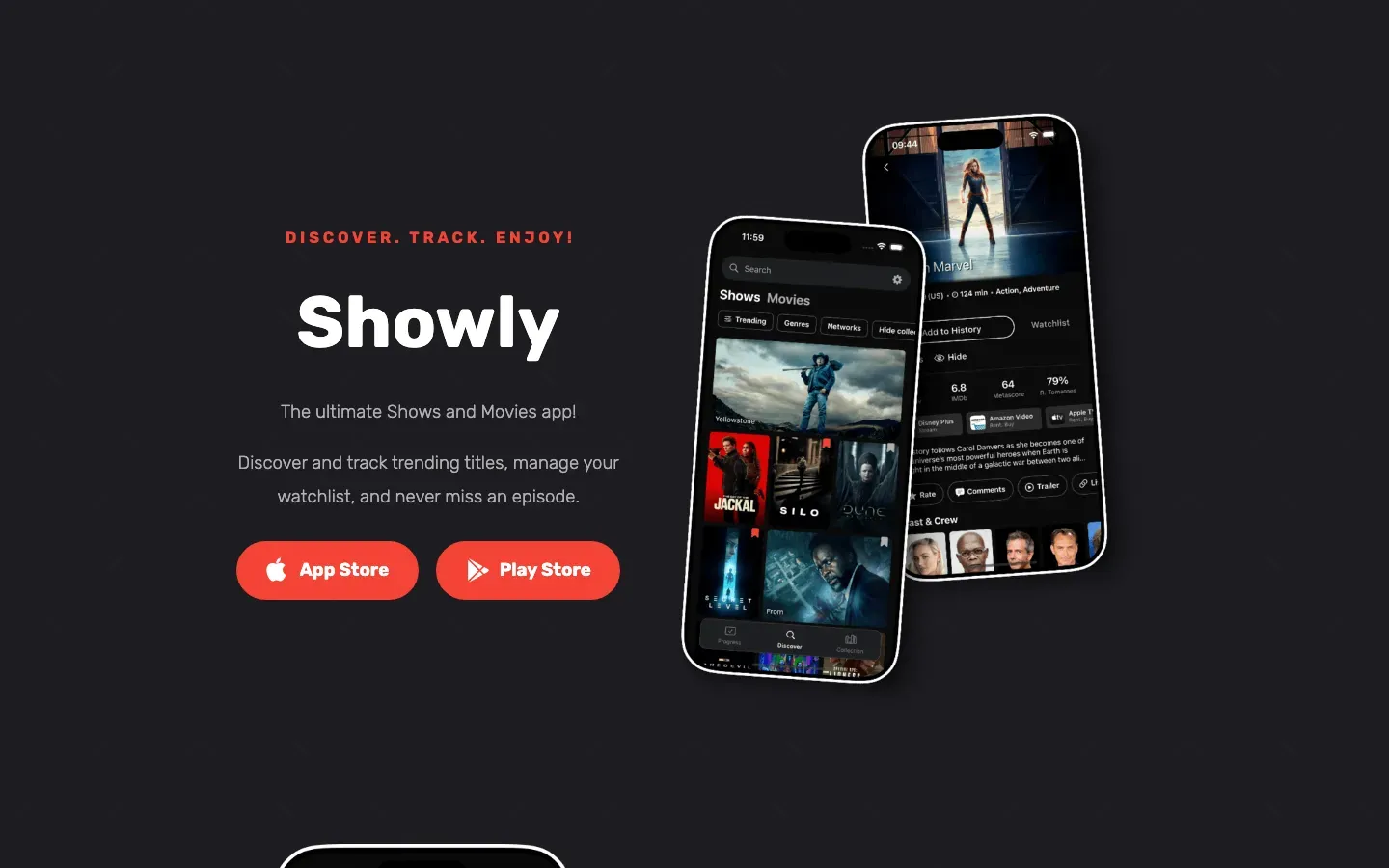
Showly
“Showly”
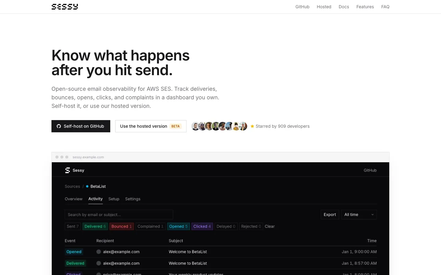
Sessy
“Know what happens after you hit send.”
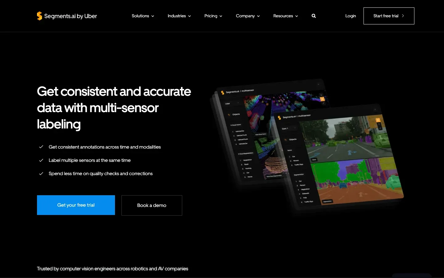
Segments.ai
“Get consistent and accurate data with multi-sensor labeling”
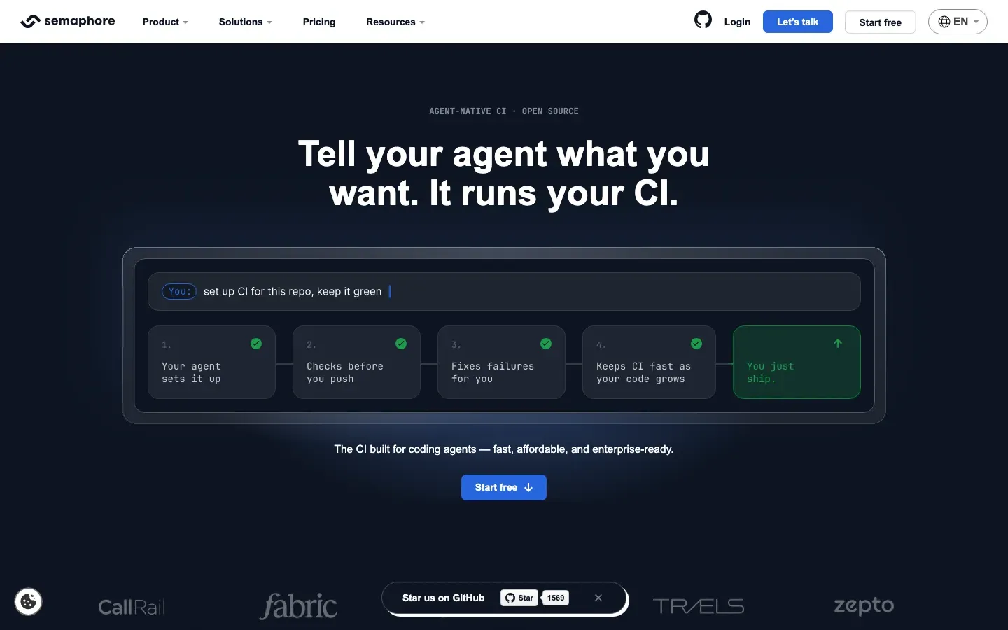
Semaphore
“Tell your agent what you want. It runs your CI.”
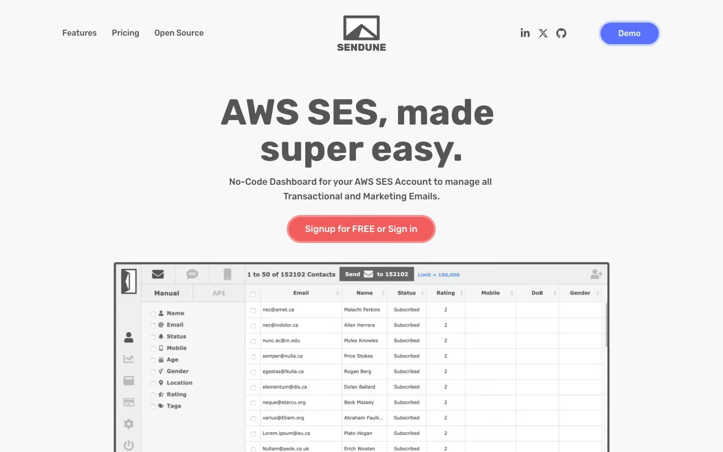
SENDUNE
“AWS SES, made super easy.”
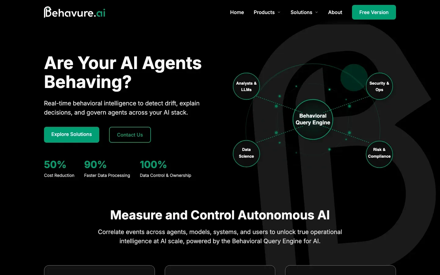
Behavure AI
“Are Your AI Agents Behaving?”
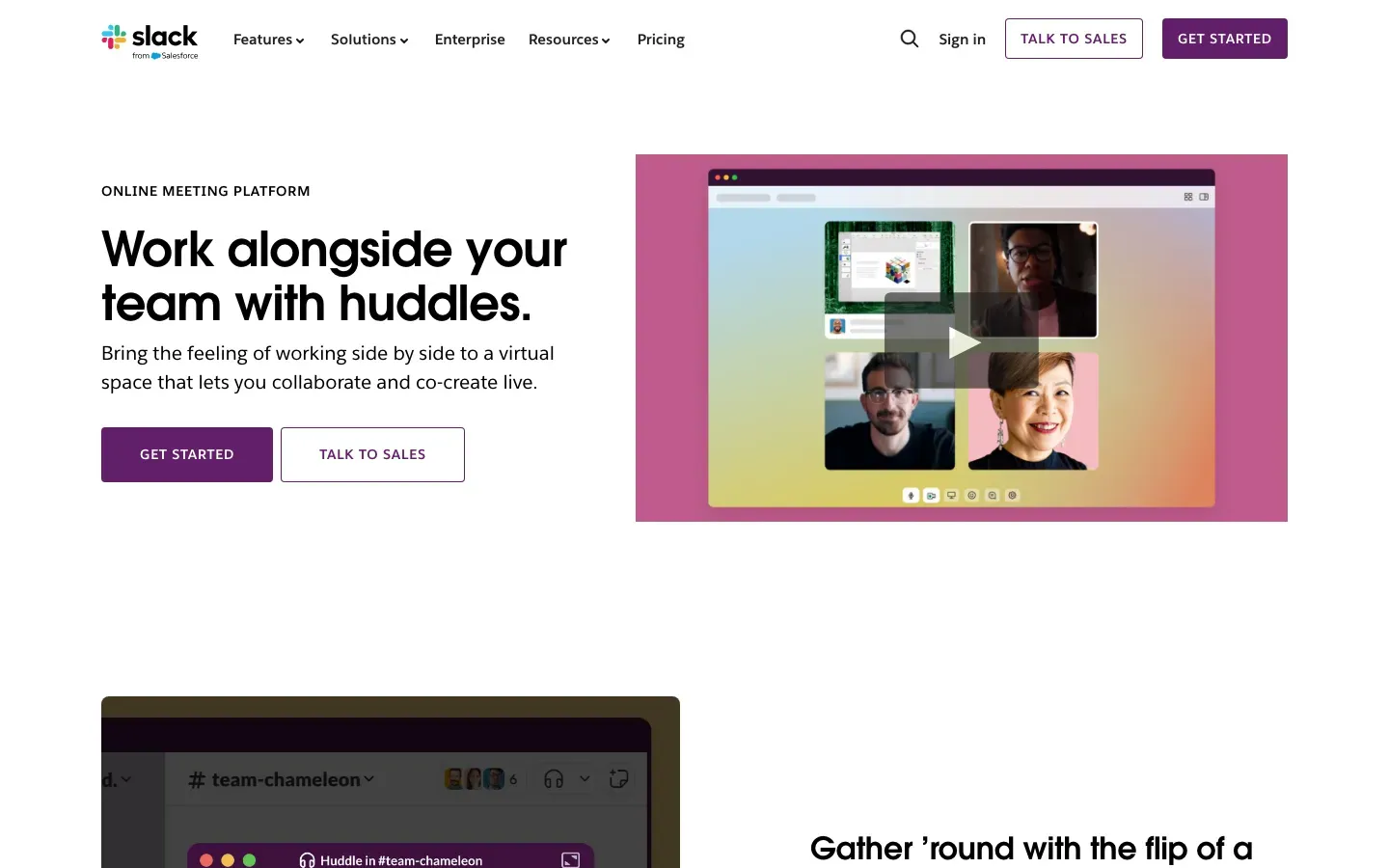
Slack
“Work alongside your team with huddles.”
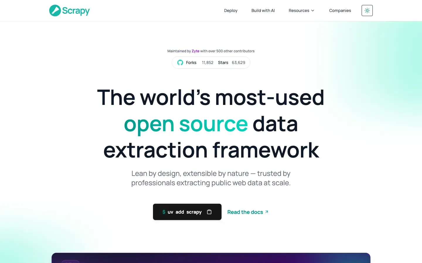
Scrapy
“The world's most-used open source data extraction framework”

Scaphold.io
“EE88 - SÂN CHƠI CÁ CƯỢC TRỰC TUYẾN UY TÍN HÀNG ĐẦU 2026”
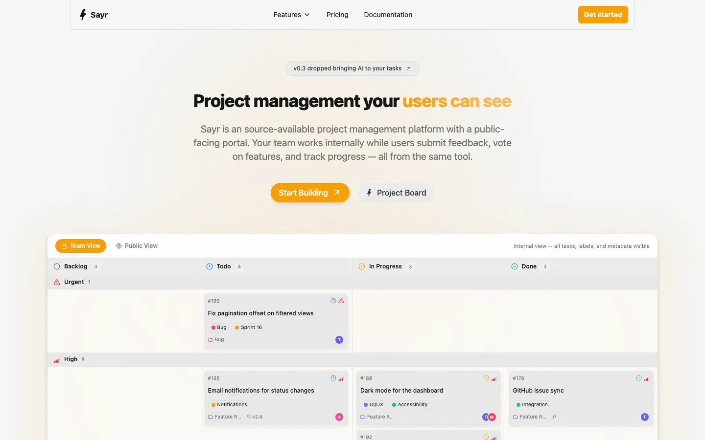
Sayr
“Project management your users can see”
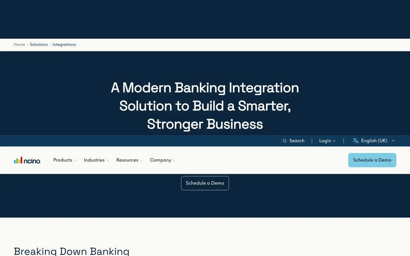
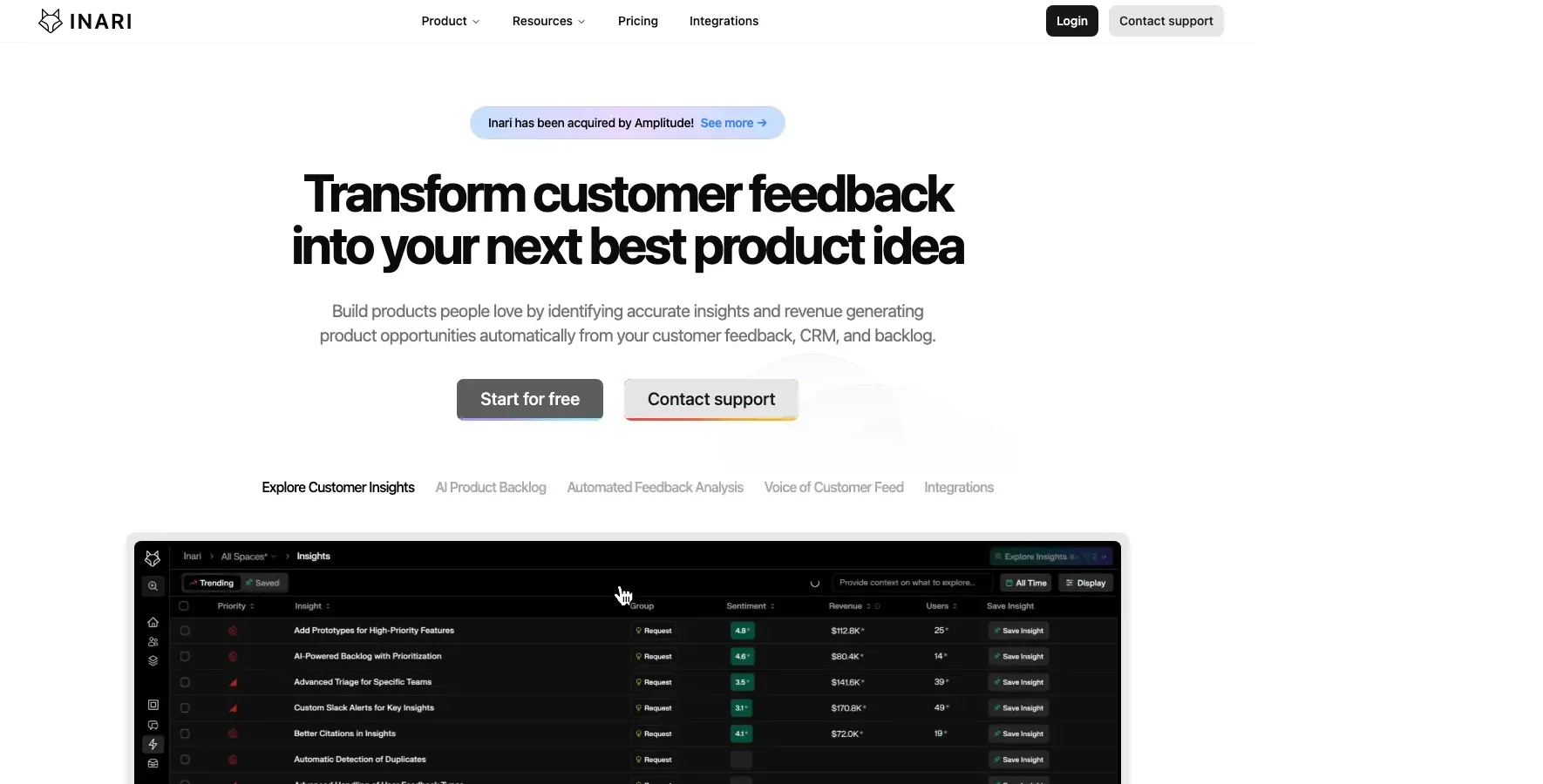
nCino Integration Gateway
“A Modern Banking Integration Solution to Build a Smarter, Stronger Business”
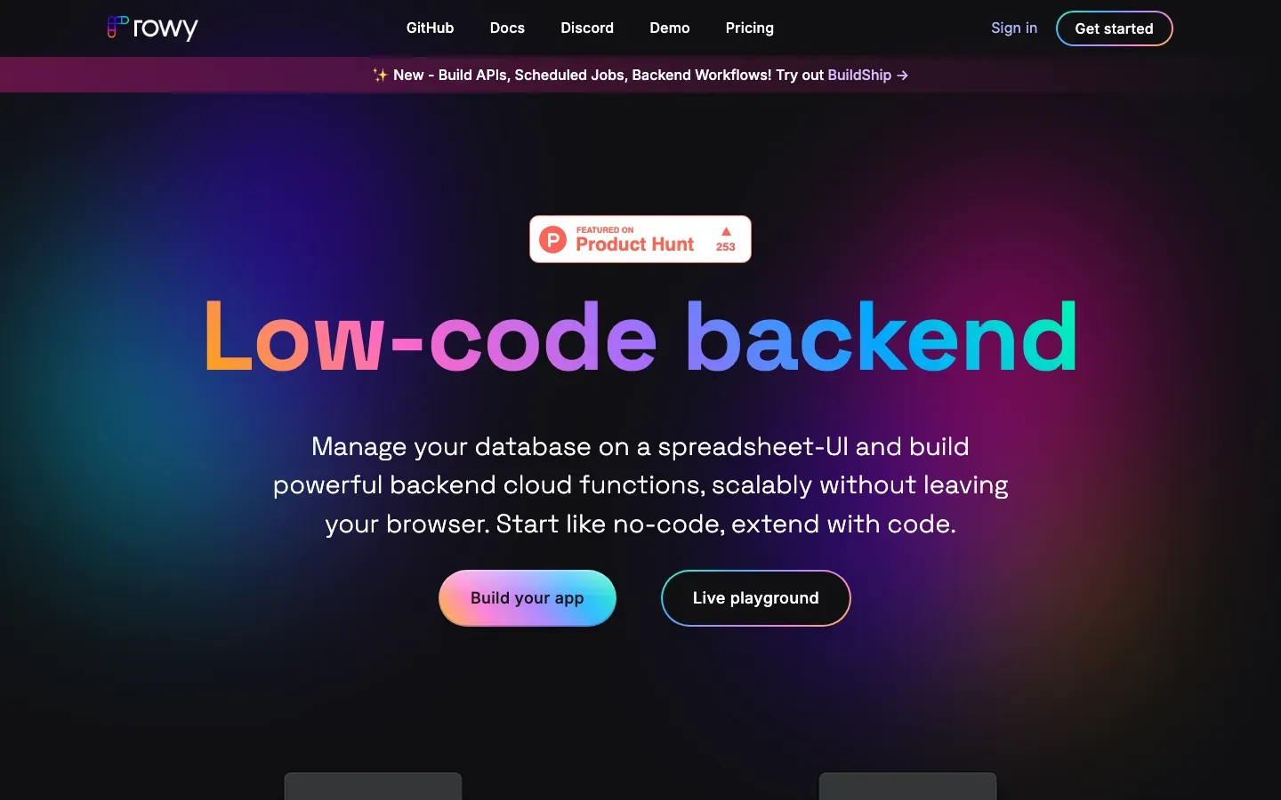
Rowy
“Low-code backend”
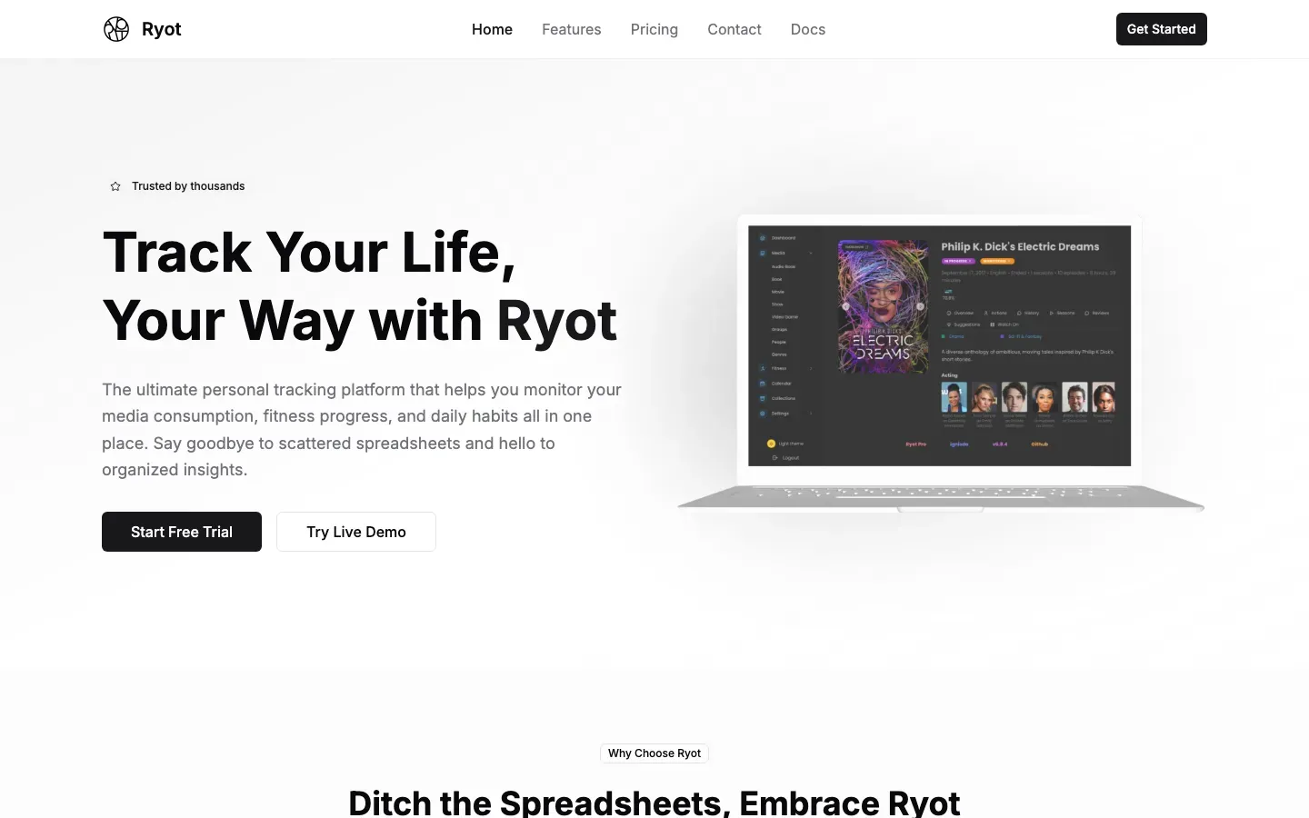
Ryot
“Track Your Life, Your Way with Ryot”
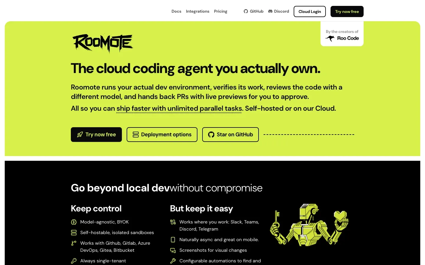
Roomote
“The cloud coding agent you actually own.”
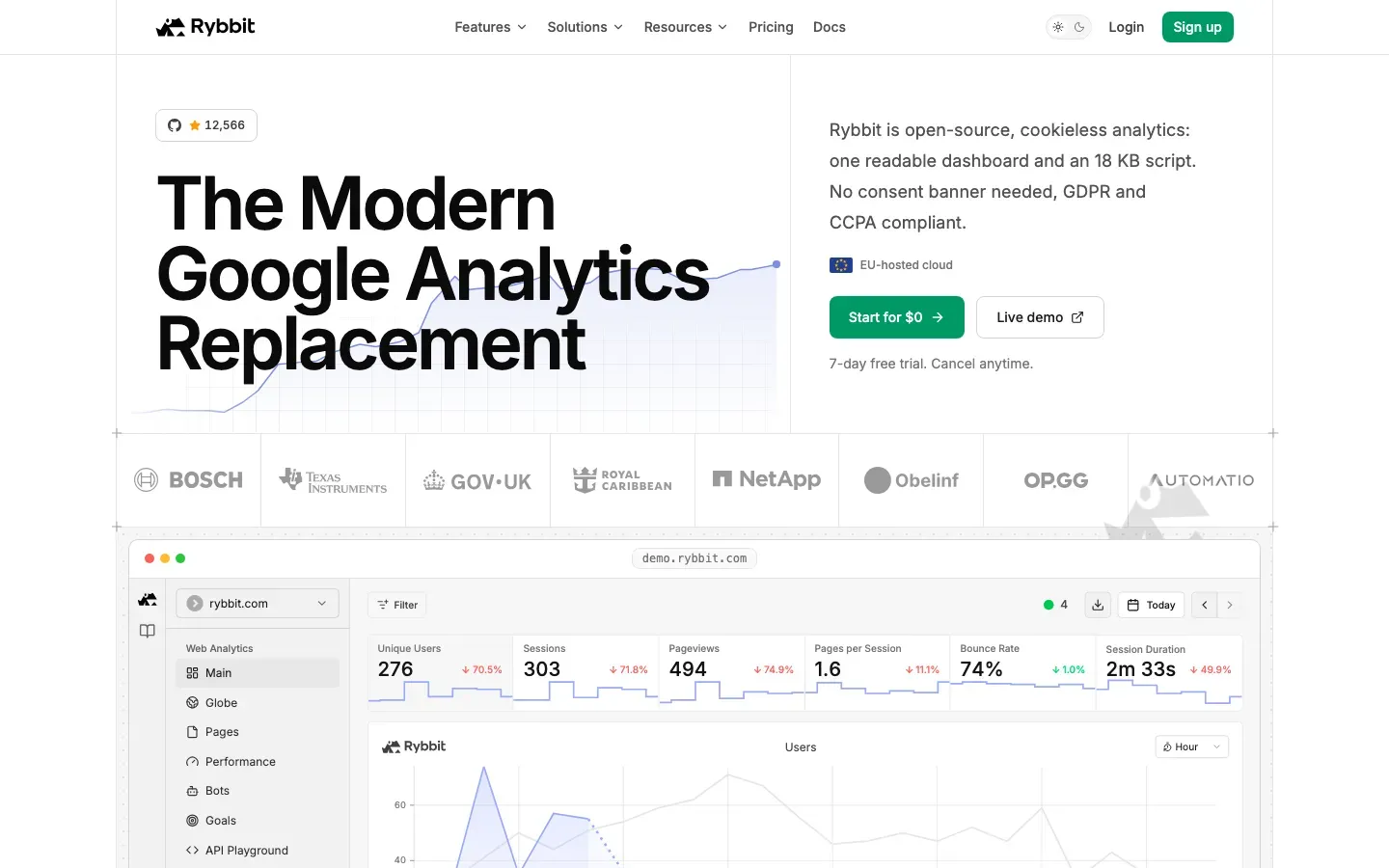
Rybbit
“The Modern Google Analytics Replacement”
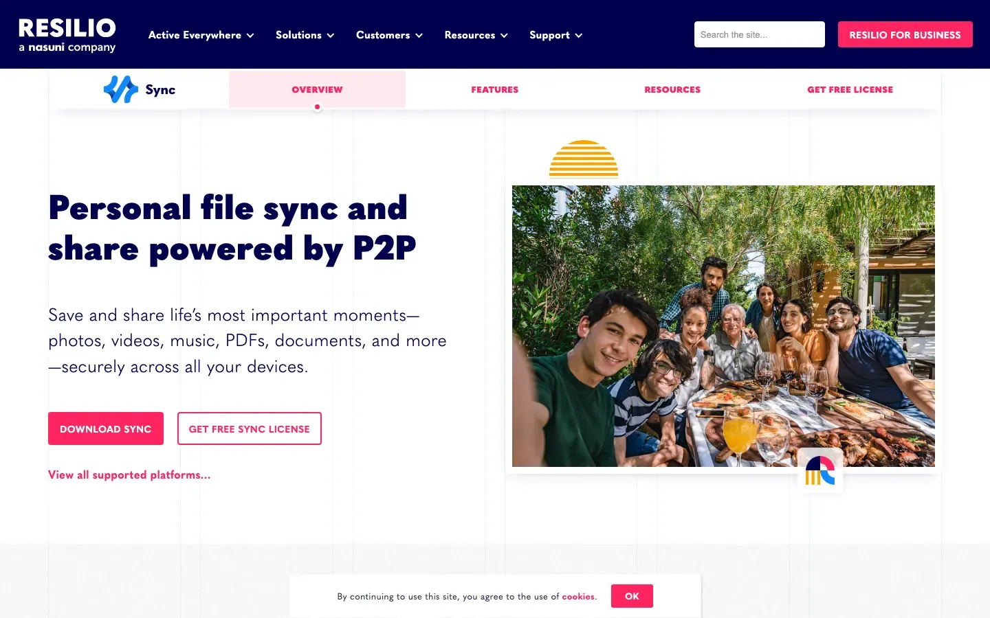
Resilio Sync
“Personal file sync and share powered by P2P”
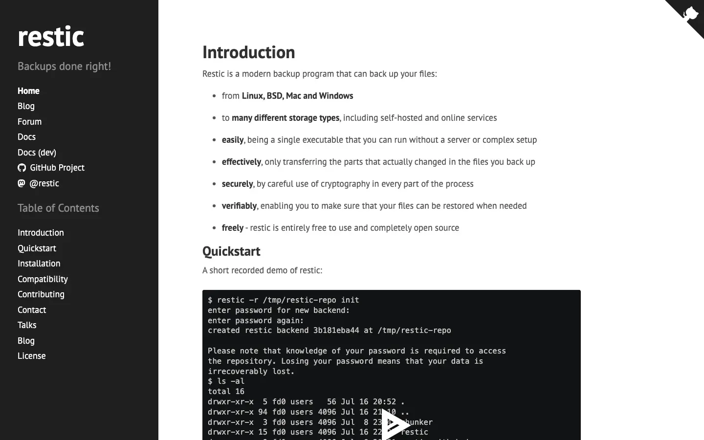
restic
“restic”
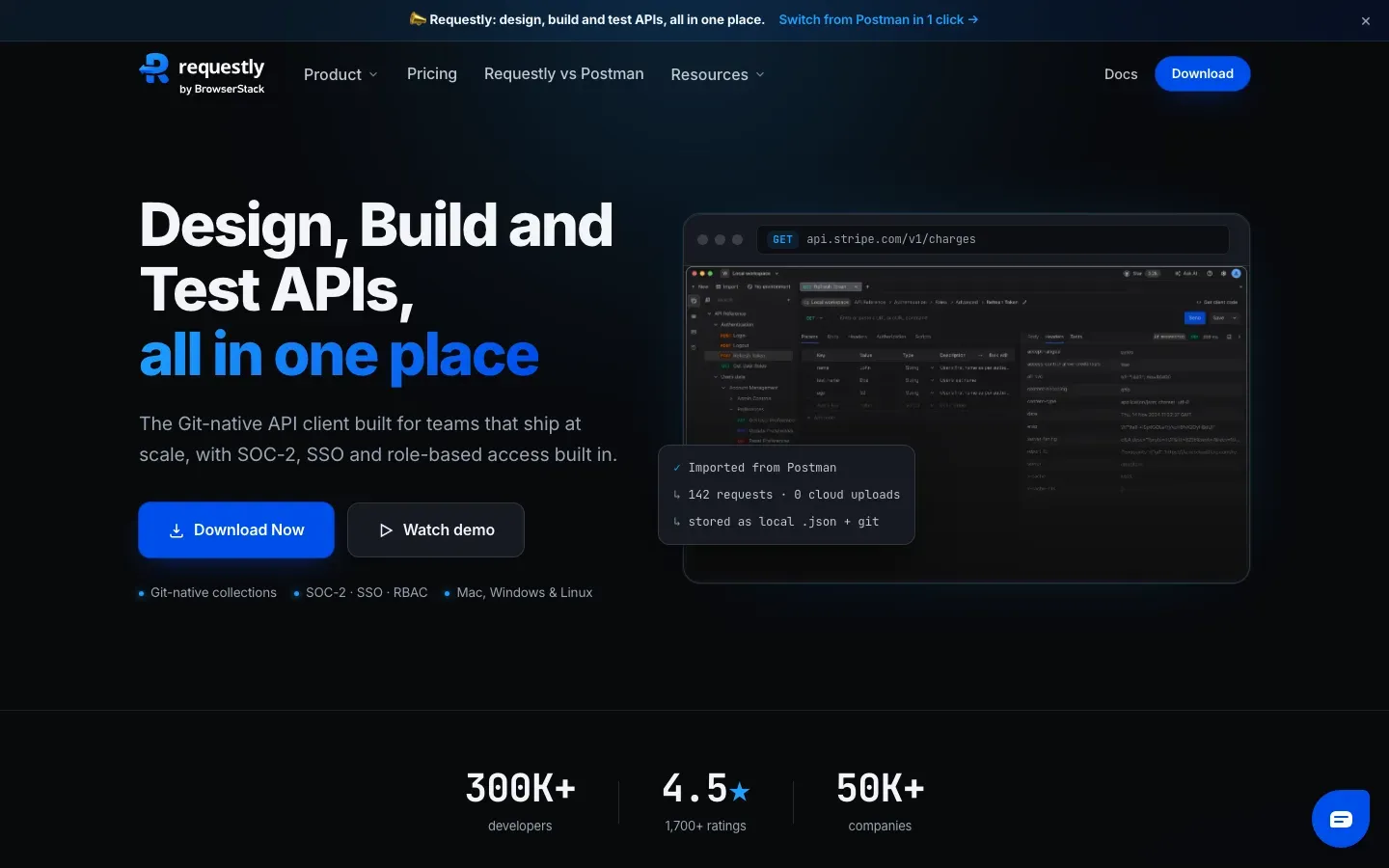
Requestly
“Design, Build and Test APIs, all in one place”
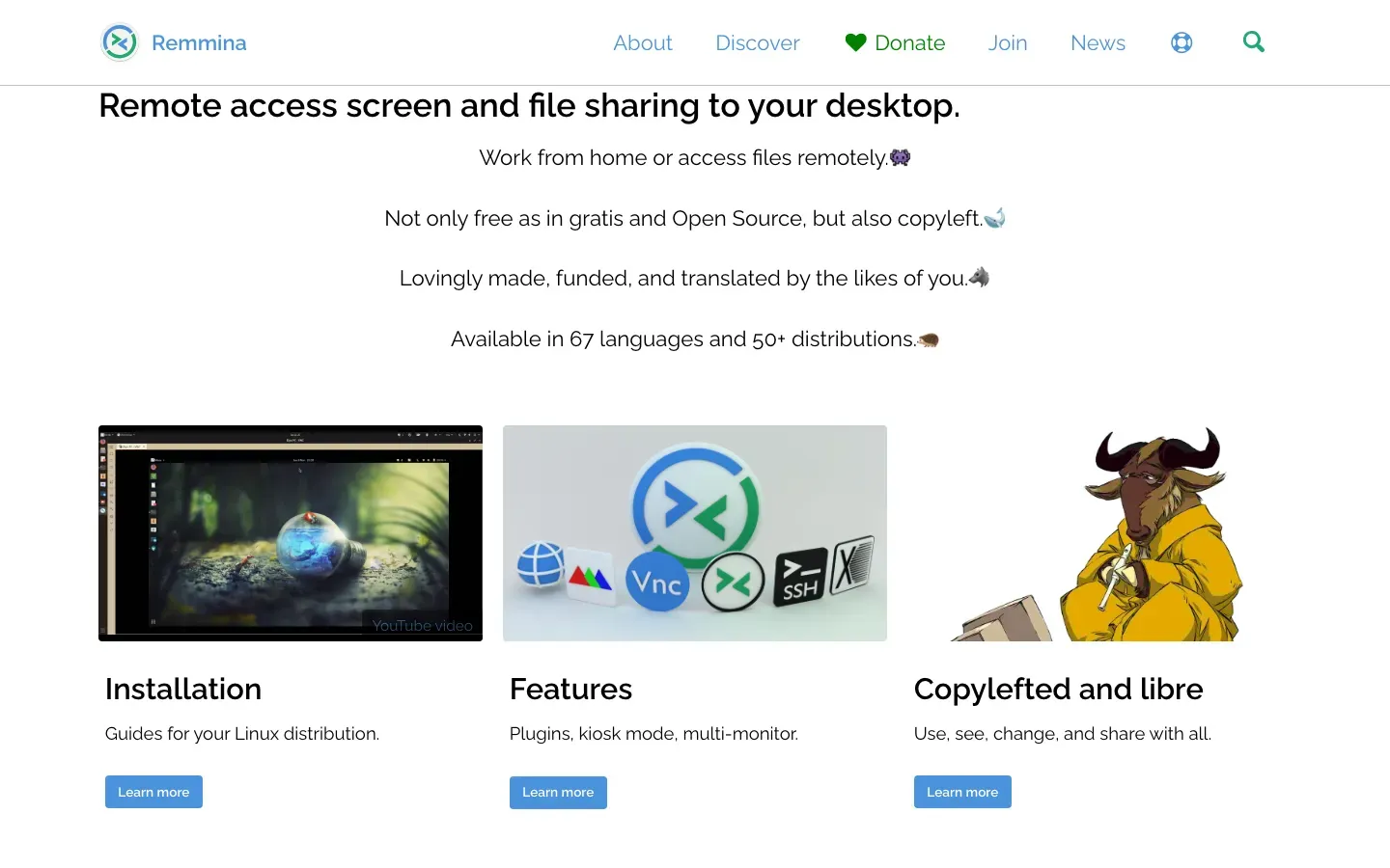
Remmina
“Remote access screen and file sharing to your desktop.”
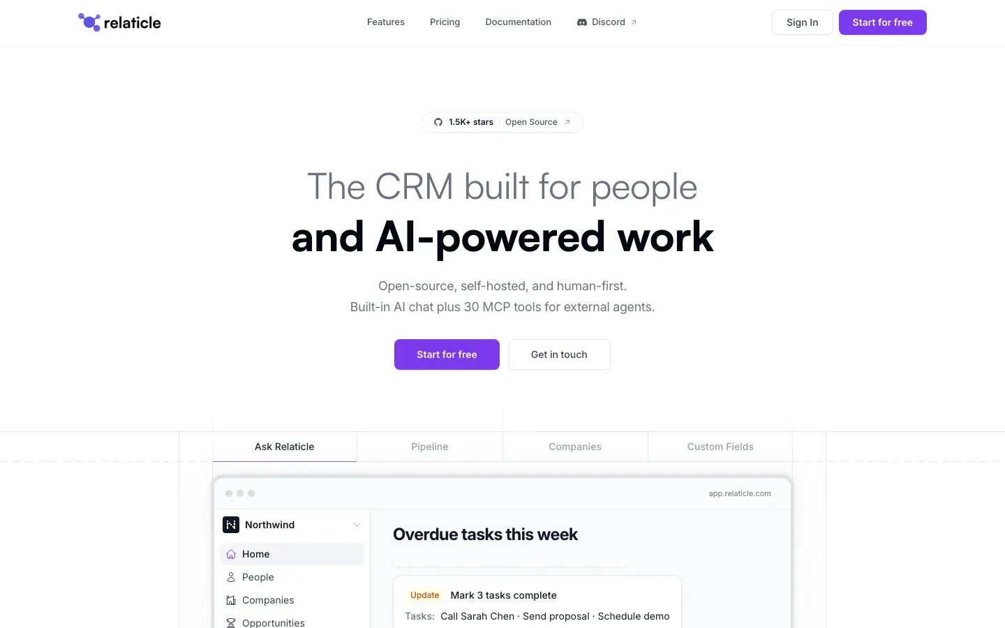
Relaticle
“The CRM built for people and AI-powered work”

Regology
“MODERN COMPLIANCE WITH AGENTIC AI”
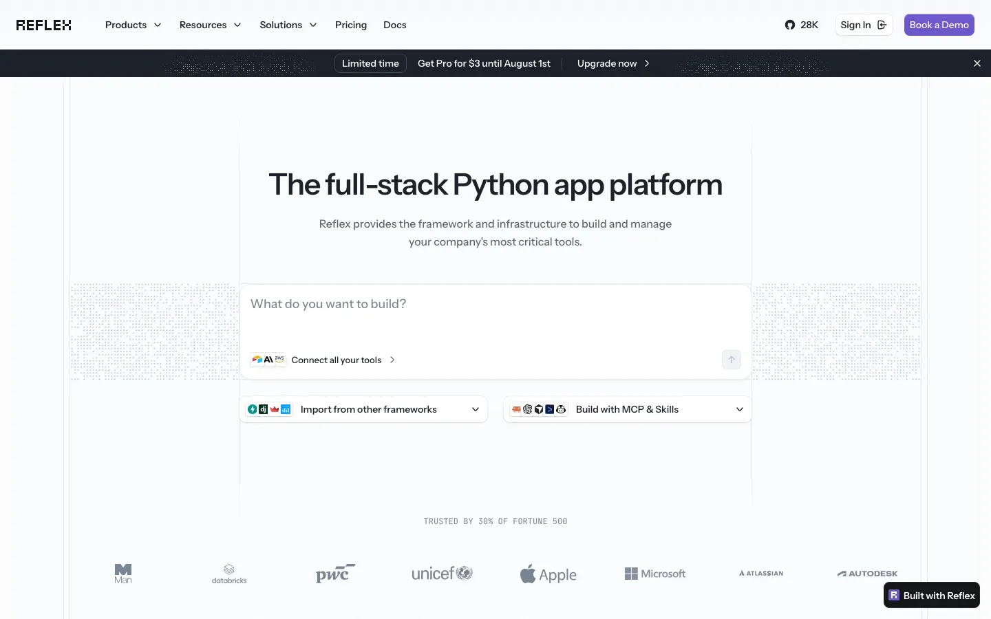
Reflex
“The full-stack Python app platform”
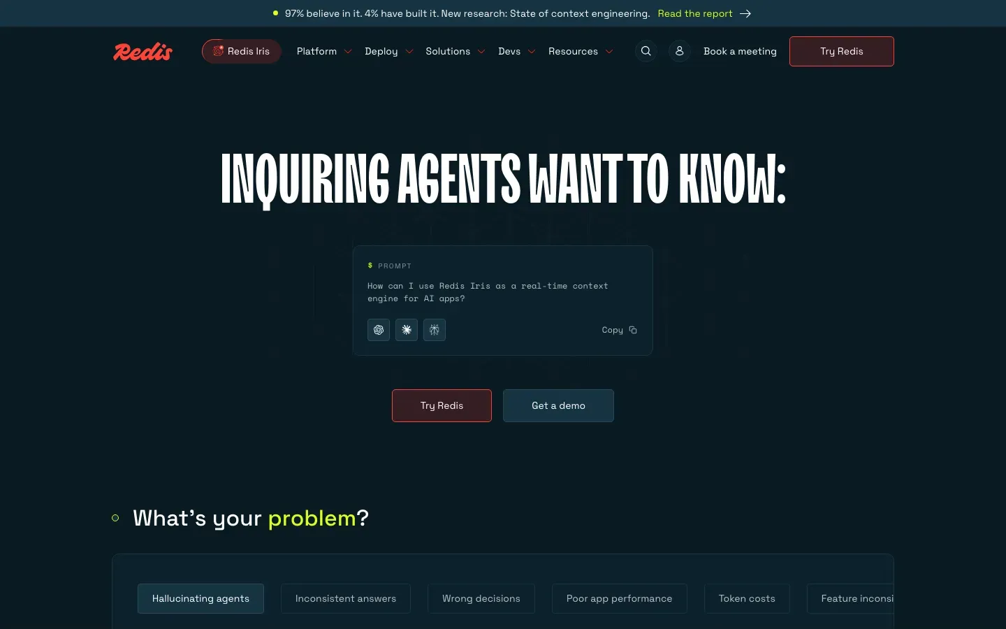
Redis
“INQUIRING AGENTS WANT TO KNOW:”
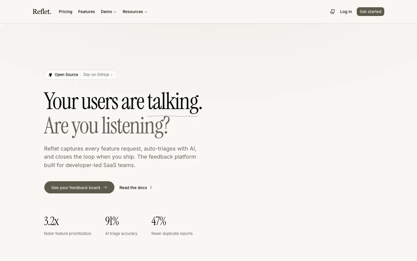
Reflet
“Your users are talking.”
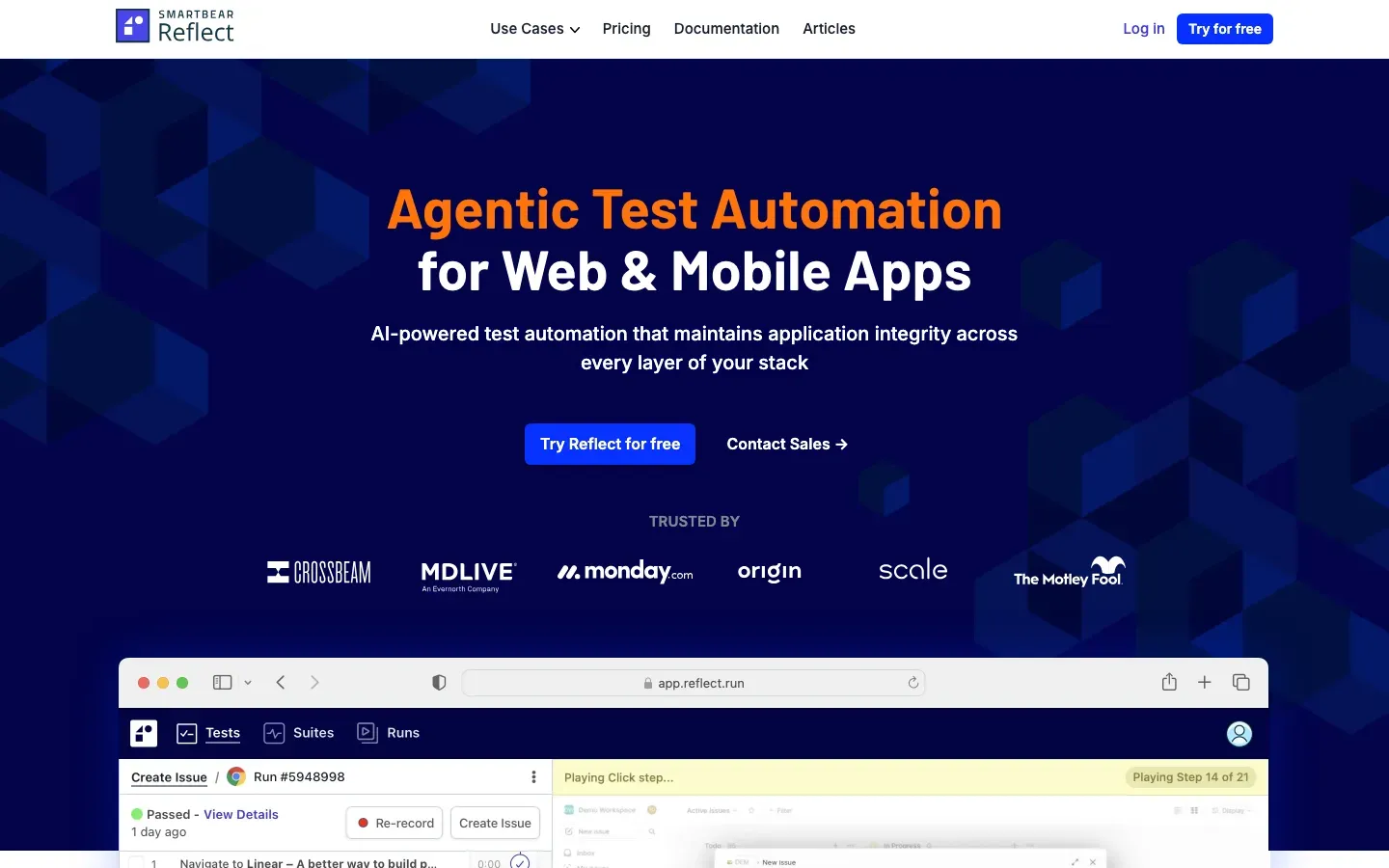
Reflect
“Agentic Test Automation for Web & Mobile Apps”
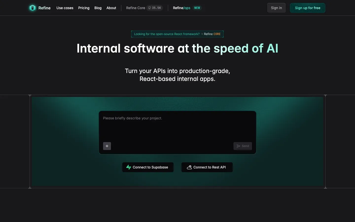
Refine
“Internal software at the speed of AI”
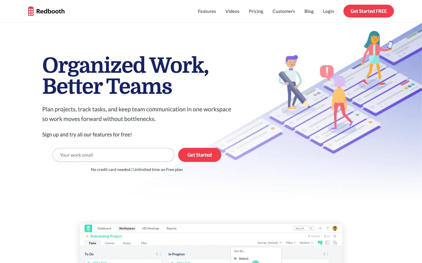
Redbooth
“Organized Work, Better Teams”

LinkedIn Sales Navigator
“Save time. Find leads. Win deals.”
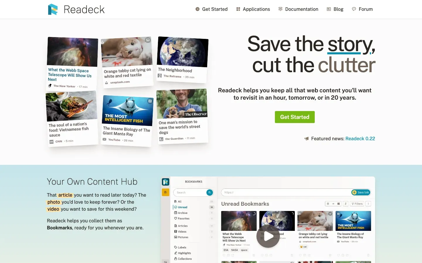
Readeck
“Save the story, cut the clutter”
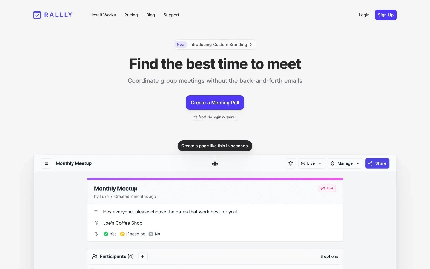
Rallly
“Find the best time to meet”

Quire
“Dream. Plan. Achieve.”

Radmin VPN
“Connect remote computers to one local network”
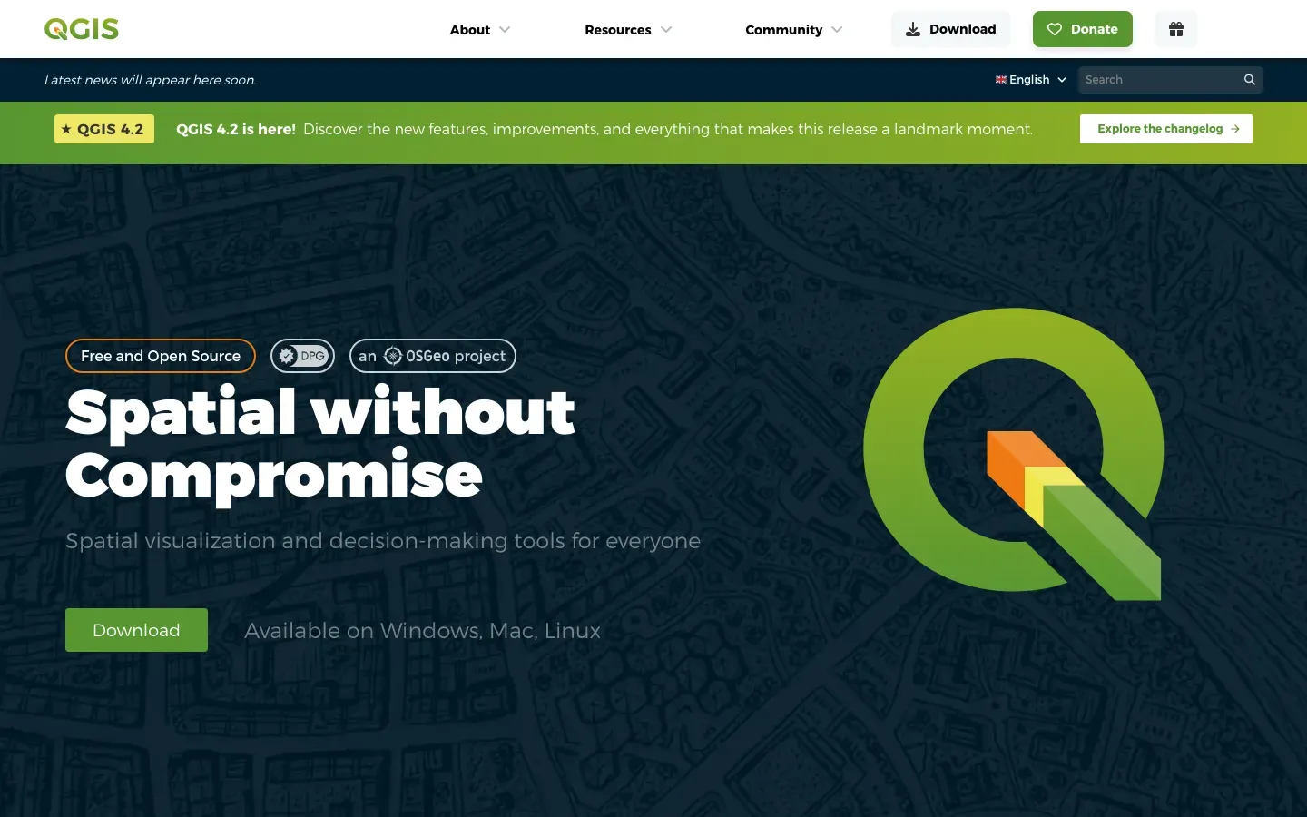
QGIS
“Spatial without Compromise”
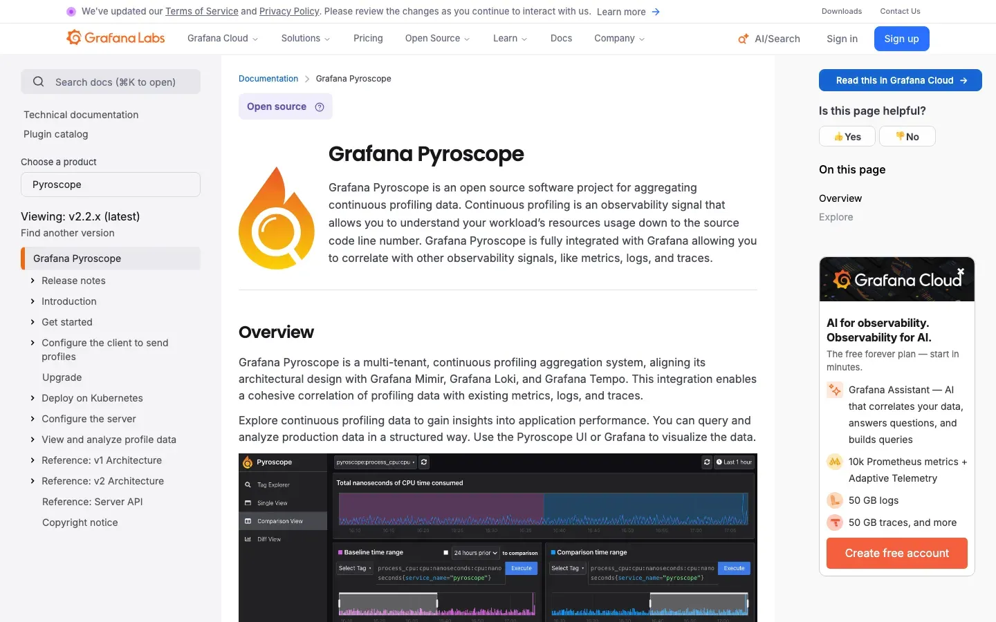
Grafana Pyroscope
“Grafana Pyroscope”
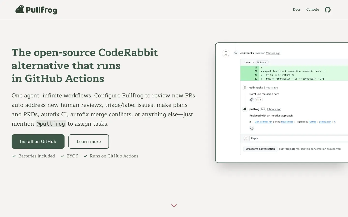
Pullfrog
“The open-source CodeRabbit alternative that runs in GitHub Actions”
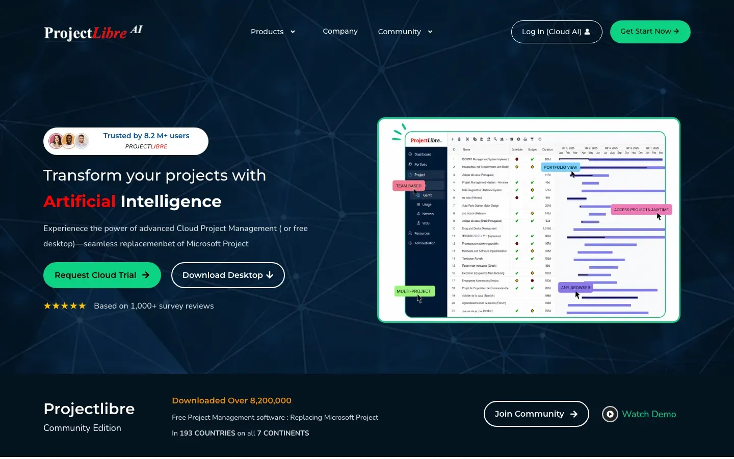
ProjectLibre
“Transform your projects with Artificial Intelligence”
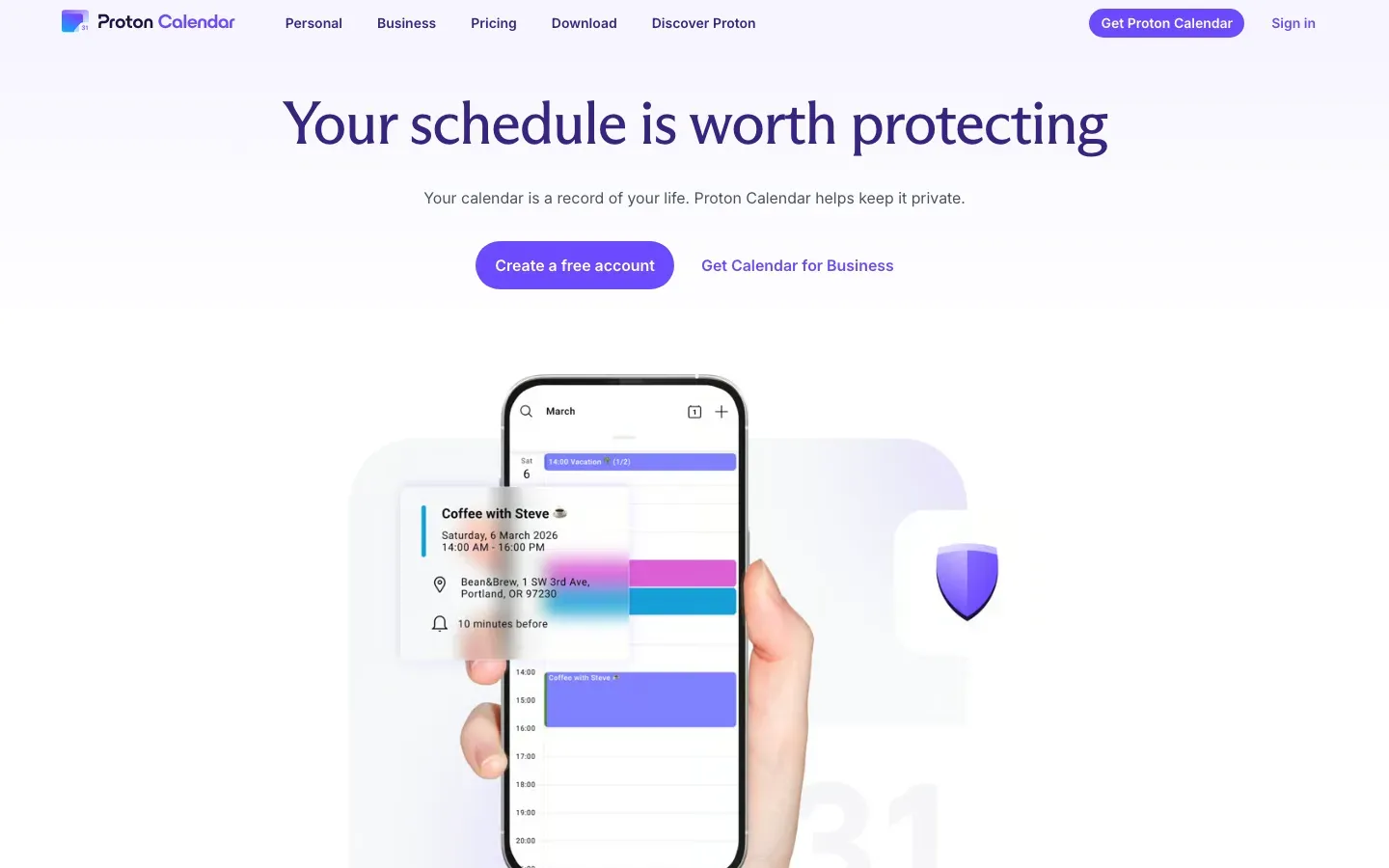
Proton Calendar
“Your schedule is worth protecting”
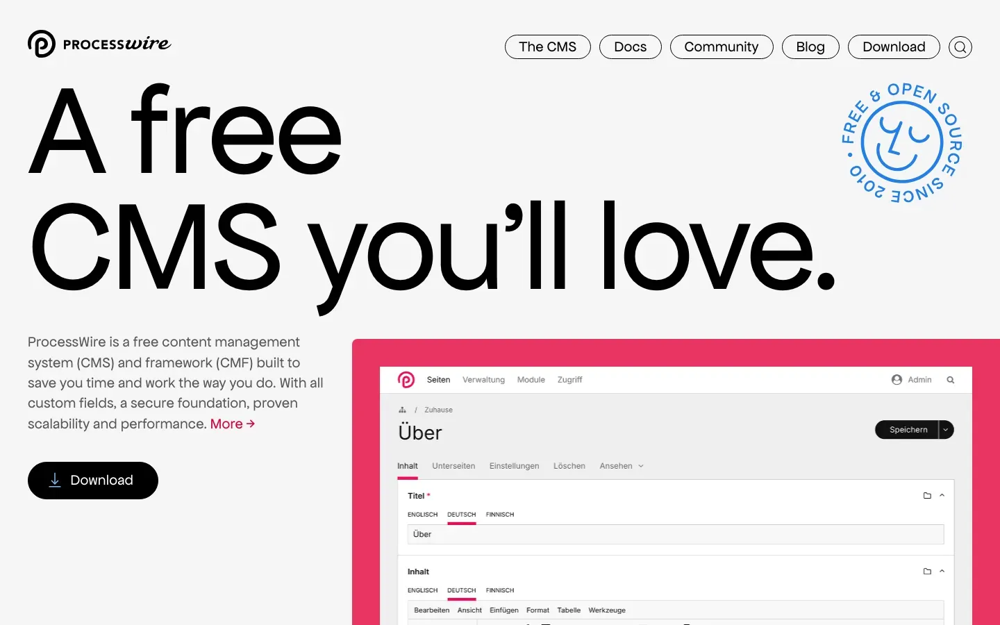
ProcessWire
“A free CMS you'll love.”
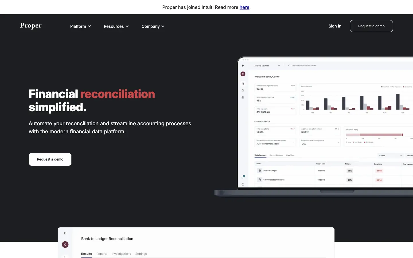
Proper
“Financial reconciliation simplified.”
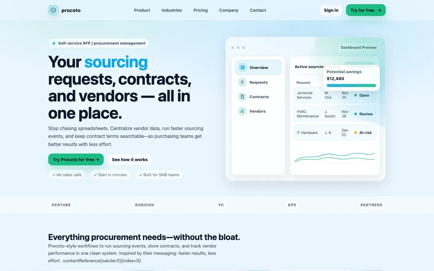
Procoto
“Your sourcing requests, contracts, and vendors — all in one place.”
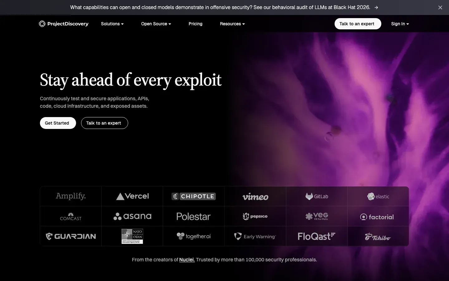
ProjectDiscovery Neo
“Stay ahead of every exploit”
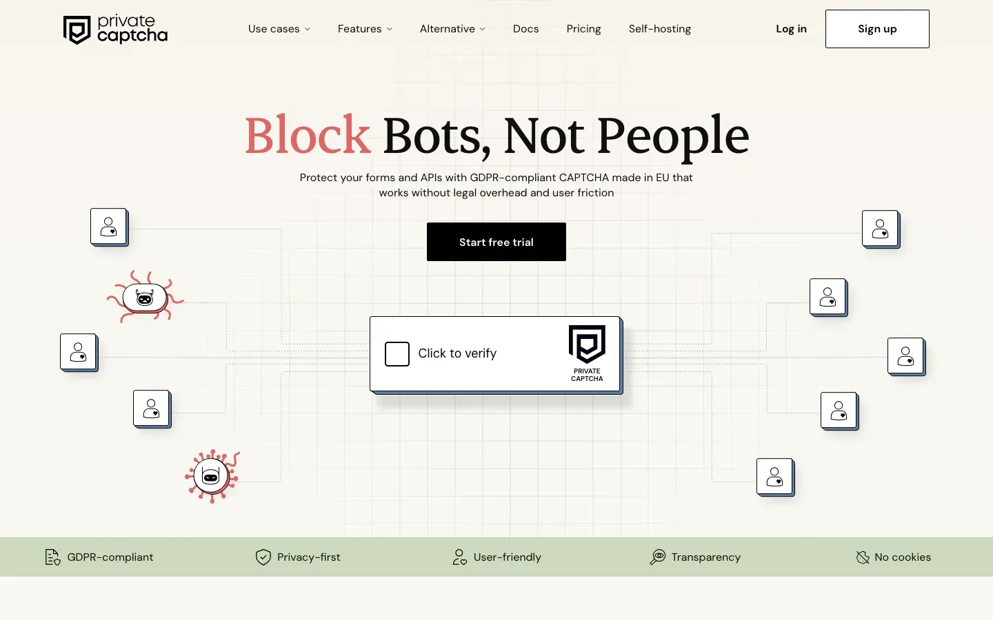
Private Captcha
“Block Bots, Not People”
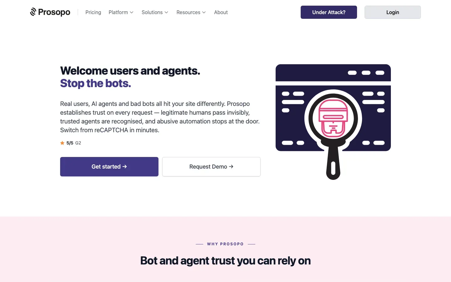
Procaptcha
“Welcome users and agents.”
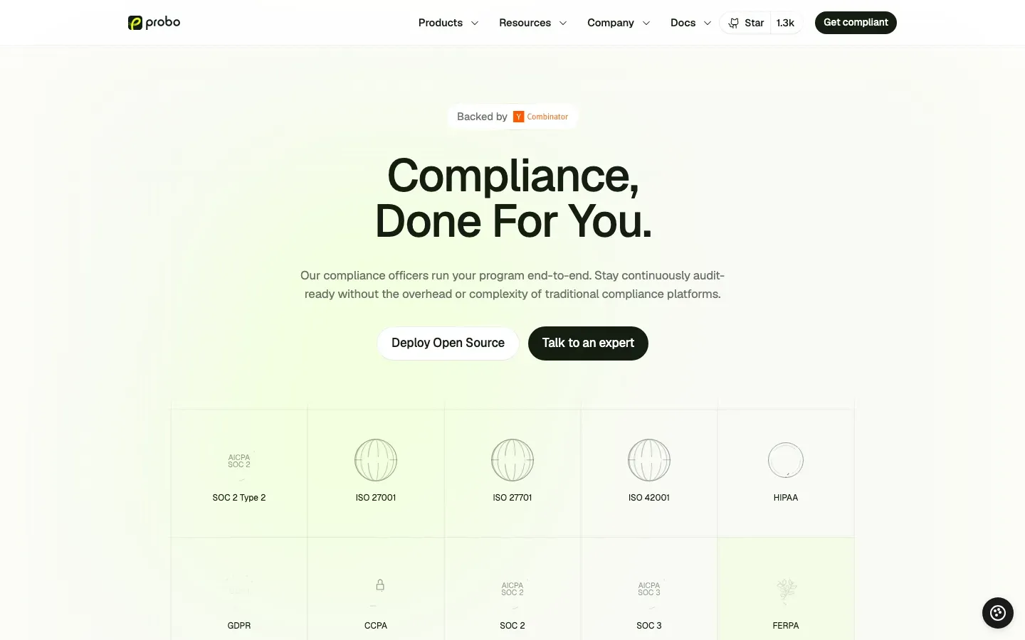
Probo
“Compliance, Done For You.”
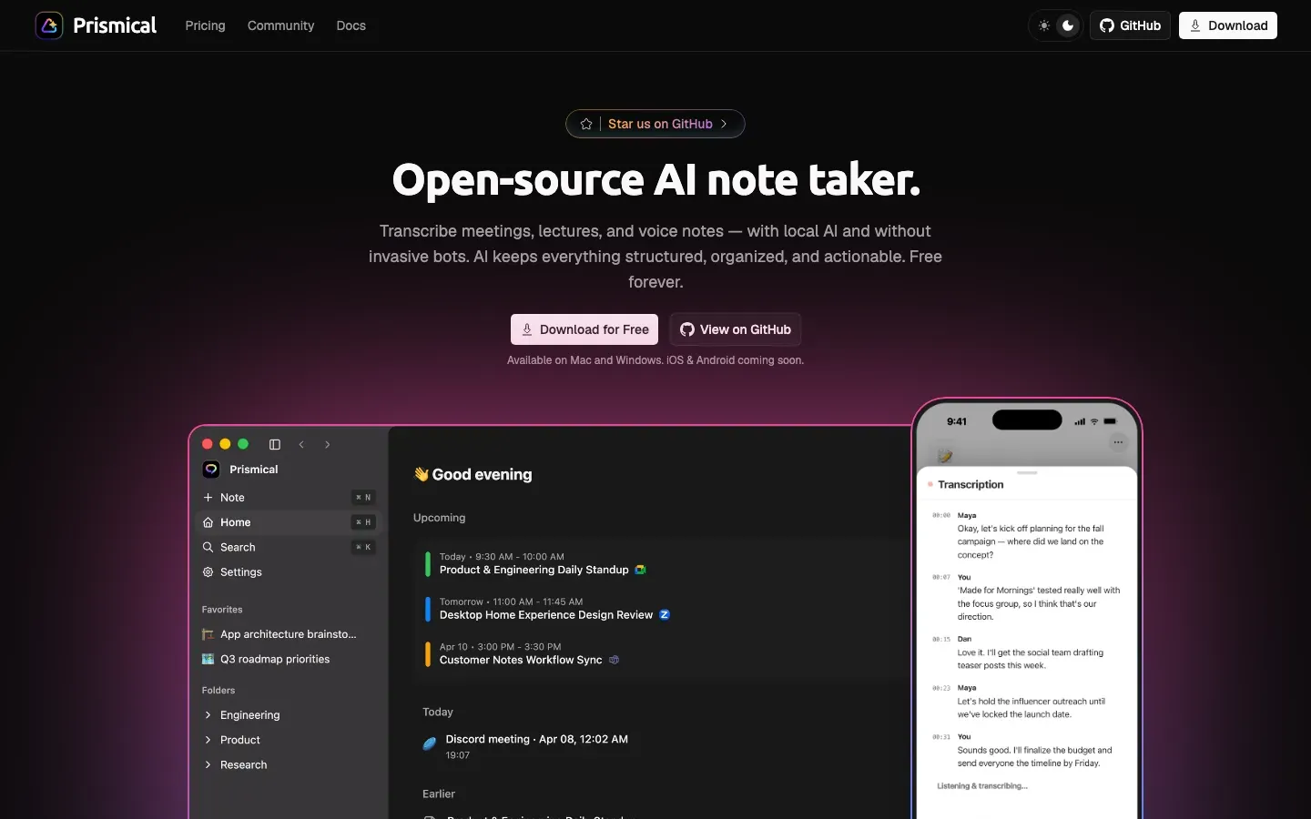
Prismical
“Open-source AI note taker.”
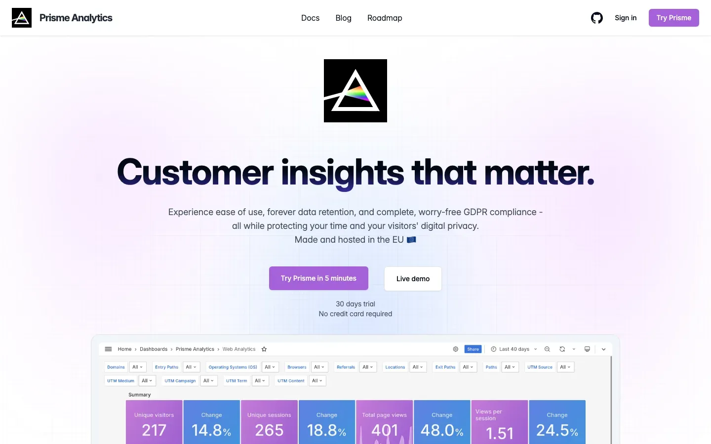
Prisme Analytics
“Customer insights that matter.”
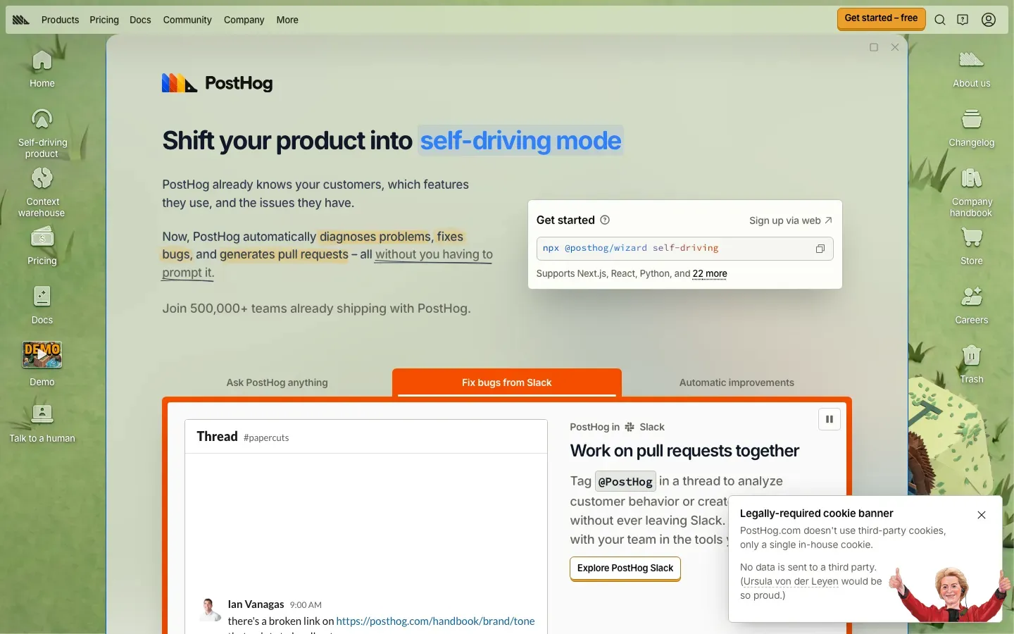
PostHog
“Shift your product into self-driving mode”
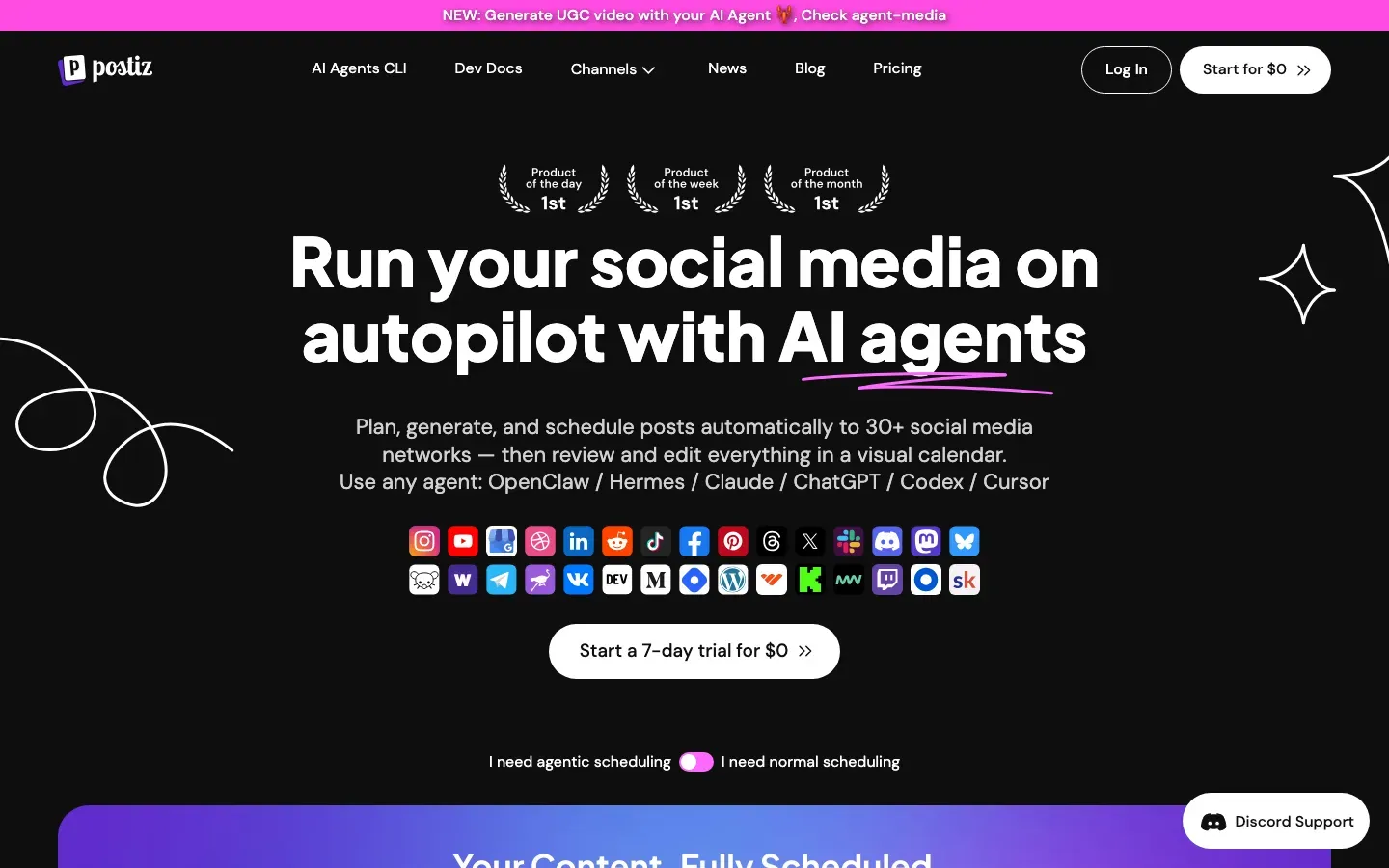
Postiz
“Run your social media on autopilot with AI agents”
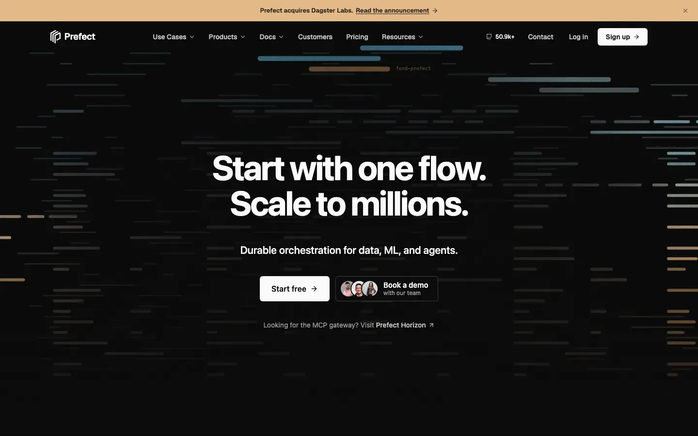
Prefect
“Start with one flow. Scale to millions.”
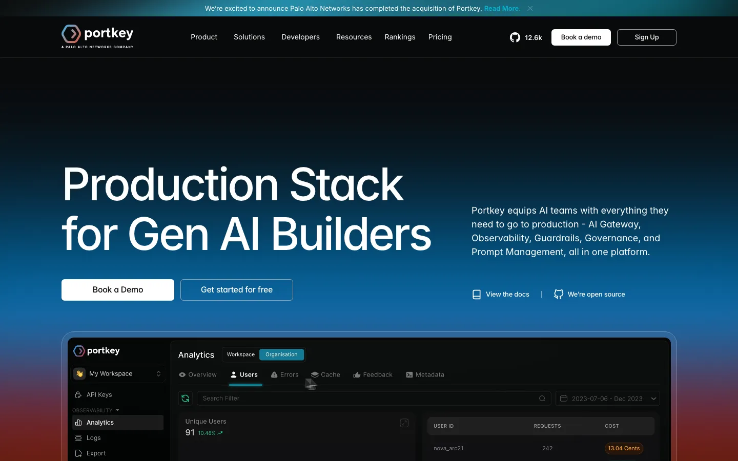
Portkey
“Production Stack for Gen AI Builders”
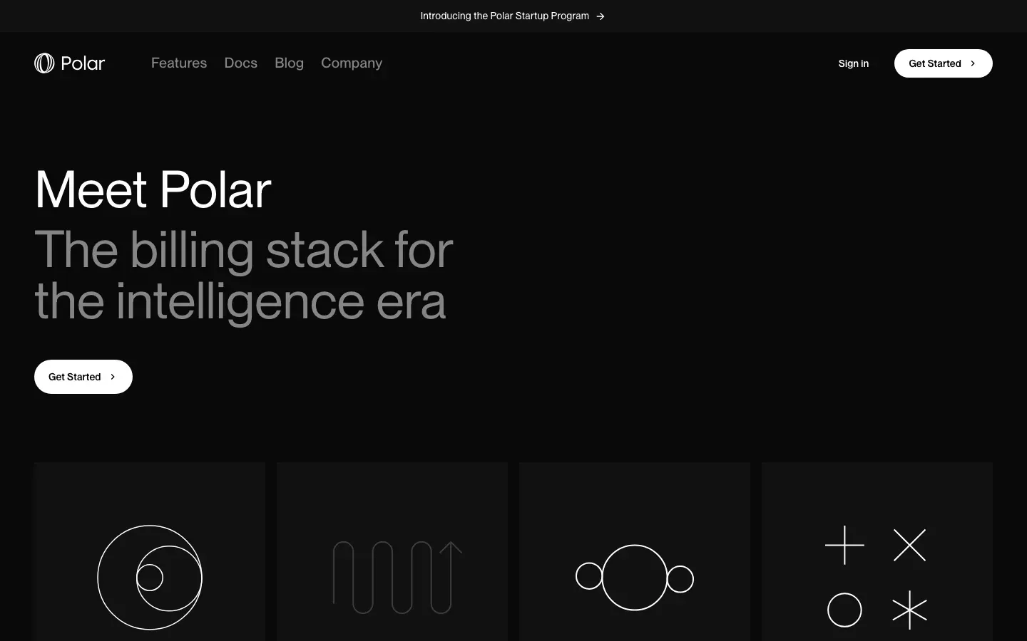
Polar
“Meet Polar”
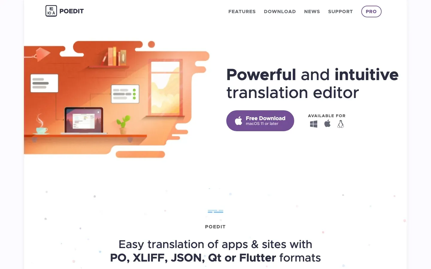
Poedit
“Powerful and intuitive translation editor”

Plausible Analytics
“Easy to use and privacy-friendly Google Analytics alternative”
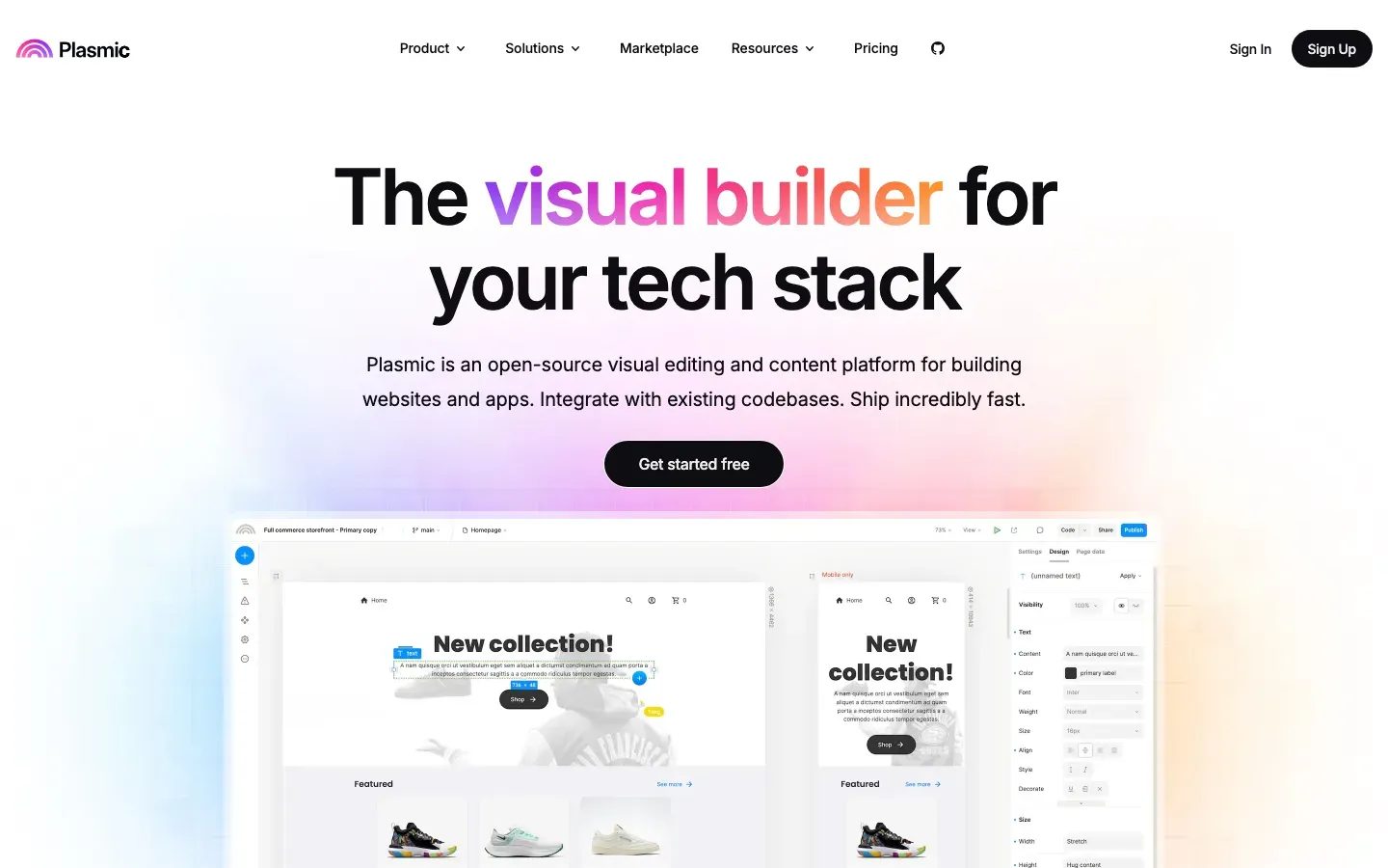
Plasmic
“The visual builder for your tech stack”
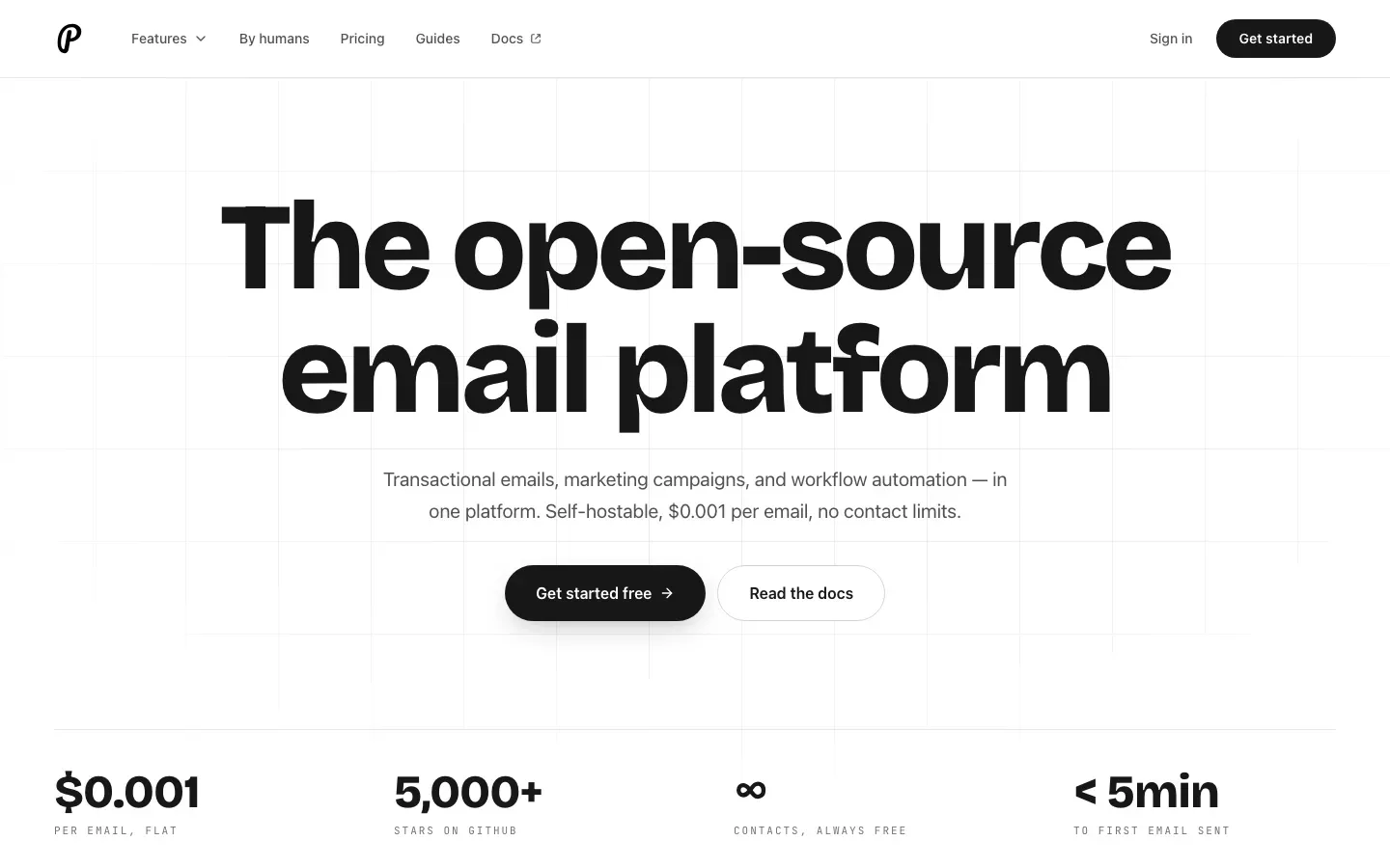
Plunk
“The open-source email platform”
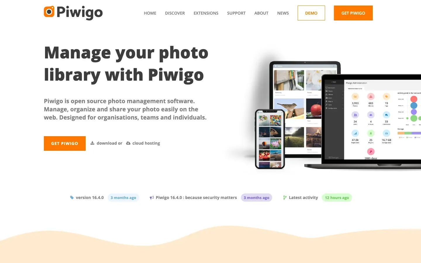
Piwigo
“Manage your photo library with Piwigo”
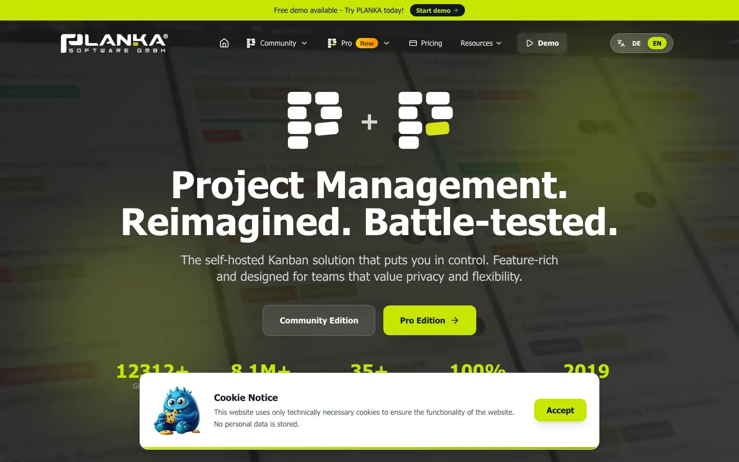
PLANKA
“Project Management. Reimagined. Battle-tested.”
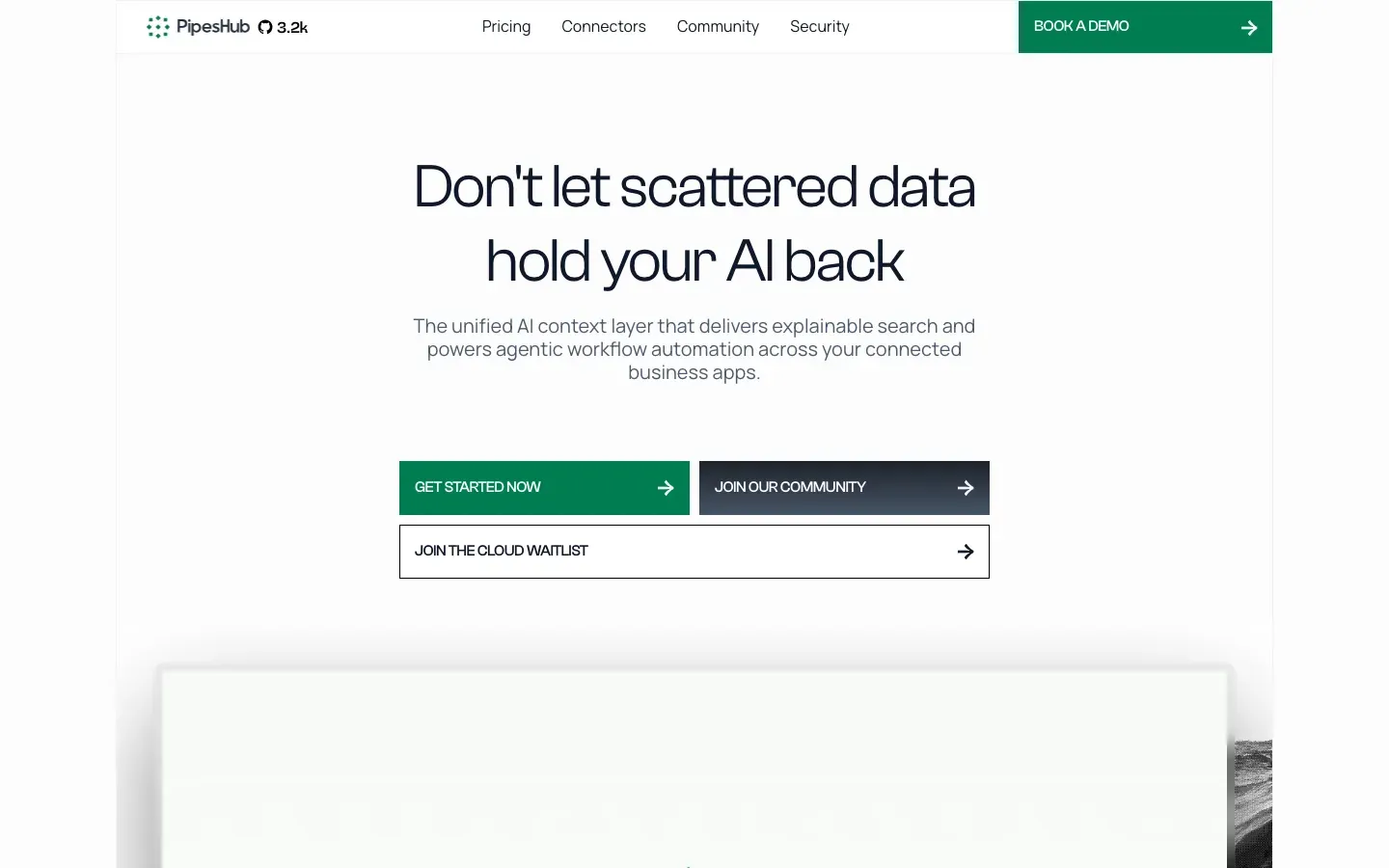
PipesHub
“Don't let scattered data hold your AI back”
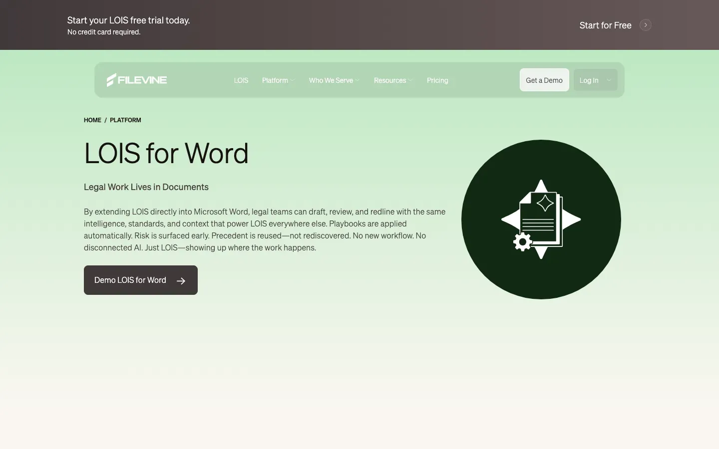
LOIS for Word
“LOIS for Word”
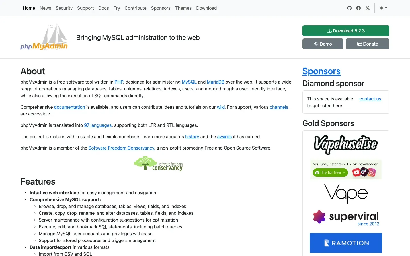
phpMyAdmin
“Bringing MySQL administration to the web”
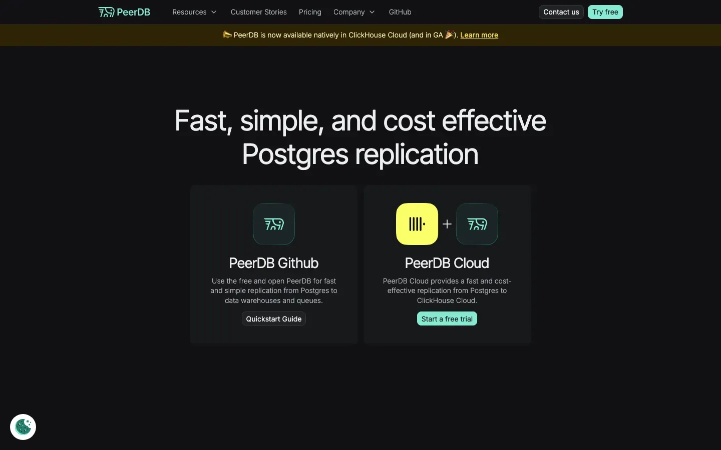
PeerDB
“Fast, simple, and cost effective Postgres replication”
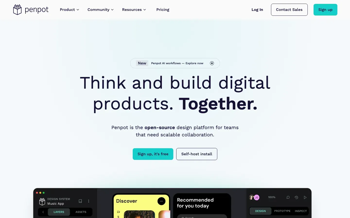
Penpot
“Think and build digital products. Together.”
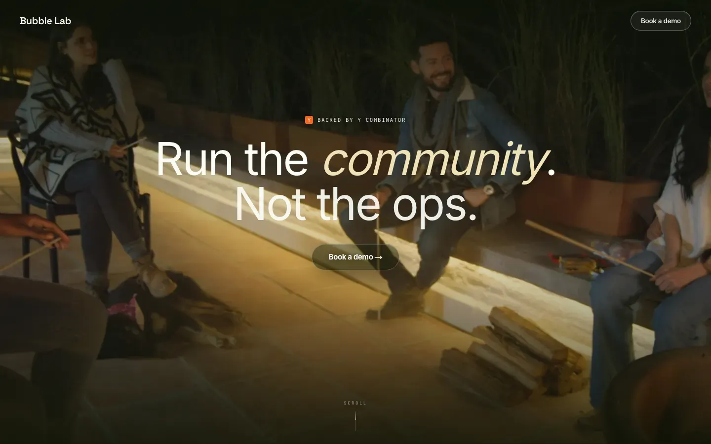
Bubble Lab
“Run the community. Not the ops.”
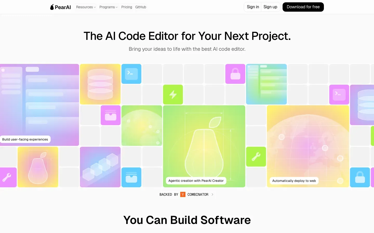
PearAI
“The AI Code Editor for Your Next Project.”
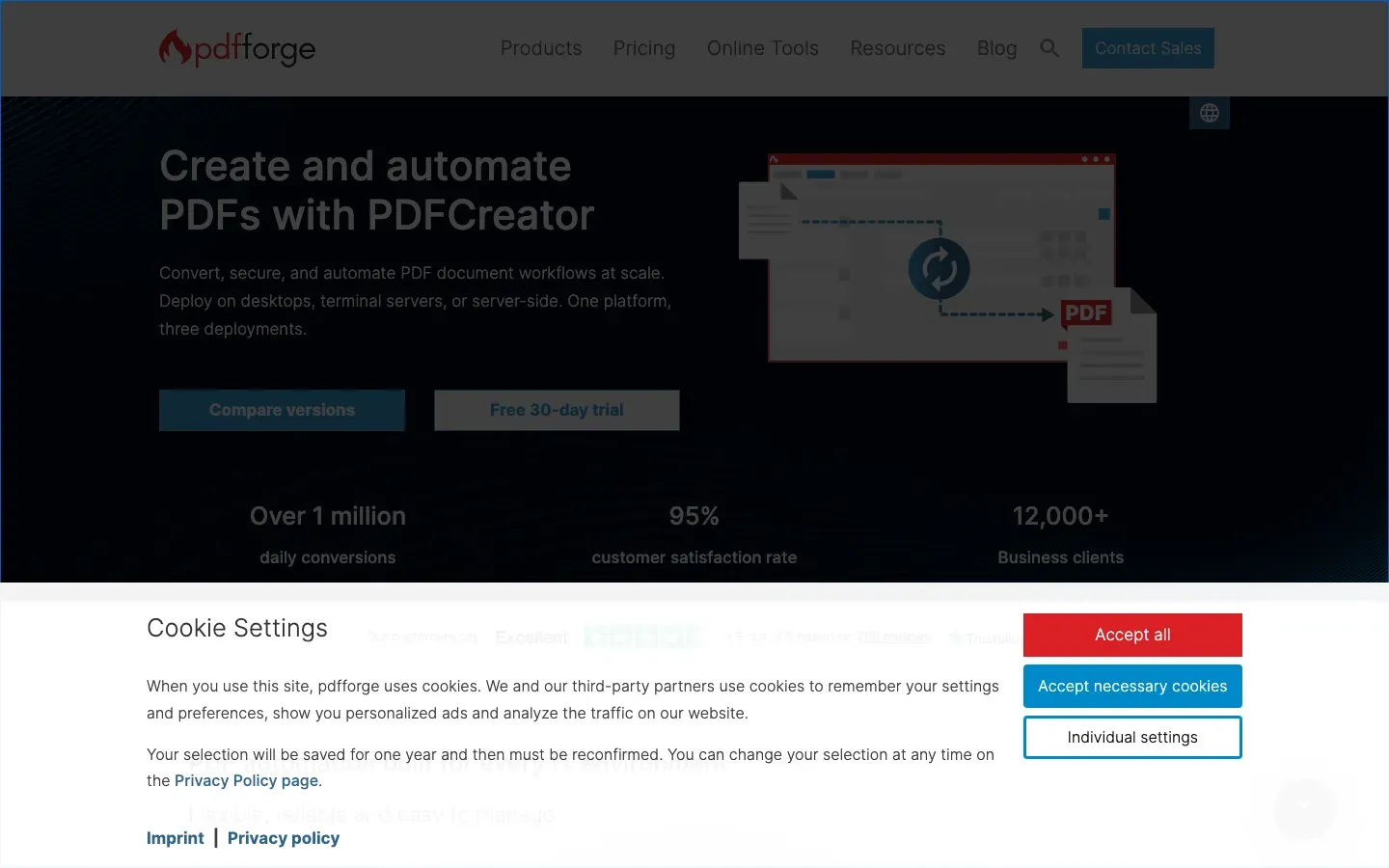
PDFCreator
“Create and automate PDFs with PDFCreator”

Patch My PC
“Automate Third-Party Patch Management in Intune & Microsoft ConfigMgr”
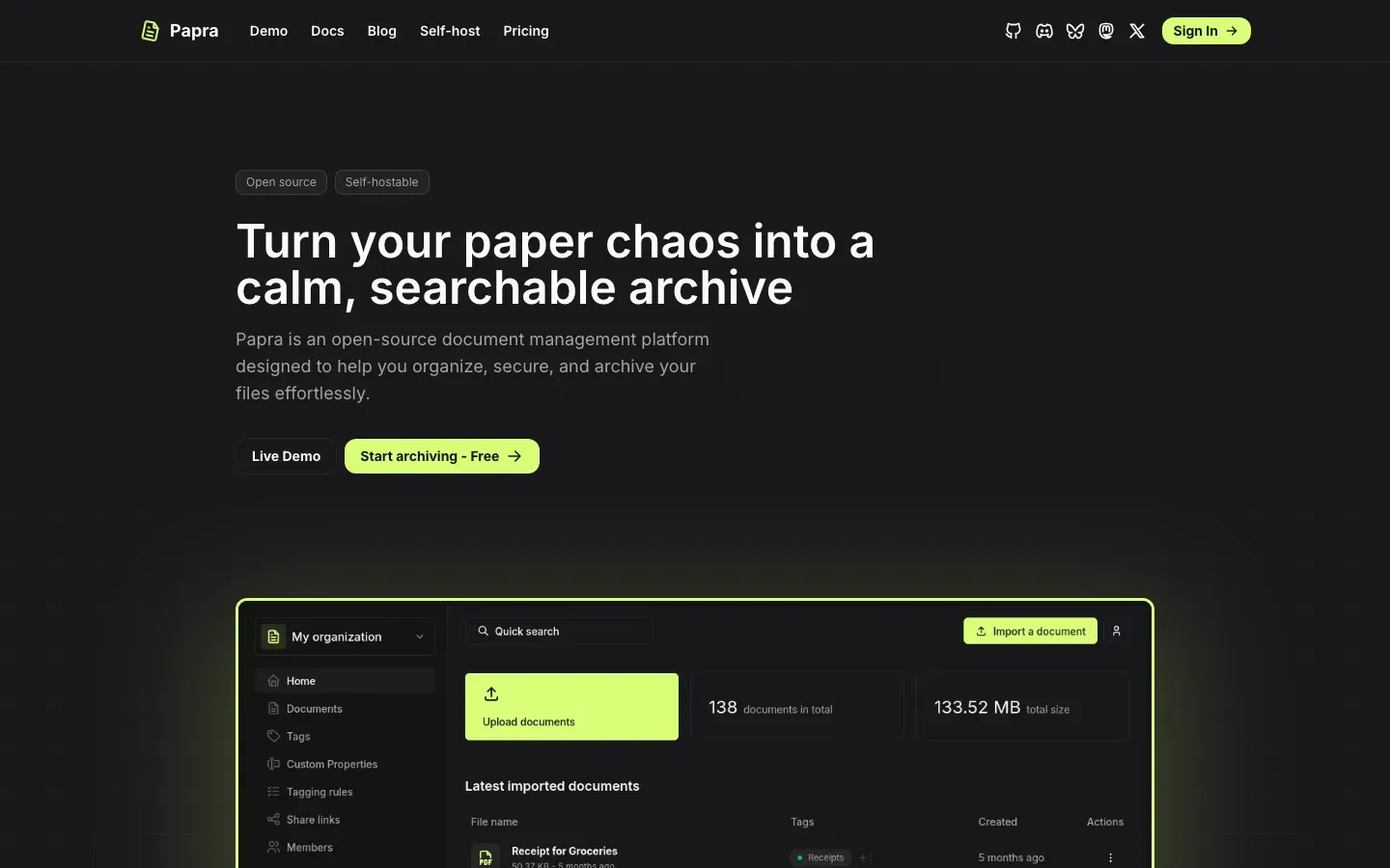
Papra
“Turn your paper chaos into a calm, searchable archive”

Papermark
“Close Deals Faster.”
Pagecord
“A blog you'll actually keep updated”
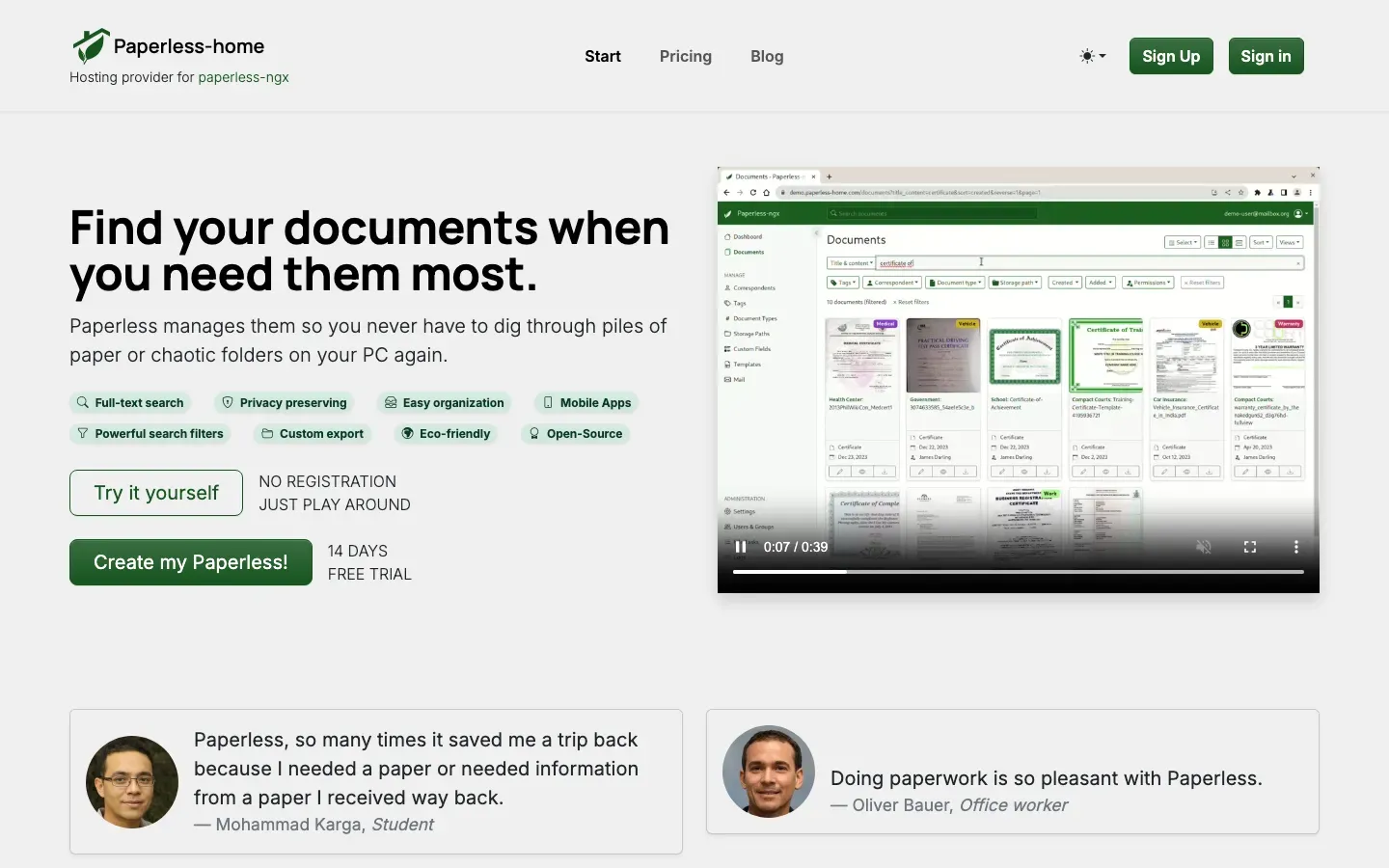
Paperless-home
“Find your documents when you need them most.”
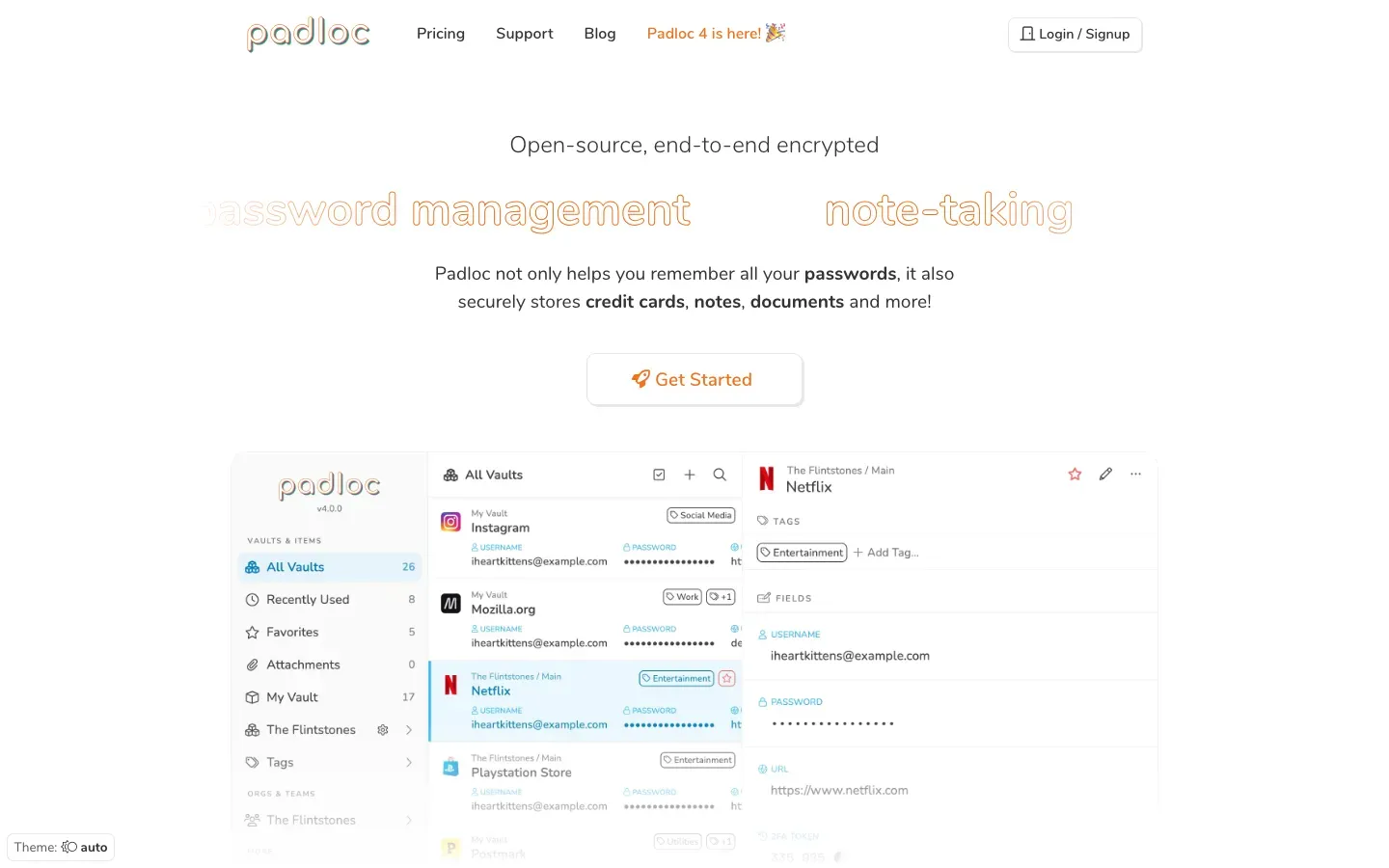
Padloc
“Open-source, end-to-end encrypted”
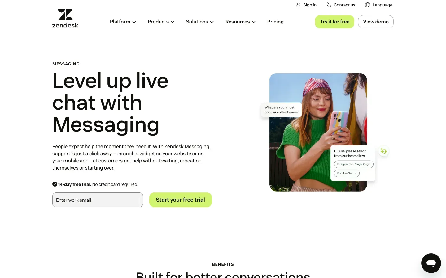
Zendesk
“Level up live chat with Messaging”
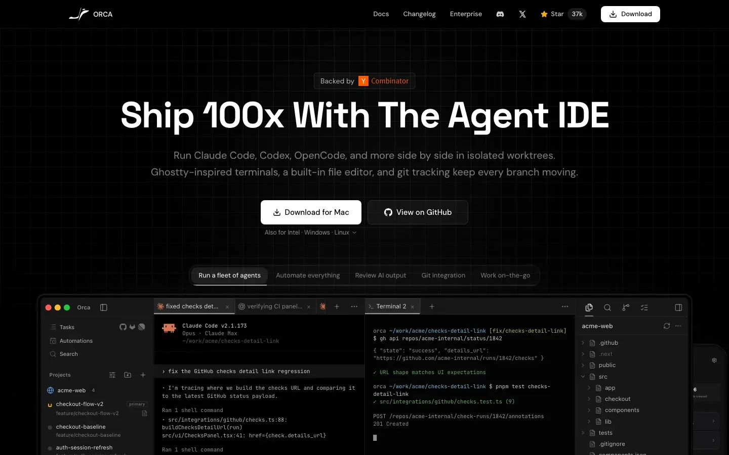
Orca
“Ship 100x With The Agent IDE”
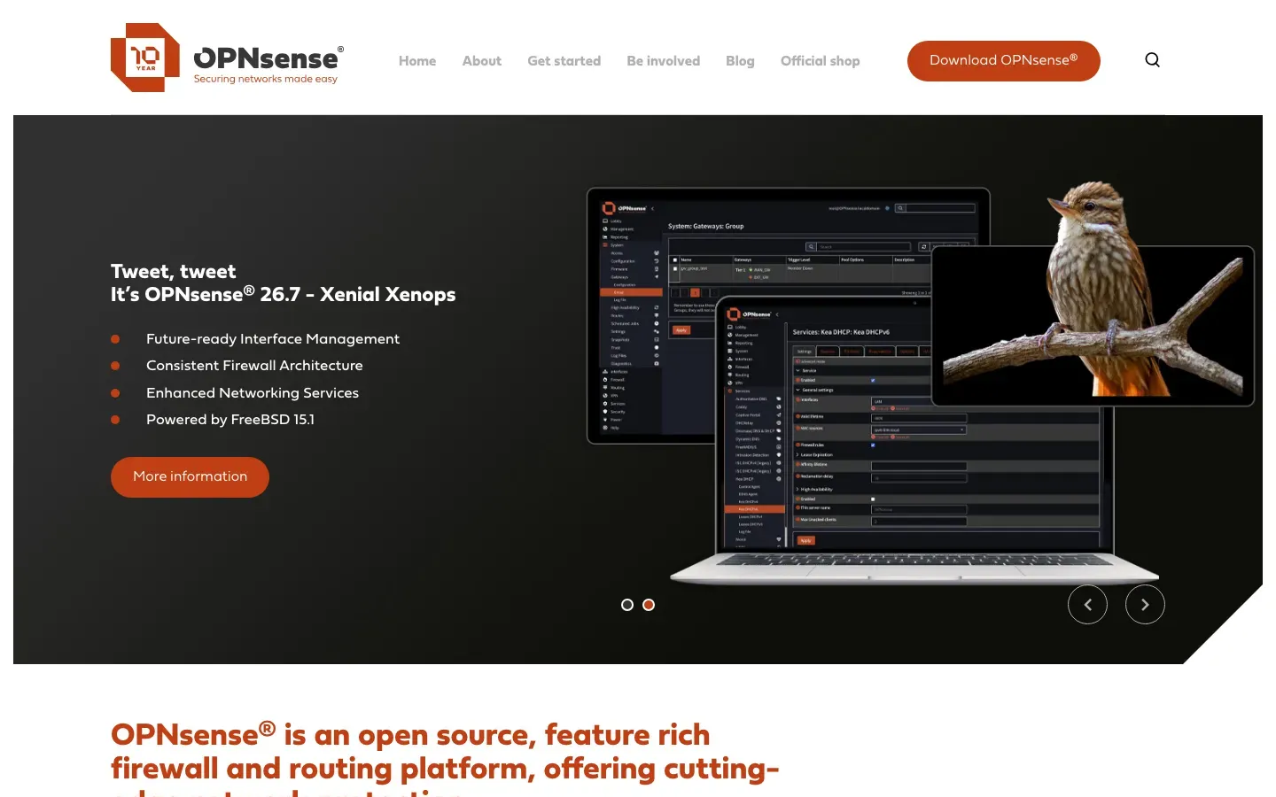
OPNsense
“OPNsense® is an open source, feature rich firewall and routing platform, offering cutting-edge network protection.”
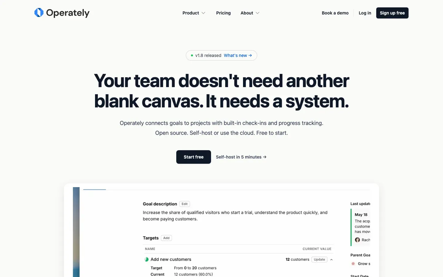
Operately
“Your team doesn't need another blank canvas. It needs a system.”

OpenStreetMap
“Welcome to OpenStreetMap!”
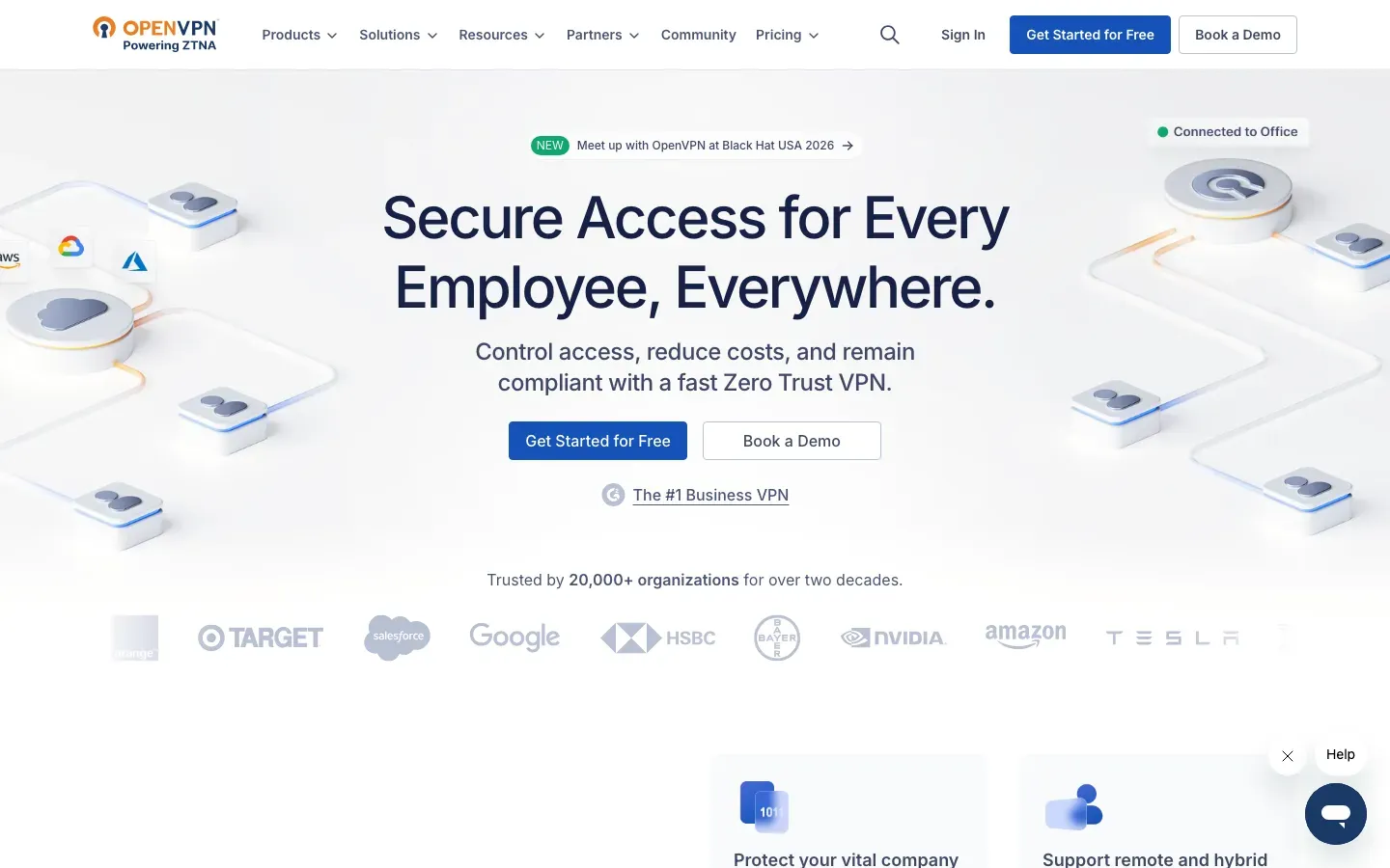
OpenVPN
“Secure Access for Every Employee, Everywhere.”
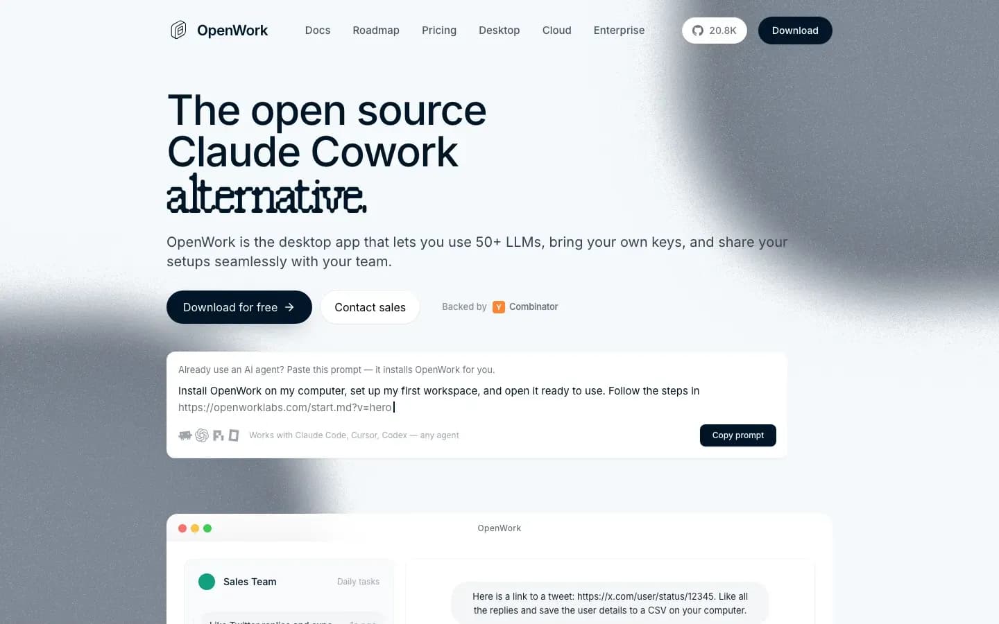
OpenWork
“The open source Claude Cowork alternative.”
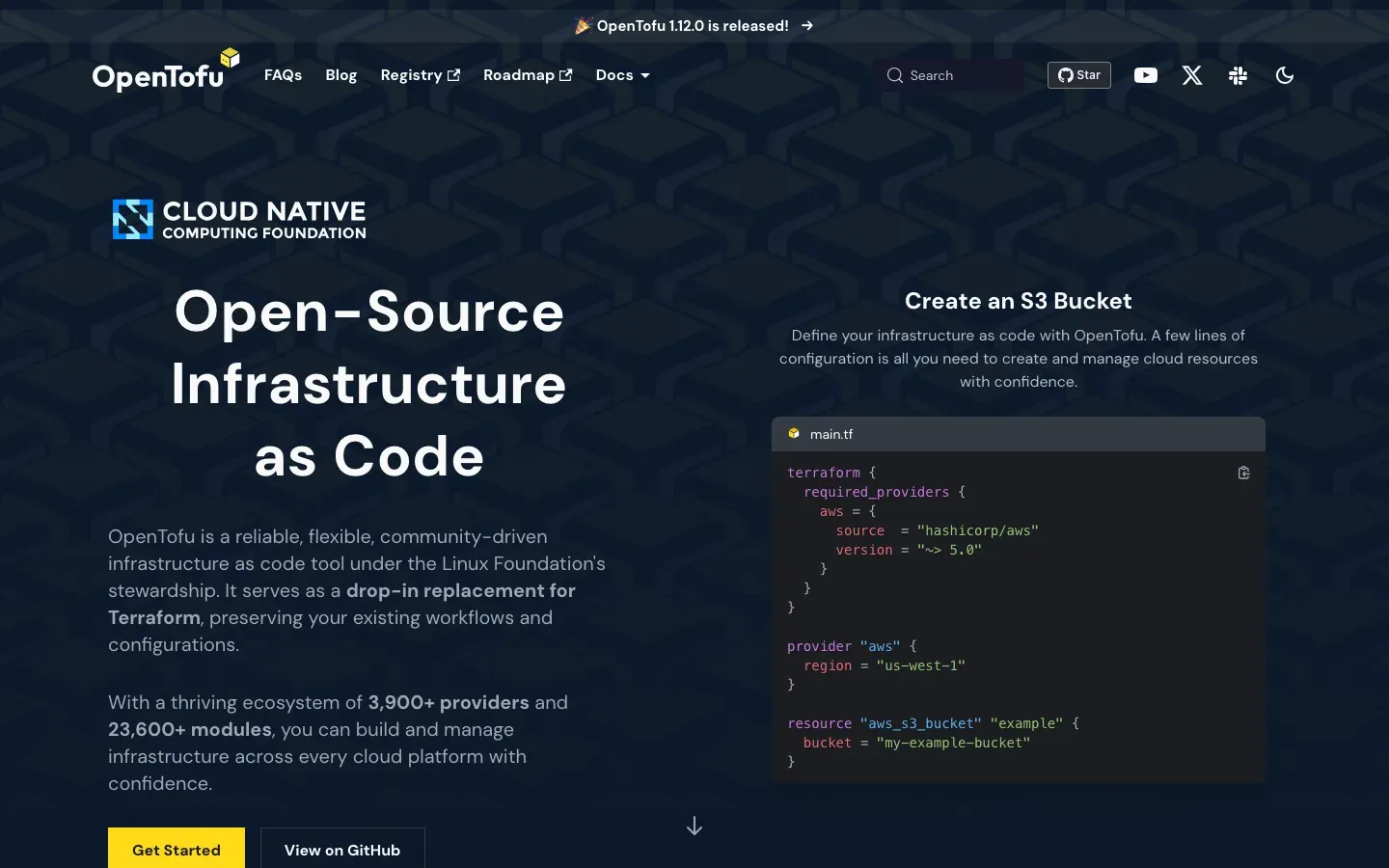
OpenTofu
“Open-Source Infrastructure as Code”
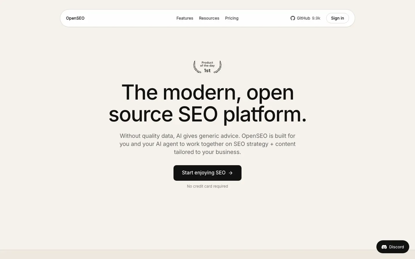
OpenSEO
“The modern, open source SEO platform.”
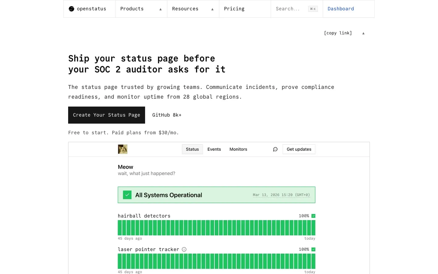
openstatus
“Ship your status page before your SOC 2 auditor asks for it”
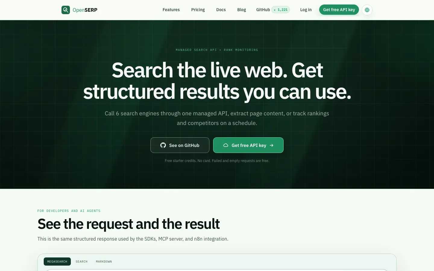
OpenSERP
“Search the live web. Get structured results you can use.”

OpenSign™
“Seal the Deal, Openly. Welcome to OpenSign™”
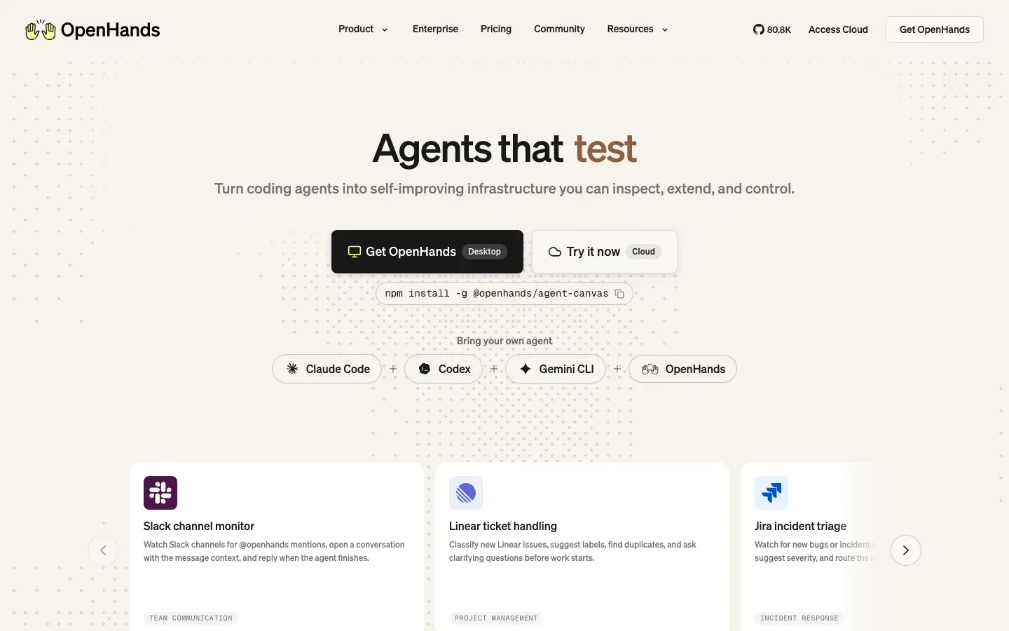
OpenHands
“Agents that deploy”
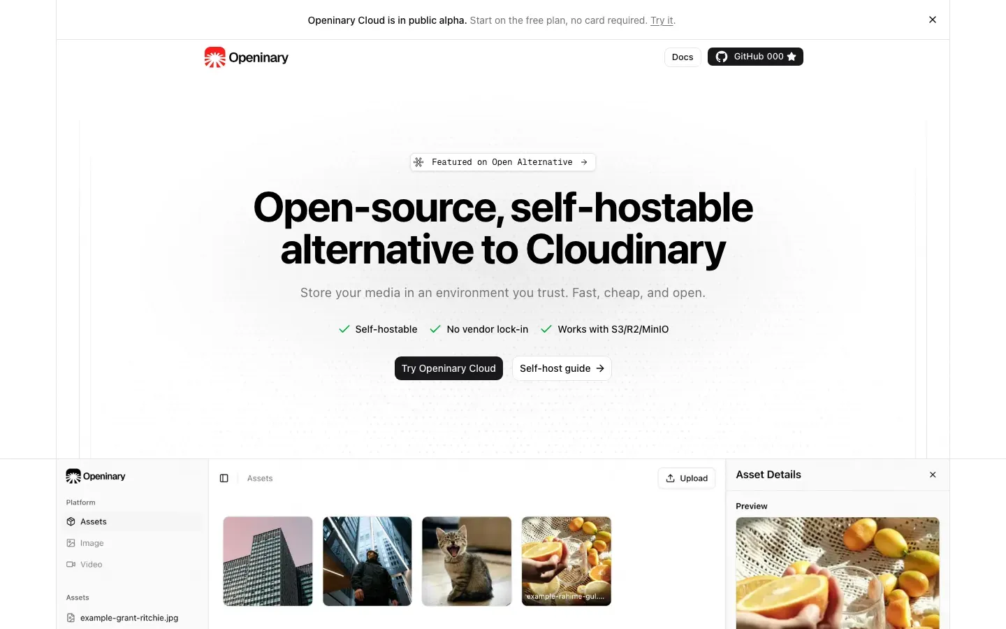
Openinary
“Open-source, self-hostable alternative to Cloudinary”
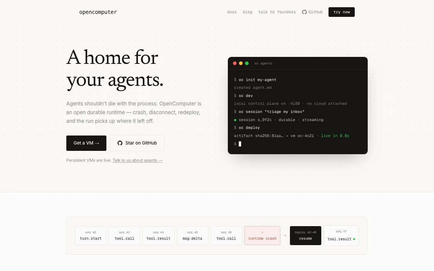
OpenComputer
“A home for your agents.”
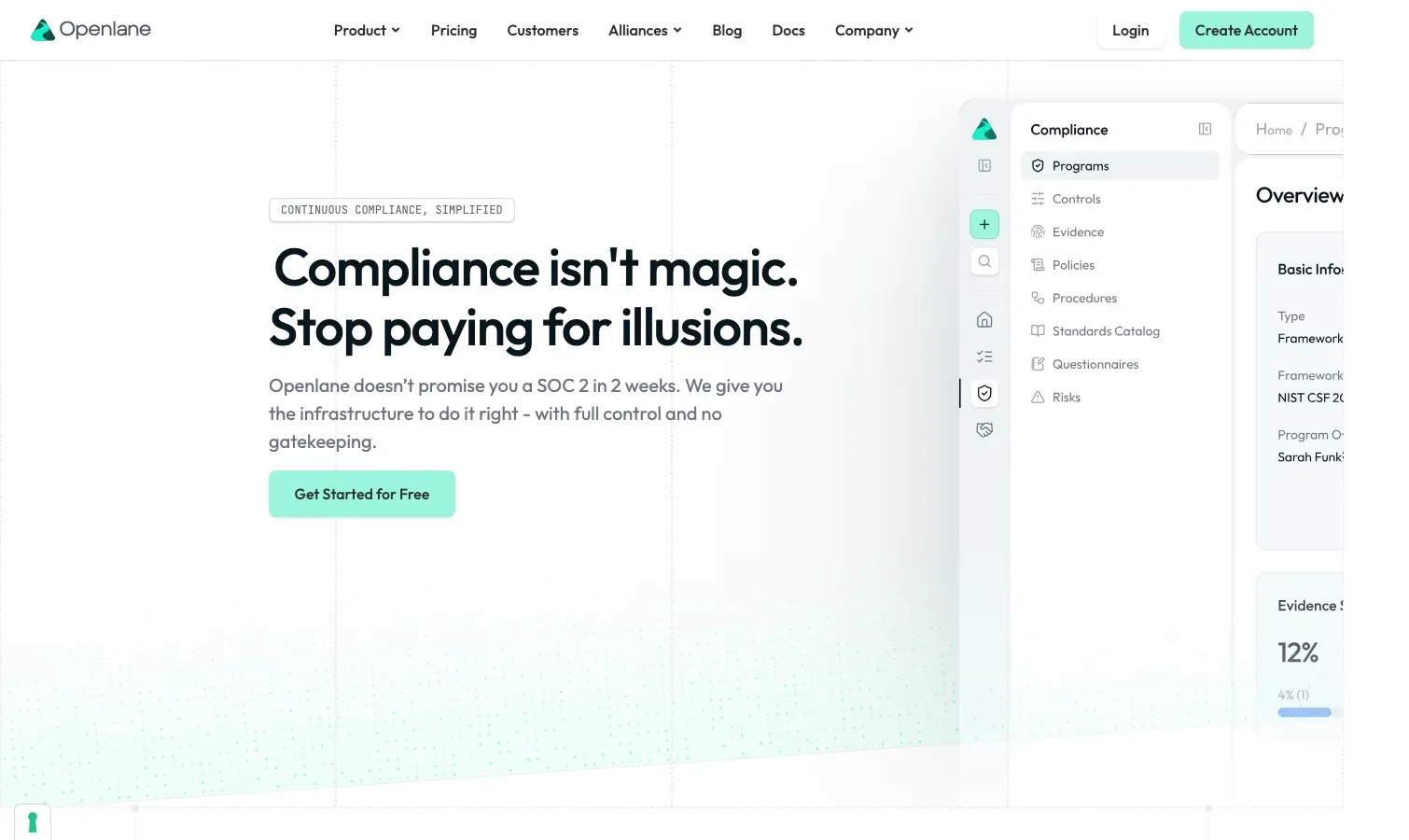
Openlane
“Compliance isn't magic.”
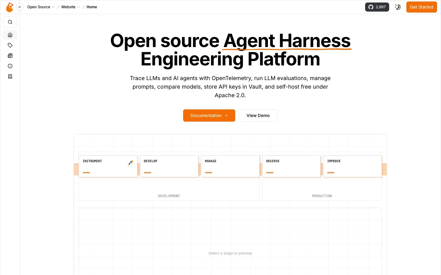
OpenLIT
“Open source Agent Harness Engineering Platform”
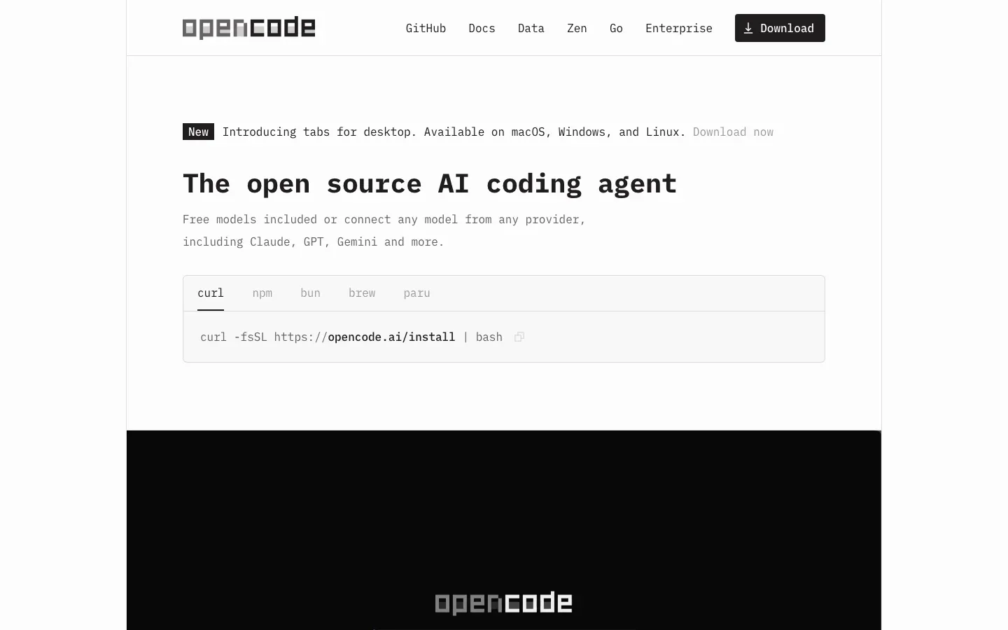
OpenCode
“The open source AI coding agent”

OpenBB
“Build your own financial workspace”
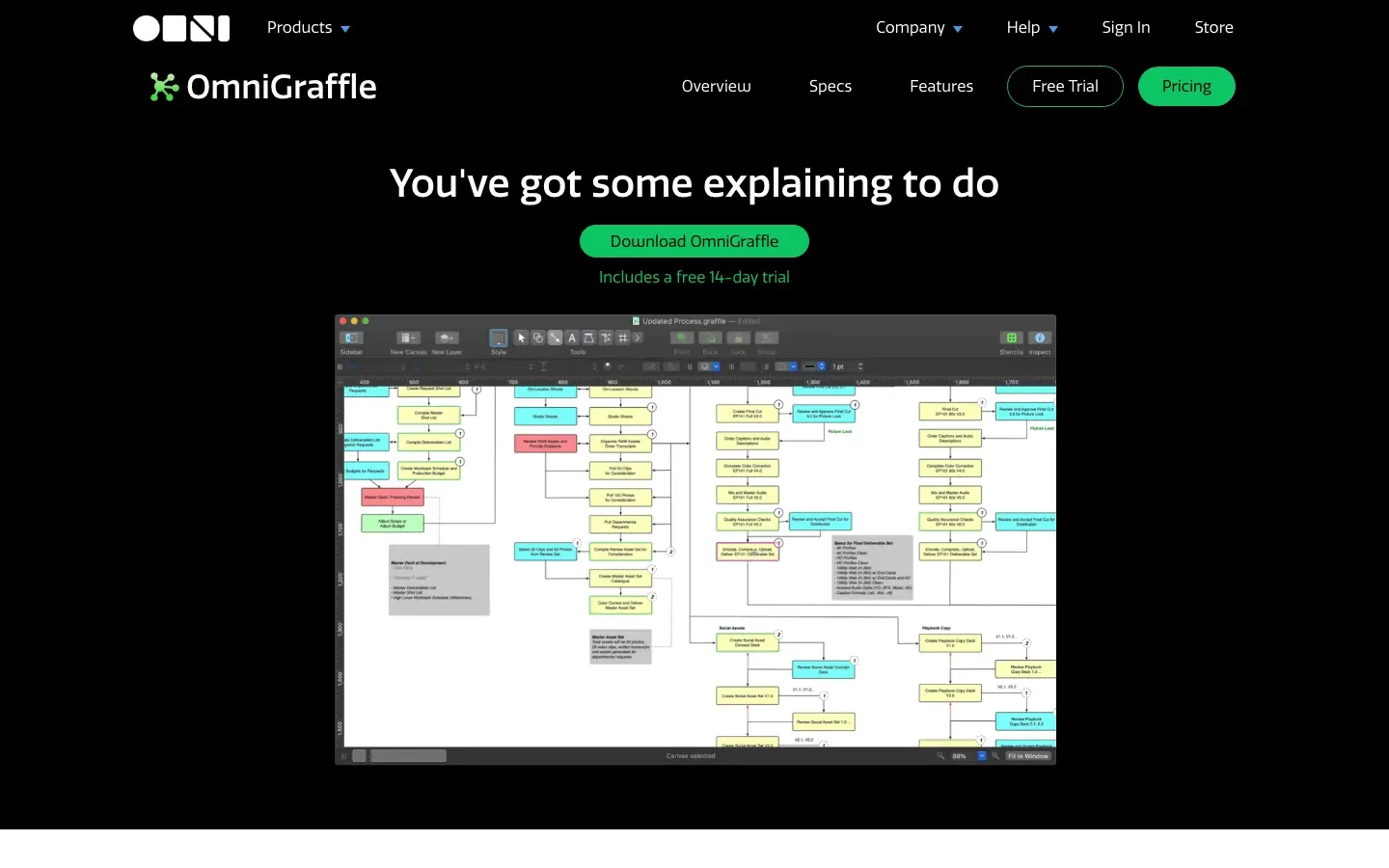
OmniGraffle
“You've got some explaining to do”

Onlook
“Cursor for Designers”
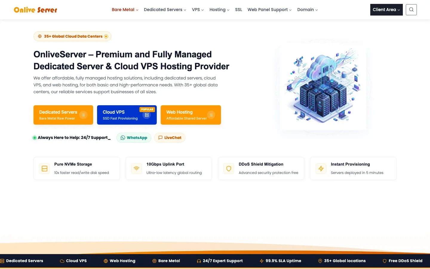
Onlive Server
“OnliveServer – Premium and Fully Managed Dedicated Server & Cloud VPS Hosting Provider”
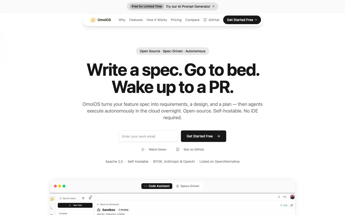
OmoiOS
“Write a spec. Go to bed. Wake up to a PR.”
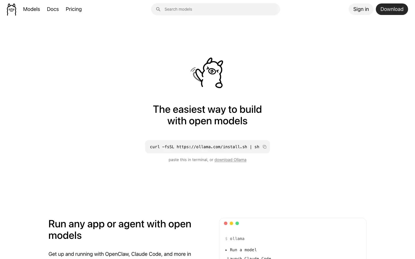
Ollama
“The easiest way to build with open models”
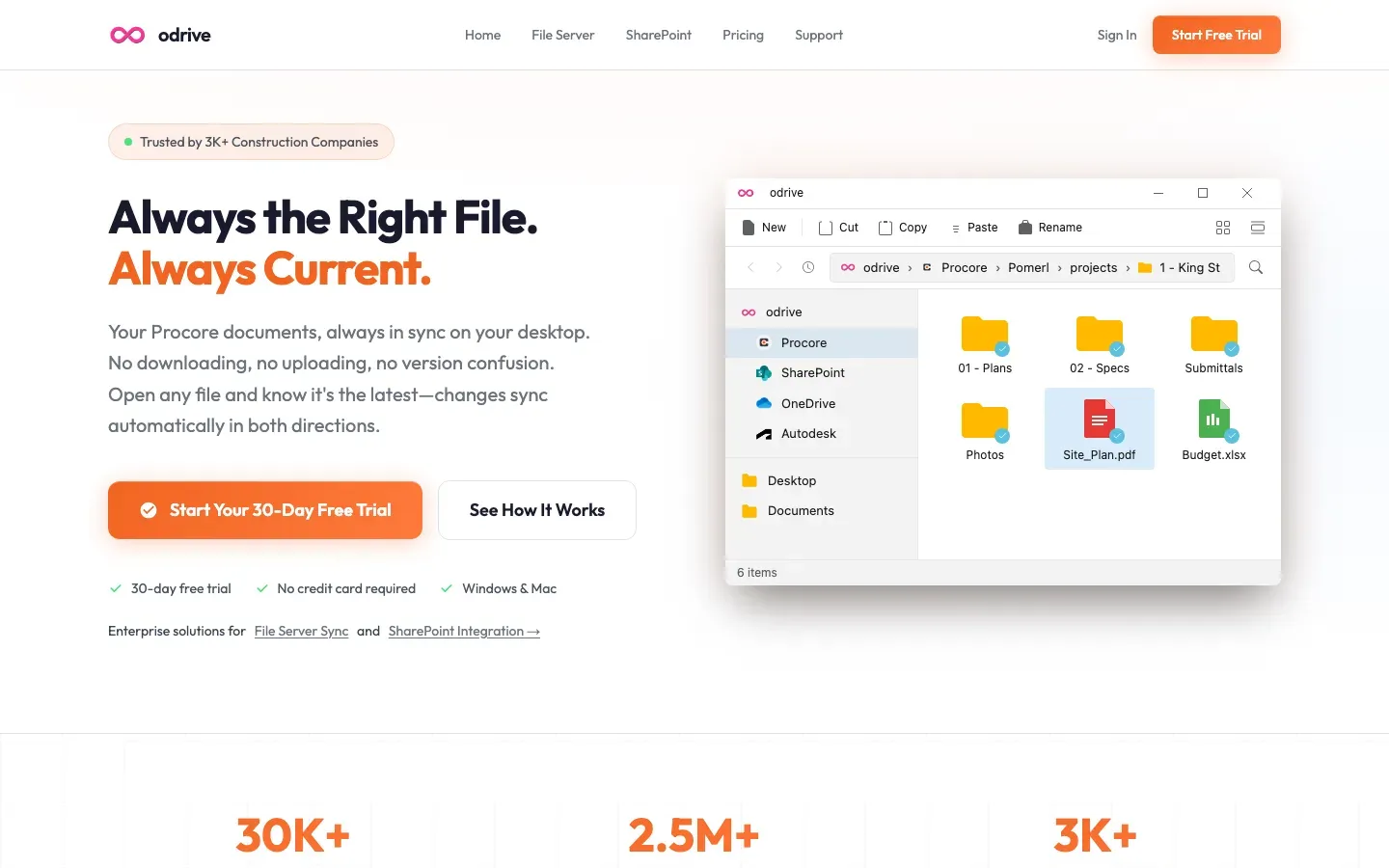
odrive
“Always the Right File.”
OceanBase
“Always Ready for”

Comma
“Create a personal website to showcase who you are in 5 minutes.”
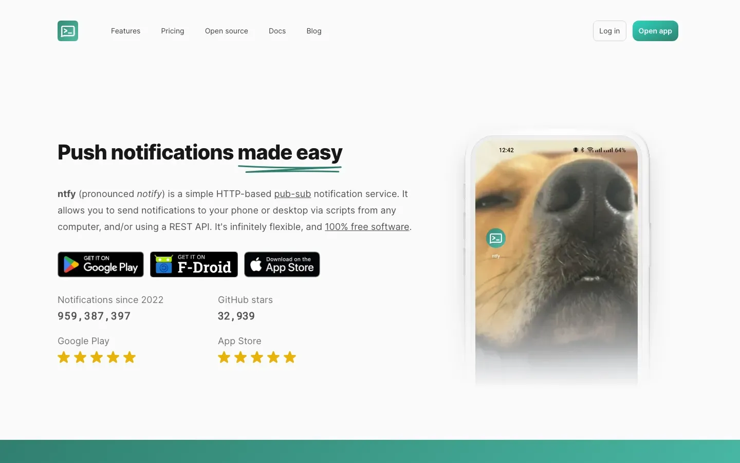
ntfy
“Push notifications made easy”
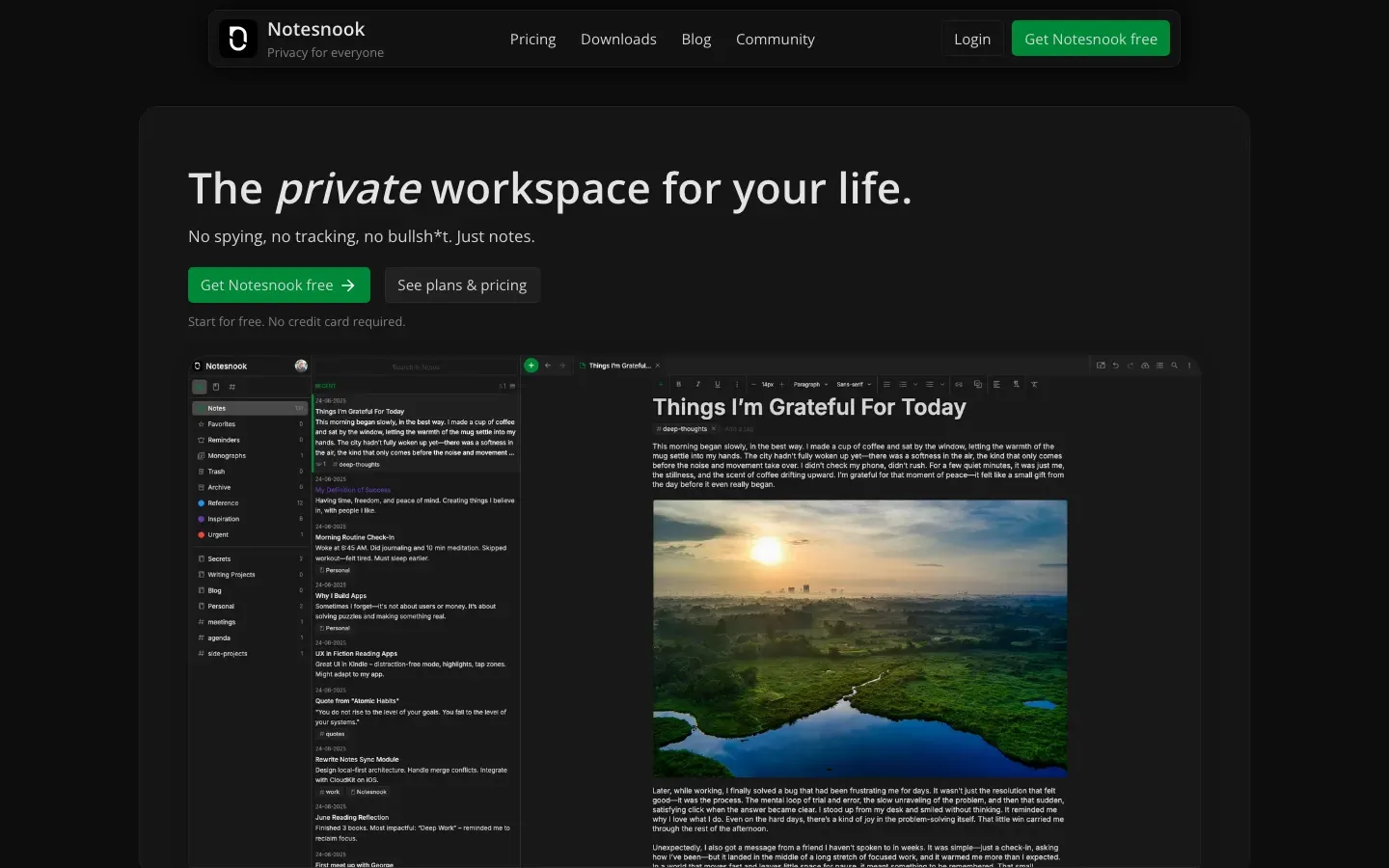
Notesnook
“The private workspace for your life.”
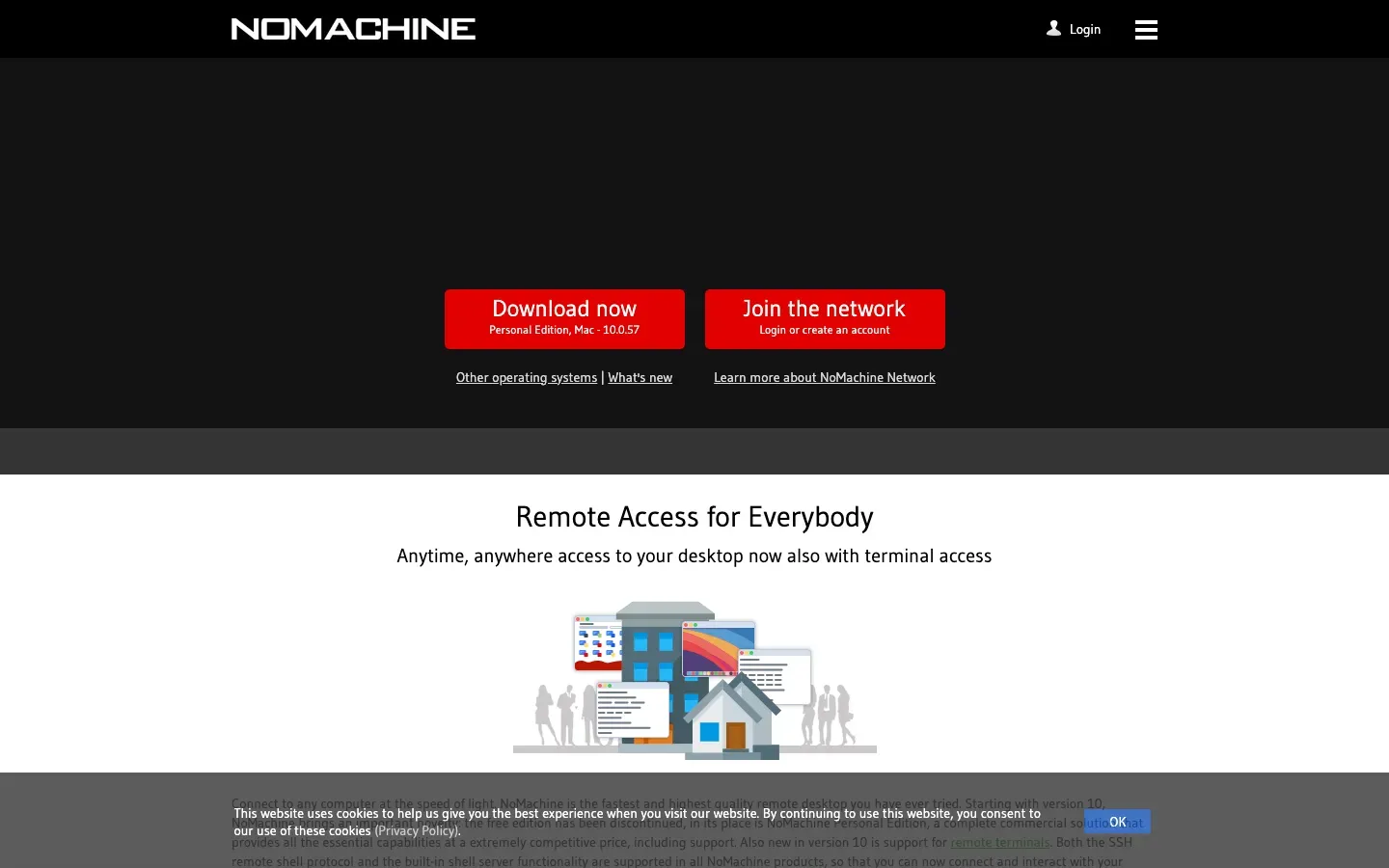
NoMachine
“The best remote desktop.”
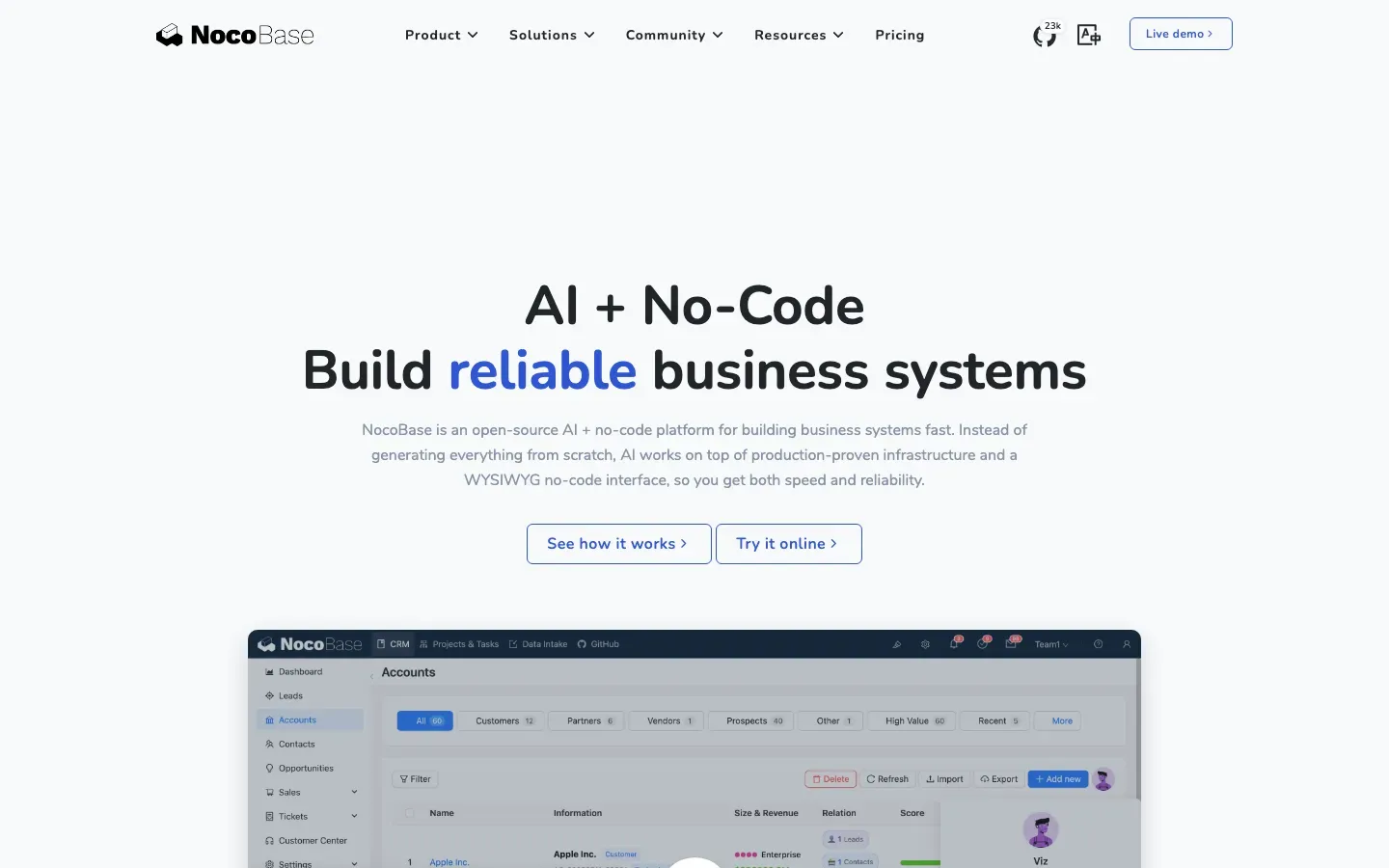
NocoBase
“AI + No-Code”
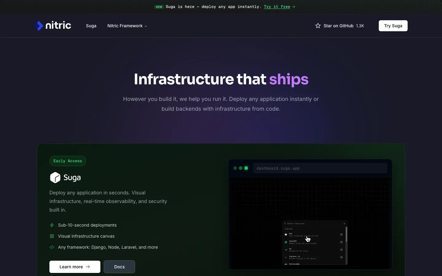
Nitric
“Infrastructure that ships”
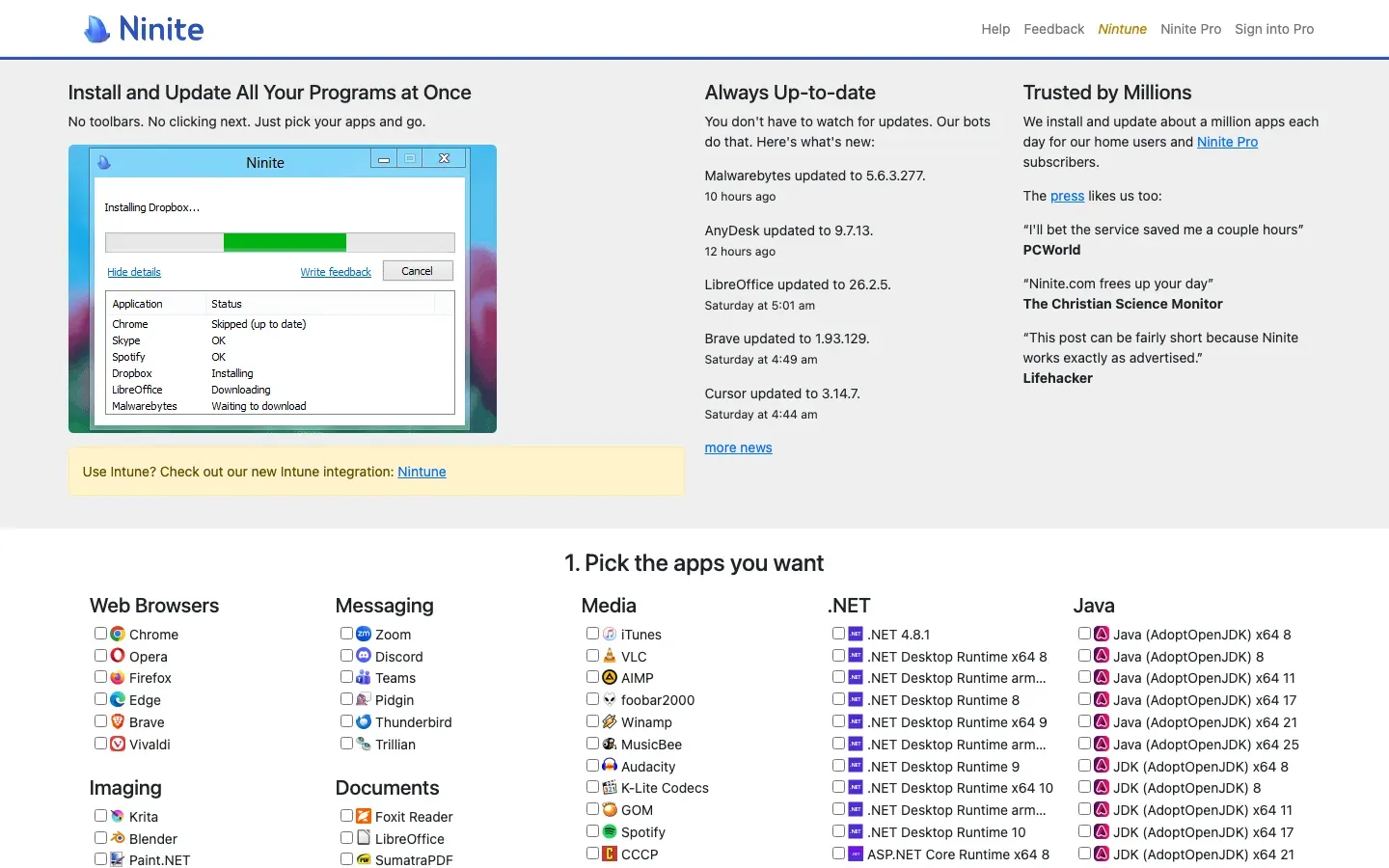
Ninite
“Install and Update All Your Programs at Once”
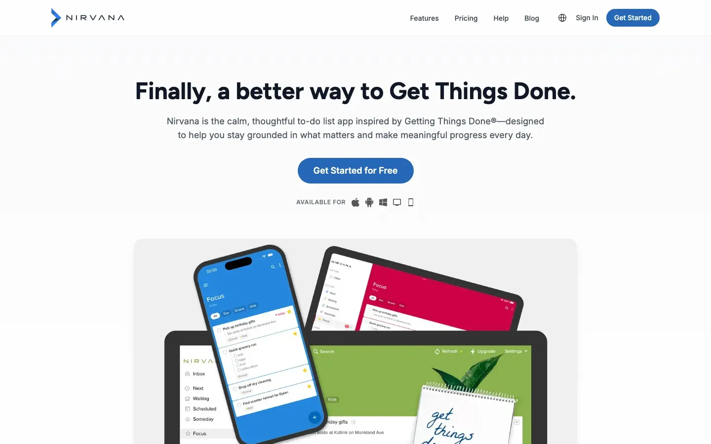
Nirvana
“Finally, a better way to Get Things Done.”
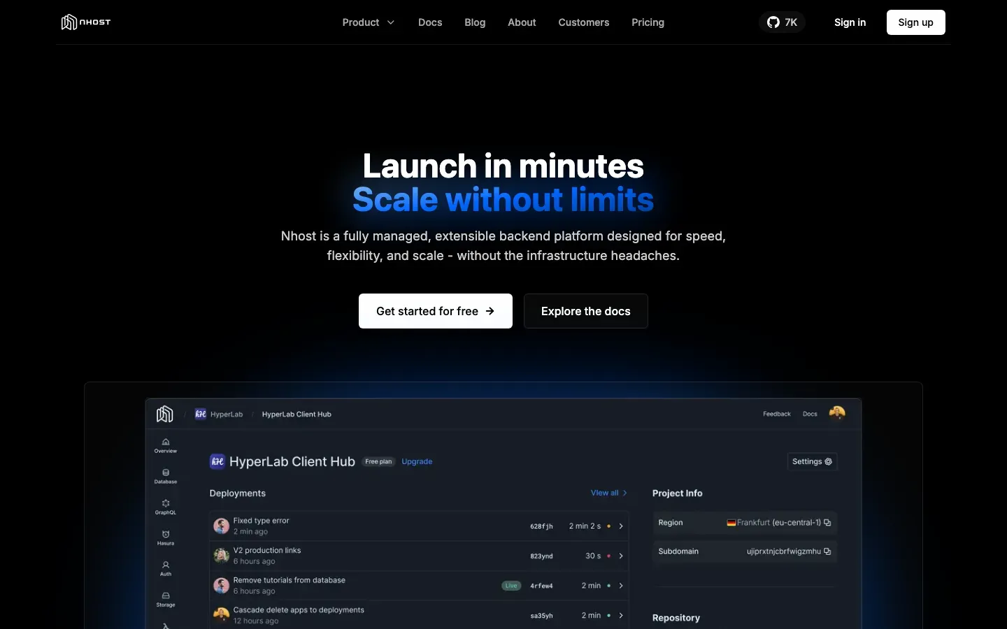
Nhost
“Launch in minutes Scale without limits”
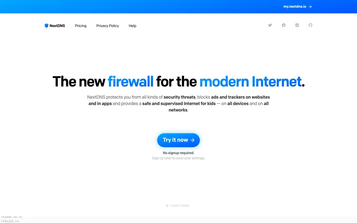
NextDNS
“The new firewall for the modern Internet.”

NewCraft
“สล็อตเว็บตรง PG Slot ลิขสิทธิ์แท้ แตกง่ายถอนได้จริง ปลอดภัย100%”
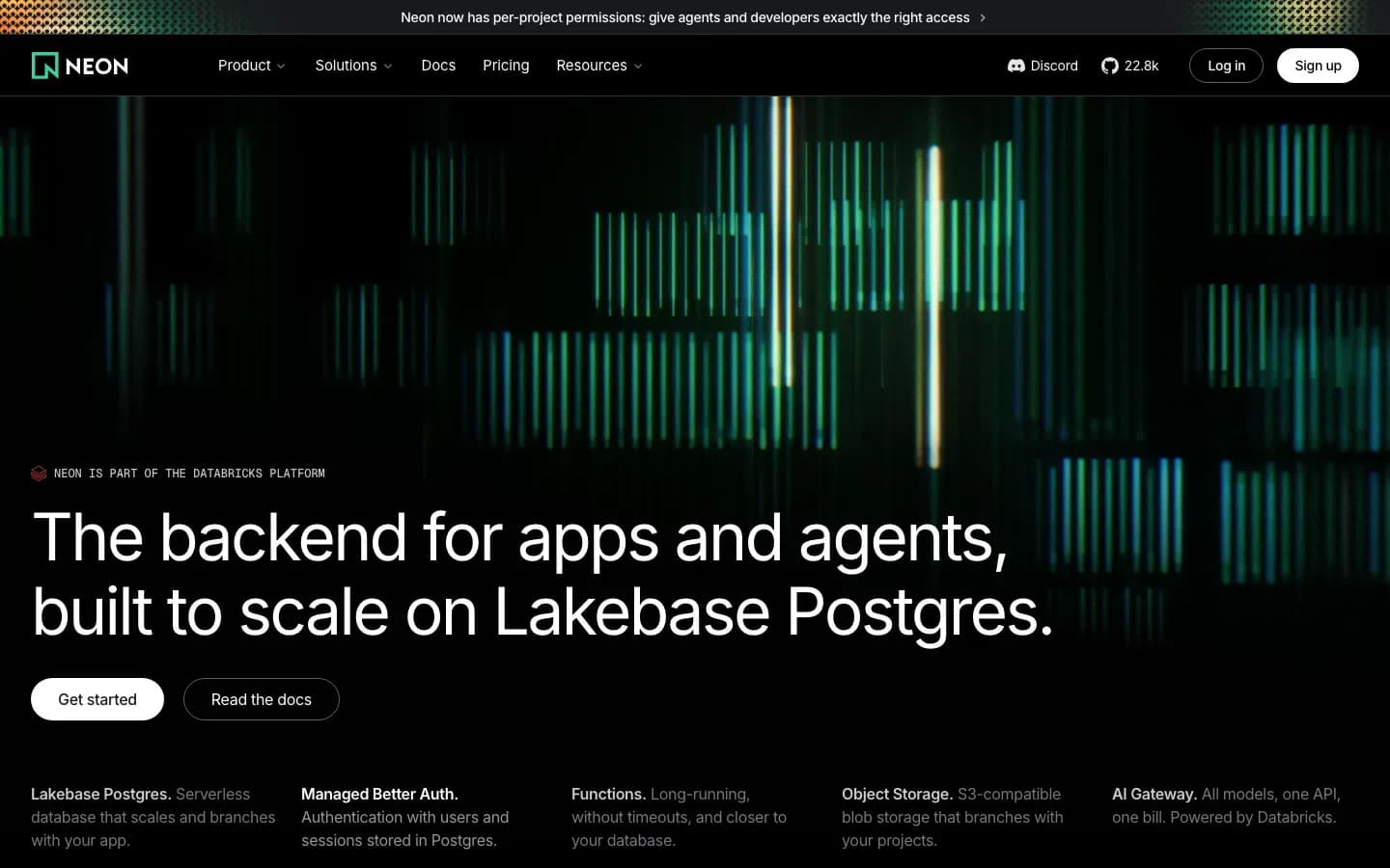
Neon
“The backend for apps and agents, built to scale on Lakebase Postgres.”

NetBird
“The Only Secure Access Platform”

n8n
“AI agents and workflows”
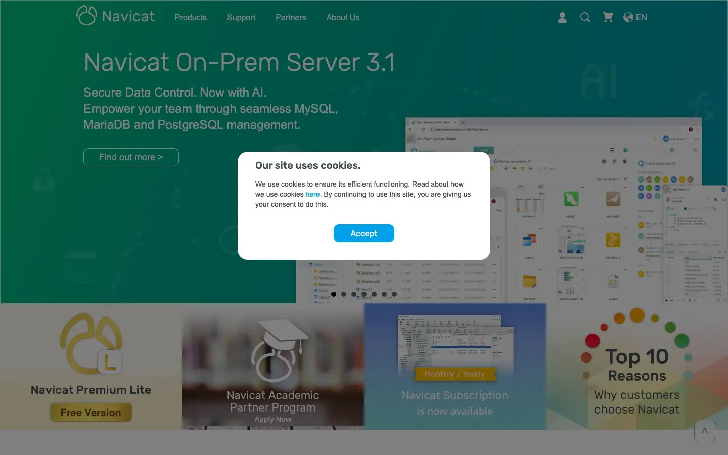
Navicat
“Navicat On-Prem Server 3.1”
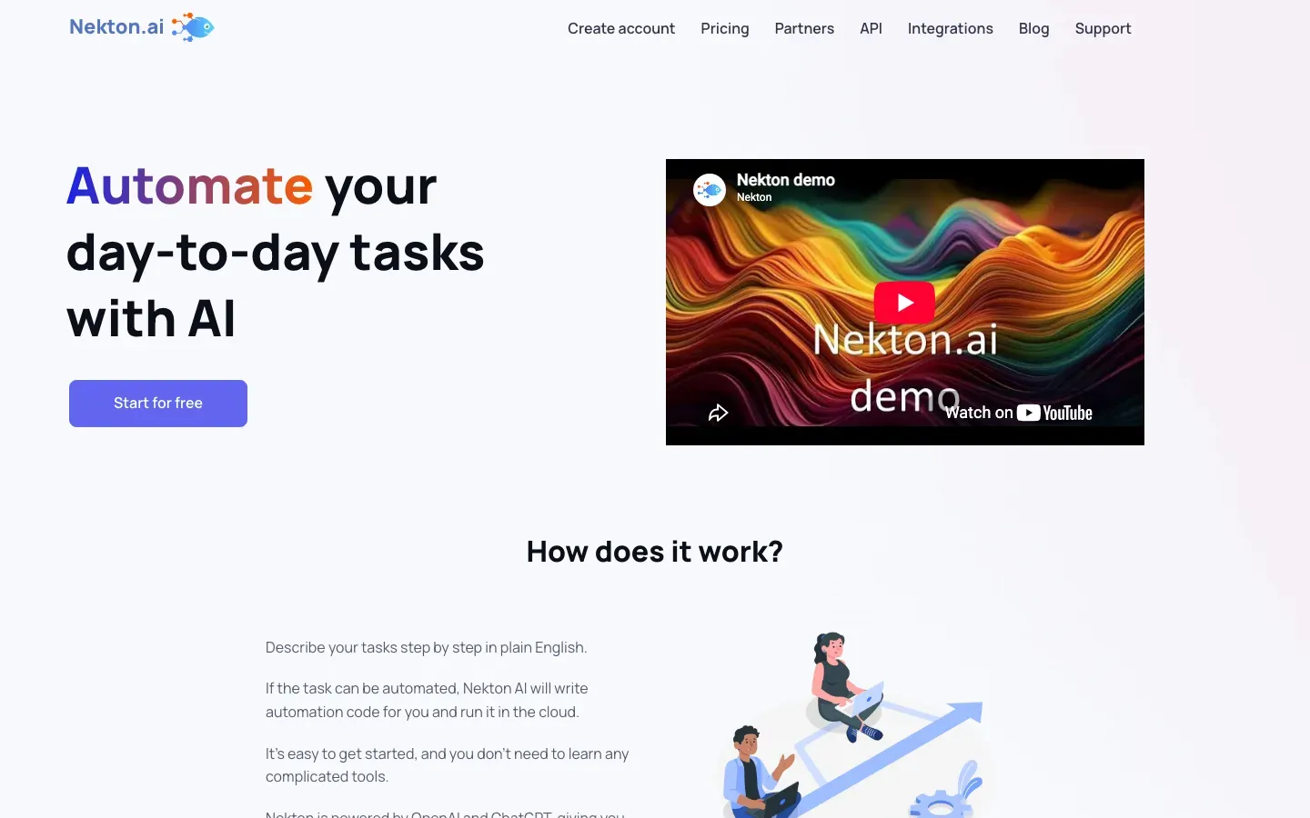
Nekton.ai
“Automate your day-to-day tasks with AI”
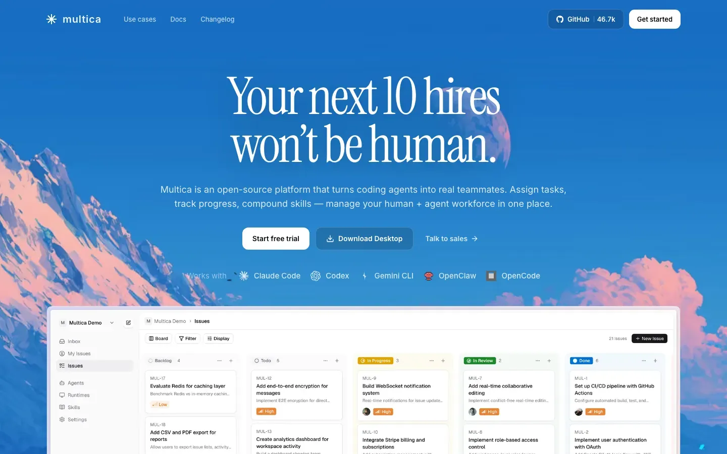
Multica
“Your next 10 hires won't be human.”

Moqups
“Wireframe, Diagram & Whiteboard Online”
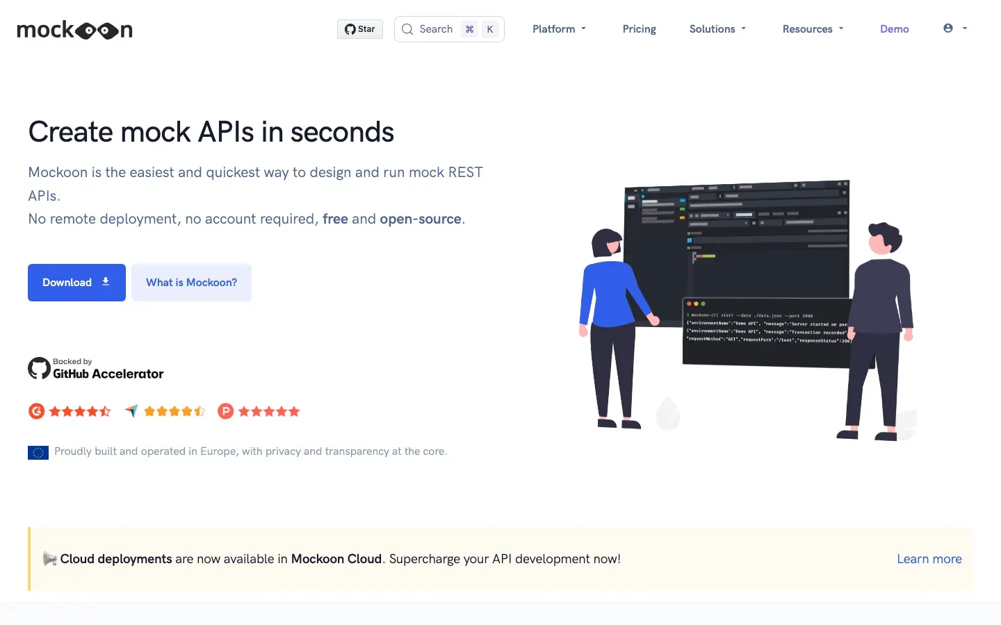
Mockoon
“Create mock APIs in seconds”
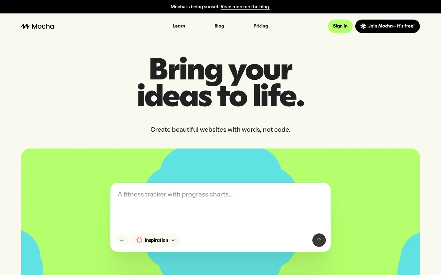
Mocha
“Bring your ideas to life.”
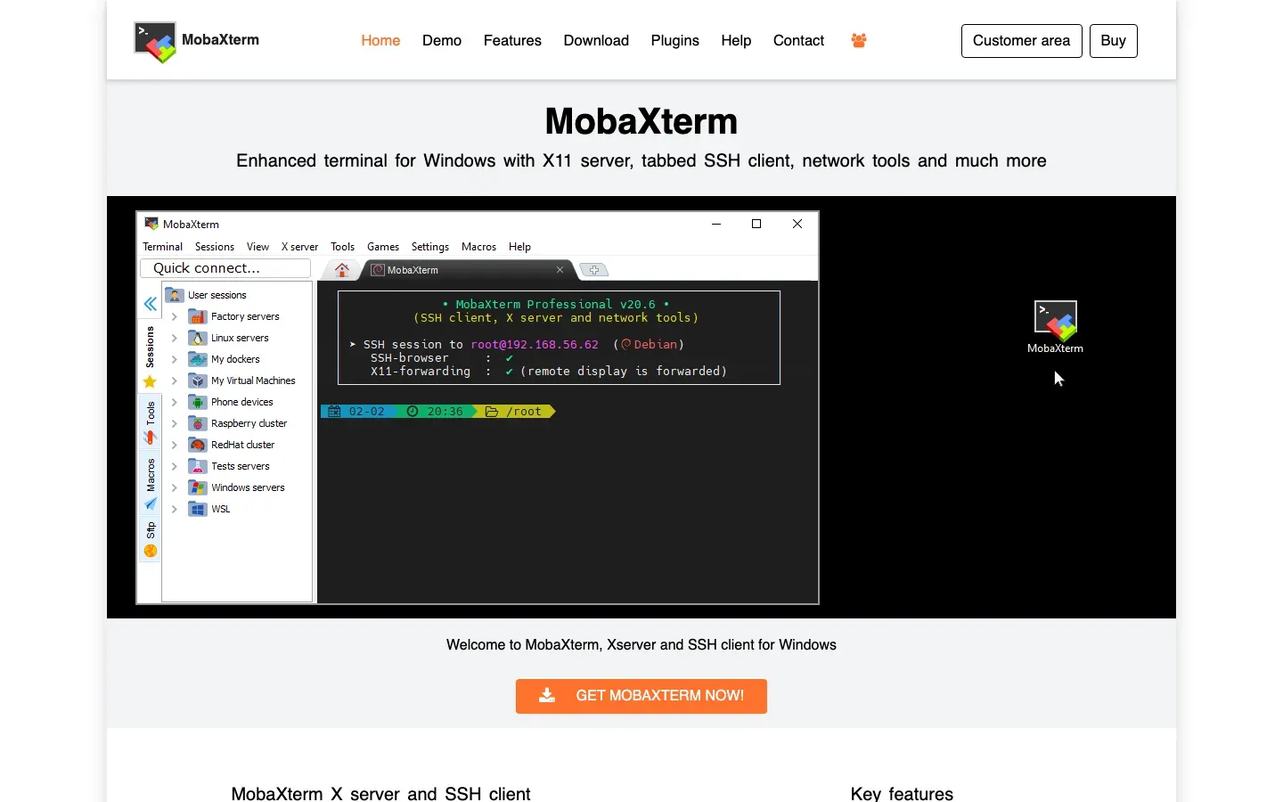
MobaXterm
“MobaXterm”
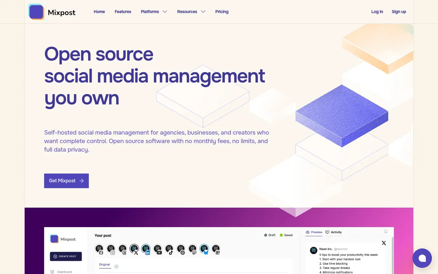
Mixpost
“Open source social media management you own”
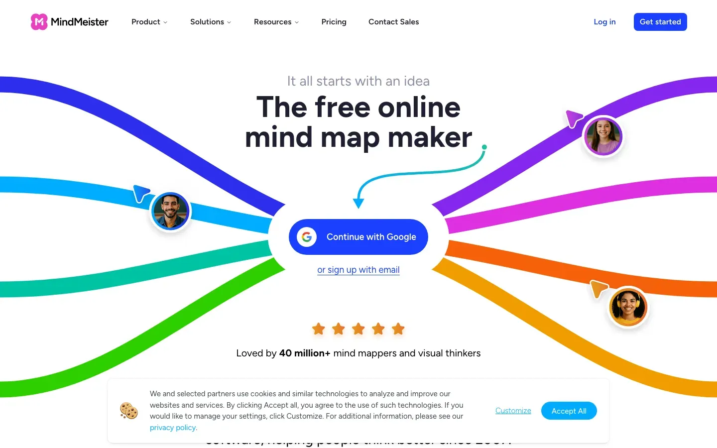
MindMeister
“The free online mind map maker”
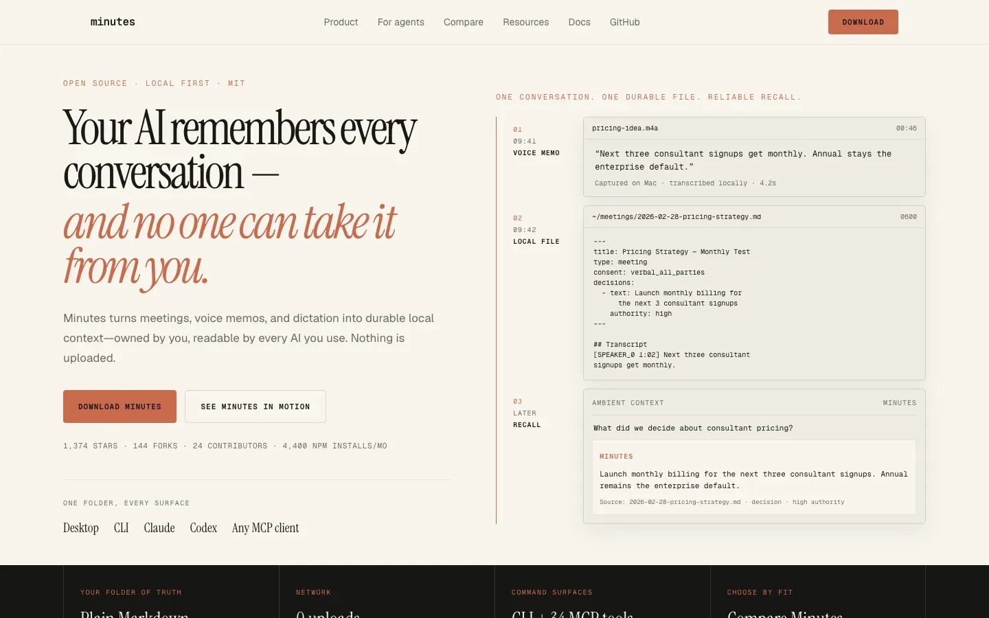
Minutes
“Your AI remembers every conversation — and no one can take it from you.”
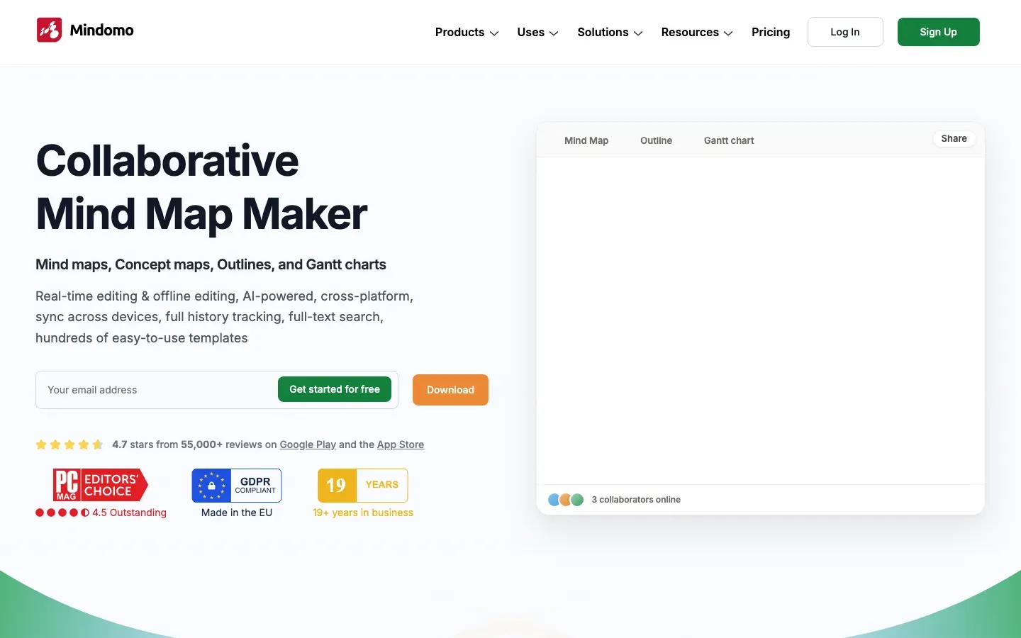
Mindomo
“Collaborative Mind Map Maker”
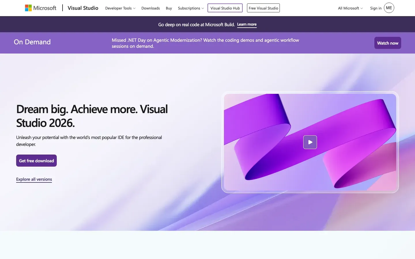
Visual Studio
“Dream big. Achieve more. Visual Studio 2026.”

Mike
“Legal AI you can truly own.”
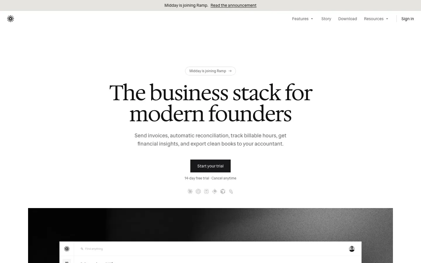
Midday
“The business stack for modern founders”
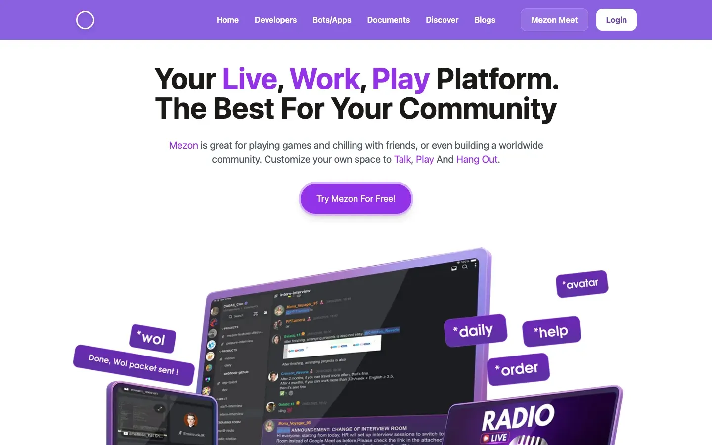
Mezon
“Your Live, Work, Play Platform. The Best For Your Community”
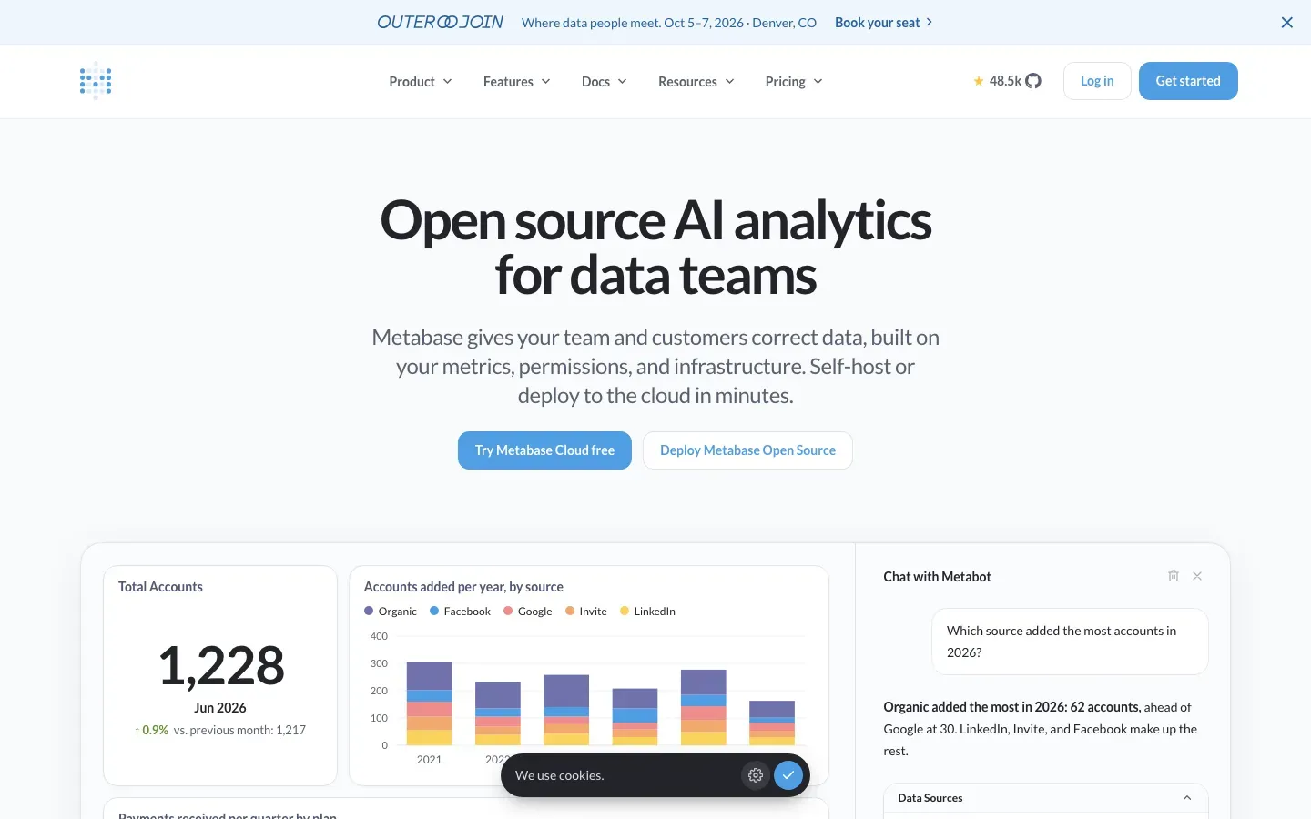
Metabase
“Open source AI analytics for data teams”
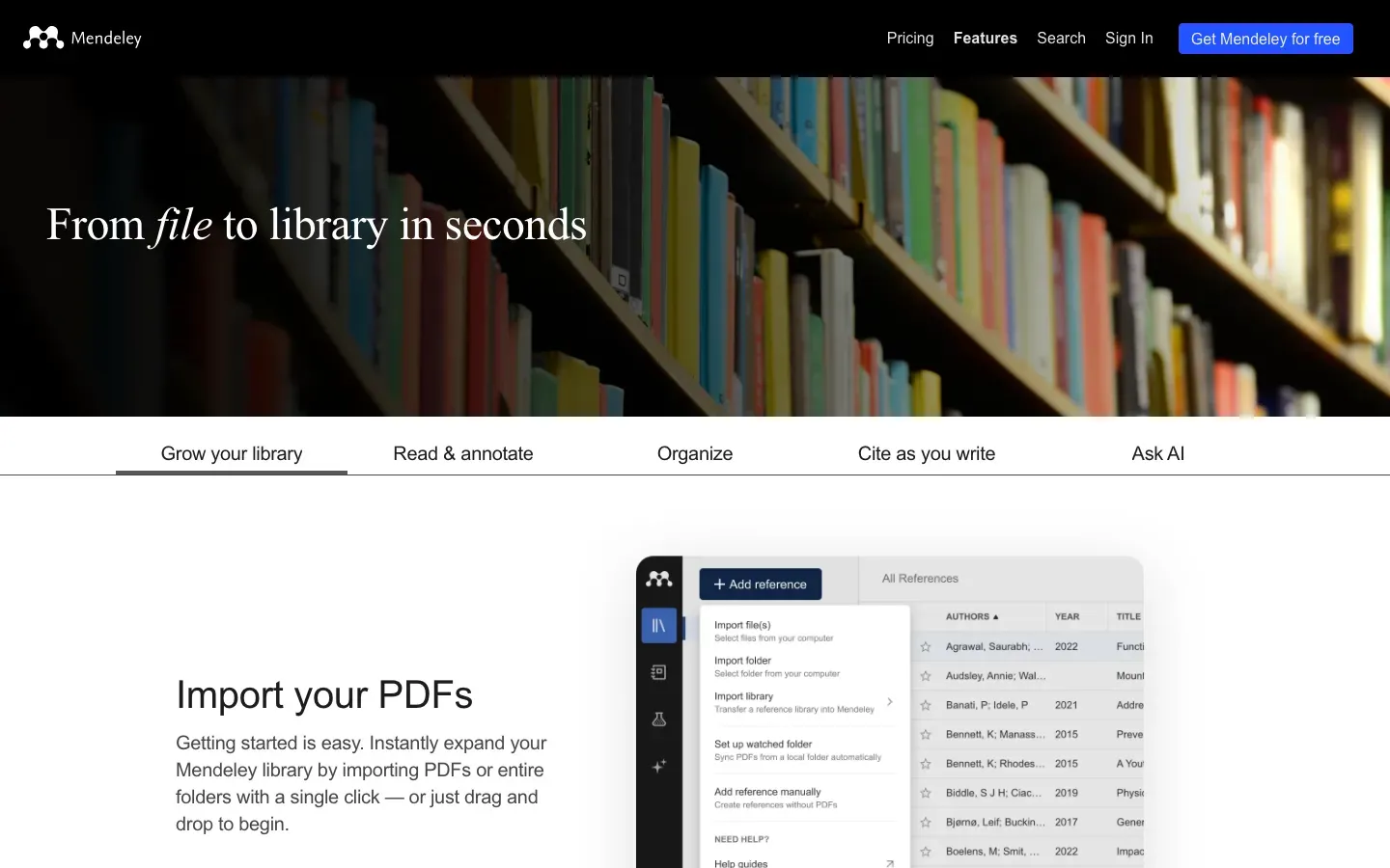
Mendeley
“From file to library in seconds”
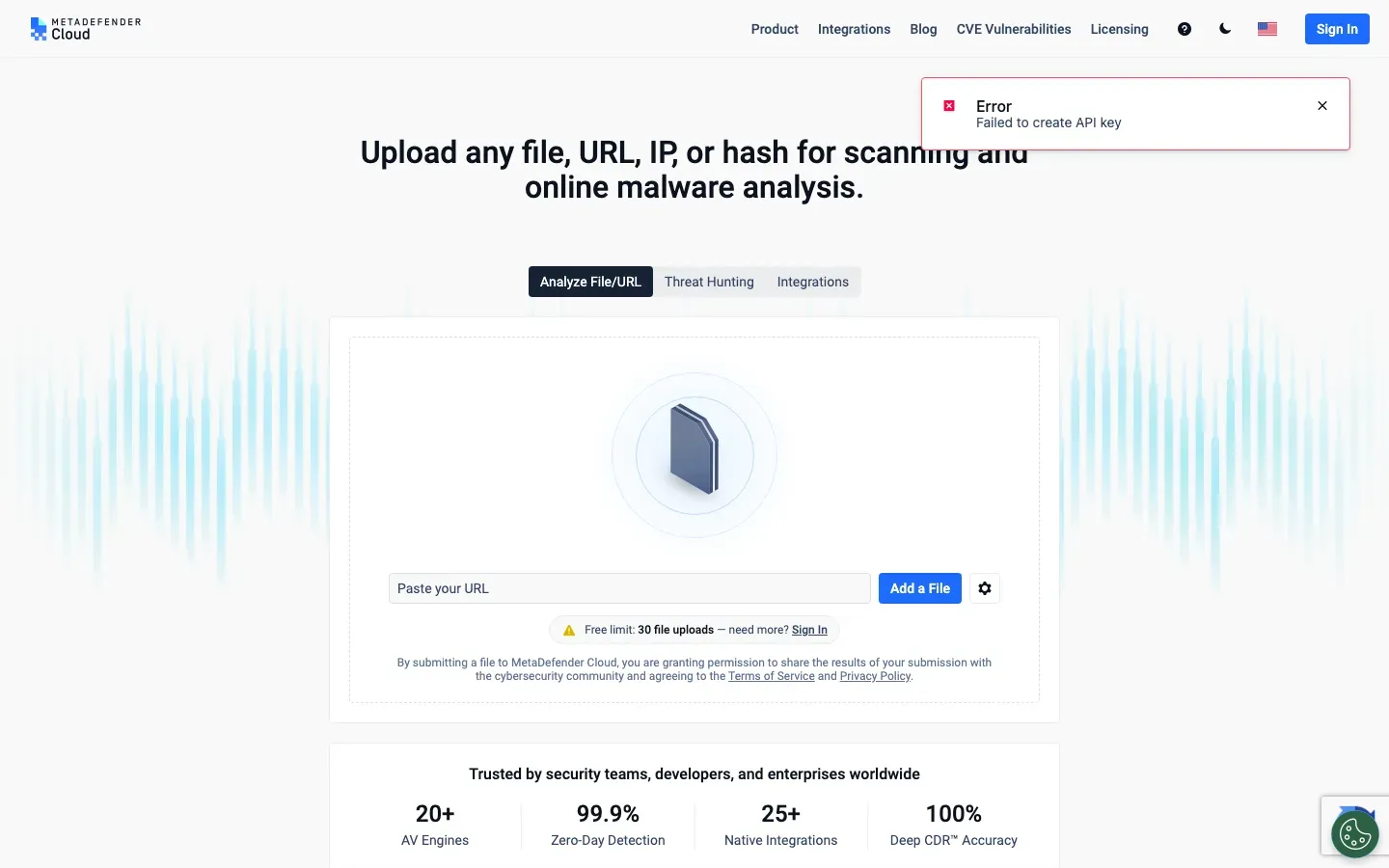
MetaDefender Cloud
“Upload any file, URL, IP, or hash for scanning and online malware analysis.”
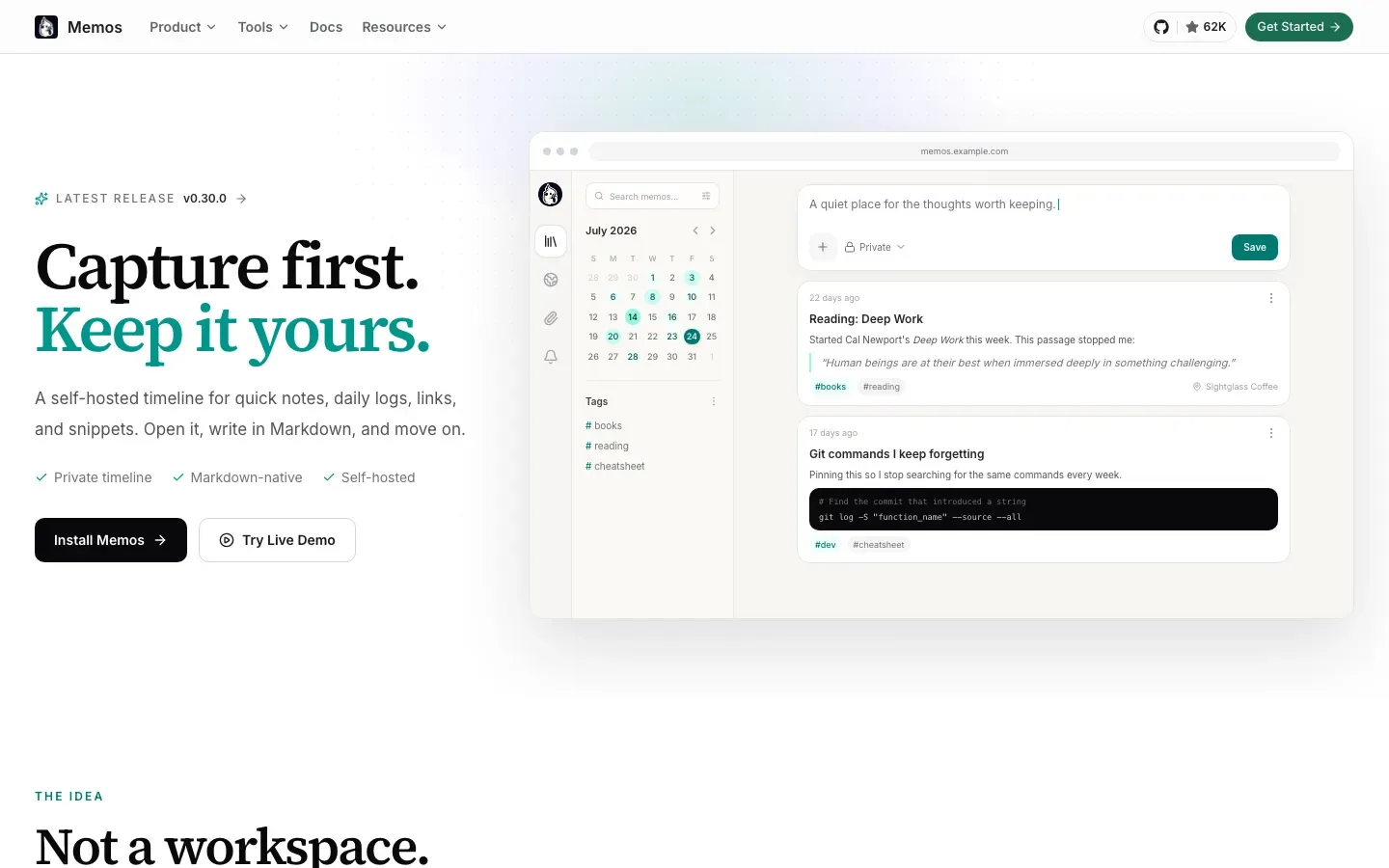
Memos
“Capture first. Keep it yours.”
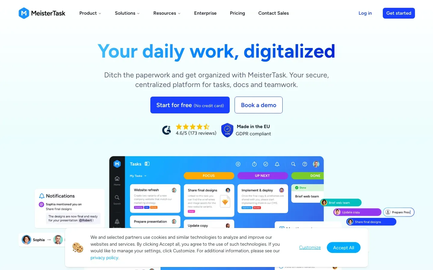
MeisterTask
“Your daily work, digitalized”
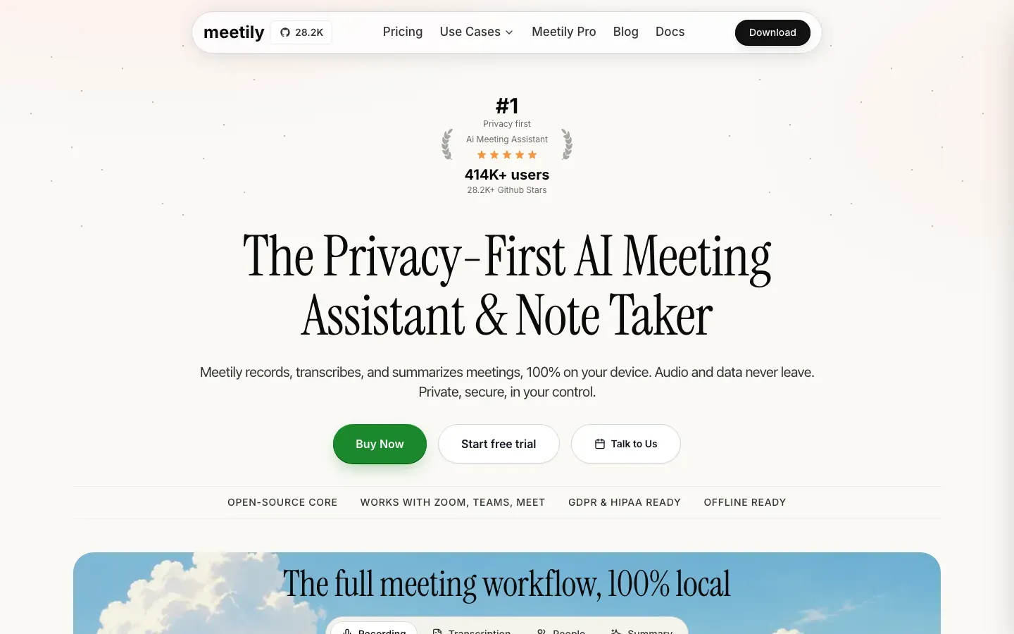
Meetily
“The Privacy-First AI Meeting Assistant & Note Taker”
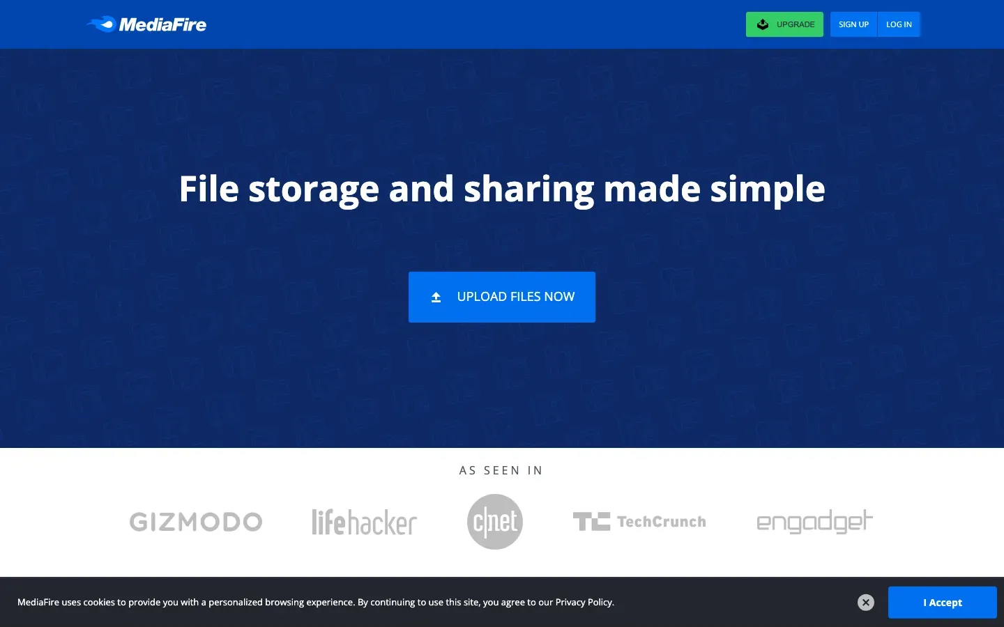
MediaFire
“File storage and sharing made simple”
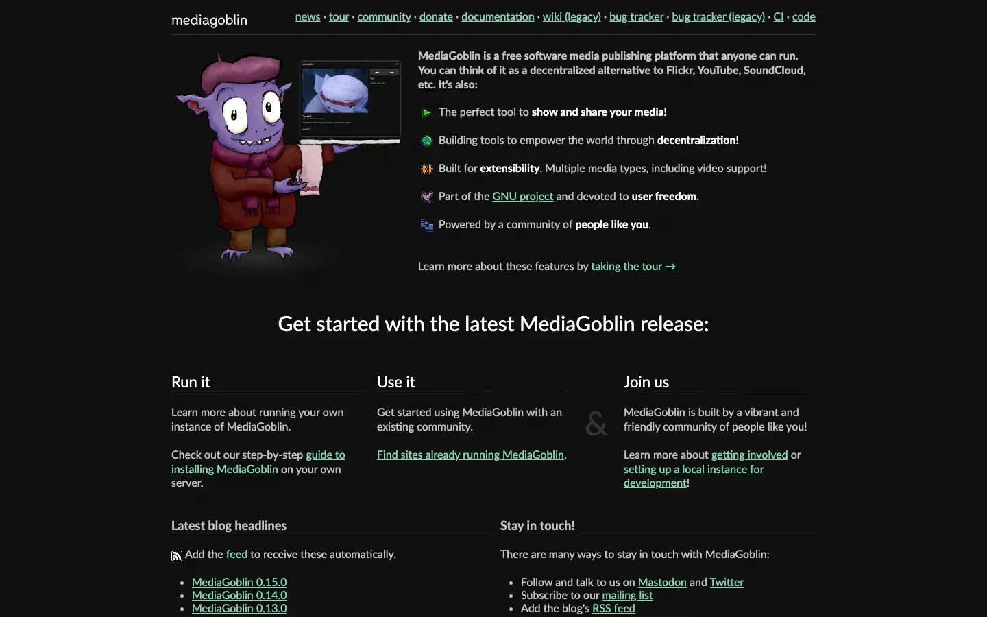
MediaGoblin
“MediaGoblin is a free software media publishing platform that anyone can run.”

Matterport
“Increase buyer and seller confidence with digital twins.”
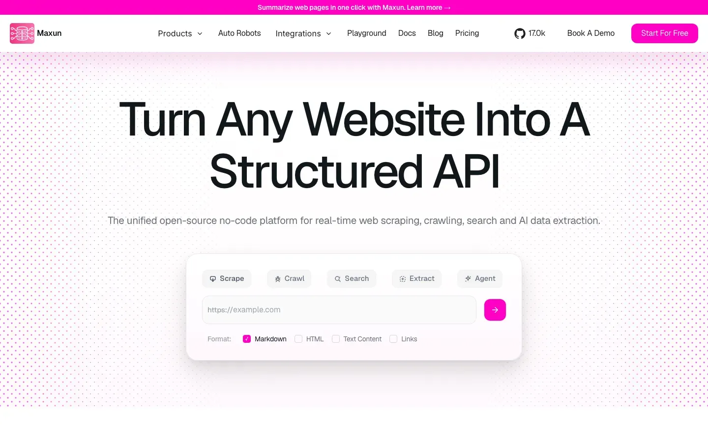
Maxun
“Turn Any Website Into A Structured API”
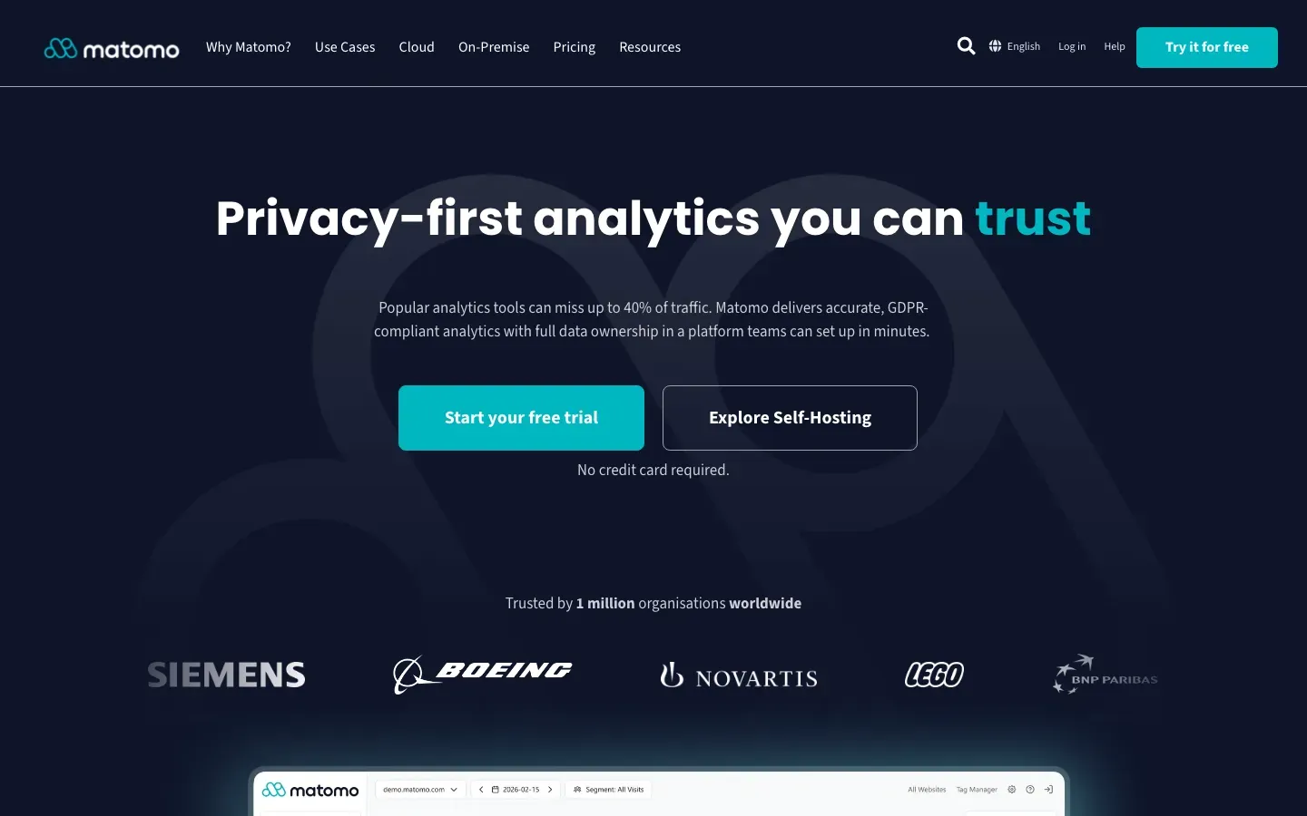
Matomo
“Privacy-first analytics you can trust”
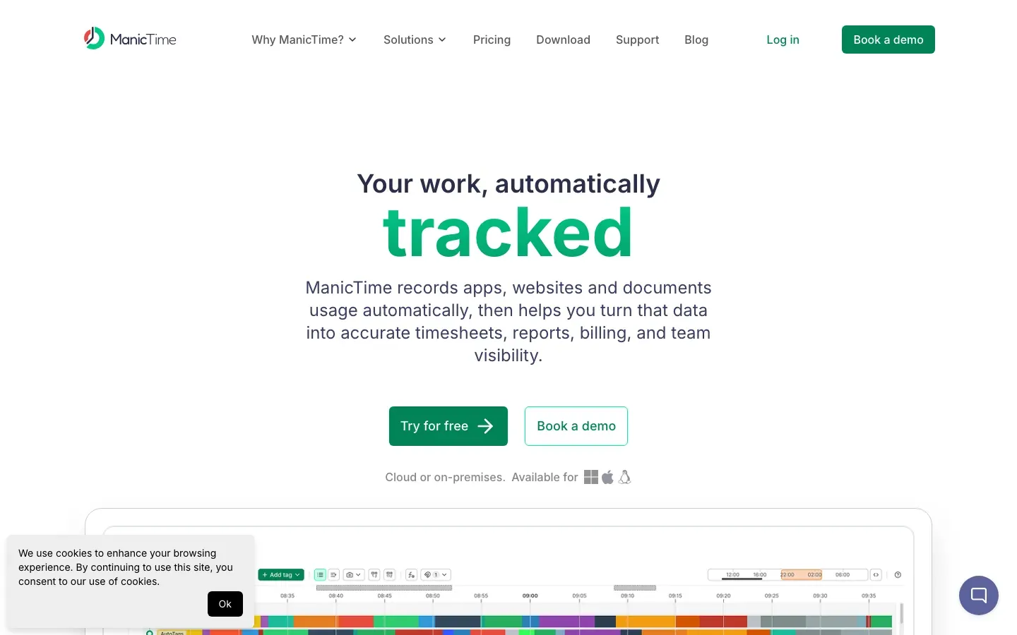
ManicTime
“Your work, automatically tracked”
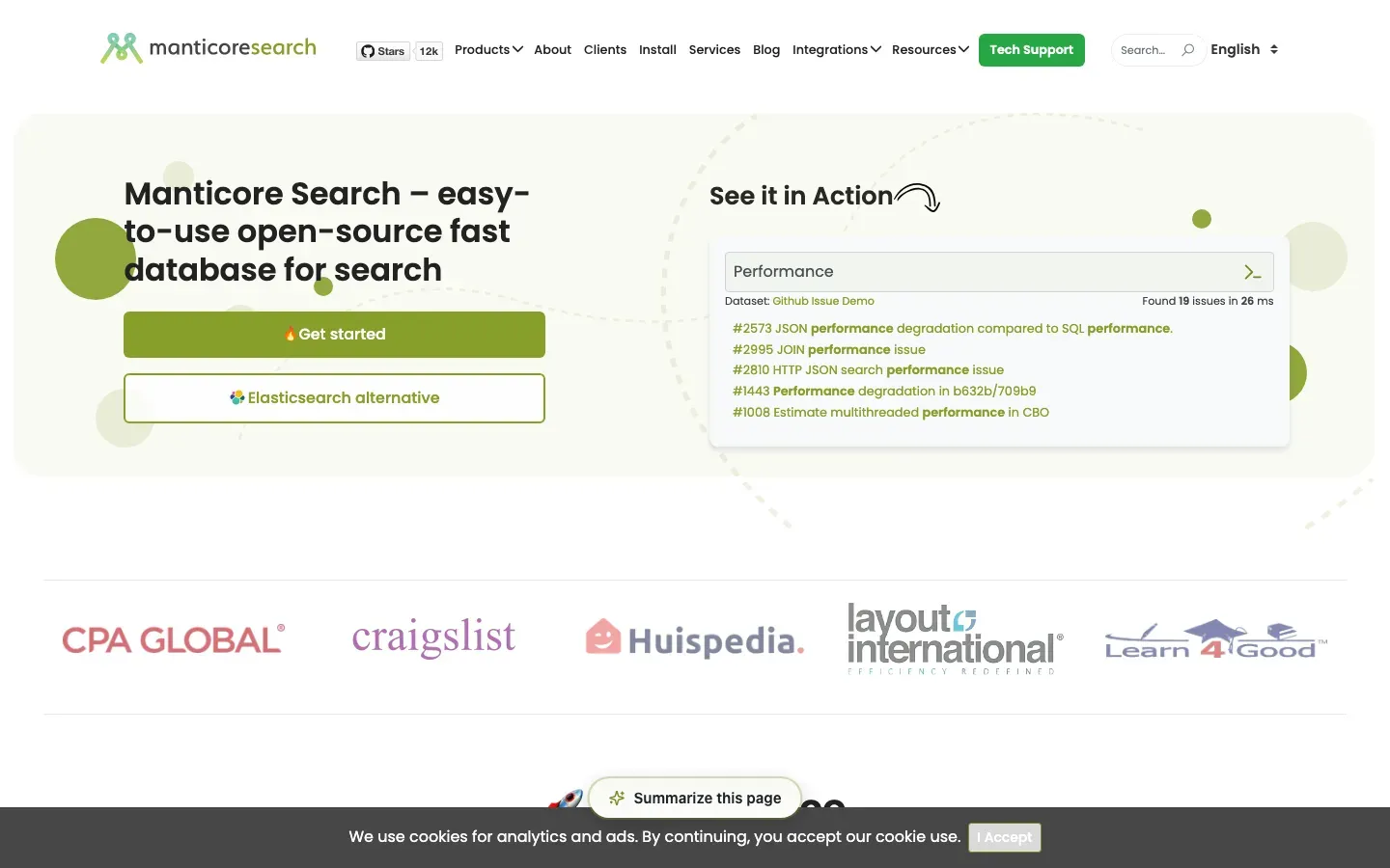
Manticore Search
“Manticore Search – easy-to-use open-source fast database for search”
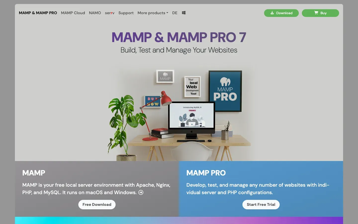
MAMP
“MAMP & MAMP PRO 7”
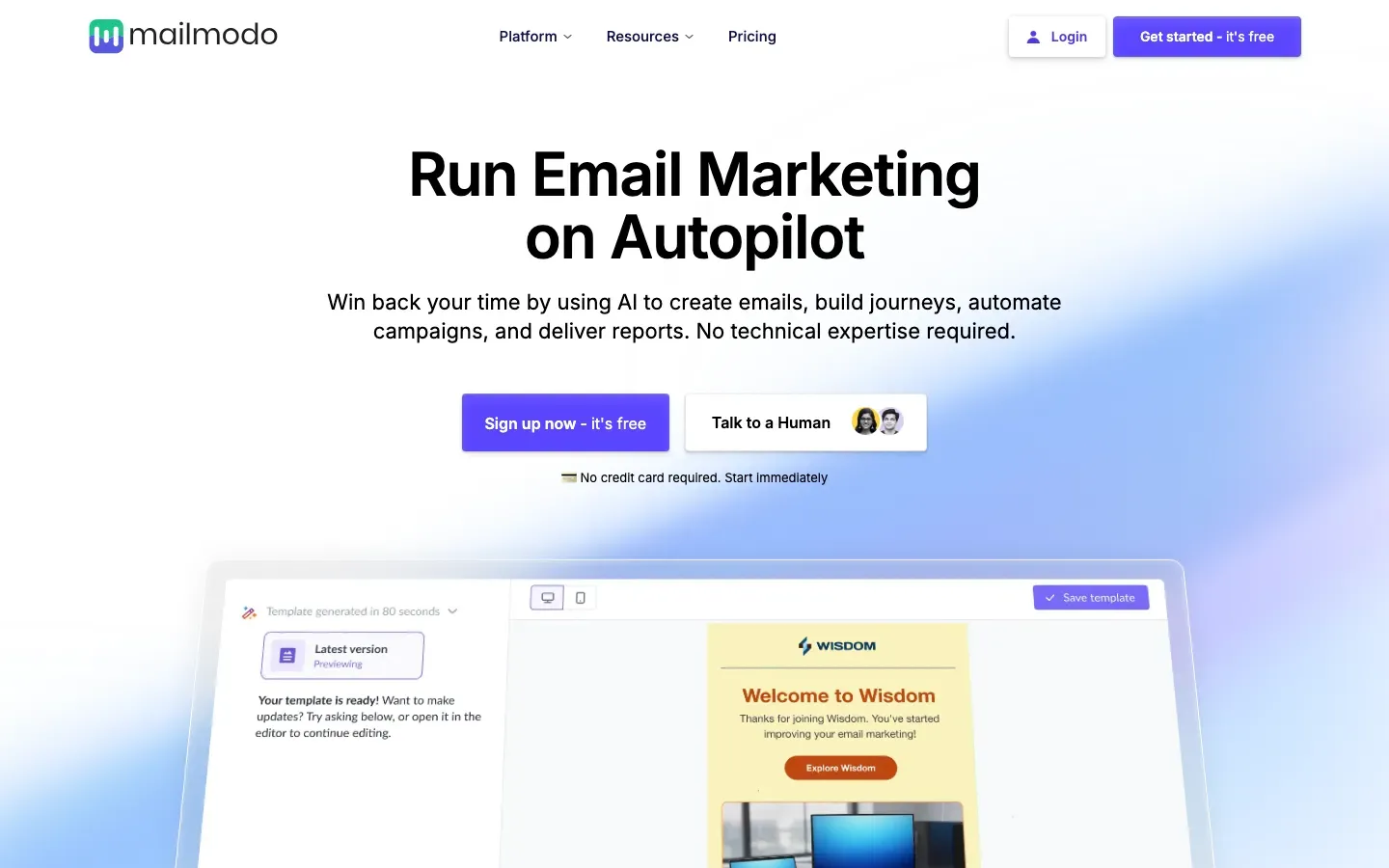
Mailmodo
“Run Email Marketing on Autopilot”

Mailchimp
“Email & SMS marketing”
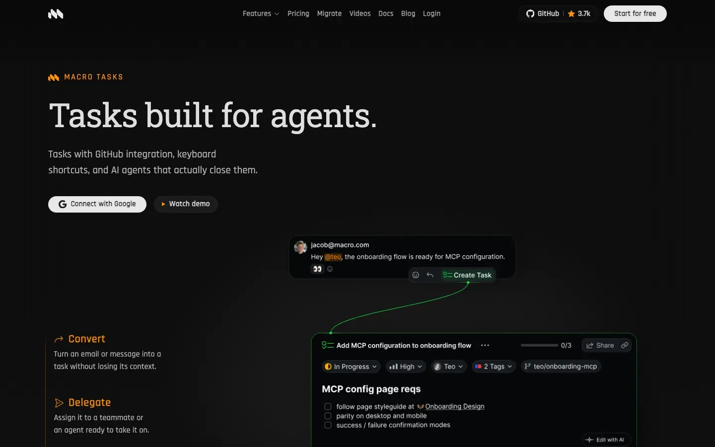
Macro Tasks
“Tasks built for agents.”

mailbox
“Your data – under your control.”
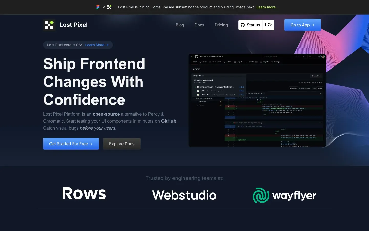
Lost Pixel
“Ship Frontend Changes With Confidence”
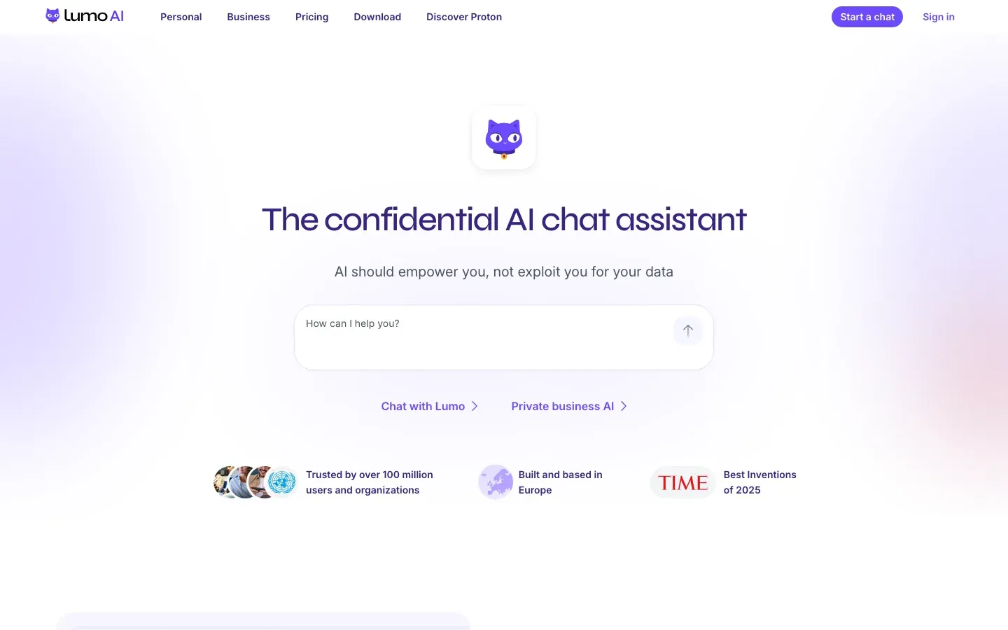
Lumo
“The confidential AI chat assistant”
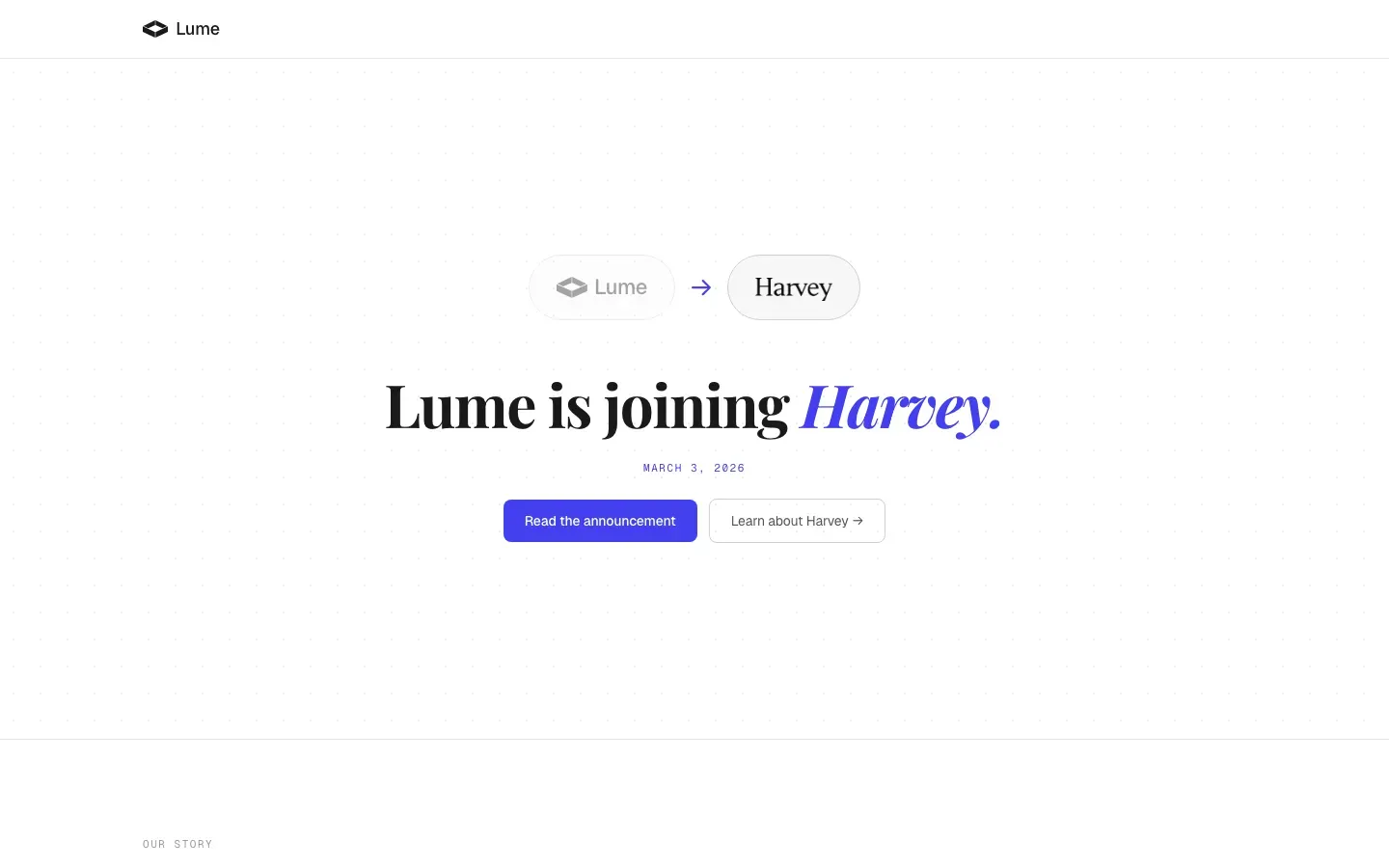
Lume
“Lume is joining Harvey.”
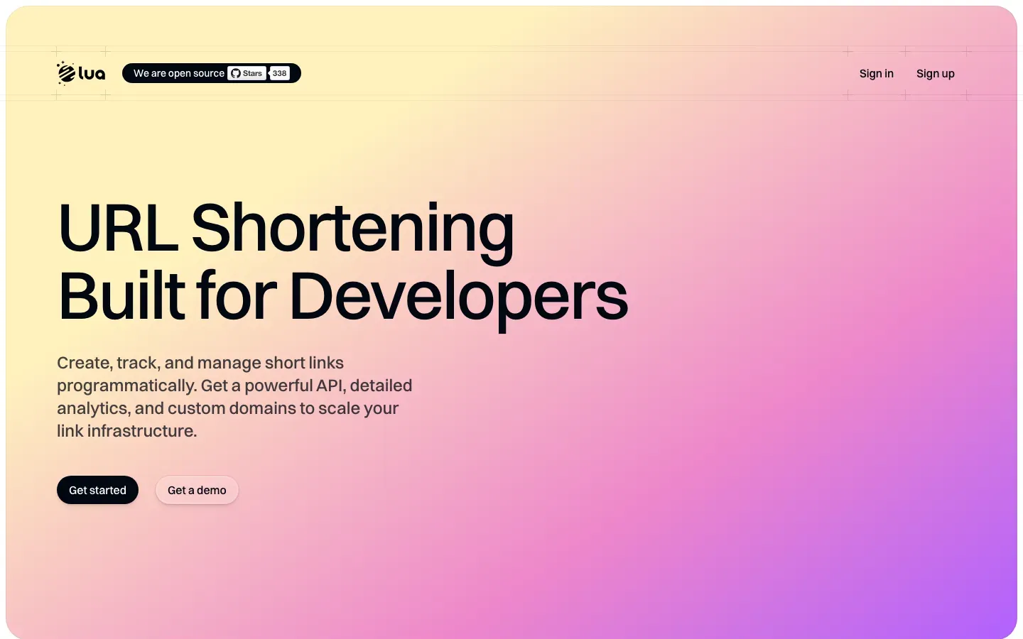
Lua.sh
“URL Shortening Built for Developers”
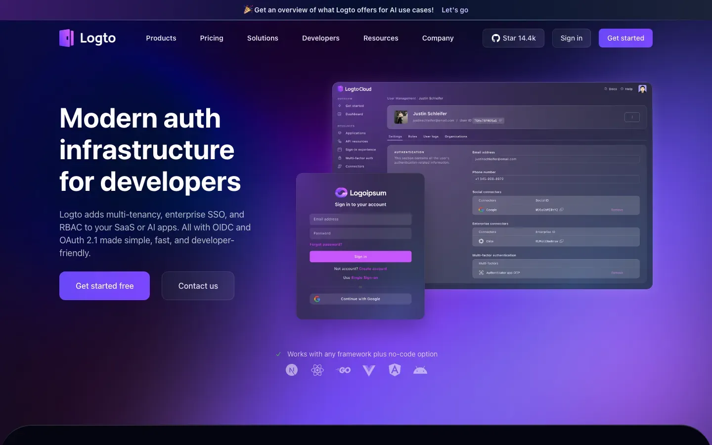
Logto
“Modern auth infrastructure for developers”
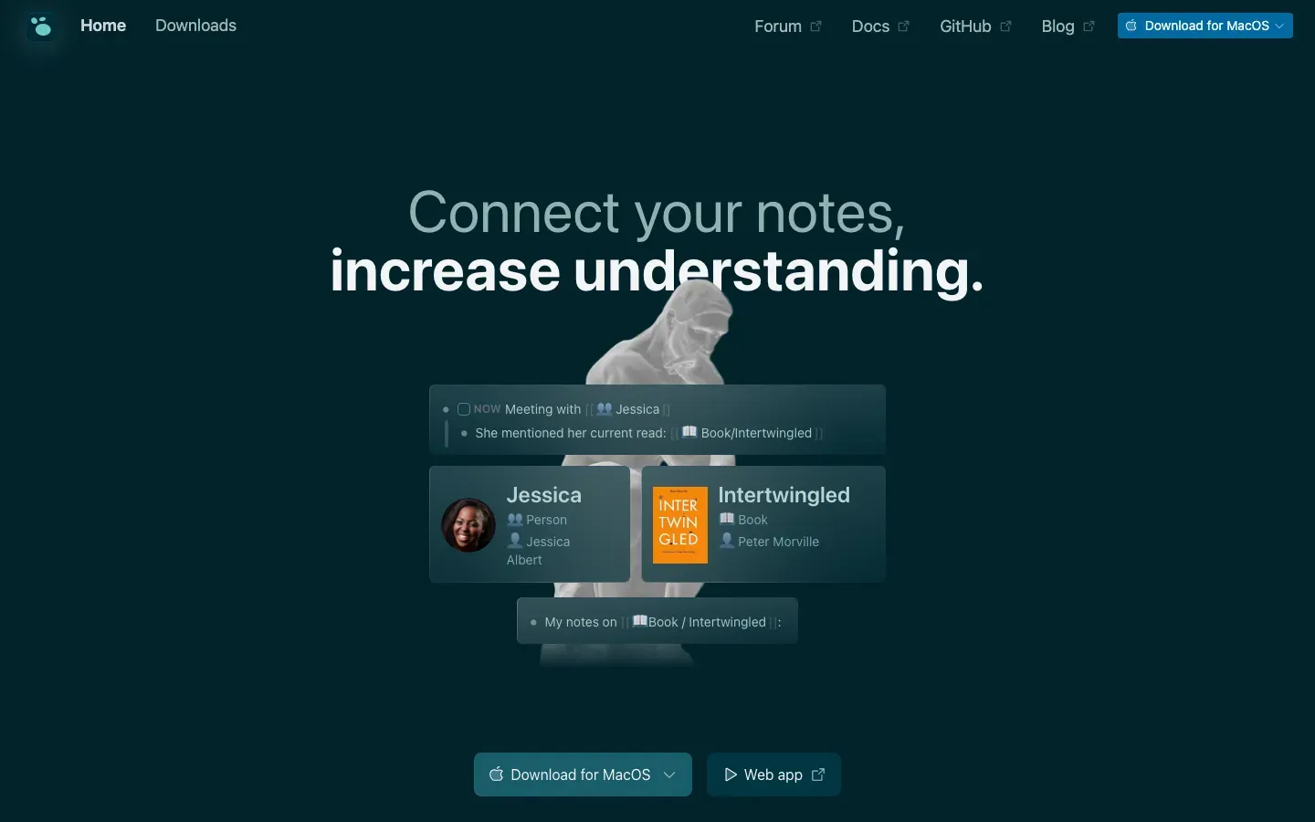
Logseq
“Connect your notes, increase understanding.”
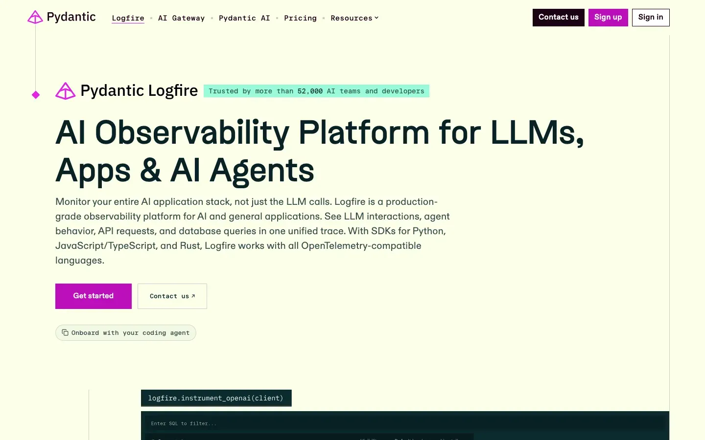
Pydantic Logfire
“AI Observability Platform for LLMs, Apps & AI Agents”

LogMeIn Hamachi
“Create virtual private networks on-demand”
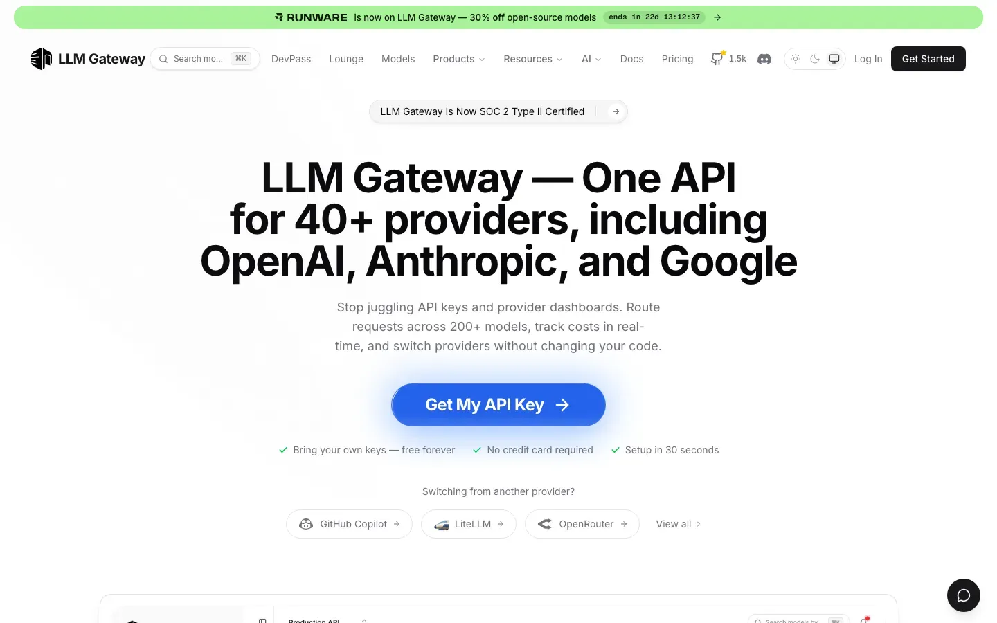
LLM Gateway
“LLM Gateway — One API for 40+ providers, including OpenAI, Anthropic, and Google”
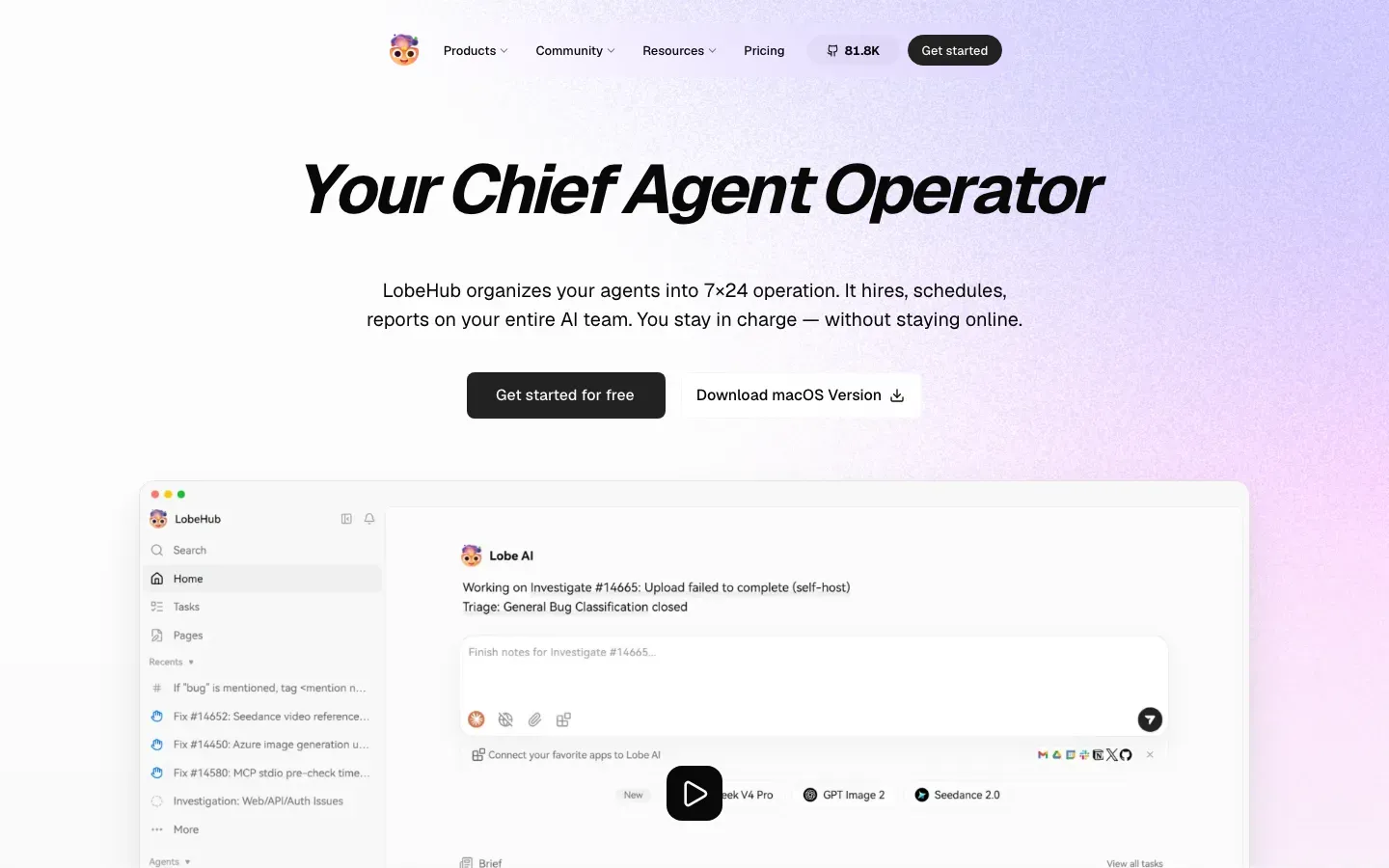
LobeHub
“Your Chief Agent Operator”
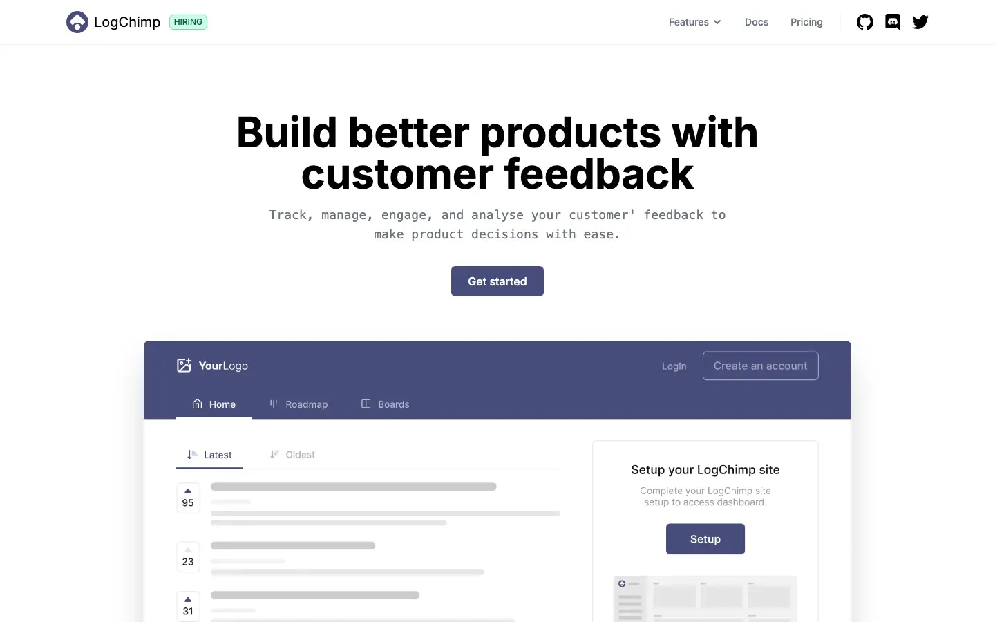
LogChimp
“Build better products with customer feedback”
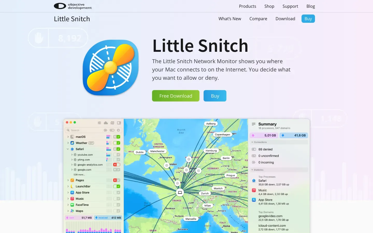
Little Snitch
“Little Snitch”
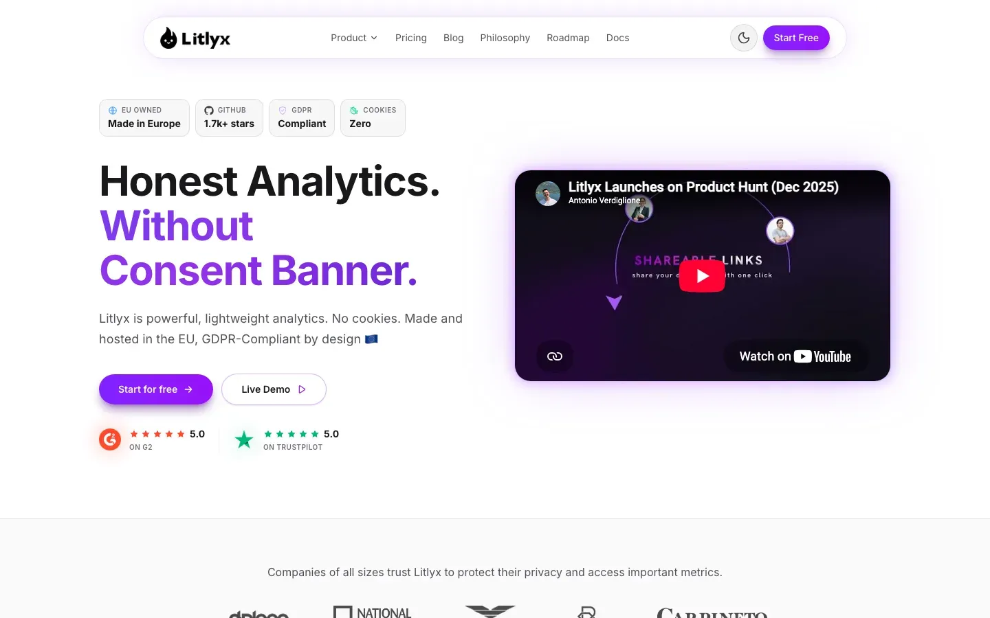
Litlyx
“Honest Analytics. Without Consent Banner.”
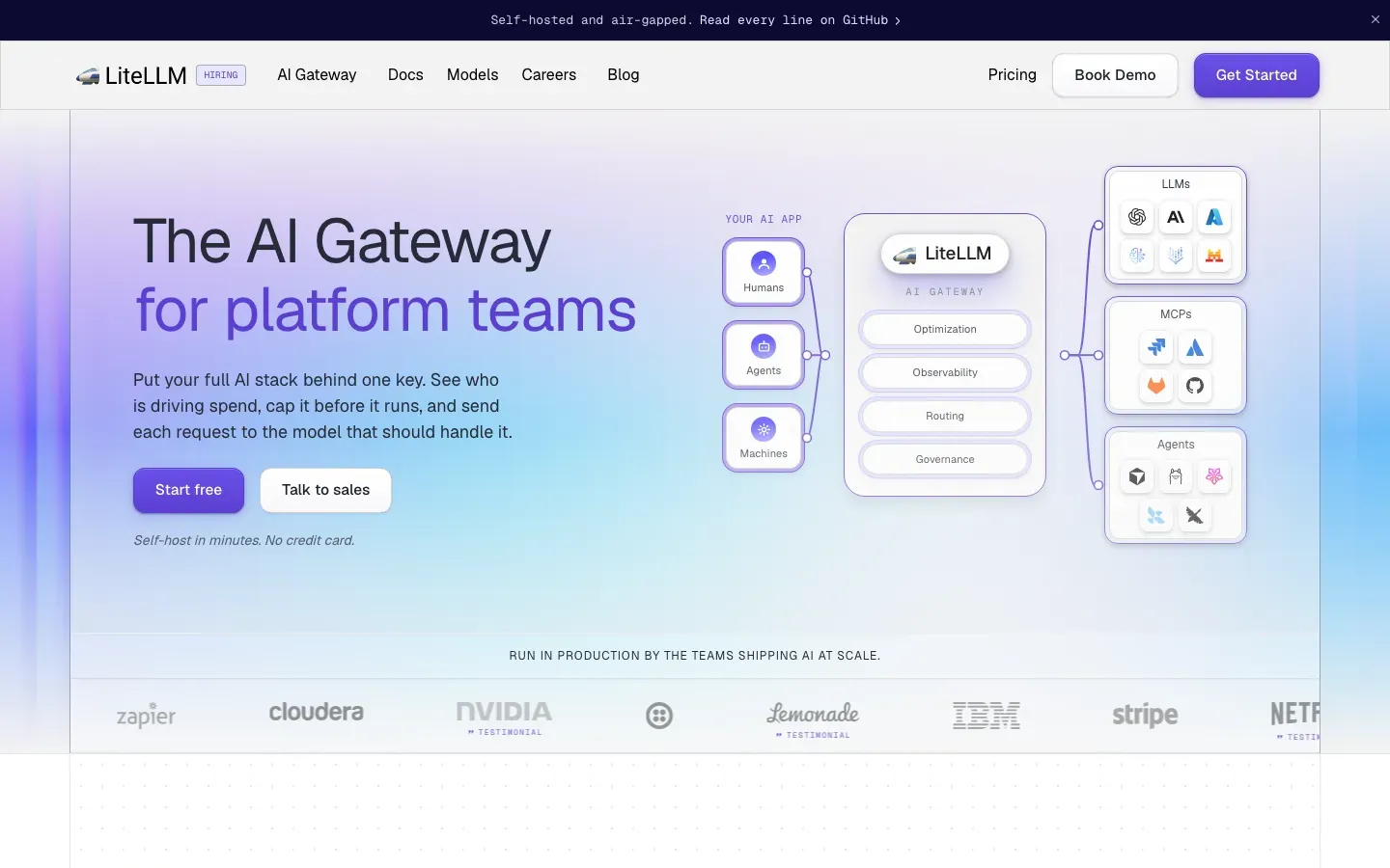
LiteLLM
“The AI Gateway”
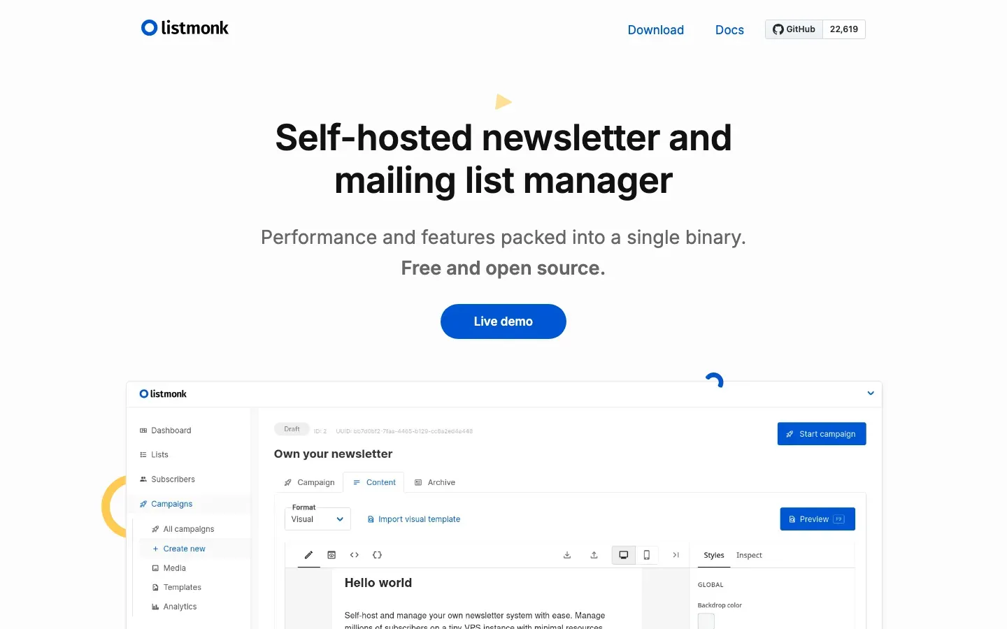
listmonk
“Self-hosted newsletter and mailing list manager”
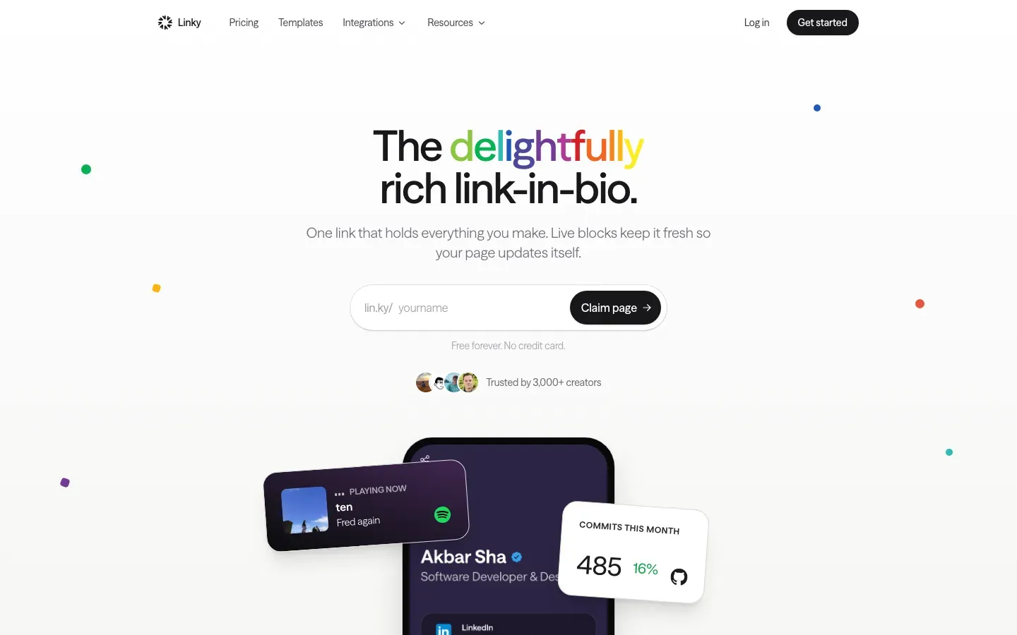
Linky
“The delightfully rich link-in-bio.”
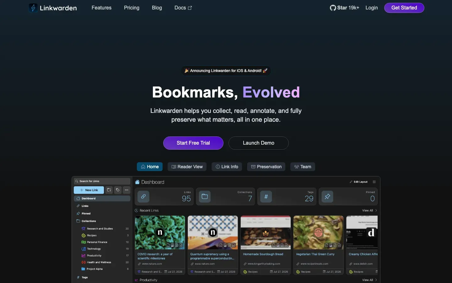
Linkwarden
“Bookmarks, Evolved”
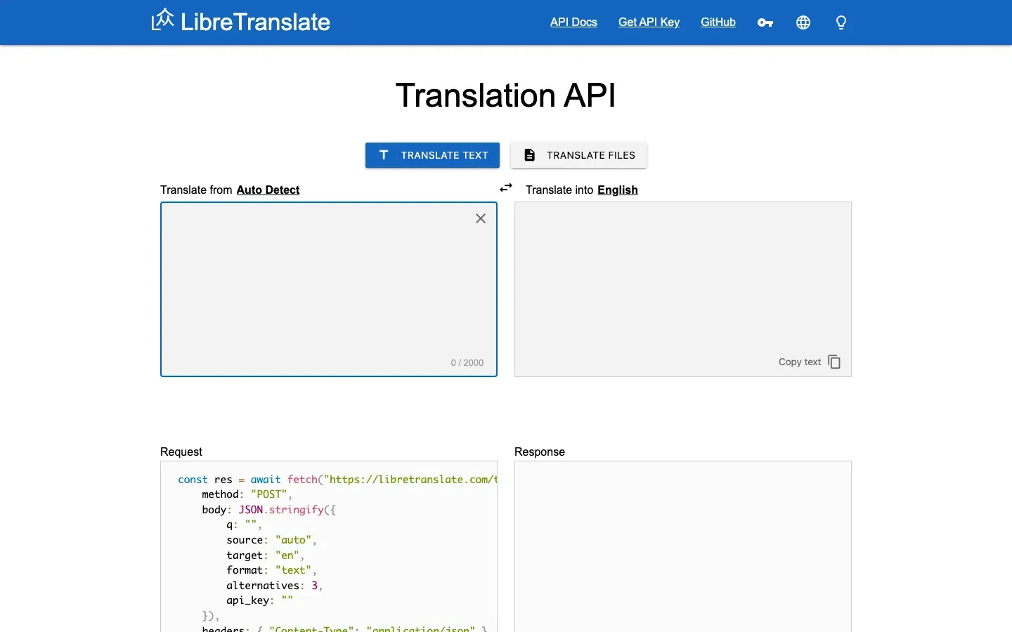
LibreTranslate
“Open Source Machine Translation API”
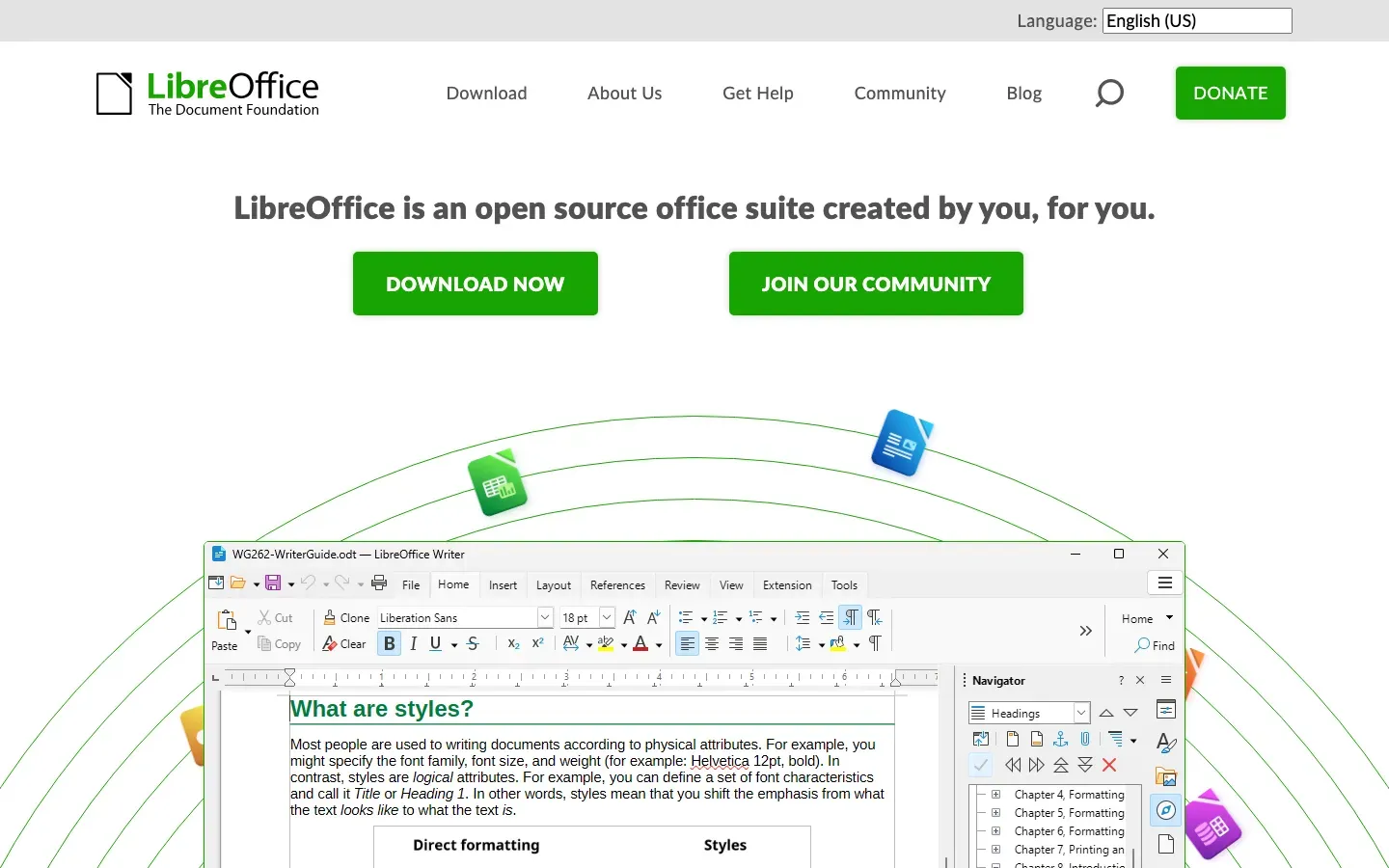
LibreOffice
“LibreOffice is an open source office suite created by you, for you.”
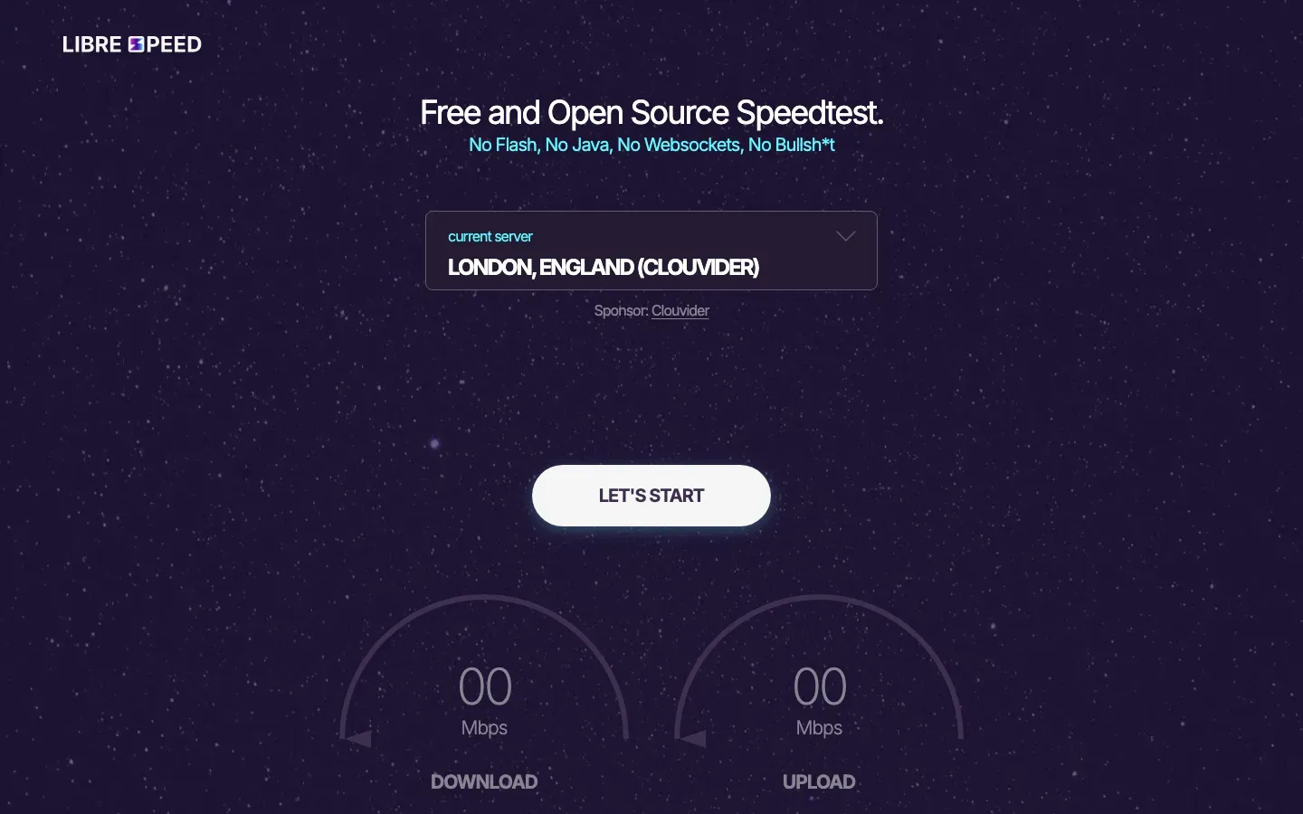
LibreSpeed
“Free and Open Source Speedtest.”

LanguageTool
“More than a Grammar Checker”
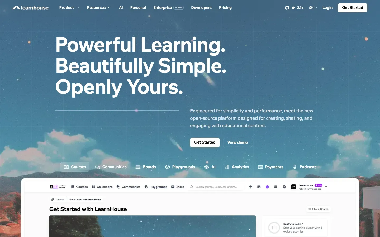
LearnHouse
“Powerful Learning. Beautifully Simple. Openly Yours.”
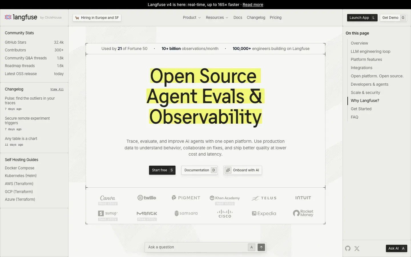
Langfuse
“Open Source Agent Evals & Observability”
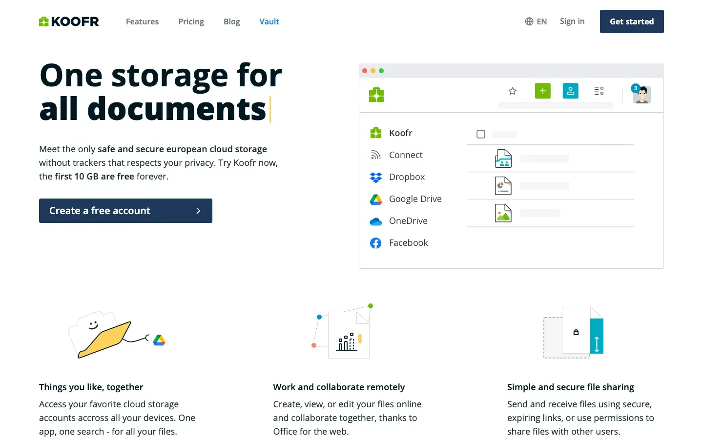
Koofr
“One storage for all documents”
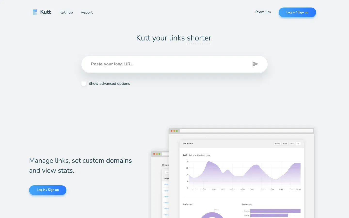
Kutt
“Kutt your links shorter.”
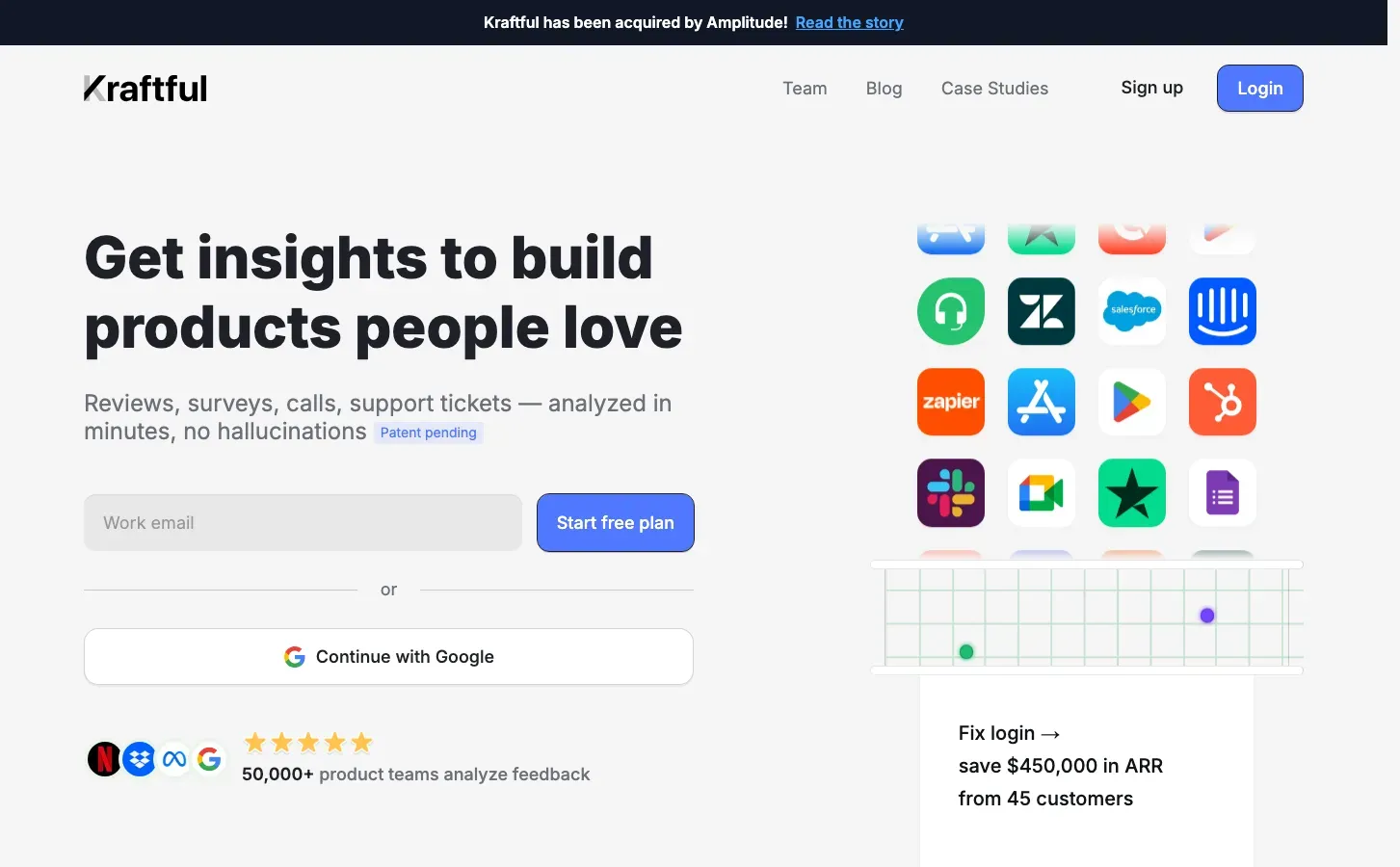
Kraftful
“Get insights to build products people love”
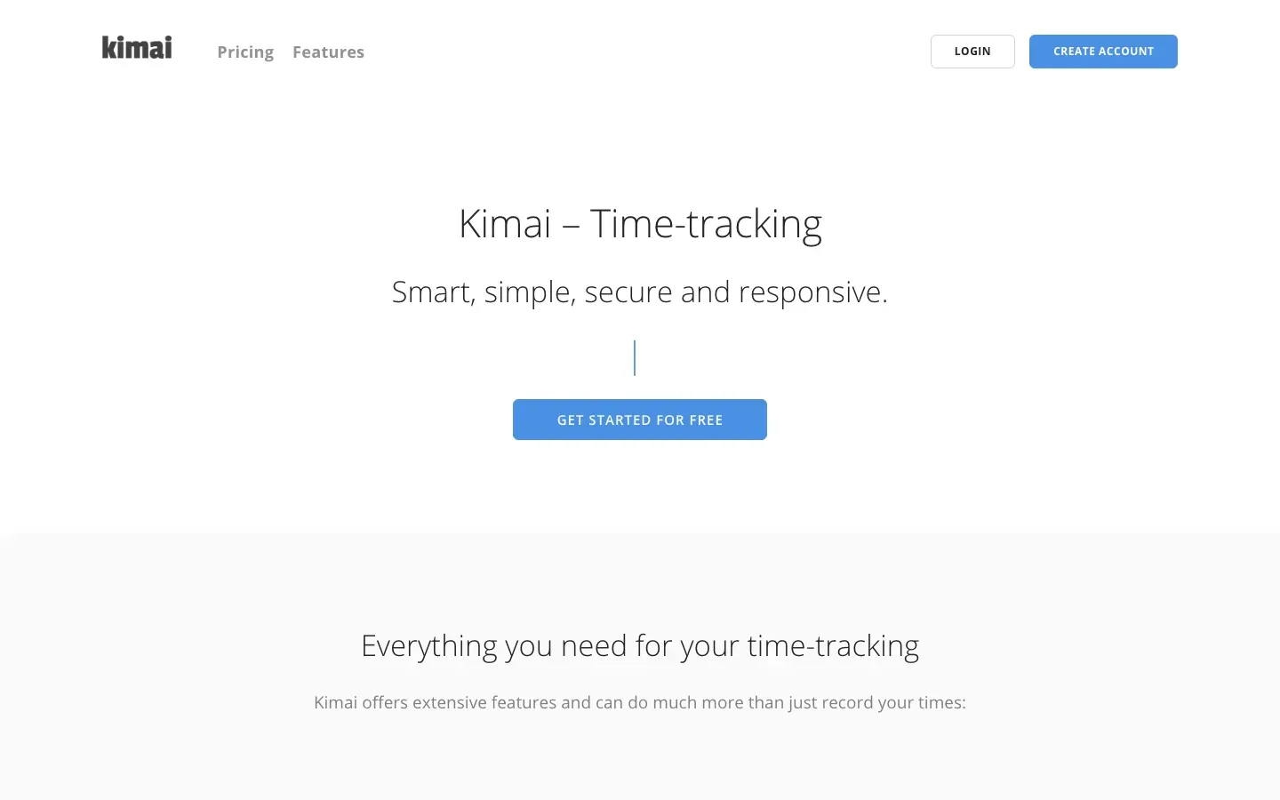
Kimai
“Kimai – Time-tracking”
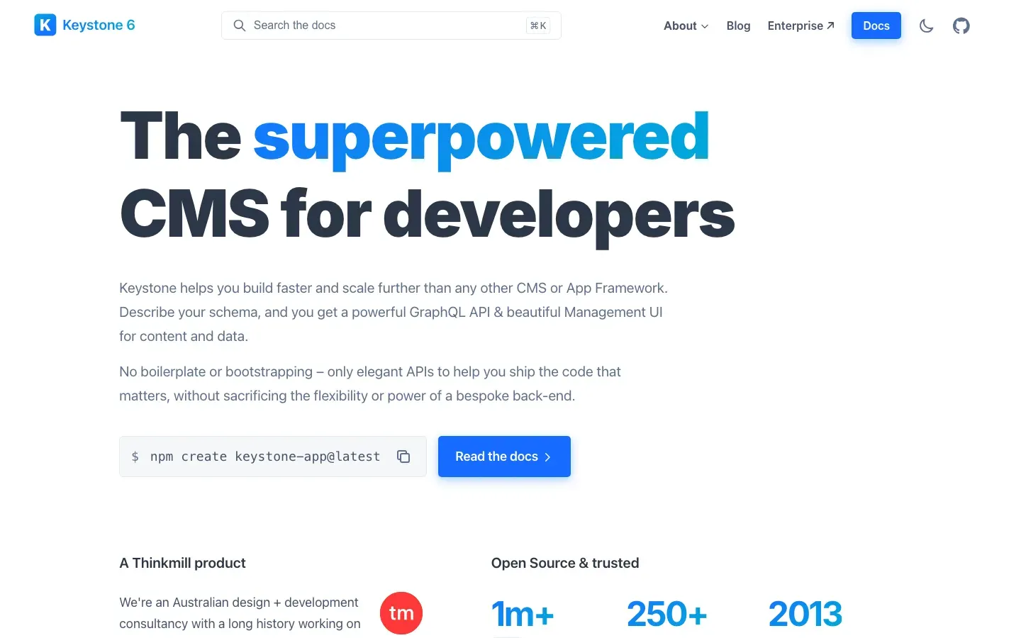
Keystone
“The superpowered CMS for developers”
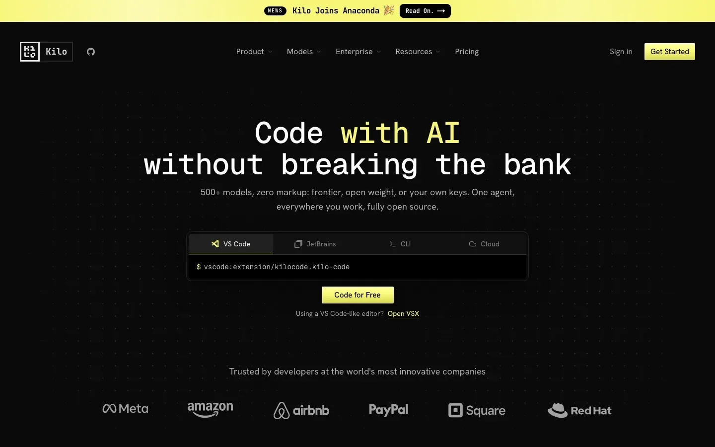
Kilo Code
“Code with AI without breaking the bank”
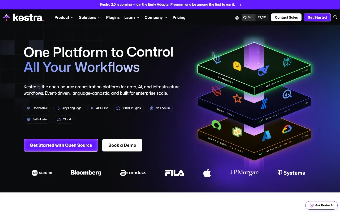
Kestra
“One Platform to Control All Your Workflows”
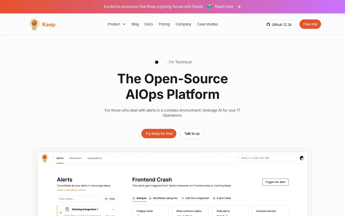
Keep
“The Open-Source AIOps Platform”
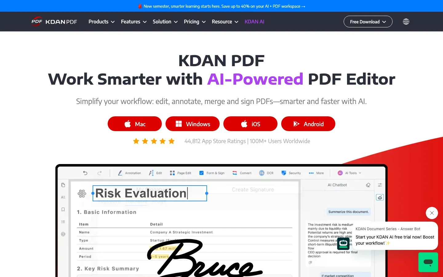
KDAN PDF
“KDAN PDF”
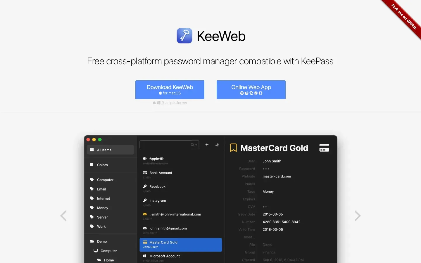
KeeWeb
“KeeWeb”
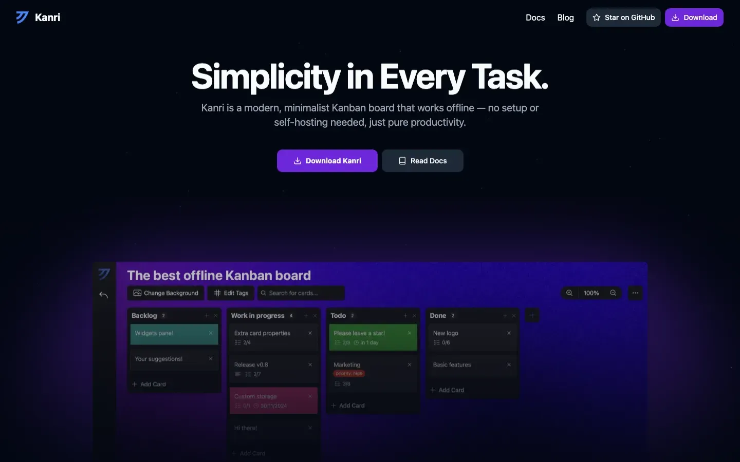
Kanri
“Simplicity in Every Task.”
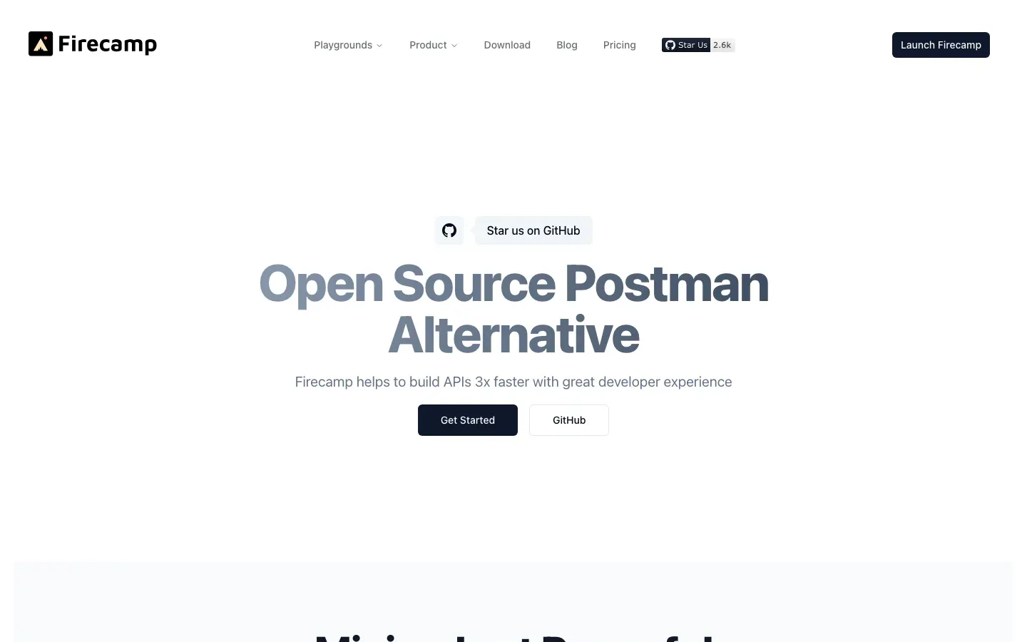

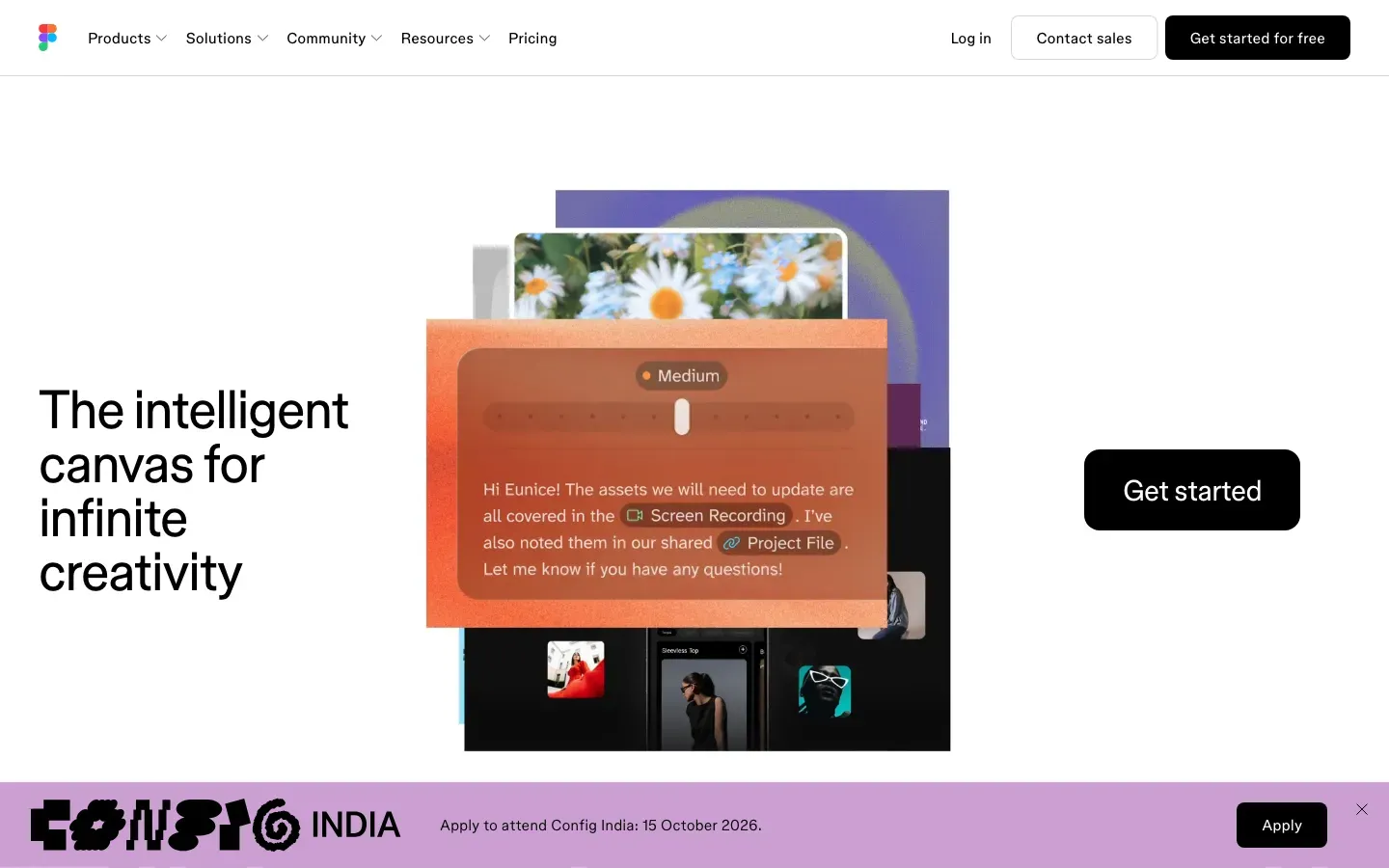
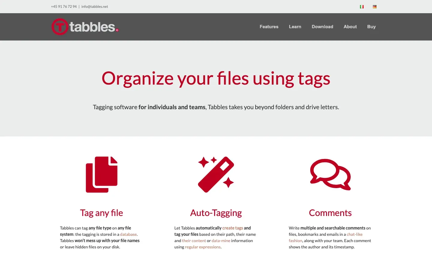
On average
What a page tends to look like once you know what it leads with. Every homepage carries one primary angle and a set of design labels, so the two can be counted against each other — these are the design labels that turn up most often behind each of the commonest angles.
Pages that lead with outcome / benefit-led
- Airy spacing layout · 11 tools
- Static / calm character · 9 tools
- Contained column layout · 9 tools
- Idealized UI mockups imagery · 8 tools
- Icon-led imagery · 8 tools
Pages that lead with open source / ownership
- Static / calm character · 5 tools
- Light scheme colour · 4 tools
- Airy spacing layout · 4 tools
- Alternating split rows layout · 4 tools
- All-caps labels typography · 4 tools
Pages that lead with all-in-one / consolidation
- Static / calm character · 3 tools
- Idealized UI mockups imagery · 3 tools
- Humanist sans typography · 2 tools
- Playful character · 2 tools
- Premium craft character · 2 tools
Pages that lead with ai-native
- Stylized product UI hero interface · 3 tools
- Airy spacing layout · 3 tools
- Idealized UI mockups imagery · 3 tools
- Premium craft character · 3 tools
- Contained column layout · 2 tools
There is more on every profile
The labels are free — that is what this gallery is built on. What is not: the written teardown of each page, the note explaining what on the page earned every label, and the pricing-page reading. Those sit on the profile pages behind the same gate as the rest of the detail here.